
Brief
The Kobbari Company supplies dry coconut to wholesale and trade buyers. Most players in this category look like village-market packaging. They needed a brand that felt natural, but precise enough to signal purity, consistency and large-scale supply.



Approach
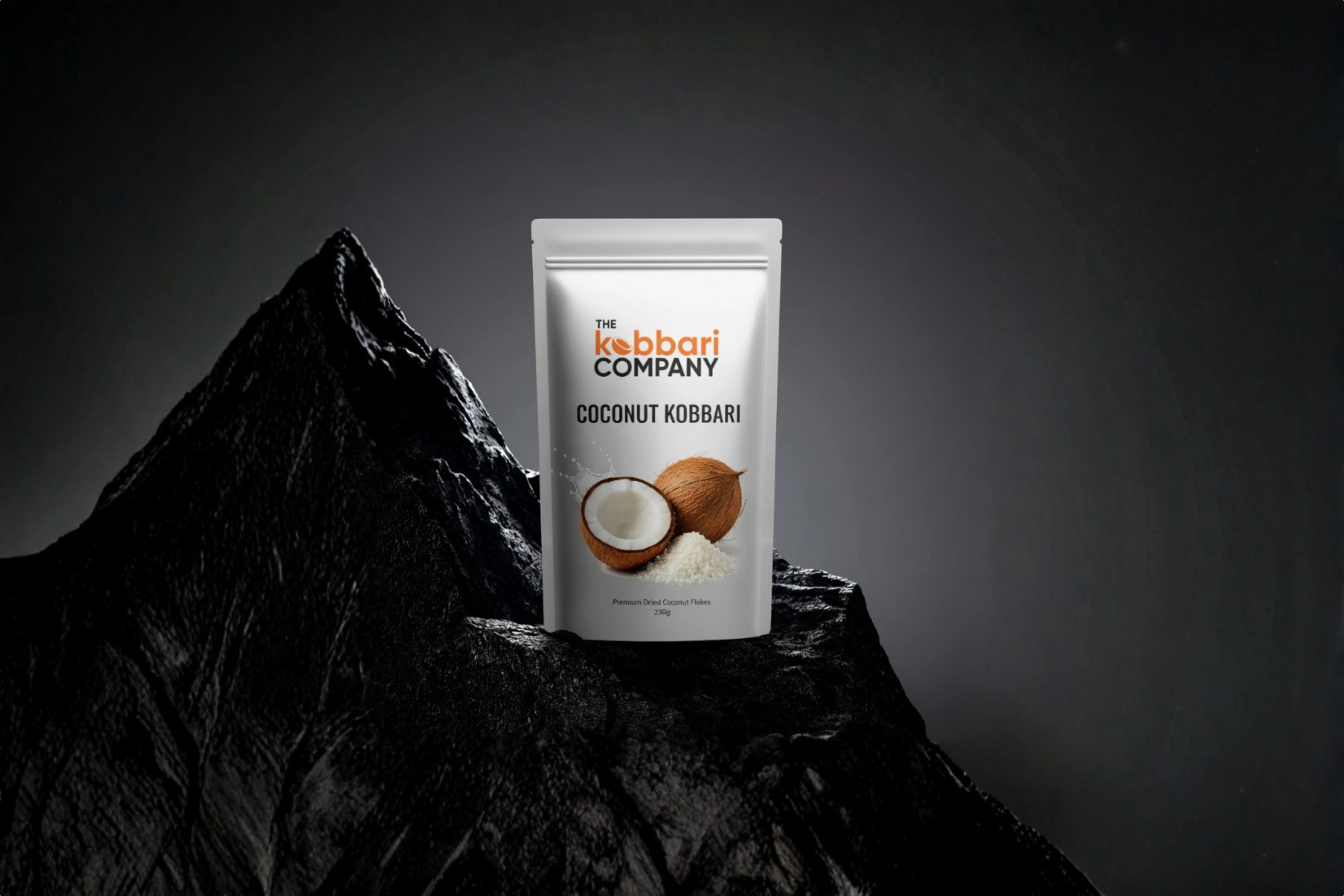
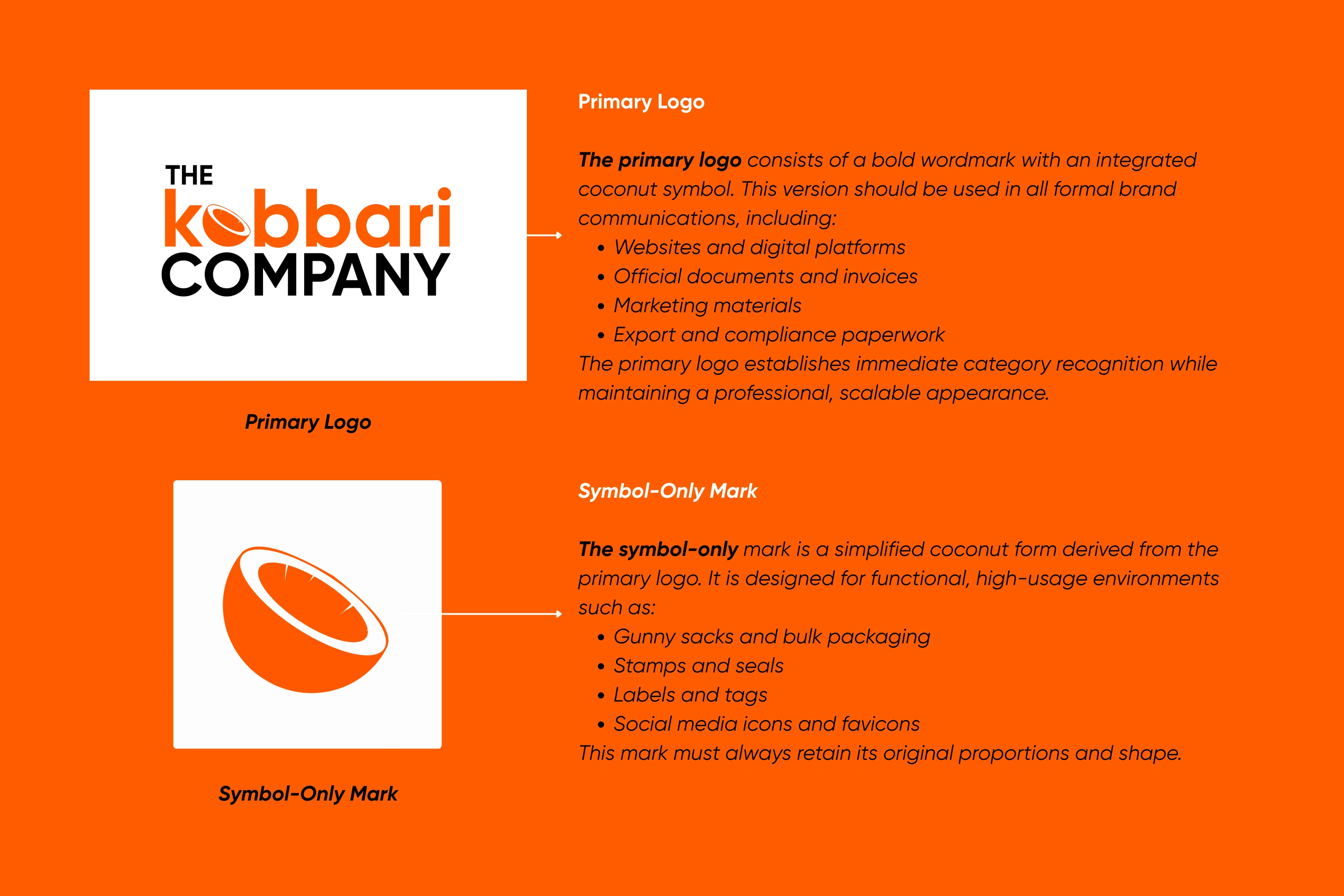
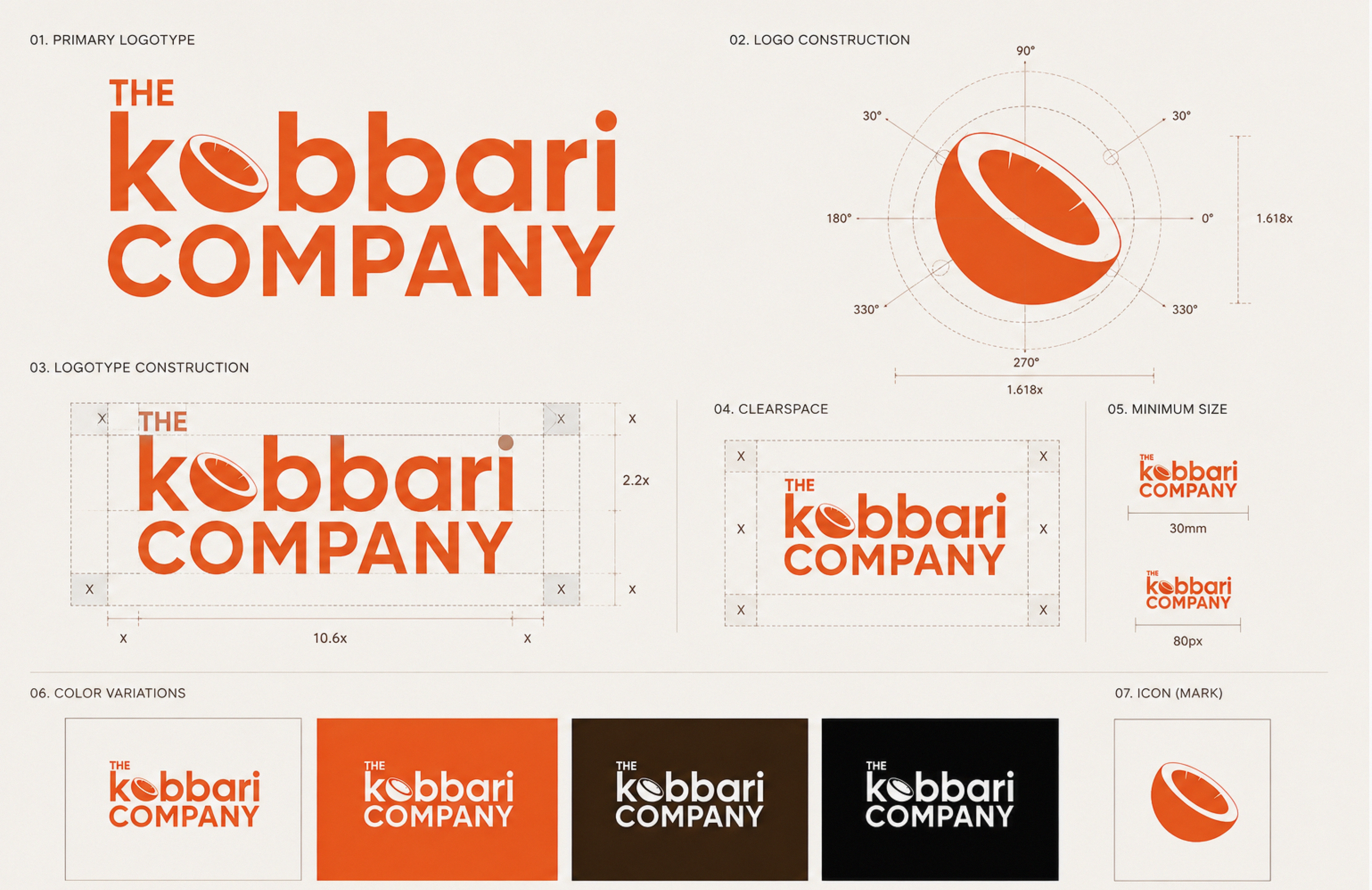
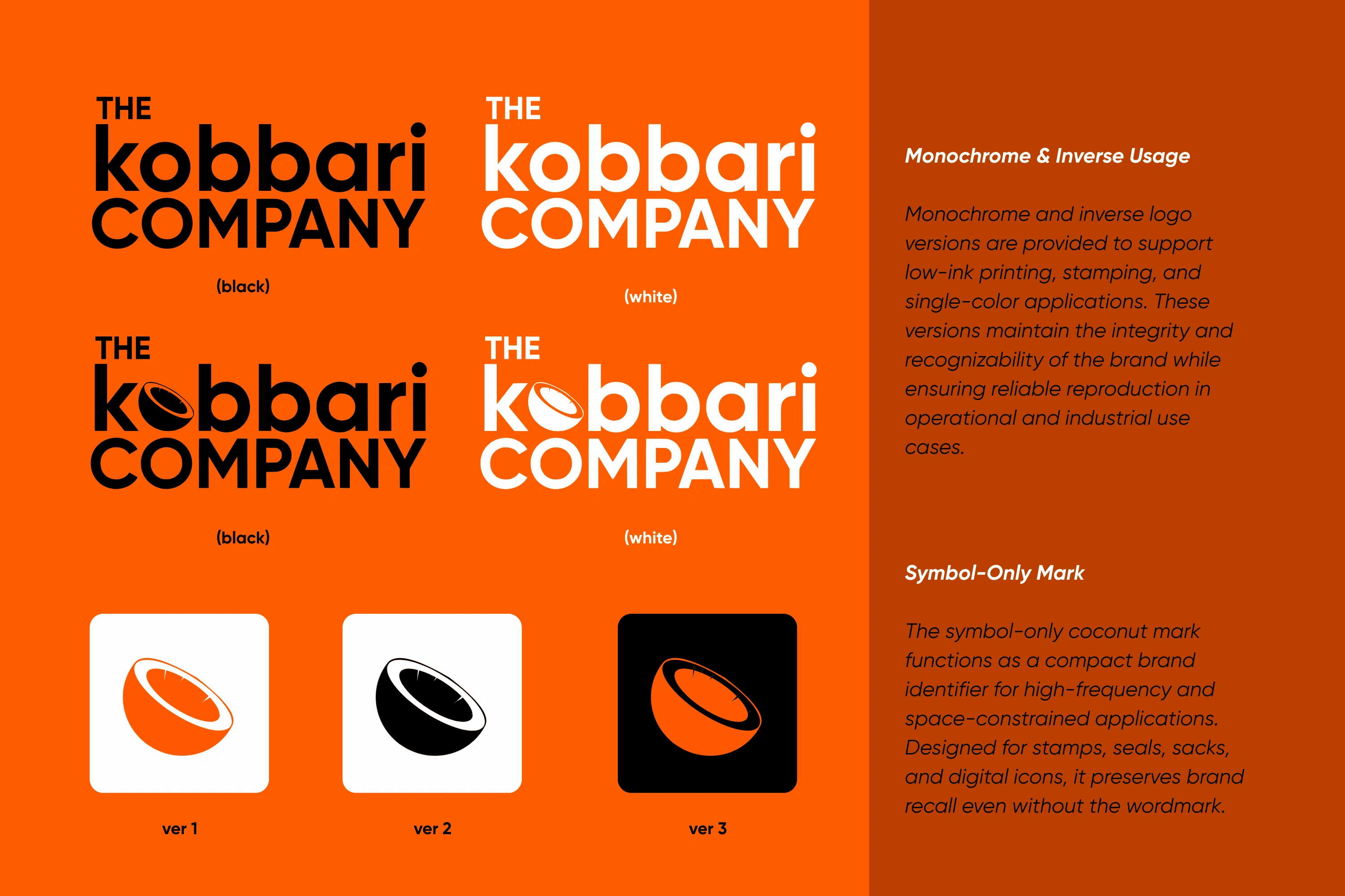
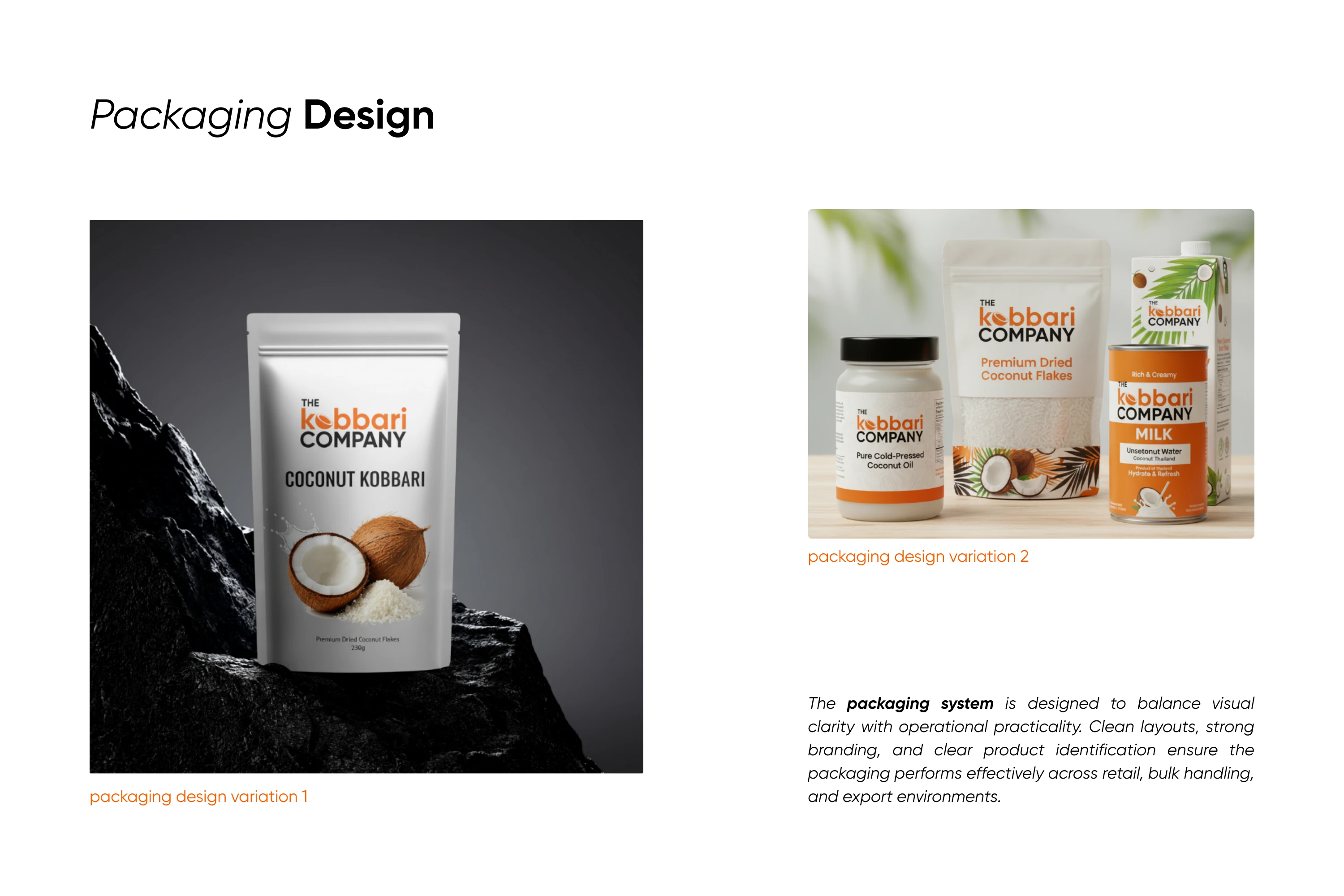
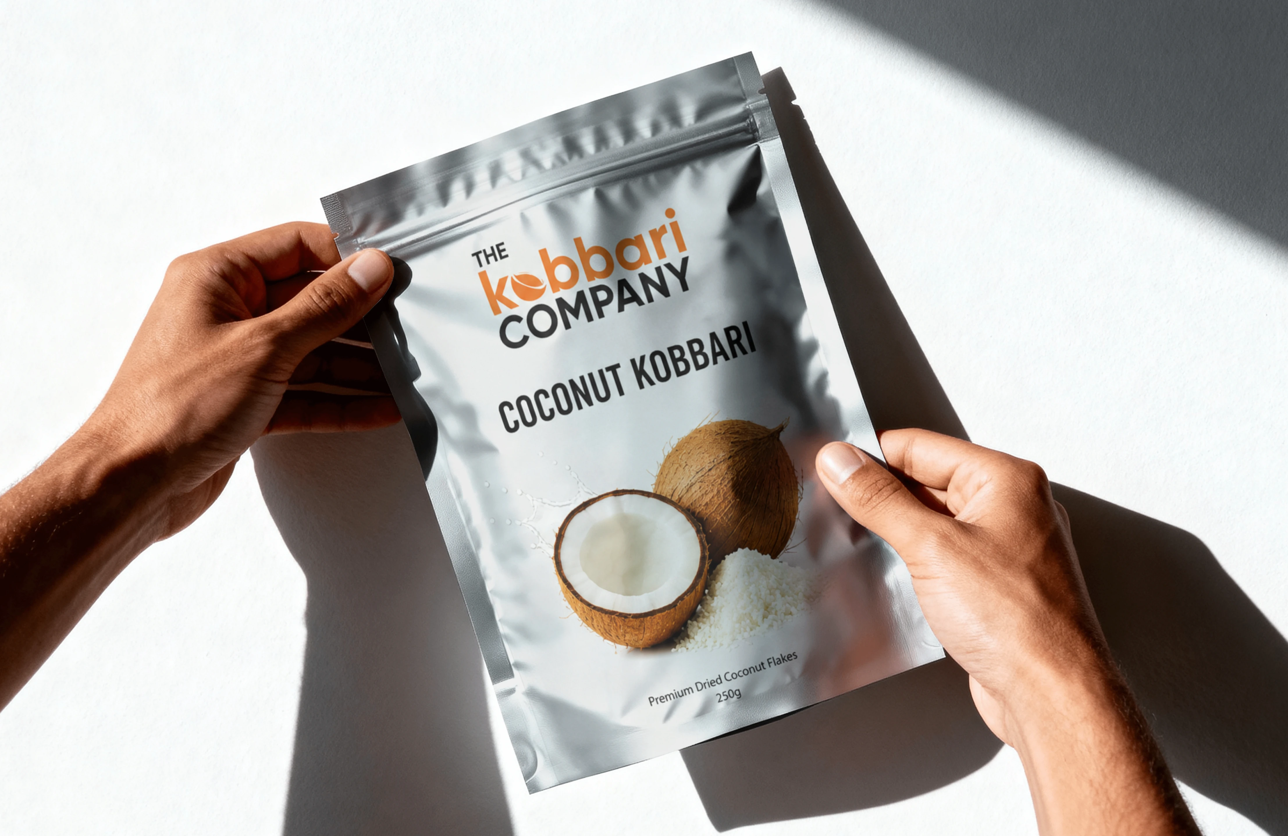
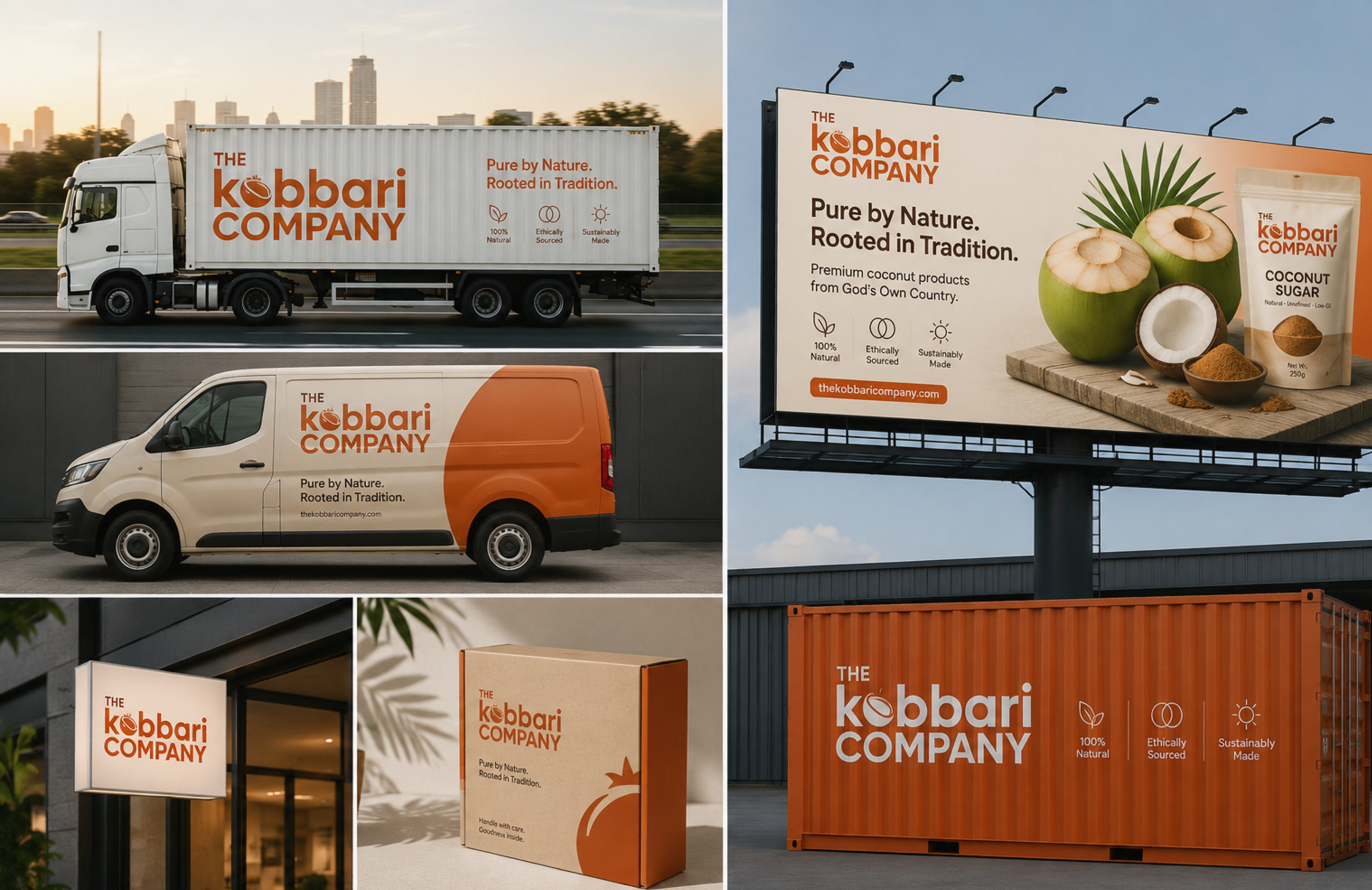
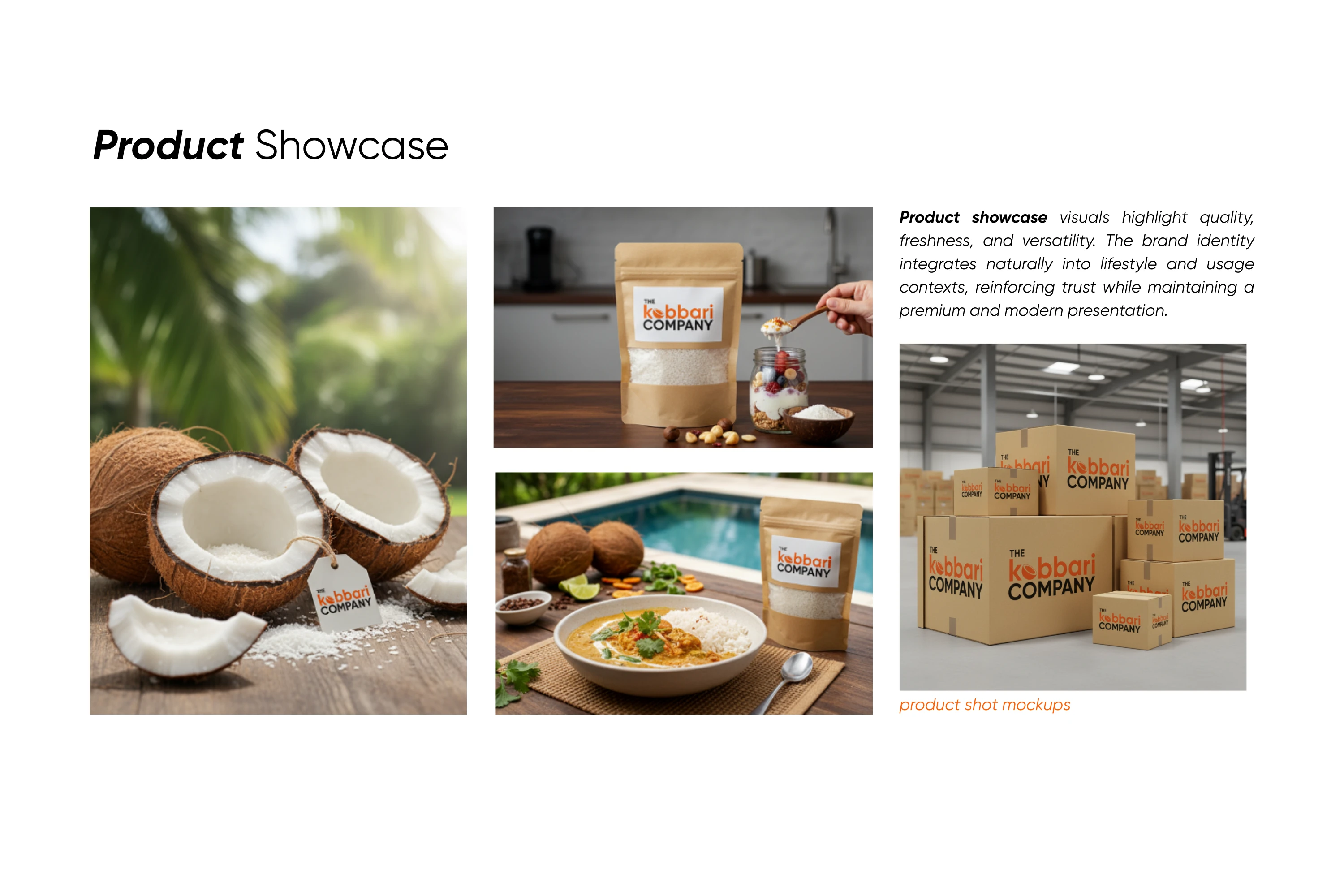
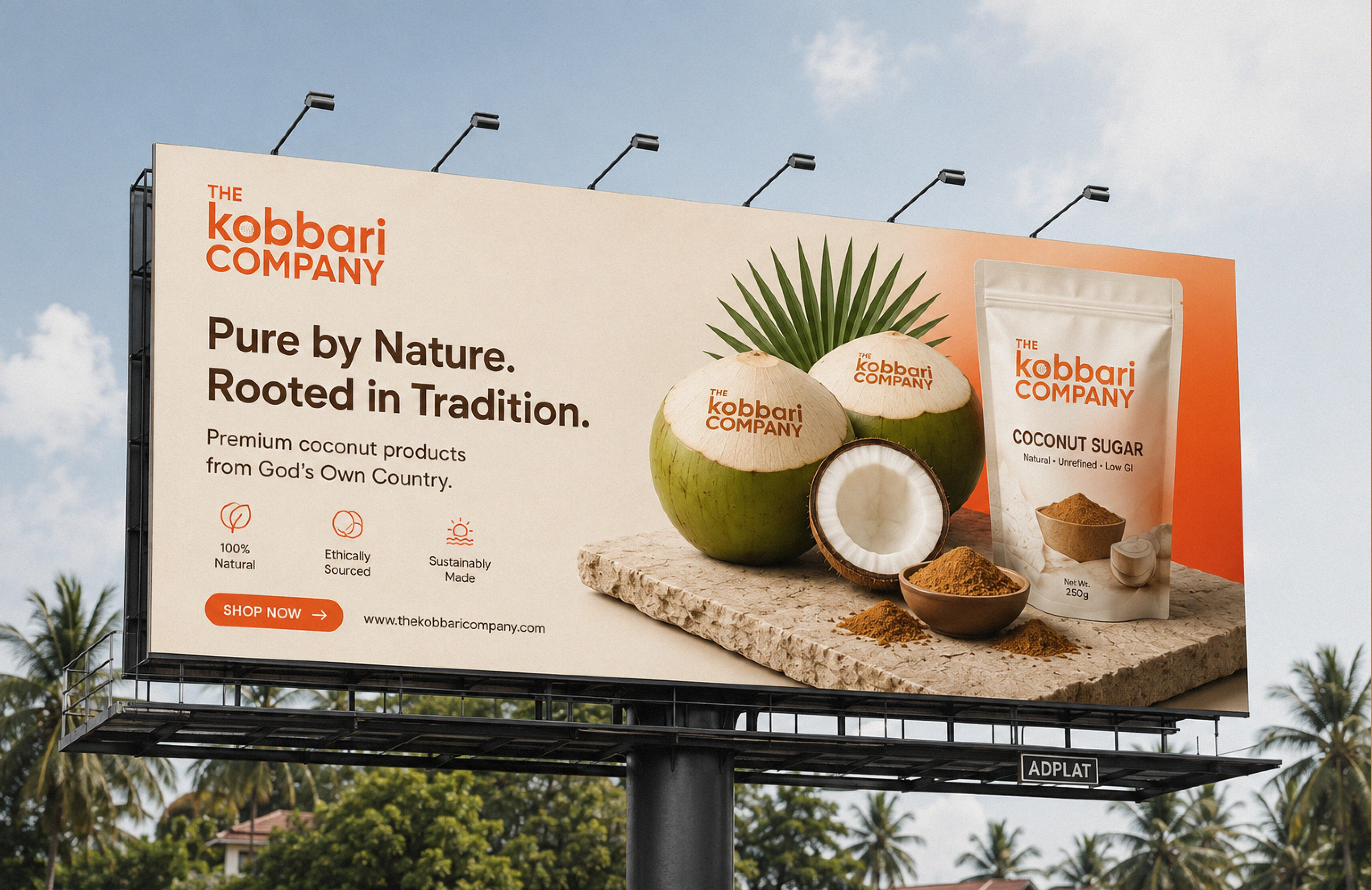
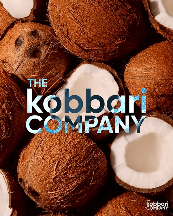
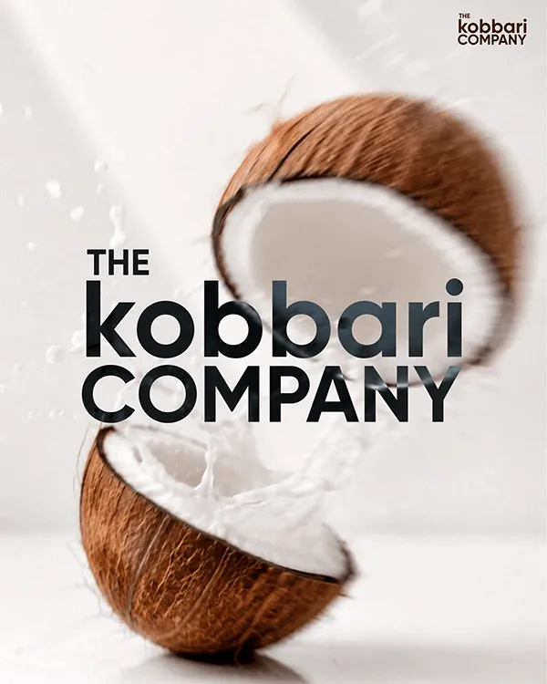
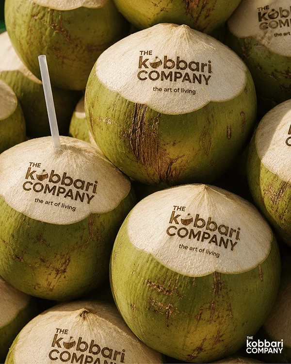
I kept the wordmark clean and confident, with a halved coconut standing in for the O as the one ownable detail. The coconut also works alone as a symbol mark for sacks, stamps and labels. A bold orange and white palette keeps the pouch visible on a crowded warehouse shelf. Packaging uses a strict layout so every SKU stays consistent at volume.

Outcome
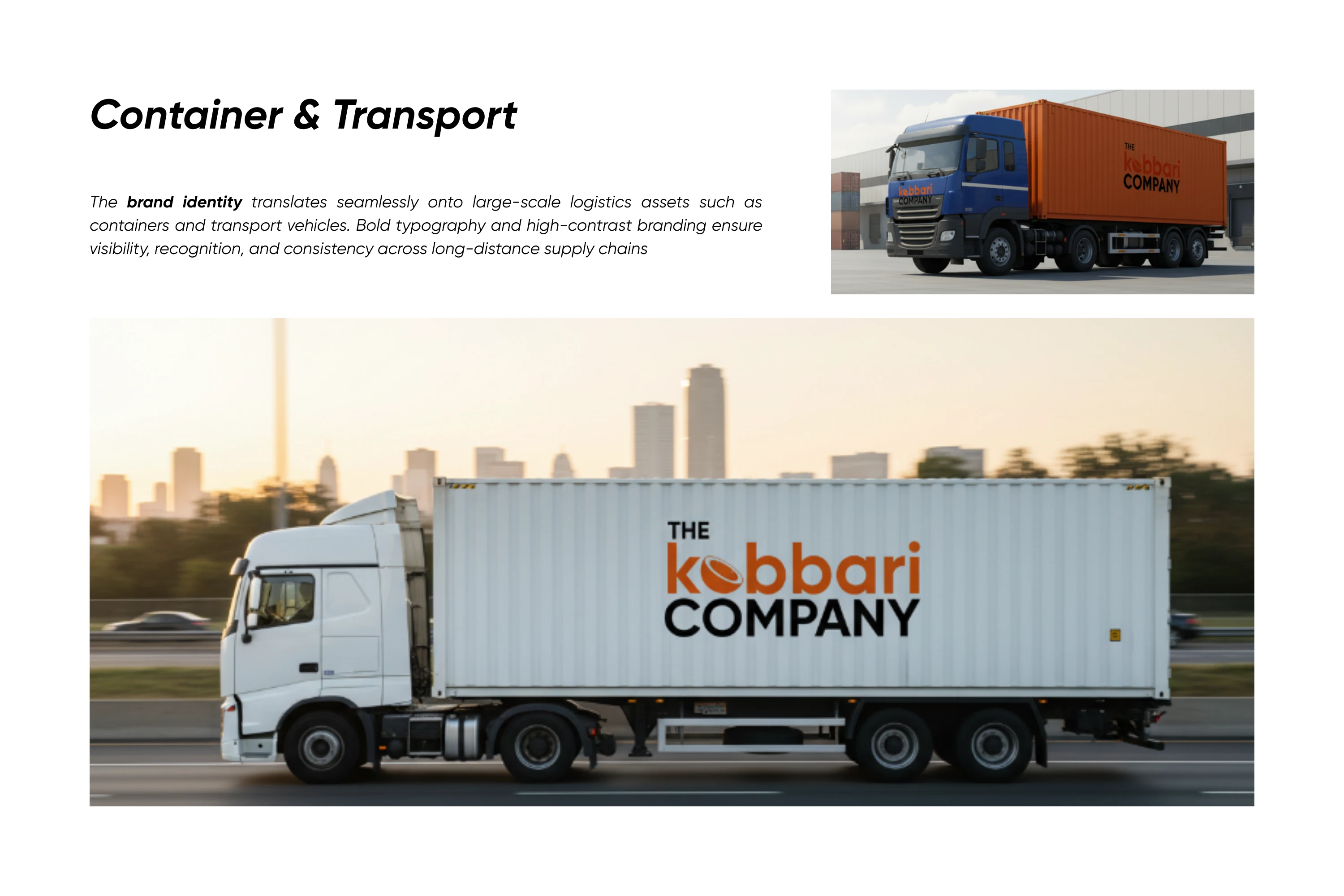
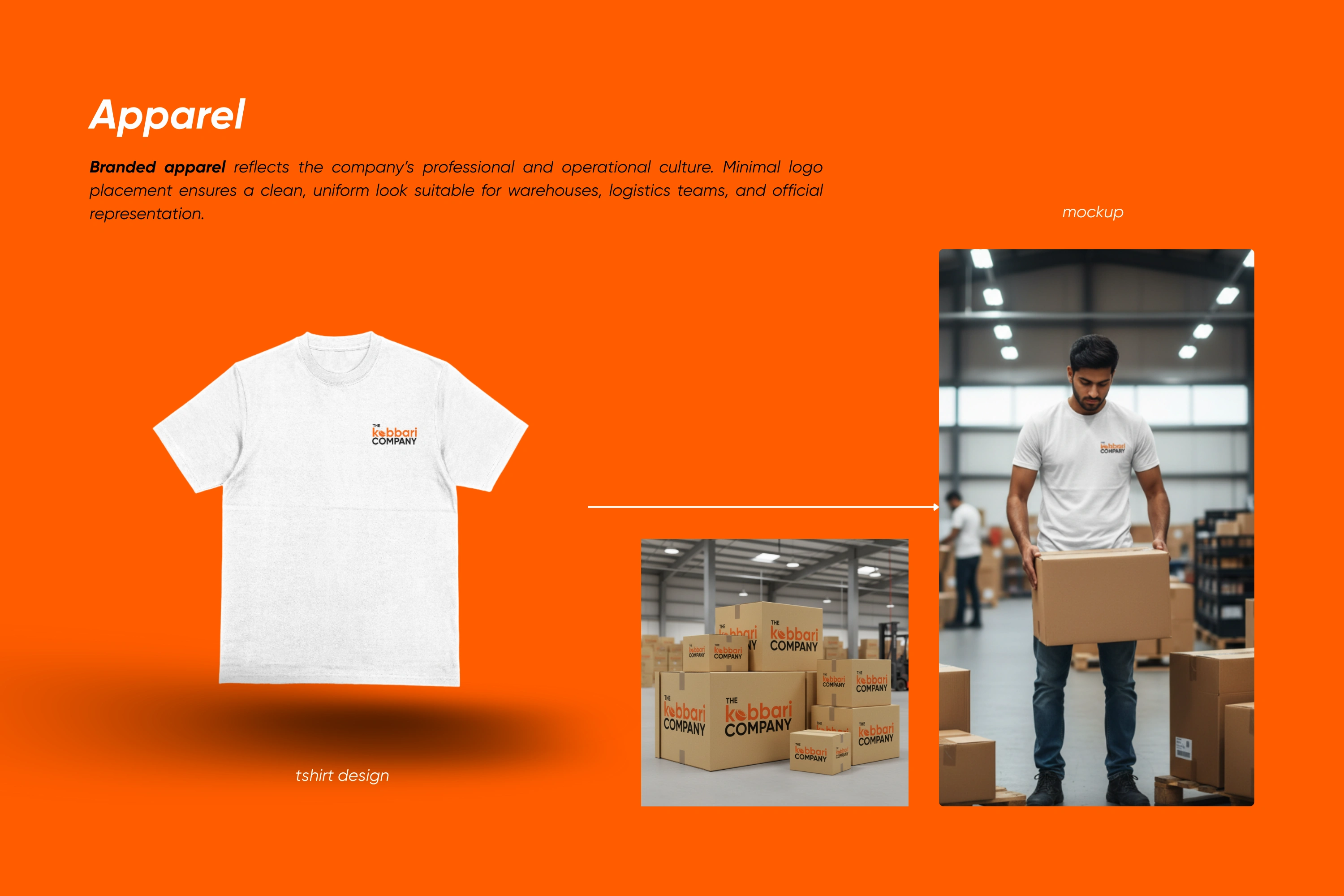
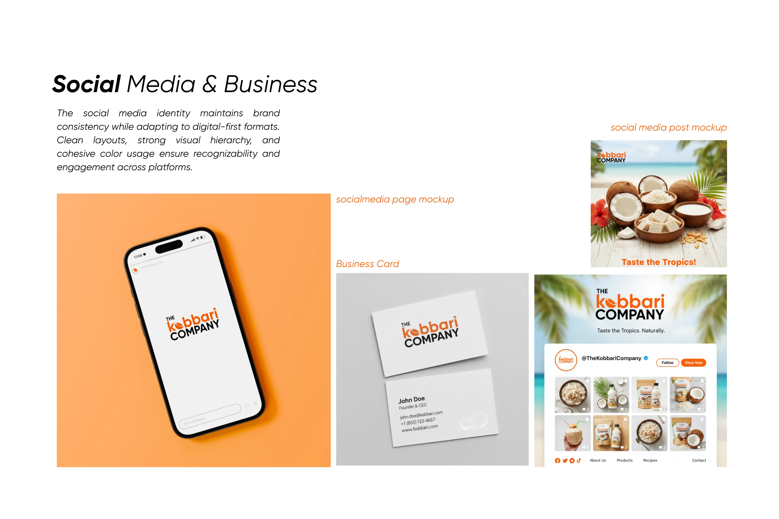
Logo, colour and type system, and packaging applied across pouches, sacks, labels, business documents and digital touchpoints.
1 like · 10 views · Sep 3, 2026
Identity for a B2B dry-coconut (kobbari) supplier. Natural and earthy, but precise enough to signal purity, reliability and large-scale trade.


