WalletWizard - Fintech - Landing Page & Mobile UI/UX
Gabriella Echebiri
WalletWizard - Expense Tracker App - Landing Page & Mobile Design
Overview
WalletWizard needed a complete digital presence that makes personal finance management feel simple and approachable. I designed the landing page and full mobile experience covering budgeting, expense tracking, card management, and financial insights.
The project transforms the intimidating world of personal finance into an intuitive, visual experience that helps users take control of their money.
The Challenge & Solutions
Converting Website Visitors to App Users
Challenge: Generic finance app websites don't communicate value quickly enough
Solution: Designed a conversion-focused landing page with clear feature showcases, "How it Works" section, social proof (15+ million users), and prominent App Store CTAs
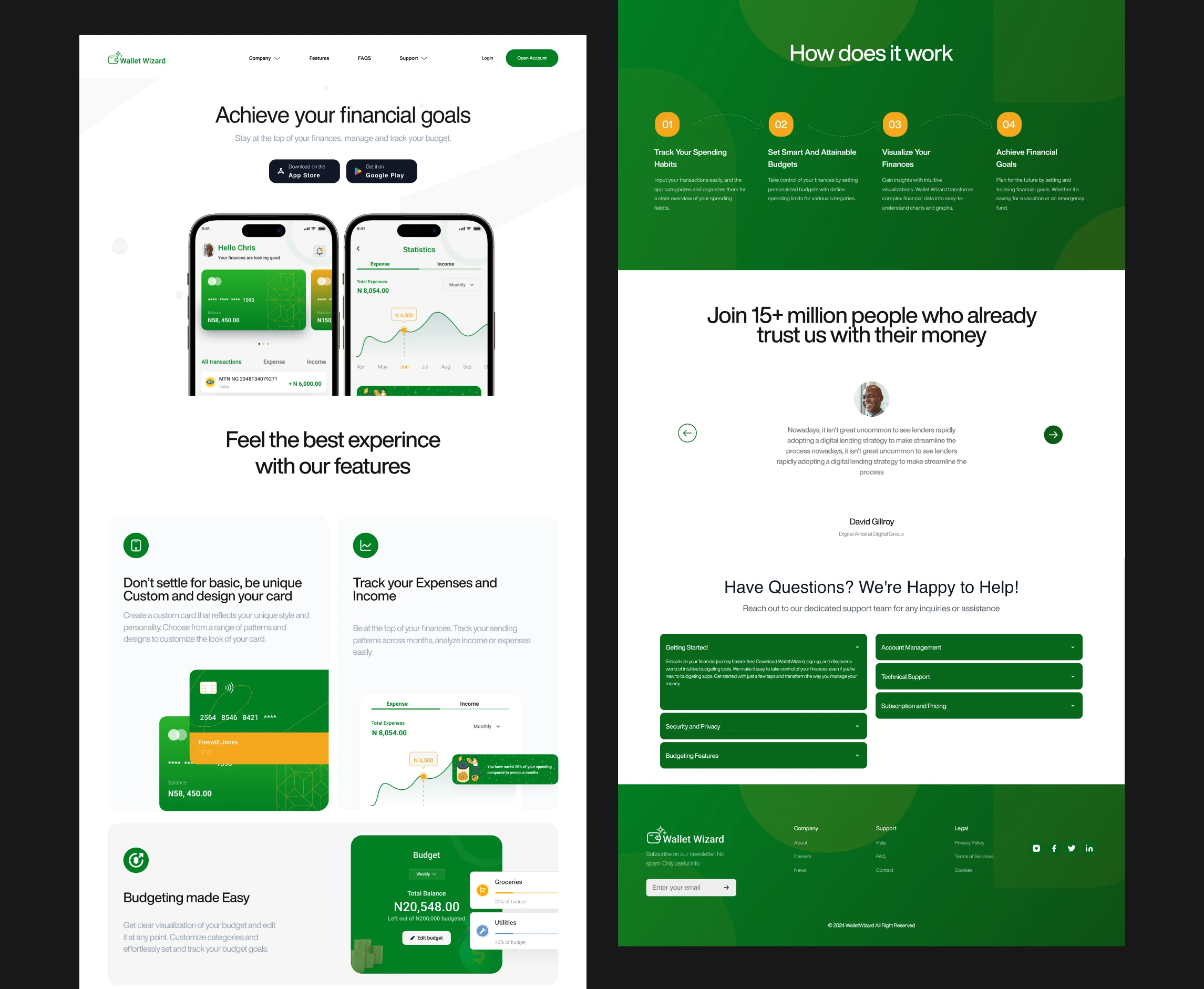
Conversion-optimized app landing page with feature showcase and social proof
Making Budgeting Feel Less Restrictive
Challenge: Traditional budgeting apps feel like financial punishment
Solution: Created playful onboarding ("Chasing Money? Let's Map Your Route!") with customizable budget categories and visual progress tracking
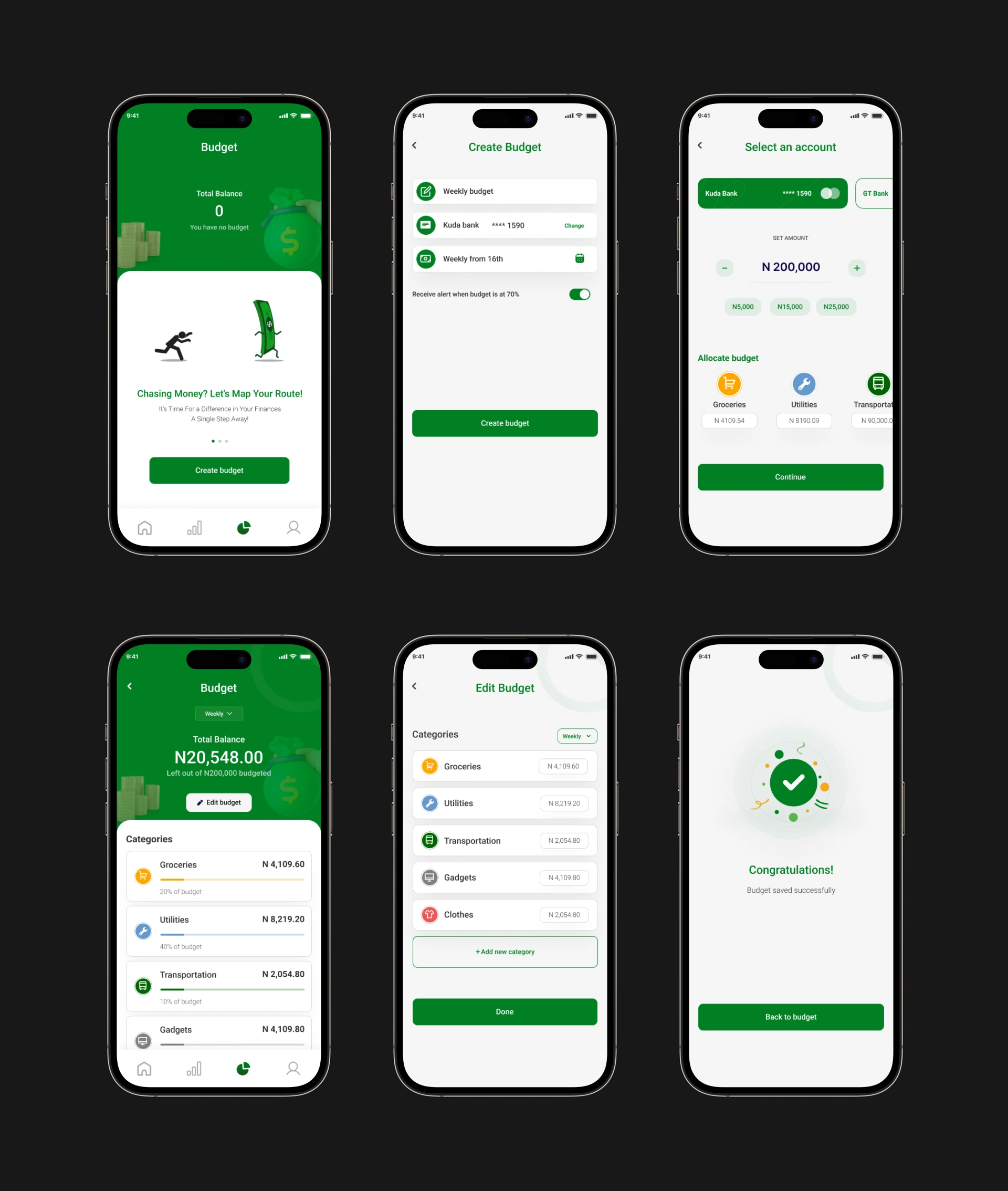
Visual budget tracking with category allocation
Card Management Confusion
Challenge: Users struggle to track spending across multiple cards
Solution: Designed customizable virtual cards with color/pattern selection, allowing users to personalize and easily identify different cards at a glance
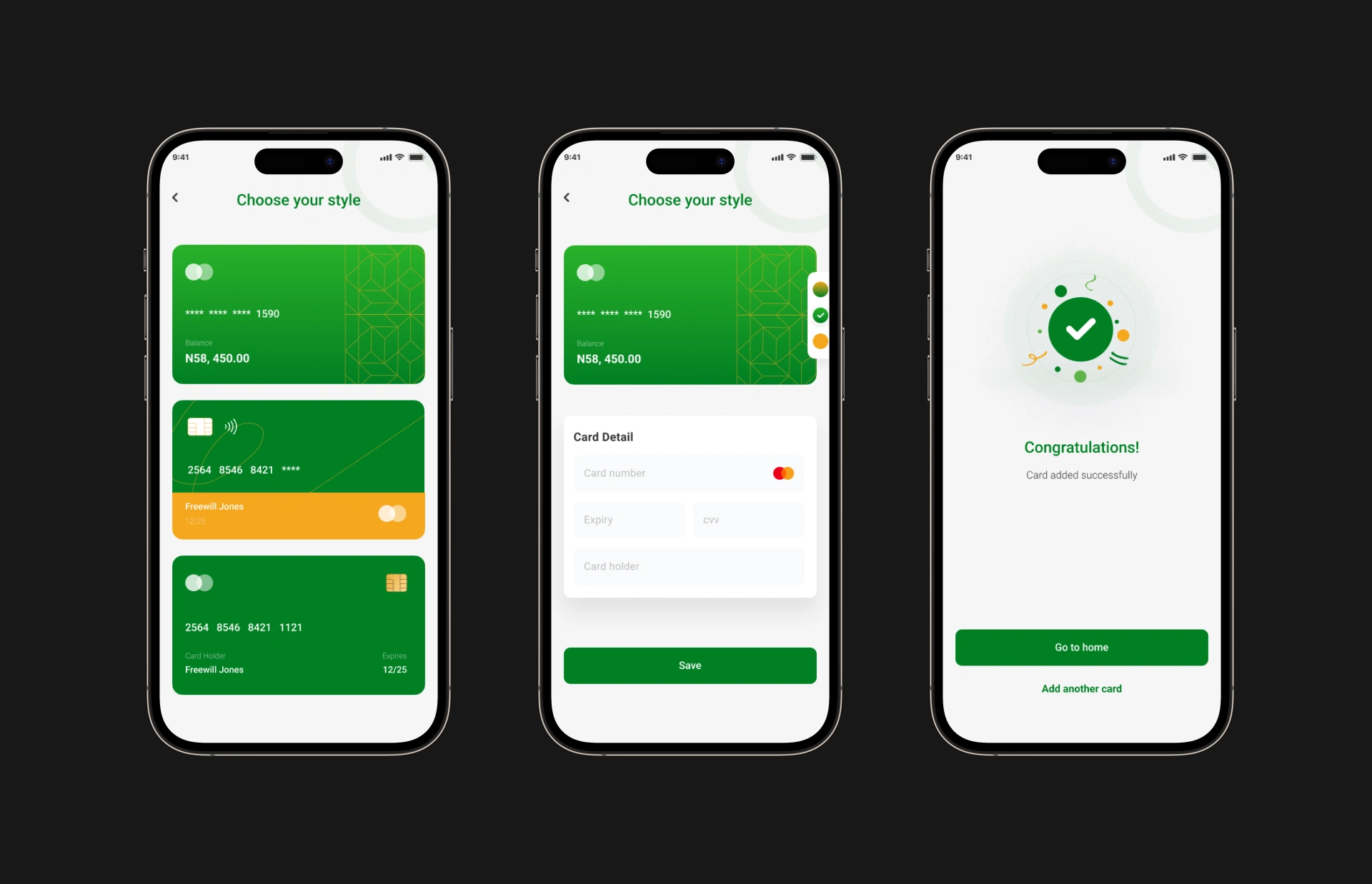
Customizable virtual cards with color and pattern selection
Complex Authentication Flows
Challenge: Users abandon apps with complicated sign-ups
Solution: Built streamlined authentication with fingerprint/biometric access, social login options (Google/Facebook), and simple password recovery
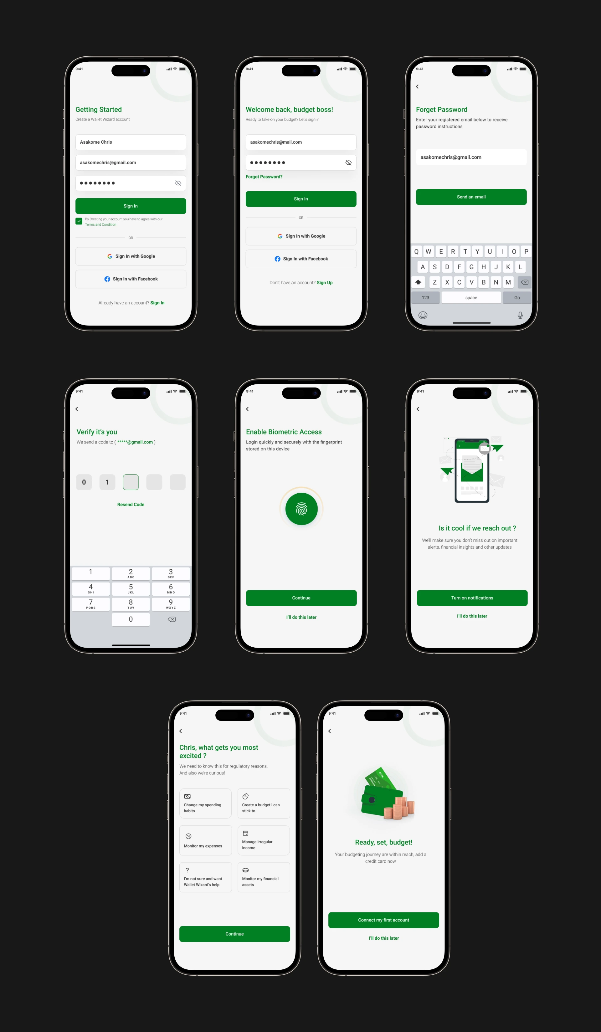
Streamlined sign-up with biometric access and social login
Overwhelming Financial Data
Challenge: Users don't know where to start when opening a finance app. There is too much data and no clear priority
Solution: Designed a clean homepage with card-first layout showing current balance prominently, recent transactions with color-coded income/expenses, and quick-add button for instant logging of transactions
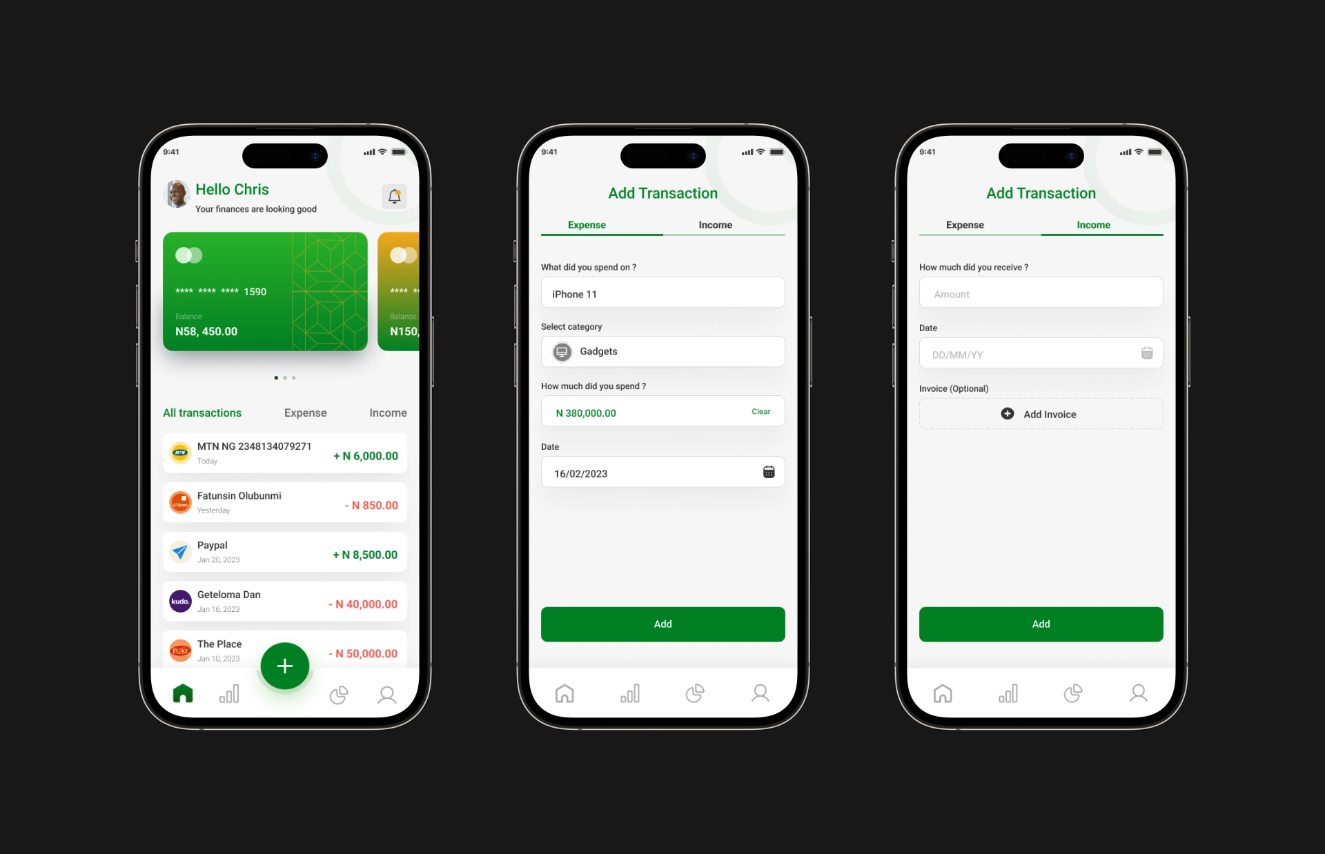
Clean dashboard with transaction history and quick-add button
My Approach
I started with user journey mapping (website visitor → app download → onboarding → daily use). This informed a cohesive design system that works across web and mobile.
For the landing page, I focused on conversion optimization with clear CTAs, feature benefits over features, and social proof placement. For the app, I prioritized speed and visual clarity - green as the primary brand color (trust, money, growth) with clean cards, icons, and illustrations that make finance feel friendly.
Outcome
The final design delivers a complete product ecosystem, from the first landing page visit to daily app usage. The friendly, visual approach makes personal finance feel accessible instead of intimidating.
The modular design system allows WalletWizard to scale new features while maintaining visual consistency.
Like this project
Posted Jan 2, 2026
I designed a complete personal finance ecosystem: conversion-optimized landing page + mobile app with category-based budgeting and offline transaction logging.