Redesigning Koyn: Smooth Crypto-to-Naira Transactions
Adesewa Grace Adebayo
Upgrading Instant Crypto-to-Naira Solution for Nigeria’s Everyday User.
My brief Was Quite Simple...
Take something functional-but-frustrating and make it thrive, trustworthy, and as smooth as sending money to a friend.
Crypto adoption in Nigeria is massive. But until recently, using Koyn felt like surviving an obstacle course; it “worked” but just barely. The interface was rough, flows were clunky, and first-timers dropped off fast. Support was overwhelmed There was no web app at all: crypto-in-naira was strictly phone-only. But underneath, the potential was real: fast crypto, fast naira, all in one kit.
The Problem & Vision
On the old Koyn app navigation felt overwhelming, and simple tasks were buried under layers of unintuitive flows clearly built more for engineers than everyday people. The visuals were roughly themed, outdated, and the whole user experience felt heavy.
My vision for Koyn was simple: it should just work for people, not against them. Every user, even a total beginner, should feel confident at every tap, like an interface they are used to.
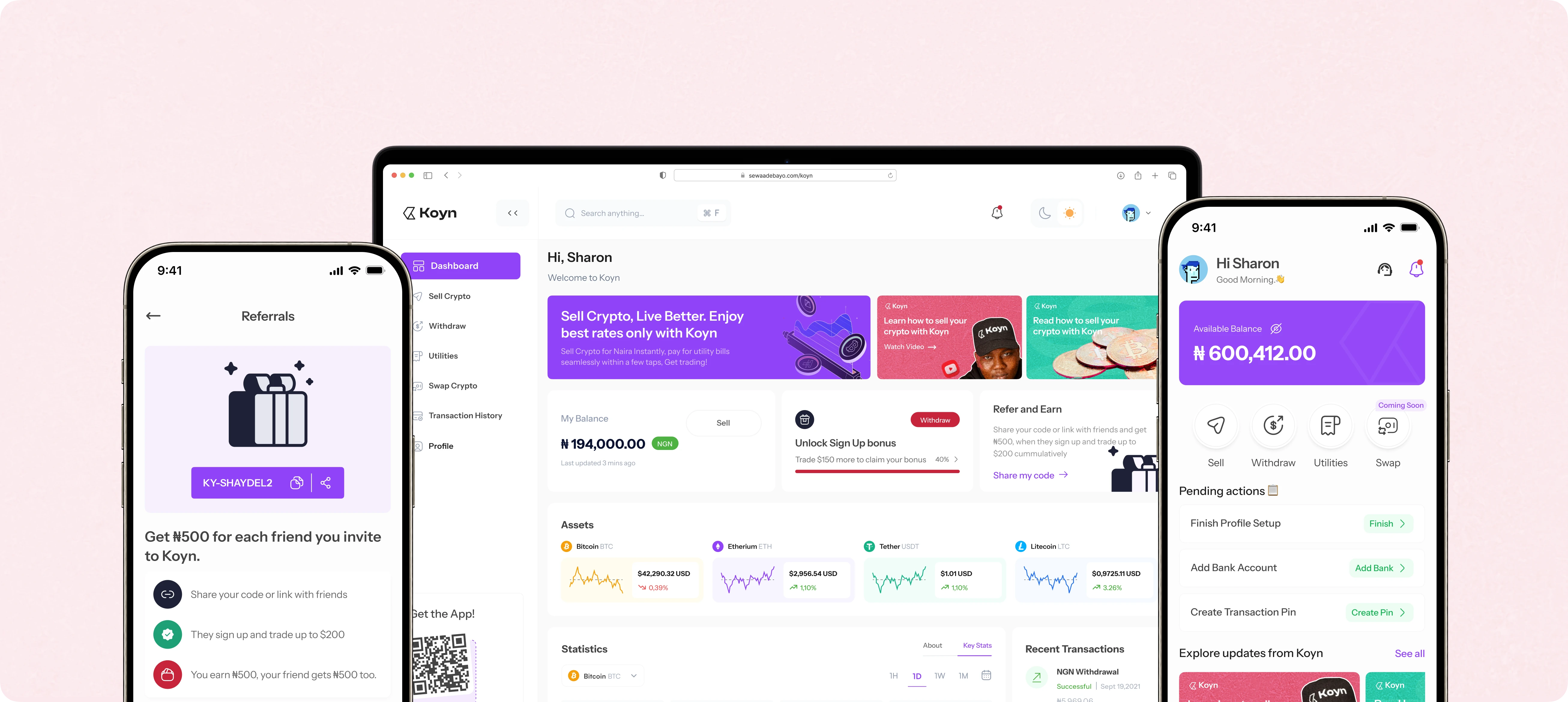
I wanted Koyn to be a true one-stop shop where anyone could sell crypto, withdraw naira instantly, and pay bills easily. All presented with a bright, modern easy to use interface.
Reimagining Koyn
Mobile:
— Deep dive into user pain points based on existing support logs and product manager notes.
— Streamlined every journey: selling, cash-out, bill payment, rewards, support.
— Added reassurance everywhere—instant feedback, familiar patterns, fewer steps, built-in trust.
Web:
— Designed from scratch, matching and extending the mobile experience.
— Responsive, clean, and optimized.
System:
— Unified, scalable design language.
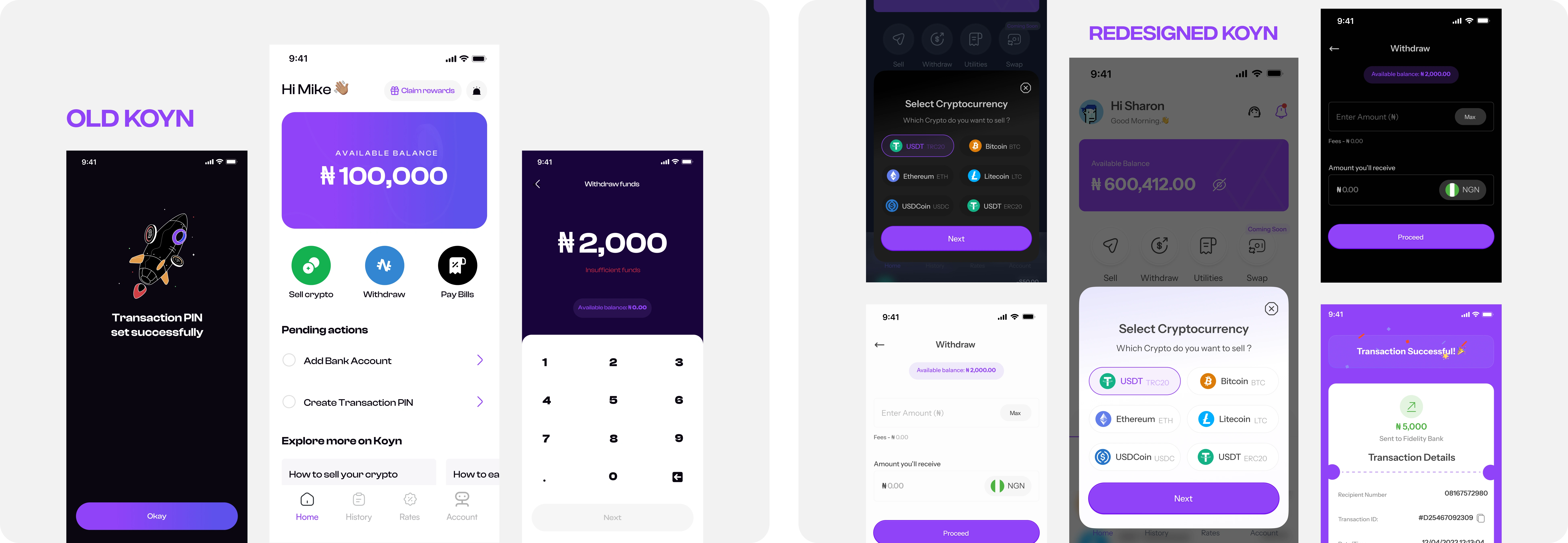
Old vs New: koyn, rebuilt for clarity.
Design Process
Audit & User Research:
dove into user pain points based on existing support logs and product manager notes, mapped support pain points, shadowed users, benchmarked best-in-class fintech and crypto apps.
Design System:
Typography, components, everything built to scale and adapt across platforms and themes (thanks Figma variables).
Prototype & Validate:
Iterated via Figma and real-world tests—old power users & crypto newbies included.
Build & Launch:
Paired with engineering for pixel-perfect delivery on both mobile and web.
The Result
By eliminating friction and making both the mobile and web apps intuitive, users actually felt at home with every interaction. The numbers and the feedback tells the success story.
Support queries for unclear or missing flows dropped by 85%, giving the support team space to focus on real user needs instead of rescuing confused customers.
User retention and referrals surged as people not only return to the app but also recommended it to friends, impressed by the new level of ease and reliability.
Cross-platform adoption soared, users can start a transaction on mobile, finish on web, or swap between devices, all with a consistent, familiar experience.
Visual and functional delight led to organic praise: “The app update was needed, it’s easier to use” quickly became the most common review, replacing older complaints.
Onboarding and first-time transactions see higher completion rates, thanks to clear flows.
Mobile App
The Koyn mobile app revamp puts every essential feature a tap away.
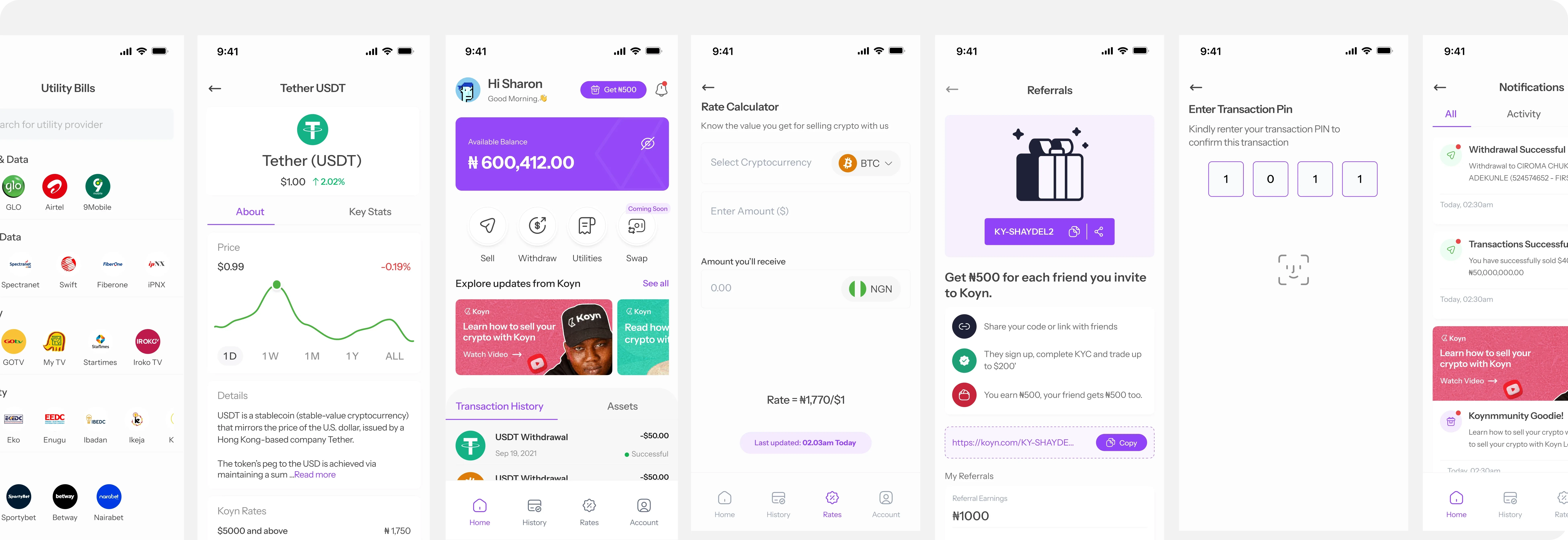
More screens from redesigned Koyn mobile app.
Web App
Built from the ground up, the Koyn web app brings the full platform experience to desktop users. With intuitive navigation, responsive layouts, and robust onboarding, users can now trade, manage, and get support on any device, in both light and dark mode.
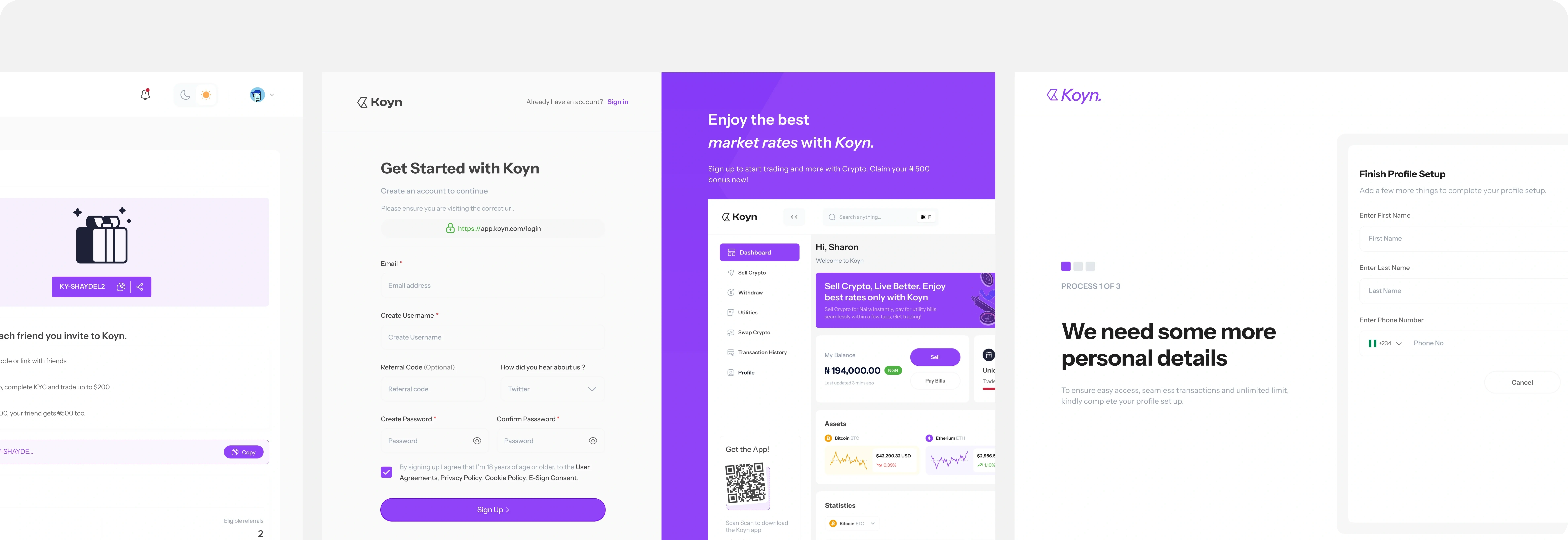
A feel of Koyn Web Experience.
The Finer Details
Fintech design is never “just UI.” Tiny choices can have big consequences.
For example, something as simple as adding an eye icon beside the balance sparked a host of questions: What if someone’s balance is really long? Will the icon crowd the numbers or become unclear? How does it look in light and dark mode, or on a small screen?
It’s the same for error messages, confirmations, and even the visibility of copy buttons for wallet addresses.
Every state and every edge case needs to be considered—because designing especially in fintech, a small design slip isn’t just confusing, it can cost real trust (and money). Designing for money means every detail, every scenario, matters.
— ‘Sewa 💜
Like this project
Posted Jan 11, 2026
Redesigned Koyn's mobile and web app for a smooth user experience, improving user retention and reducing support queries.
Likes
0
Views
13