Raza/First-Gen Mentorship
Project Overview
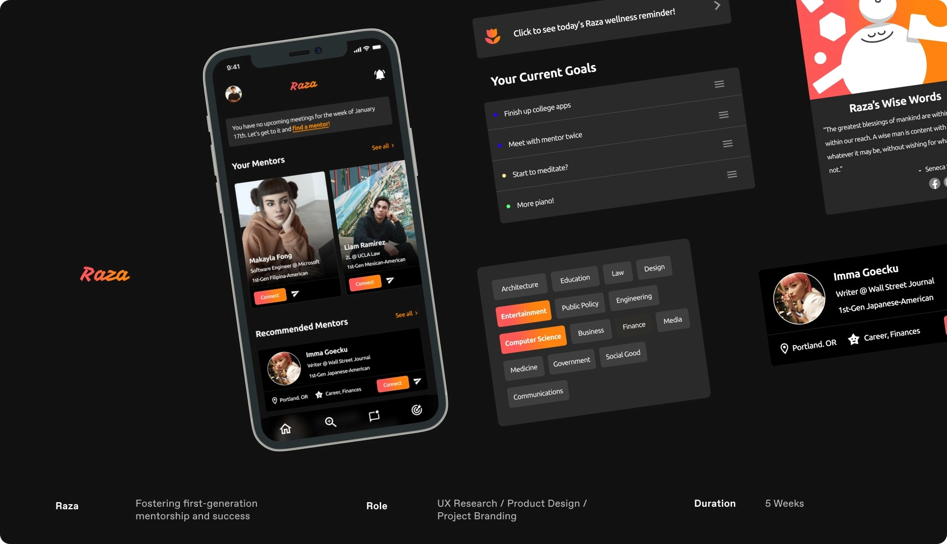
Raza is an application designed to provide mentorship to first-generation students. As a first-generation student who was involved in multiple first-gen orgs in undergrad, I found mentorship and community to be pivotal in my growth and successes as a student - especially early on in my college career. As both a mentor and mentee in first-gen programs, I have talked to students about their qualms with imposter syndrome, academics, finances, and remote learning.
My time in these communities gave me an extensive amount of information and individuals to reach out to in order to discuss the struggles first-generation students face in their struggle to navigate university and beyond. When designing Raza I asked myself many why questions about how might I design an application that helped others fighting to escape generational barriers and I am ecstatic with my end product. Raza serves as a home for first-gen students to find mentors whether they be peers, professionals, or the likes, and to provide a central place for establishing goals that will help stay the course.
User Research
Due to my proximity to various first-generation student communities, I luckily had quick access to real users who are currently navigating or have previously navigated life as a first-generation student and professional. With this, I was able to kick off my discovery process by carrying out 5 user interviews where I probed my participants on their struggles being first-generation students, how they connect with others and their personal experience with mentorship.
These conversations yielded powerful responses that allowed me to begin ideation and develop early user profiles to guide the rest of my process.
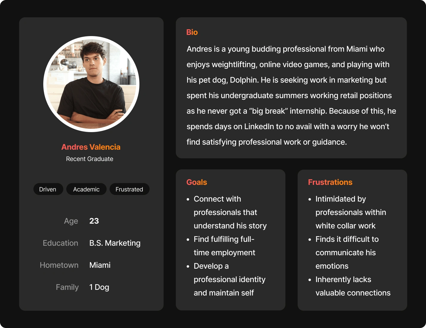
User Persona 1 - Andres Valencia
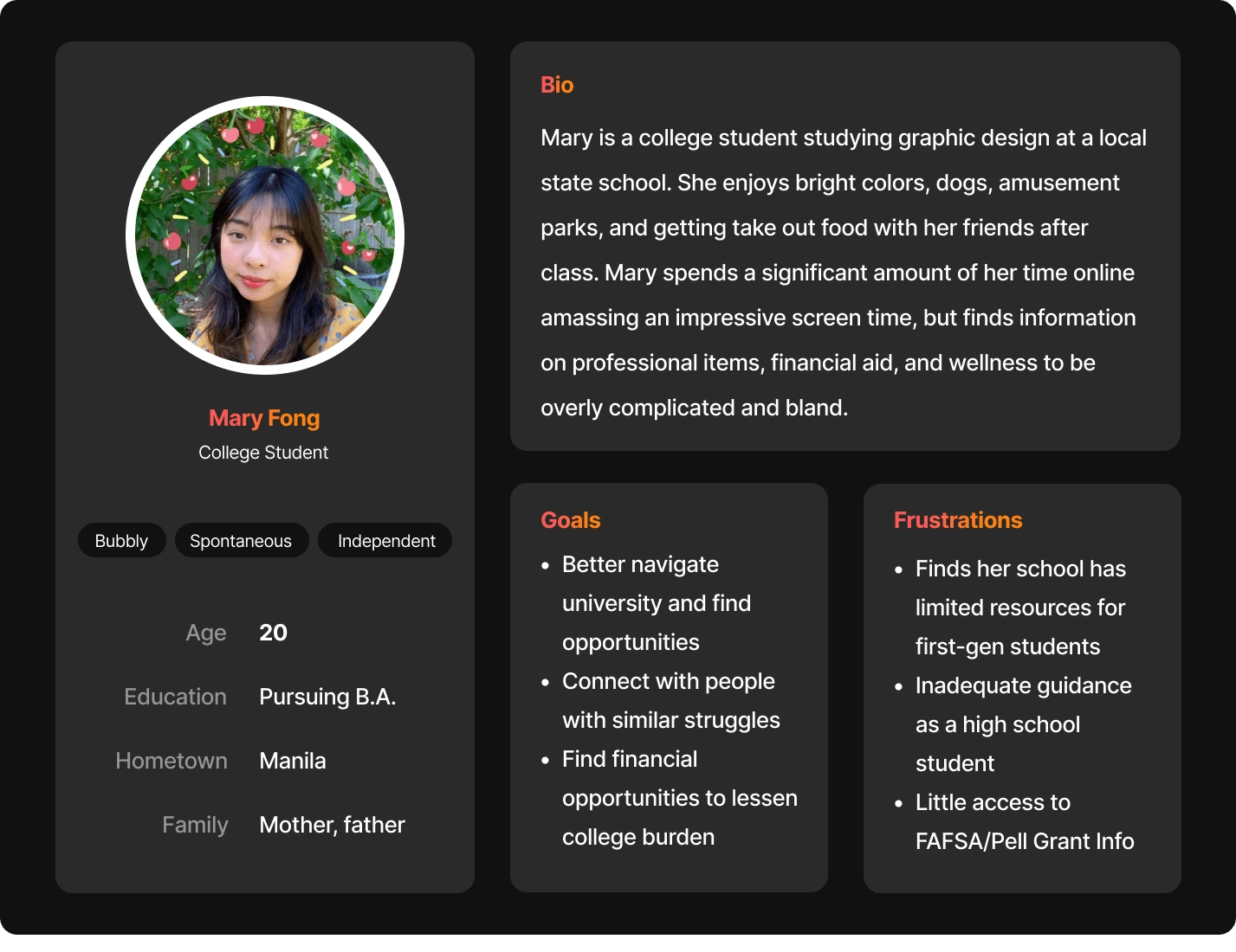
User Persona 2 - Mary Fong
Ideation & Prototyping
After wrapping up my early phases of research, I moved on to mapping out the basic architecture of Raza. I created three main user flows and mapped them out using the basic screens they would require to complete. I find user flow mapping to be particularly useful as they allow for my ensuing wireframes to have an intuitive structure that logically makes sense from the start, allowing for more focus for information layout and then visual design.
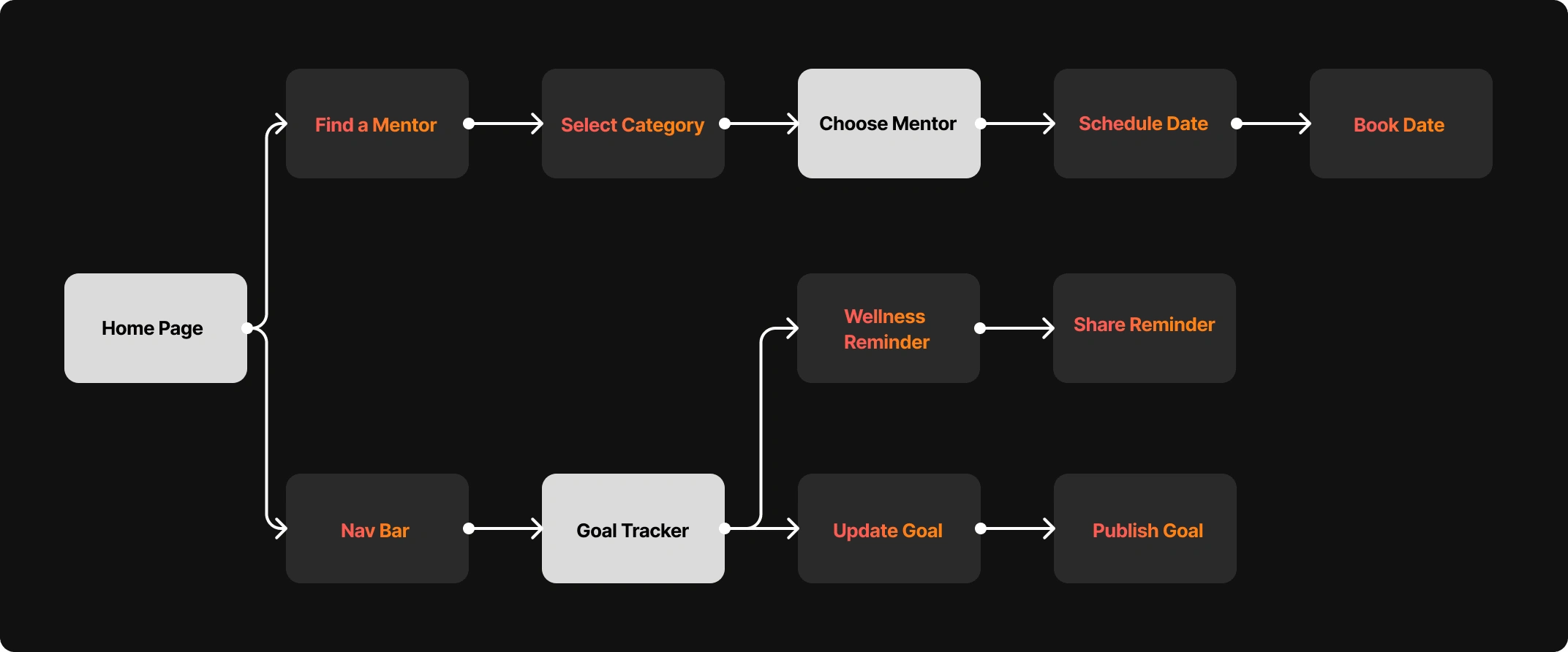
User Flow
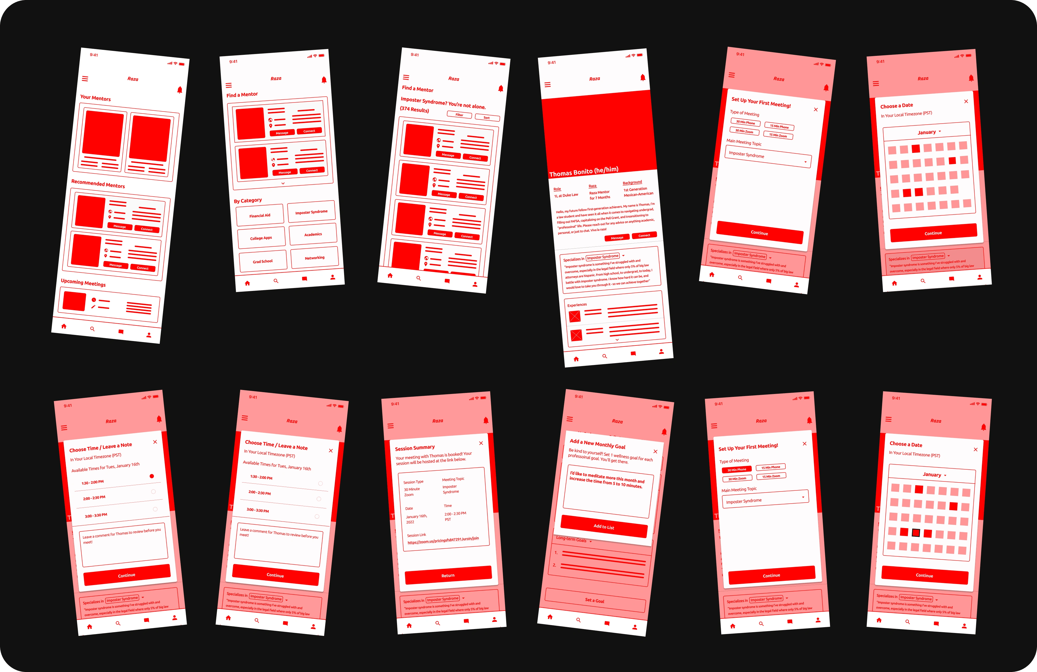
Digital Wireframes for Flow 2 (see all frames in my portfolio project!)
Usability Testing / High Fidelity Mock-Ups
At this point, I moved into a moderated usability study where I prompted 5 participants to navigate the three central flows of my application. On my self-guided projects, serving as a UX researcher has been the most difficult process to fully carry out. However, during this project I happened to be reading Steven Krug’s book, Don’t Make Me Think, which gave me the confidence to know I could find actionable insights with samples as small as 3 - the important thing was just that I was watching real users interact with my prototype. Using Krug’s usability testing script from Rocket Science Made Easy, I had a newfound prowess for my usability testing (thank you Mr. Krug!)
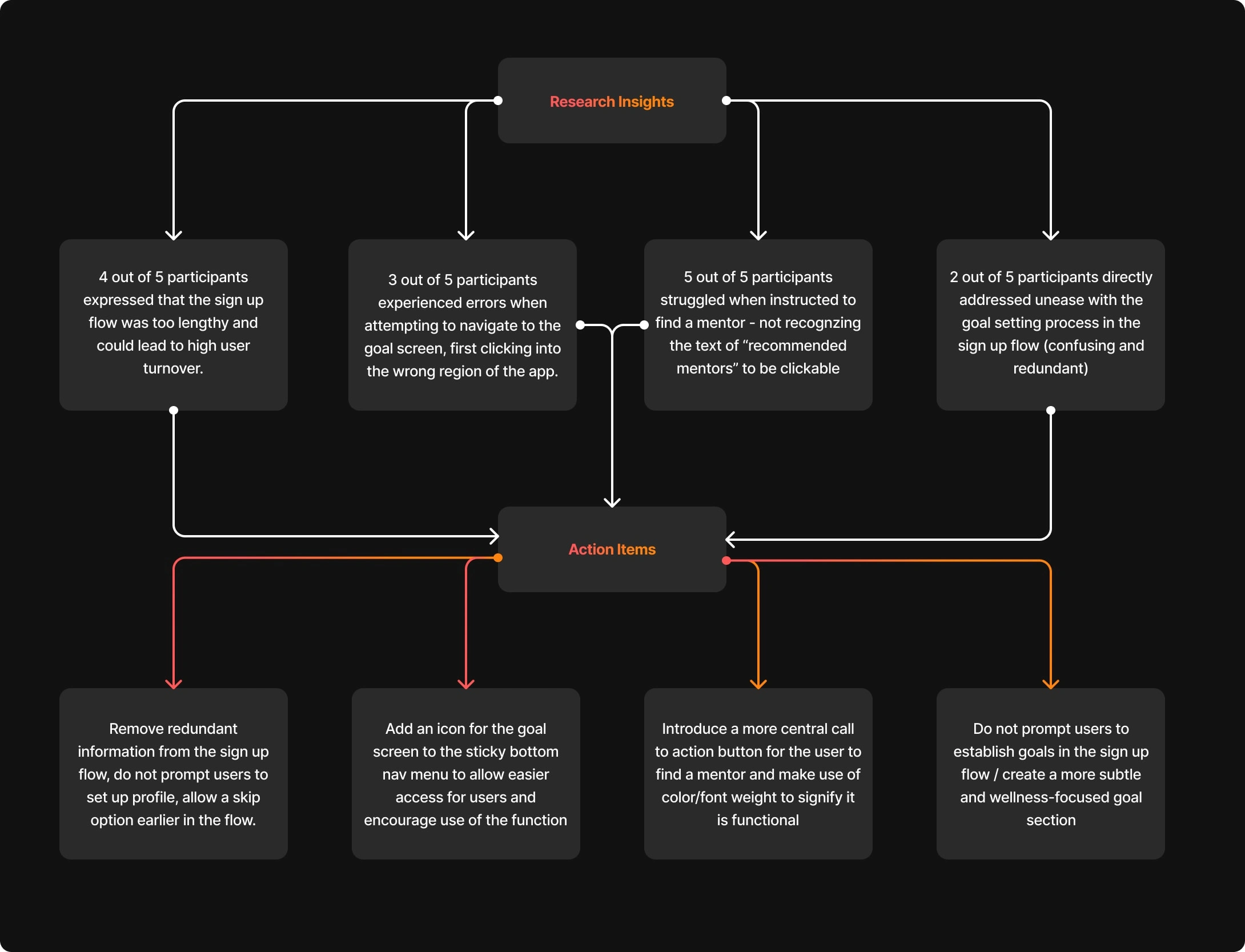
Usability Findings
Once I sat with my research results and moved into altering my designs - it was ready to get some color involved! I continued to ideate and work towards a final product that operated as I imagined Raza to truly function. After many many mix-ups and mock-ups, I arrived at a product fully functioning with 3 various flows (sign up, mentor booking, goal setting/wellness check) that I am proud to share. Check out the full prototype down below!
Like this project
Posted Feb 2, 2022
Raza is a mentorship app designed to foster community among first-gen students and professionals. Raza provides new resources to first-gen individuals all over.
Likes
0
Views
45
