ParkingMyCar Design System
Emanuele Pasin
Overview
Parking My Car’s web team needed a new, cohesive design system that would bring the visual design in lockstep with production. As a fractional product manager, I led the effort to audit the existing system, align it with the team’s Bootstrap‑based technology stack, and deliver a reusable component library that supports both light and dark modes. The resulting design system was fully integrated with the developers’ workflow and ready for implementation.
Challenges
Misalignment between design and production – the current design system did not match the live website, a common pitfall when designers create a system that developers implement in isolation.
Component duplication – multiple versions of product cards and other UI elements existed across the site, leading to inconsistencies and wasted effort.
Technology constraints – the website relies on Bootstrap, so any new system had to respect Bootstrap’s component structure and CSS variable conventions.
Lack of developer input – without early collaboration, the design team risked creating components that were difficult to adopt or that conflicted with the existing codebase.
Performance and accessibility – custom icons and dark‑mode support needed to be optimized for speed and usability.
My Role
I served as the fractional product manager, coordinating cross‑functional stakeholders and guiding the project from discovery to hand‑off. My responsibilities included:
Facilitating discovery workshops with developers and product stakeholders.
Auditing the current Bootstrap components and the existing design system.
Defining a prioritized component backlog and ensuring alignment with the tech stack.
Overseeing the creation of design tokens and Figma variables that mirror Bootstrap’s CSS variables.
Selecting an icon set, augmenting it with custom icons, and planning font‑icon export for performance.
Presenting the new design system to the dev team, gathering feedback, and providing ongoing support during implementation.
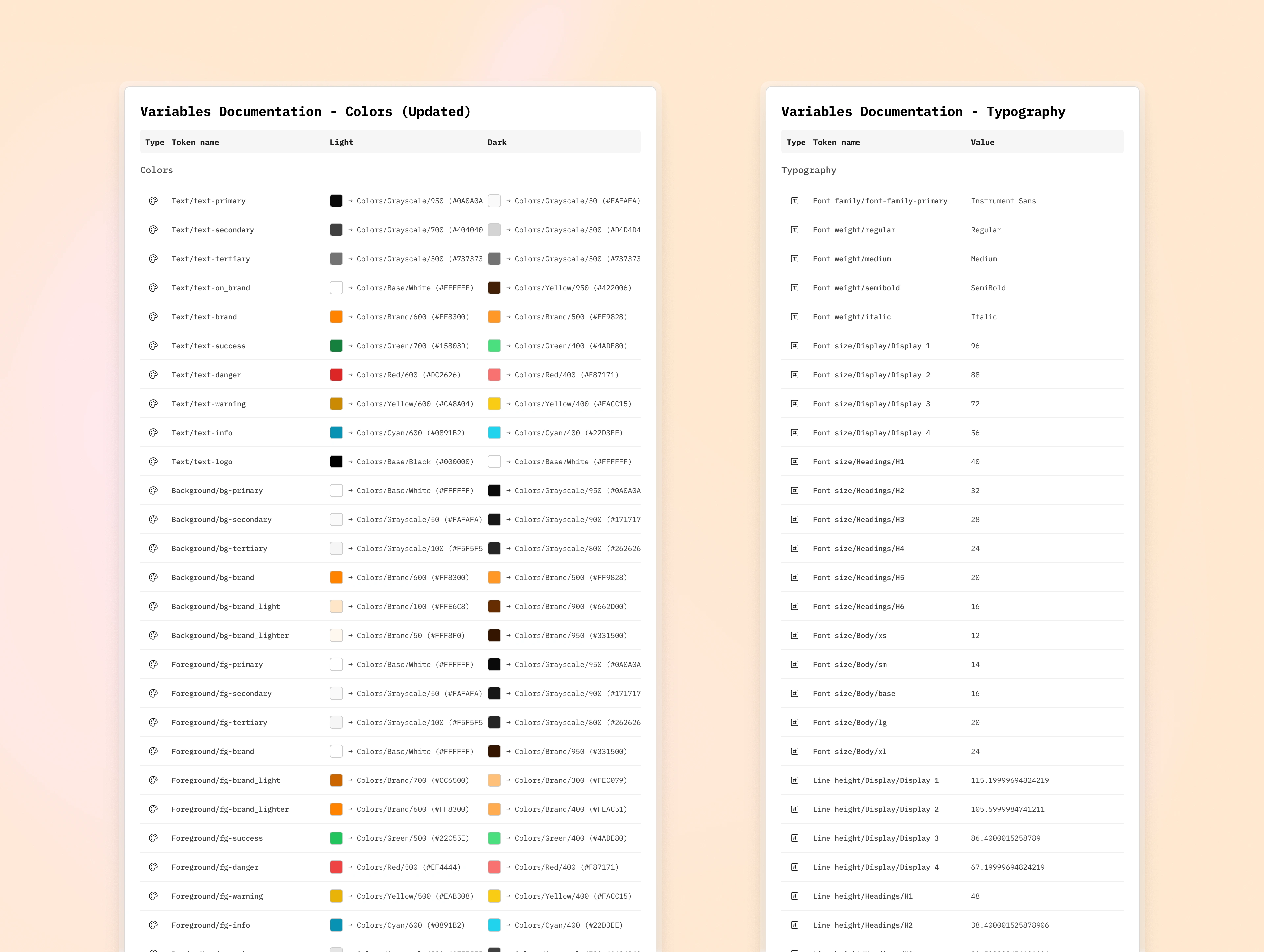
Figma variables — colors & typography
Process
Stakeholder & Developer Discovery
• Conducted interviews to surface pain points and understand the Bootstrap stack and its limits.
Component Audit & Optimization
• Reviewed all available Bootstrap components and the current design system.
• Identified duplicates (e.g., product cards) and compiled a streamlined component list.
Tokenization in Figma
• Created design tokens for sizes, colors, and typography, mapping each to a Figma variable.
• Aligned tokens with Bootstrap’s CSS variable names to ensure seamless integration.
Dark‑Mode & Color‑Mode Definition
• Defined color tokens for both light and dark themes, ensuring the design system is fully responsive.
Icon Strategy
• Selected the Tobler icon set for its breadth and open‑source nature.
• Designed custom icons where necessary and planned export as a font for optimal loading.
Component Development
• Built shared UI elements (accordion, alert, avatar, breadcrumbs, buttons, checkboxes, dropdowns, icons, inputs, text areas, selects, etc.).
• Maintained a clean, reusable component library in Figma.
Developer Presentation & Feedback Loop
• Showcased the system, highlighting how the CSS variables map to Bootstrap.
• Received positive feedback and committed to a phased implementation.
Handoff & Ongoing Support
• Delivered the component library to developers.
• Remained available for minor changes and support throughout the implementation phase.
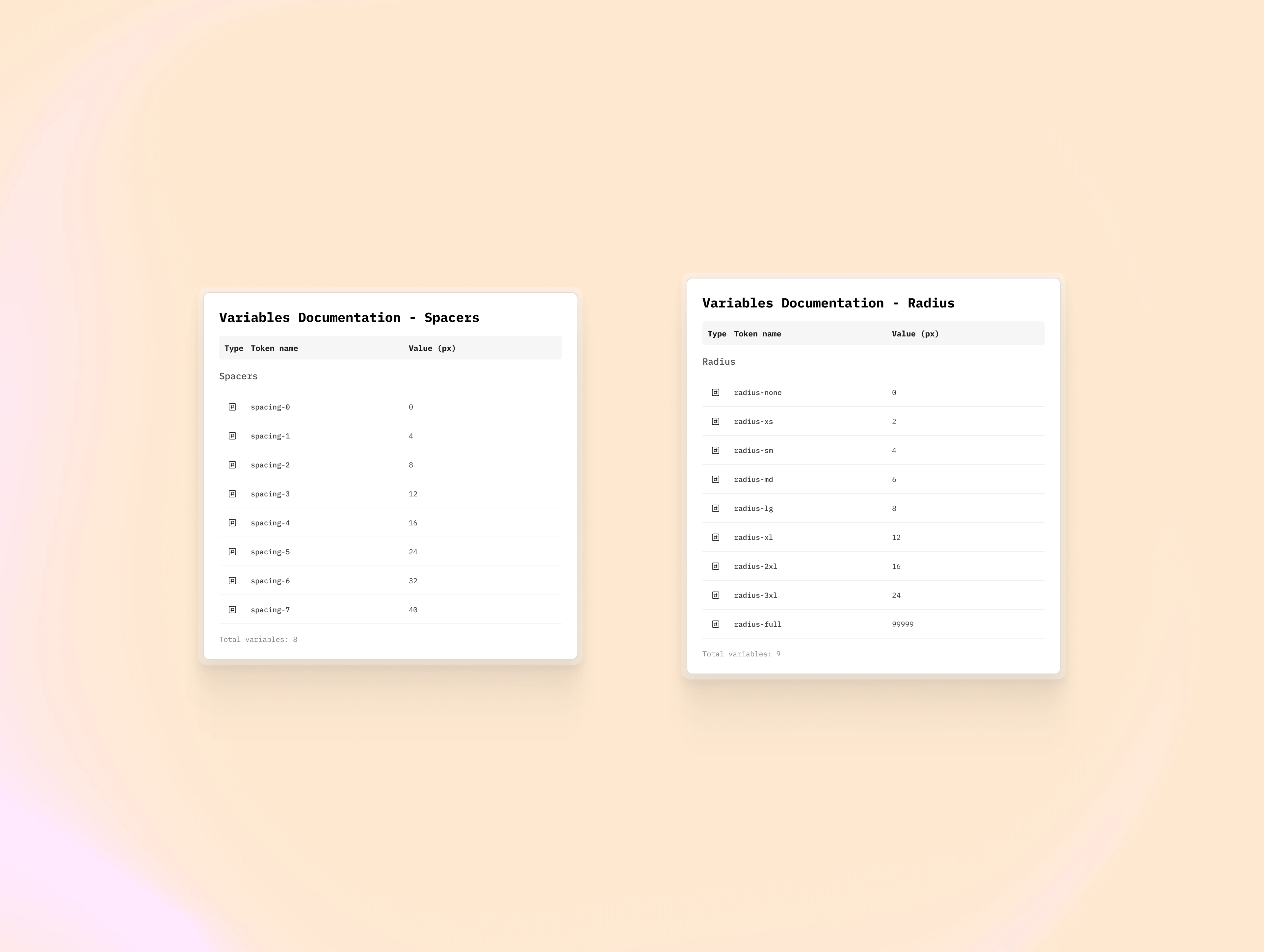
Figma variables — spacers & radius
Results
Seamless Alignment – The new design system uses the same CSS variables as Bootstrap, making it intuitive for developers and ensuring visual consistency.
Developer Buy‑In – The dev team praised the clarity of radius, color, and spacing definitions, expressing confidence in the upcoming implementation.
Prepared for Dark Mode – All components now support both light and dark themes out of the box.
Reduced Redundancy – Duplicate UI elements were consolidated, simplifying future maintenance.
Performance Gains – Custom icons will be exported as a font, improving load times compared to inline SVGs.
Ongoing Collaboration – The project established a template for continuous support and iterative refinement.
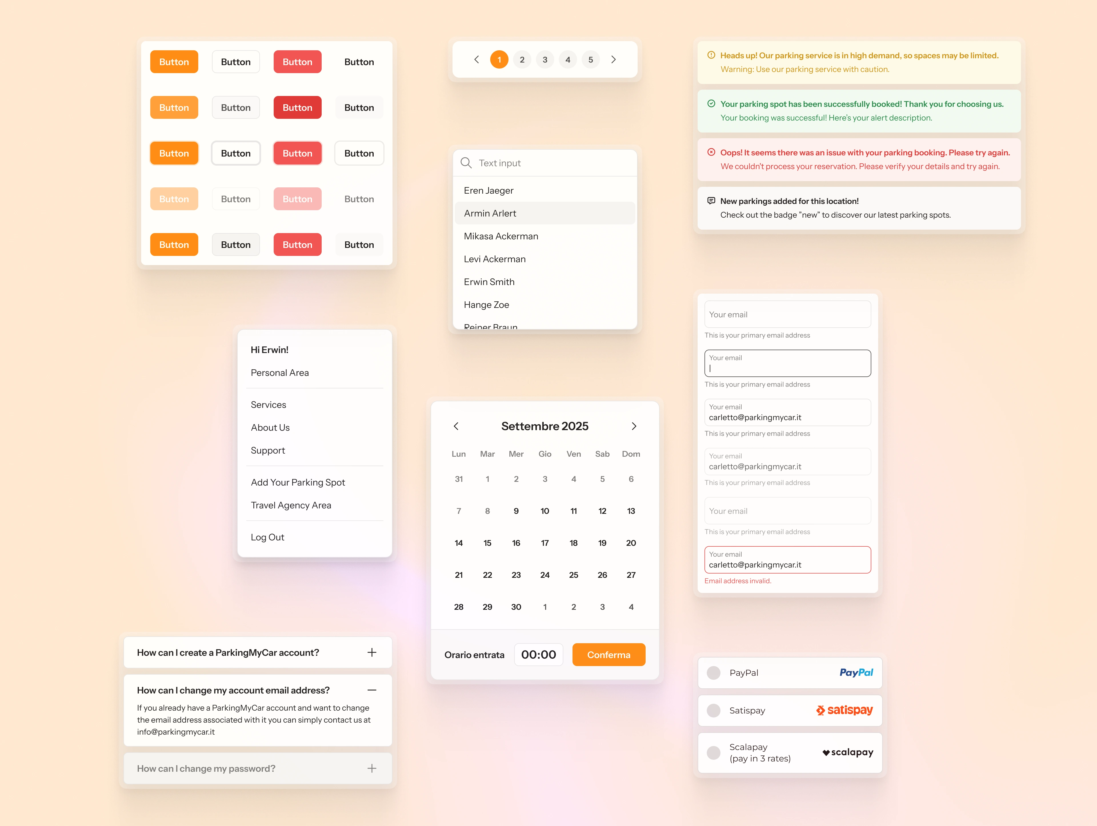
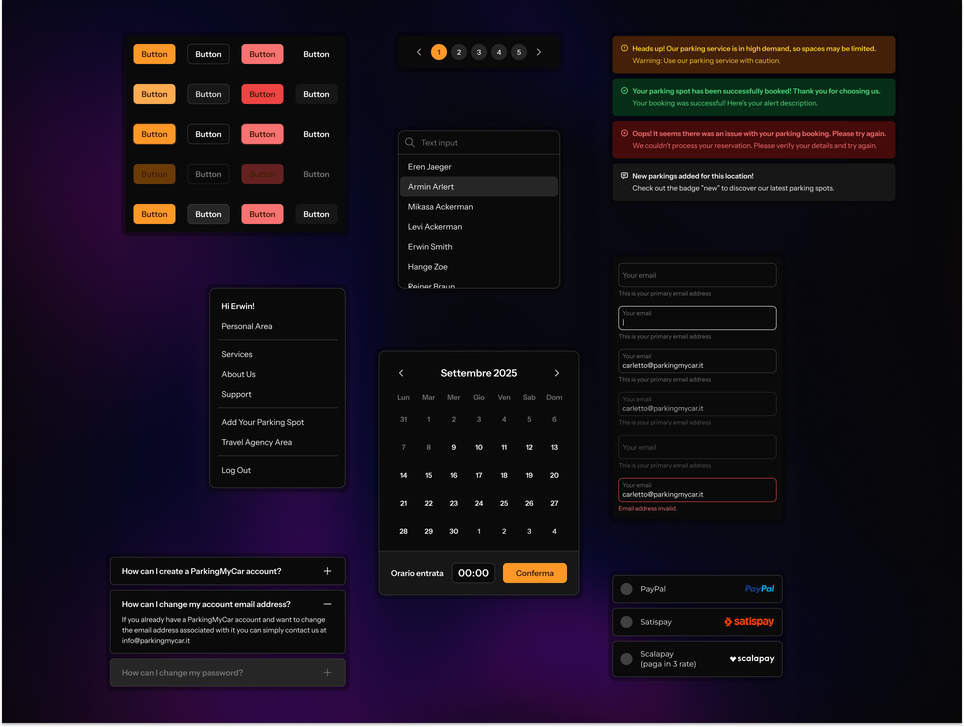
Selection of components — light mode
Selection of components — dark mode
Takeaways
Talk to Developers Early – A design system that ignores the developers’ workflow will rarely reach production.
Align Tokens with the Tech Stack – Mirroring Bootstrap’s CSS variables ensures a smooth handoff and reduces friction.
Prioritize Reusability and Clarity – A concise component list and well‑named tokens prevent duplication and confusion.
Plan for Dark Mode from the Start – Defining color modes during tokenization saves time and guarantees accessibility.
Maintain Ongoing Support – Continued collaboration between designers and developers throughout implementation preserves fidelity and minimizes post‑release fixes.
Like this project
Posted Oct 14, 2025
Unified Bootstrap‑based design system with light/dark support, streamlined components, and developer‑ready tokens for quick production rollout.
Likes
0
Views
28
Timeline
Jun 4, 2025 - Jul 4, 2025
Clients
ParkingMyCar