Data Masters E-Learning Platform Redesign
Emanuele Pasin
Data Masters E-Learning Platform Redesign + Design System
Data Masters is an Italian on‑demand e‑learning platform that teaches data science, Python, machine learning, and AI. The service offers career paths from beginner to professional.
The original product had a complex, hard‑to‑navigate dashboard and an inconsistent design language, making it difficult for users to follow learning paths. My mandate as product designer was to redesign the entire platform, creating a modern, cohesive user experience and a reusable design system that would support future feature work.
Challenges
Complex, fragmented flows: The existing dashboard was hard to navigate and use.
Lack of user‑centric design: No clear alignment with the intended audience (“ICP and target personas” were not fully integrated).
Scattered components: The platform had many bespoke UI elements that were difficult to maintain and scale.
Time pressure: The redesign had to be completed within roughly one month, with tight coordination across design and development teams.
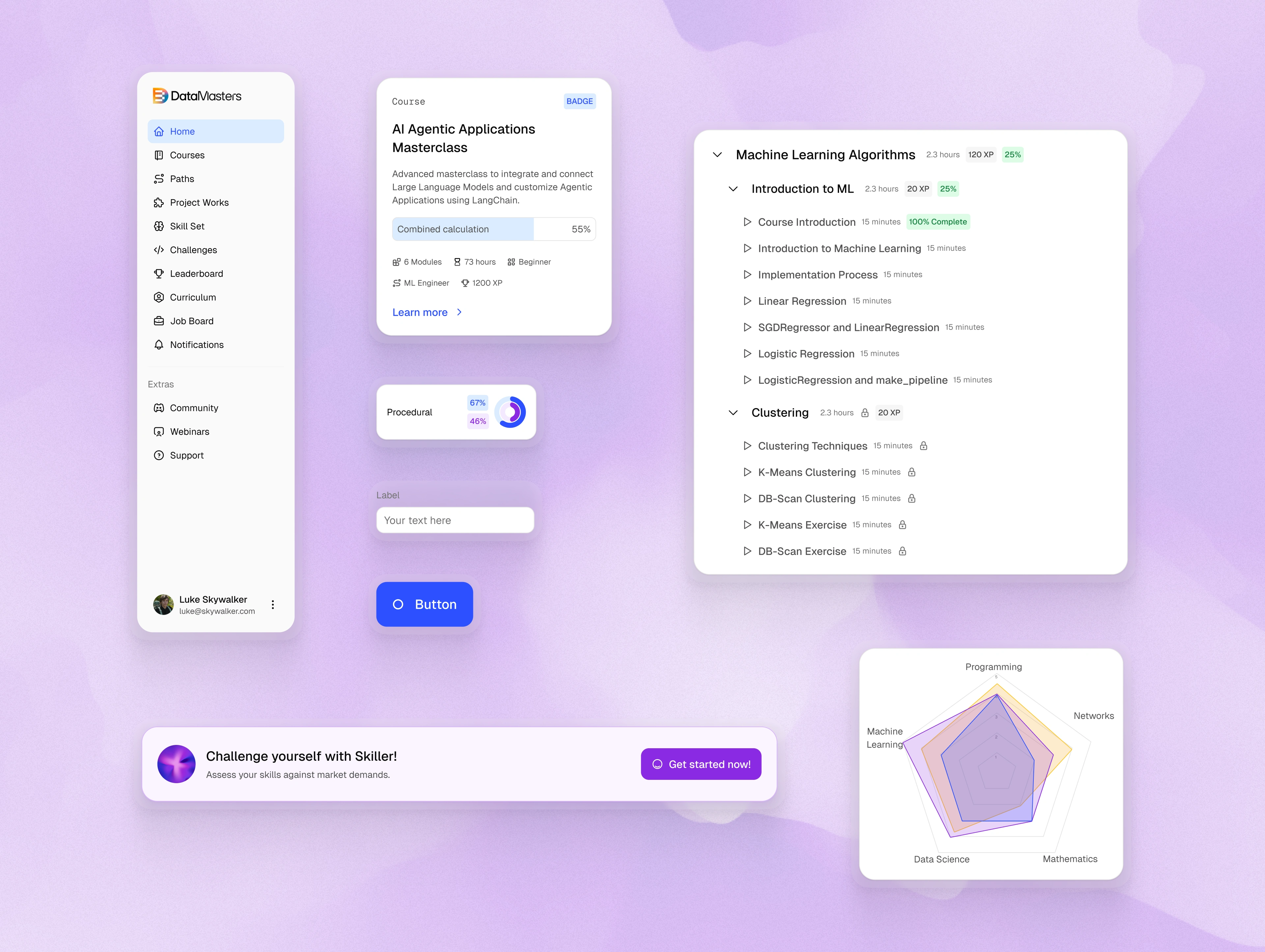
Components selection from the design system — light mode
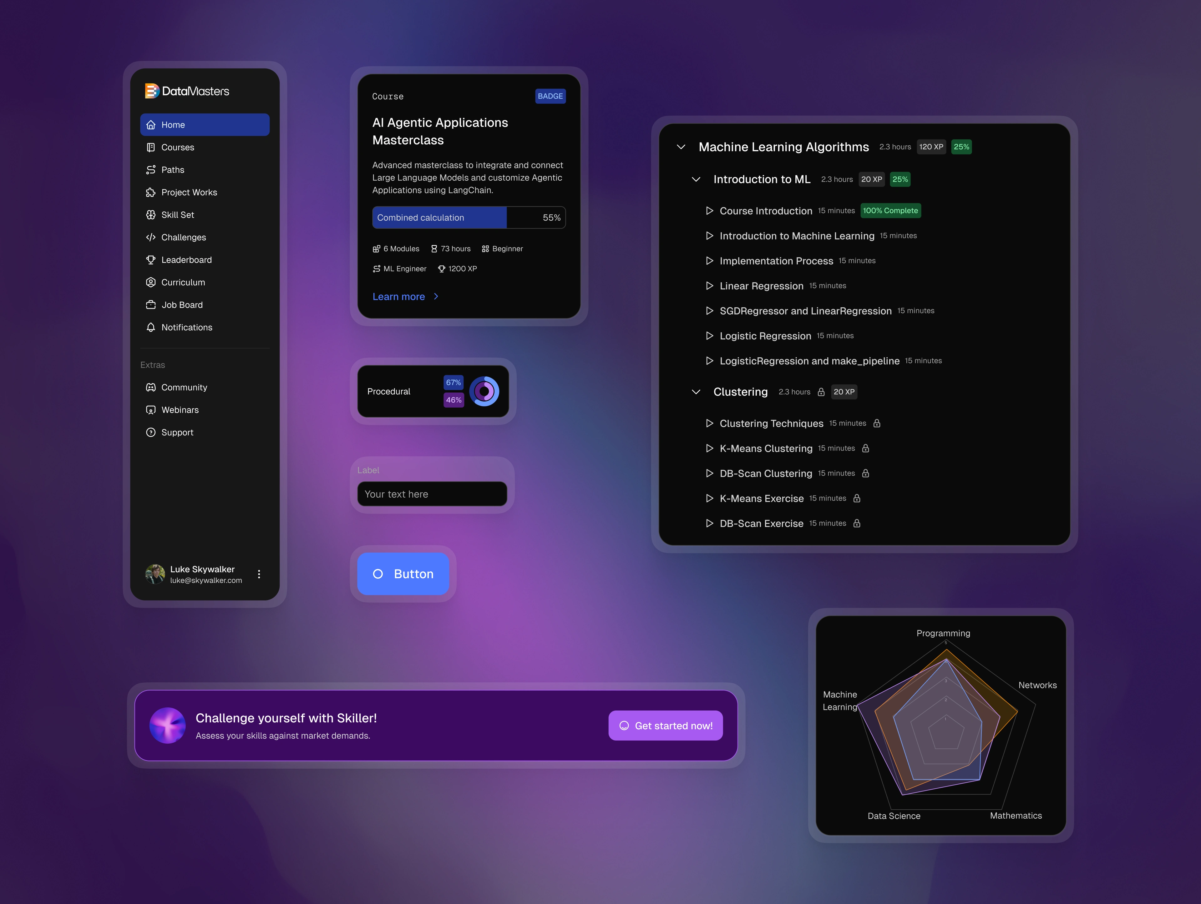
Components selection from the design system — dark mode
Challenges
My Role
I served as the lead product designer, responsible for:
Facilitating workshops to define the Ideal Customer Profile (ICP) and target personas.
Analyzing the current dashboard to surface friction points and communication gaps.
Writing user stories for both legacy and brand‑new features.
Sketching initial wireframes by hand, then refining them in Figma.
Building a lightweight design system, creating tokens for light/dark mode, and producing reusable components (buttons, inputs, cards, etc.).
Conducting bi‑weekly sprint reviews with stakeholders and developers to keep the project on track.
Leading the handoff to development, ensuring clear documentation and component props for reusability.
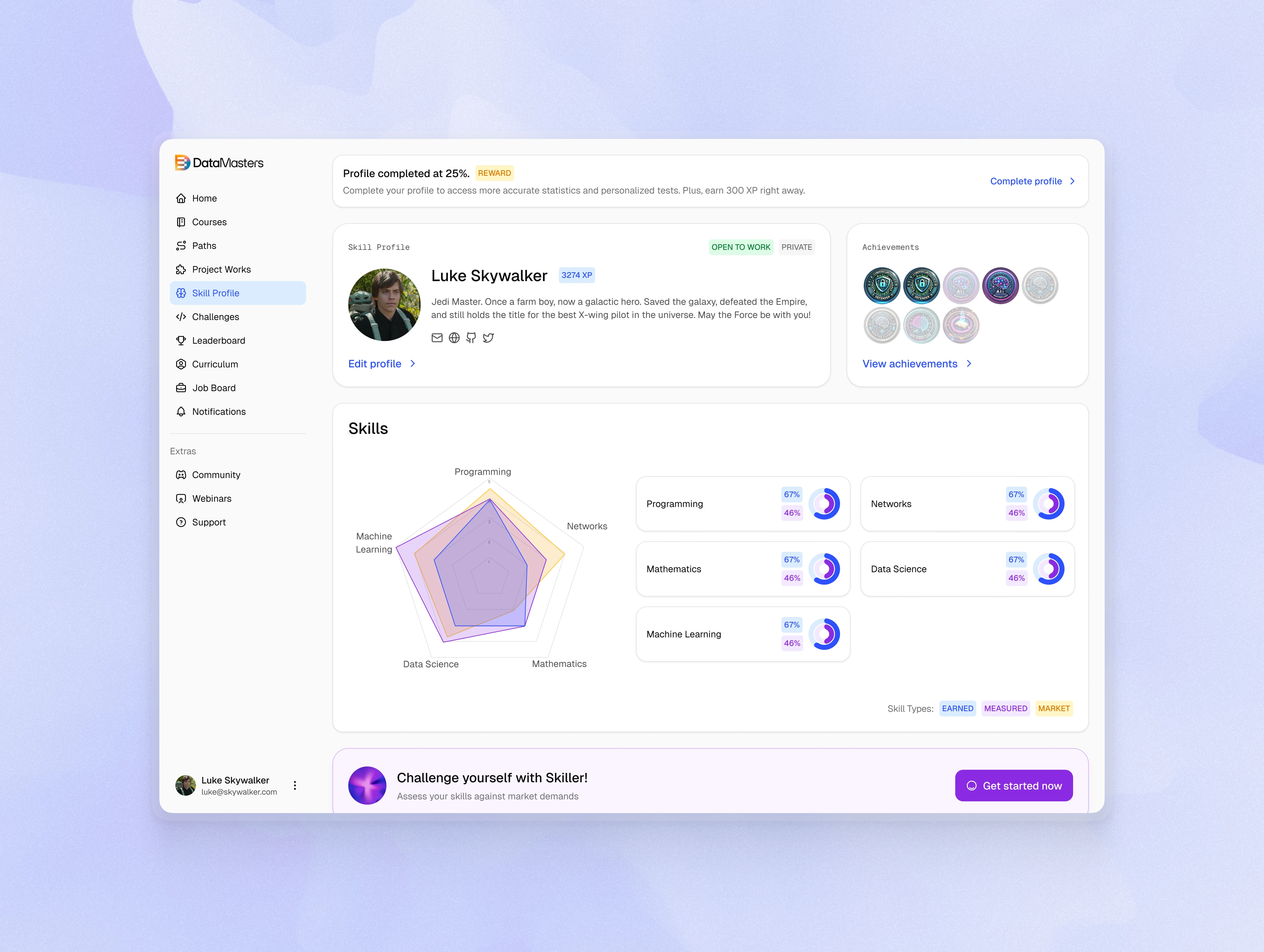
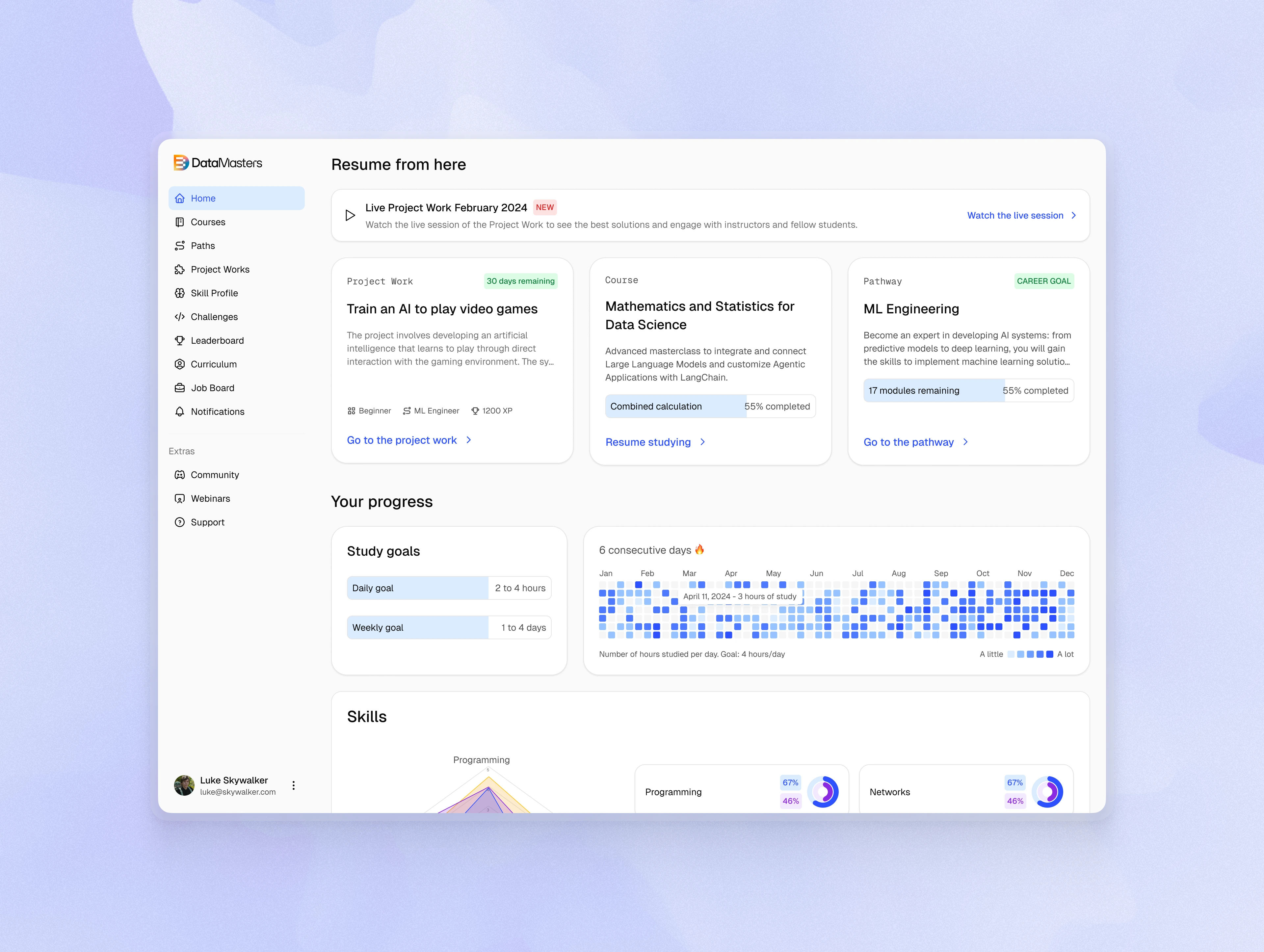
Skill profile
Process
Discovery & Personas – Workshops to clarify ICP and personas, establishing a user‑centric foundation.
Dashboard Audit – Detailed review of the existing UI to map friction points and communication issues.
User Story Definition – Distinguishing which stories mirrored the old platform and which required new solutions.
Wireframing – Rapid pen‑and‑paper sketches followed by Figma wireframes, reviewed in iterative sessions.
Design System & Tokens – Creation of a modular component library with light/dark mode support; defined Figma variables for consistency.
Component Development – Building core UI elements (buttons, cards, inputs) from scratch, emphasizing prop‑based variations for reuse.
Sprint & Review Cadence – Two‑week sprints with bi‑weekly design reviews to validate progress with stakeholders.
Handoff – Delivering a clean, well‑documented system to developers, who praised the clarity and minimal component set.
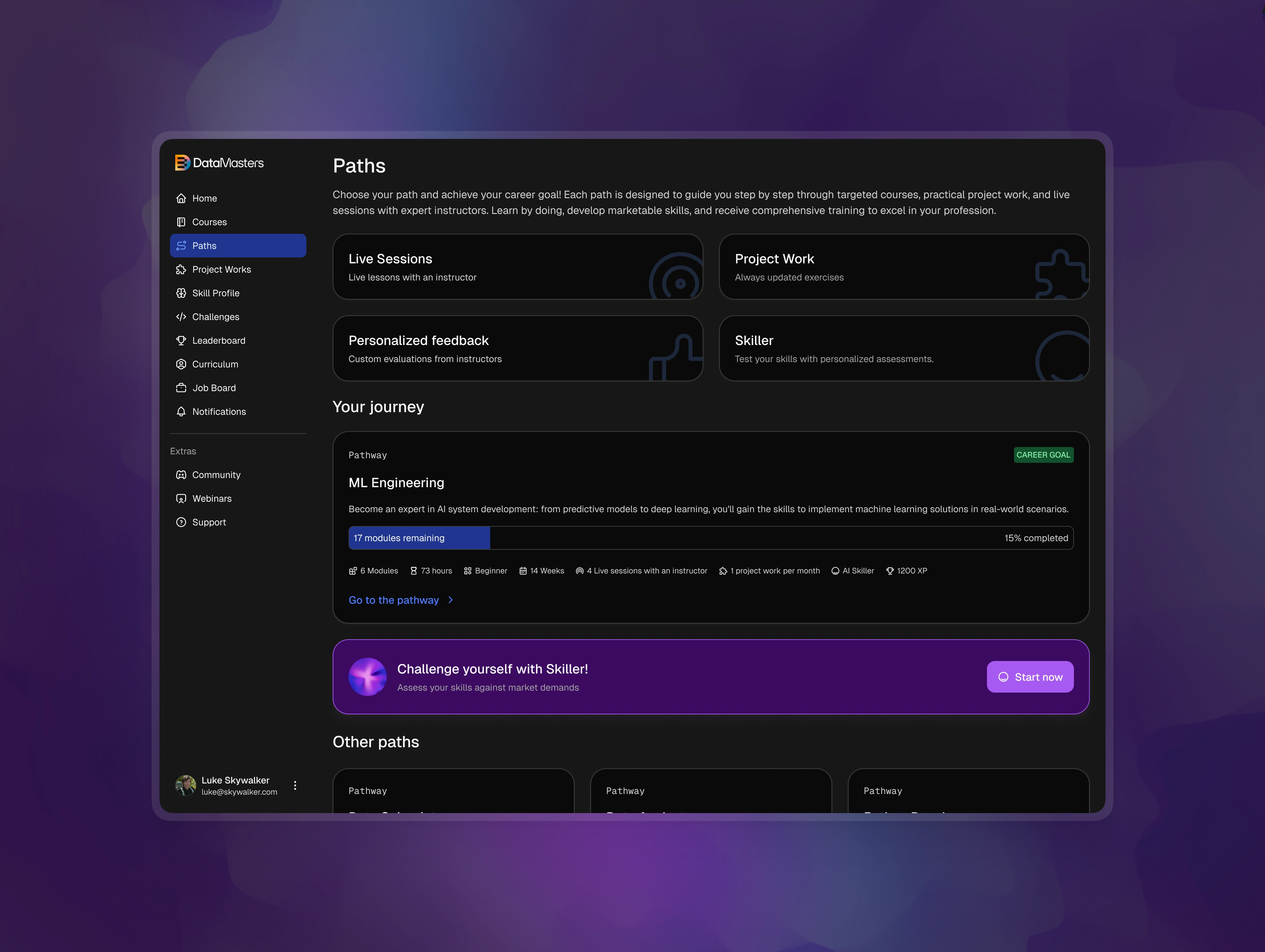
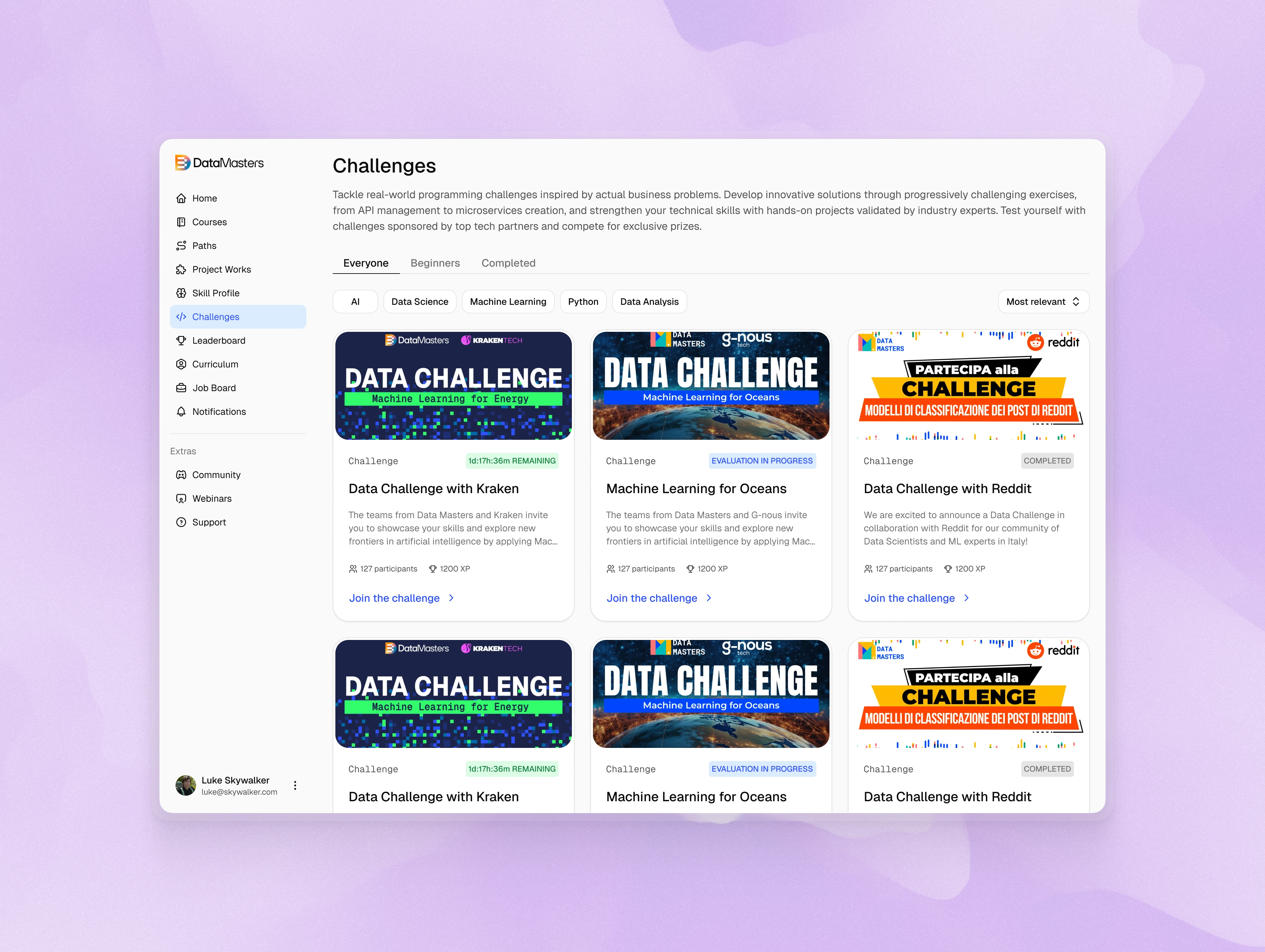
Career paths — dark mode
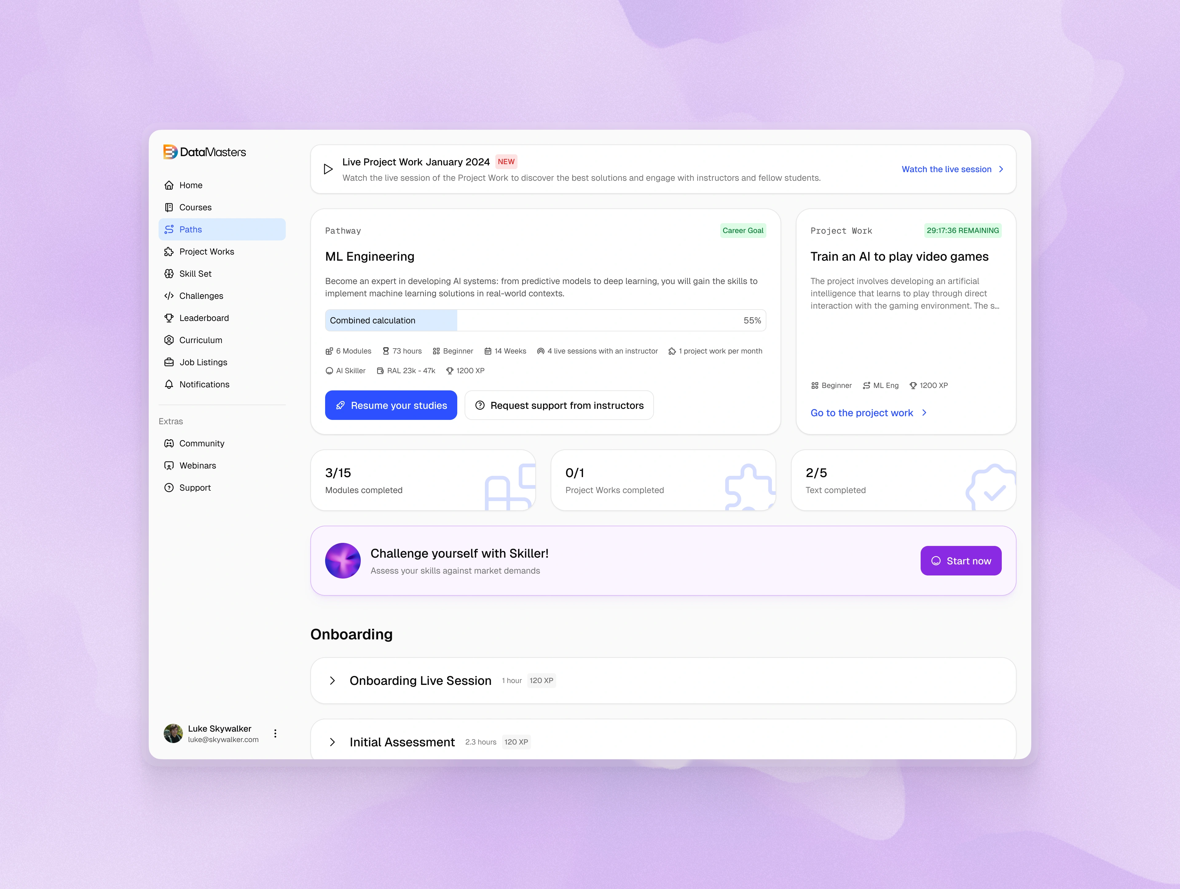
Career path details — light mode
Results
Delivered a fully redesigned, user‑friendly platform within just over one month.
Introduced a clean, modern UI and a lightweight design system that dramatically reduces component bloat.
Achieved developer satisfaction: “They’ve never seen a clean design like this one.”
Enabled rapid iteration on new features for both the e‑learning platform and the corporate website.
Currently awaiting first‑hand live user feedback to measure impact quantitatively.
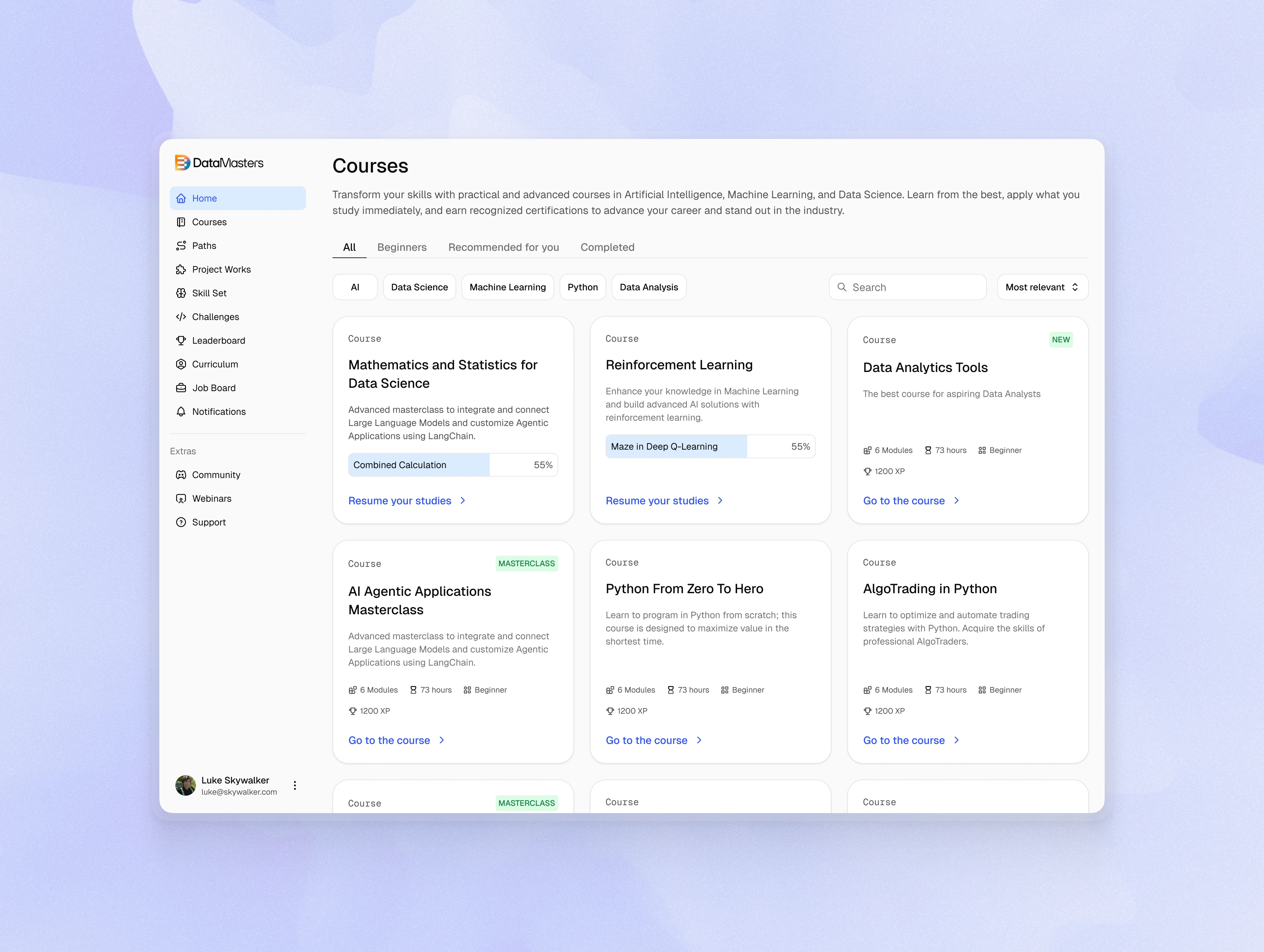
Courses — light mode
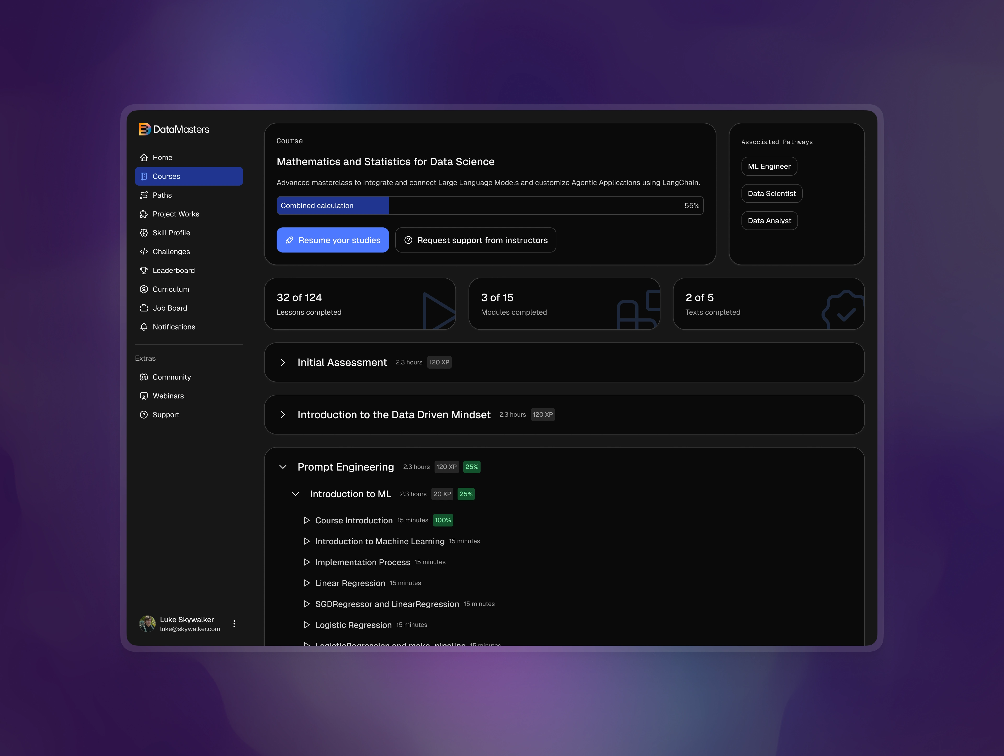
Course details with syllabus — dark mode
Takeaways
Early persona definition is critical; it drives all subsequent design decisions and keeps the team aligned.
Friction point audits expose hidden usability problems that may not surface until later stages.
A minimal, prop‑driven component library improves maintainability and accelerates future feature rollouts.
Bi‑weekly sprint reviews foster transparency and early detection of misalignments between design and business goals.
Clear communication with developers during handoff is essential. Documentation and design tokens can be the difference between a smooth implementation and a rocky handoff.
Like this project
Posted Oct 6, 2025
Redesigned the e-learning platform for Data Masters, improving usability, visual hierarchy, and engagement through a cleaner, conversion-focused interface.
Likes
11
Views
205
Timeline
Jan 6, 2025 - Jan 31, 2025
Clients
Data Masters