Building the Coreloops Design System
Osagie Eigbe
-- Case Study In Progress --
Laying the Foundation: Building the Coreloops Design System
Background & Overview
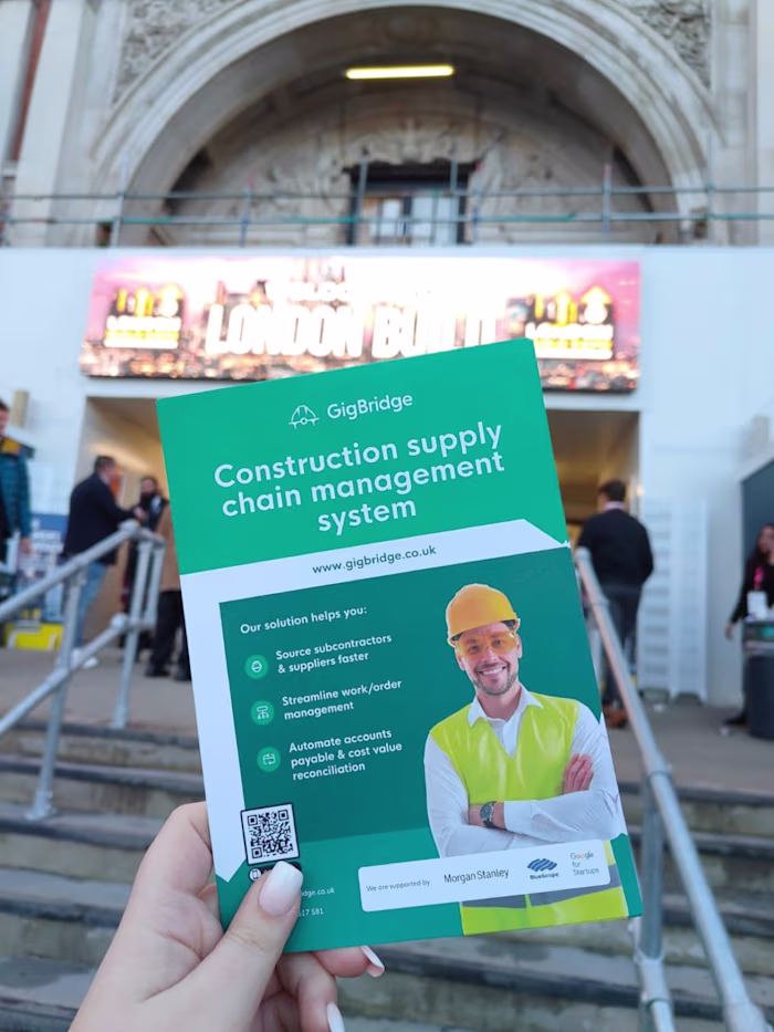
When I joined Coreloops (then called GigBridge), I came on board as the founding designer. At the time, the company had a barely usable MVP built on Adalo, which wasn’t fit for real-world use. My first task was to design a proper MVP from scratch—something functional, scalable, and user-focused.
Originally, Coreloops aimed to connect construction contractors with workers. Over time, it evolved into a construction financial management platform, shifting its focus toward solving operational and financial pain points for contractors.
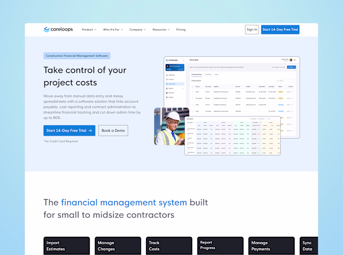
To support the product’s development, I built a design system in Figma from the ground up. It included everything from typography and color styles to layout grids and components. This system became the foundation for the platform and remained useful through several product pivots, helping the team move quickly while maintaining consistency and quality.
Design System Strategy & Foundation
Since there was no design foundation in place, I started by setting up the core elements in Figma: typography, color styles, spacing rules, and layout grids. The goal was to create a flexible system that could grow with the product and adapt to future changes.
For typography, I created both web and mobile styles to ensure responsiveness. In the early stages, when the platform focused on connecting workers with contractors, mobile-friendly pages were especially important for the worker experience.
Component-wise, I focused on building reusable pieces like buttons, input fields, modals, and navigation elements. These were structured with Figma’s auto layout and variants to make updates and scaling easier as the product evolved.
Figma variables didn’t exist when we began in 2022, but I later incorporated them as they were released in 2023. This allowed me to define proper design tokens, which became useful during the rebrand from GigBridge to Coreloops. Updating things like brand fonts and colors became far easier and more reliable.
Why I Didn’t Use a UI Kit or Existing Design System
A common question is why I didn’t rely on a pre-built UI kit or design system. My answer: I wanted to challenge myself and create something bespoke and authentic for Coreloops.
While UI kits offer a shortcut, I believed a custom system would better serve our specific needs. I wanted to design a system that reflected our brand and vision, not just a collection of components. I drew inspiration from others but aimed to build something truly tailored to our evolving product.
This approach pushed me to think beyond the conventional, resulting in a system that was flexible, scalable, and aligned with Coreloops’ growth.
Key Components
The Coreloops design system is built around a set of key components that ensure consistency, flexibility, and scalability. Each component is designed to work seamlessly across different parts of the platform, adapting to various use cases. Below are the major components, each carefully crafted to meet specific needs and ensure usability across the app.
Buttons & Inputs
Buttons
Buttons are a core element in any app, and for Coreloops, we made sure they were flexible enough for various scenarios. Each button has multiple states (e.g., default, hover, active, disabled) and sizes, ensuring they fit within any part of the app. We also integrated left and right icons for additional clarity and visual hierarchy.
Inputs
Input fields are often overlooked but are crucial to the user experience. For Coreloops, inputs were designed to handle a range of field types—standard text fields, text areas, and dropdowns. Each input was customized with different states such as error, active, and mandatory, and had variants for size and layout. Inputs also featured external labels, internal labels, form validation text, and icons placed on the left or right, ensuring they could accommodate various use cases.
Dropdown Menus
Dropdown menus were designed with an atomic structure, starting with individual items that could be customized with various states. The menus supported icons, hover states, checkboxes for multiple selections, and hierarchical items, making them adaptable for a range of interactions. For complex data, collapsible items were included to group and streamline content, even supporting images within dropdowns when needed.
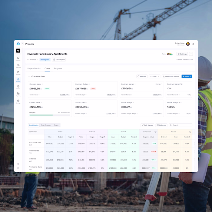
Tables
Tables were a key component of Coreloops’ system, essential for displaying and entering data. As many users were transitioning from MS Excel, we focused on creating a robust table system that mirrored that experience while making it more user-friendly.
I approached the table system with an atomic structure, starting with individual cell designs before assembling them into tables. I differentiated between data display cells and data entry cells, each with unique behaviors. Cells were designed with variants for different data types (e.g., header, checkbox, button, status, profile picture) and for editable states like empty, filled, error, disabled, or dropdown.
Modals
Modals are widely used throughout Coreloops to collect or display information without overwhelming users. I created a variety of modal states and sizes, all built on a flexible base template with a slot component. This slot could be replaced with any other component, allowing for full customization of modal content while maintaining a consistent structure across the app.
Navigation
Navigation is crucial for a smooth user experience, and Coreloops features a customizable dashboard navigation system. I designed a sidebar that supports customizable menu items, with different states for parent and child items. For section navigation within pages, I implemented tabbed navigation to provide easy access to subpages. In cases where a secondary hierarchy was needed, a second sidebar was added.
To maximize screen space, I also made the main sidebar collapsible, which was particularly useful for pages that needed extra room to display data.
Like this project
Posted Apr 15, 2025
Created a bespoke Figma design system for Saas company - Coreloops, enhancing product scalability and consistency.
Likes
0
Views
7
Timeline
Jul 18, 2022 - Nov 29, 2024