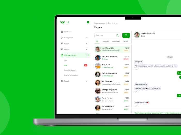
Food Searching Category and Filter Feature in Traveloka Eats
Overview 🔎
The Product
Traveloka Eats Delivery’s traffic increase in July 2021 is related to increasing order demand and the fantastic number of discounts given. As a result, Traveloka Eats Delivery gain positive reviews on Google Playstore and Appstore. As time passes it turns into negative reviews, some points out technical problems and mainly user’s concern was the lack of promos available.
Problem & Solution 🤝
Our main research goal is to determine the push and pull factors impacting user’s motivation to stop or continue using Traveloka Eats Delivery as their reliable food ordering application. Eventually, we want to find probable solutions to be translated into design, in order to further increase user’s motivation to continue using Traveloka Eats Delivery.
Process 🛣
Empathize
So the initial question was “What is the main reason Traveloka Eats Delivery went from positive, 5-star reviews to negative, 1-star reviews in short span of time?”
Method 1
Review on Play Store and App Store
The definite first step I took was doing desk research by looking into user reviews on Play Store and App Store. Insights regarding technical and non-technical issue then gathered into a big pile of insights to be sorted.

Method 2
Qualitative Data - In-Depth Interview
More insights are then gathered through in-depth interview. These insights are more personalized since user habits, user knowledge and user’s ability to solve problems are discovered.
Research Plan
I made a research plan to decide the objectives, participant, method, timeline and expected outcome.
Making a research plan is necessary since it will guide the whole research process.
Recruitment
There area 4 participants in total for this user research, found by purposive sampling method.
In-Depth Interview
I interviewed one active user and asked the user on how they use the app, their expectations, pain points, and also their habits on using competitor applications.
Define
I used these methods to discover every single problem experienced by user and eventually take action about it through design
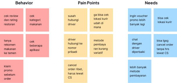
Affinity Diagram
The first method is to use affinity diagram to categorize each problem into smaller pile. This method is very helpful for me to define the main problem
The insights gathered from interview are then categorized by user’s behavior when using the app, the problems they experienced, and the solutions given to accommodate their needs.
Persona Creation
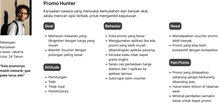
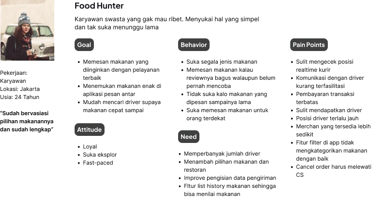
Using insights narrowed in affinity diagram, I am able to create personas that represents the ideal user of Traveloka Eats Delivery
Persona 1
2. Persona 2
Journey Map
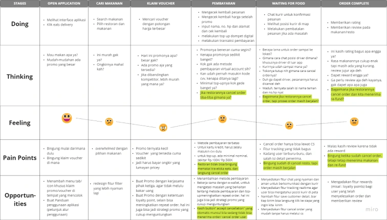
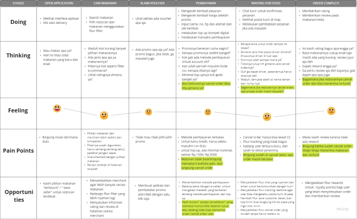
I tried to map out the persona’s journey while using Traveloka Eats Delivery to draw conclusions and come up with main problems to solve.
Promo hunter's journey map
Food hunter's journey map
Key Insight
😑 Confusing User Interface
Selecting the discount vouchers and dishes can be confusing for users because of the interface. They feel overwhelmed by disorganized dish selections.
😨 Complicated order process
In general user felt there are fewer choices of dishes and restaurants compared to competitors. They also experienced uninformative filter feature, input data errors, inadequate order tracking and one-way order cancellation when ordering food.
🙃 Promos far from expectation
User’s expectation to get big discount and free shipping fee does not match the discount given.
😔 Lack of feedback for user
In order to motivate the user to keep using Traveloka Eats Delivery they need something that reciprocate their actions. That’s something that the users haven’t got based on their insights.
😤 Limited payment method
Payment methods are still limited, and some users have to input their payment information twice. Also, users feel the minimal top-up amount from Traveloka Eats Delivery’s e-wallet is pretty high.
Ideate
After gathering main problems experienced by user, I decided to take 2 problems to be developed as design improvement.
Problem #1 - User can’t search food by categories.
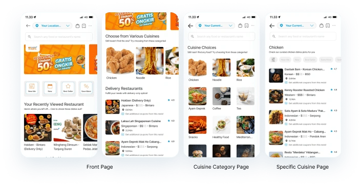
I add Cuisine carousel as a way for user to find the dish they want faster. Previously this section doesn’t exist on the first page, instead it is available inside the filter page.
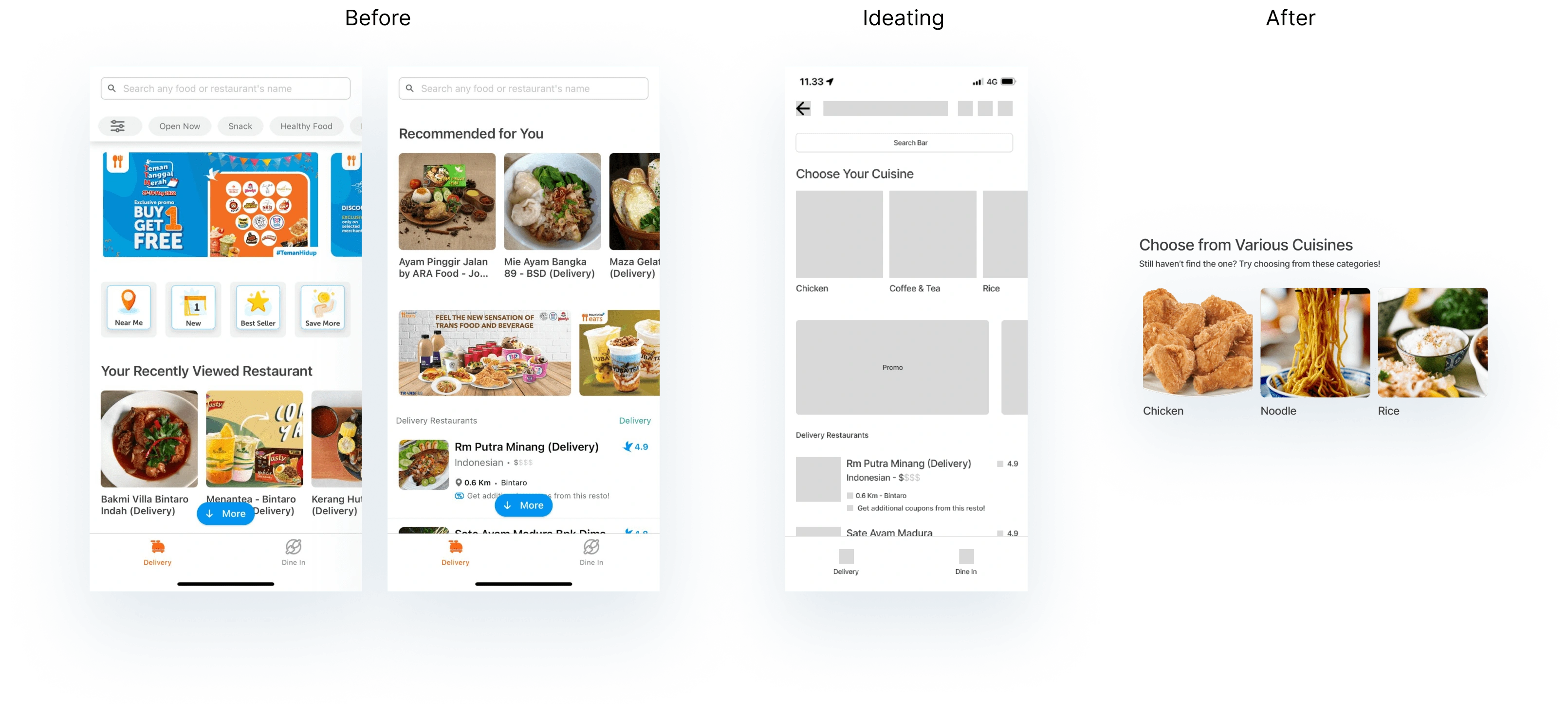
Cuisine category page then further developed for continuity from the previous page. I put cuisine categories on different page to improve the comfort of choosing cuisine.
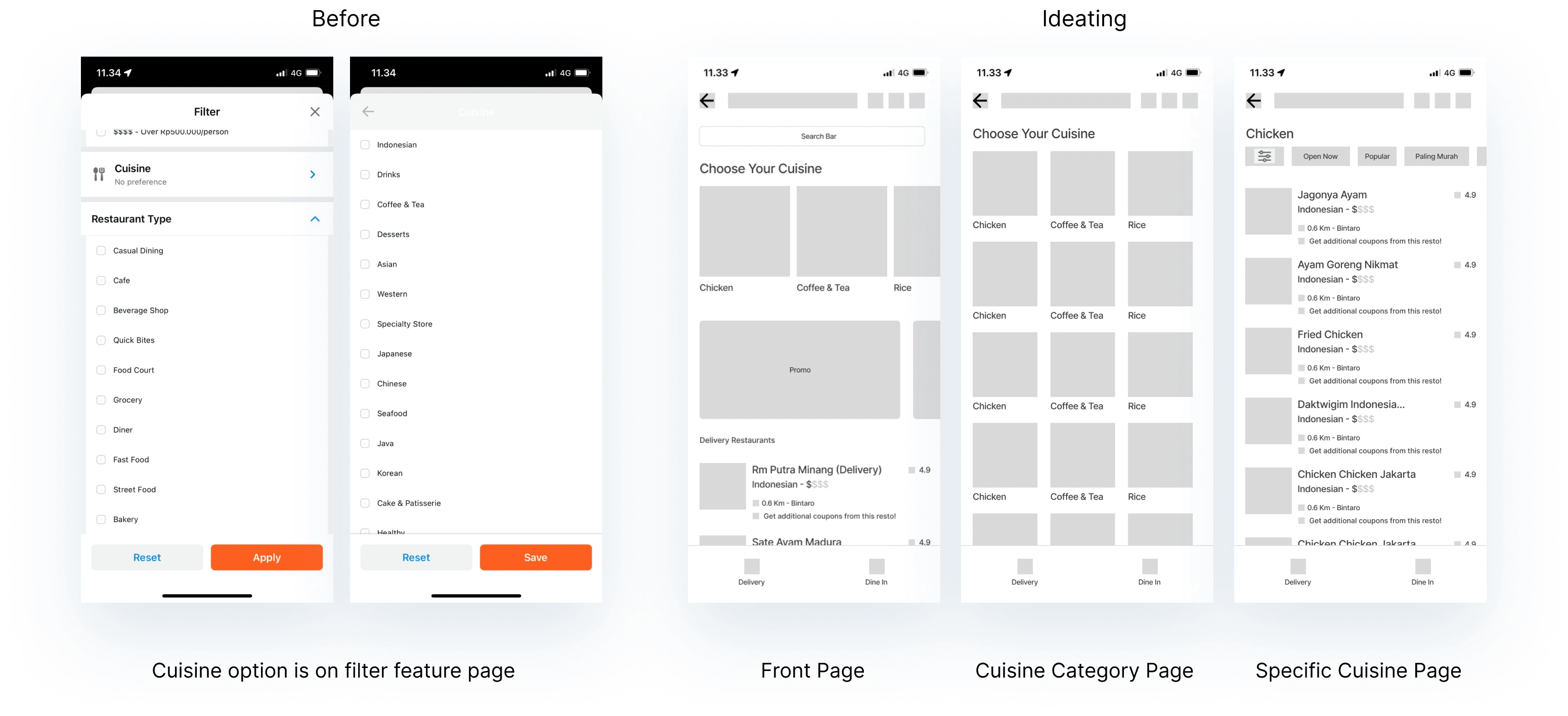
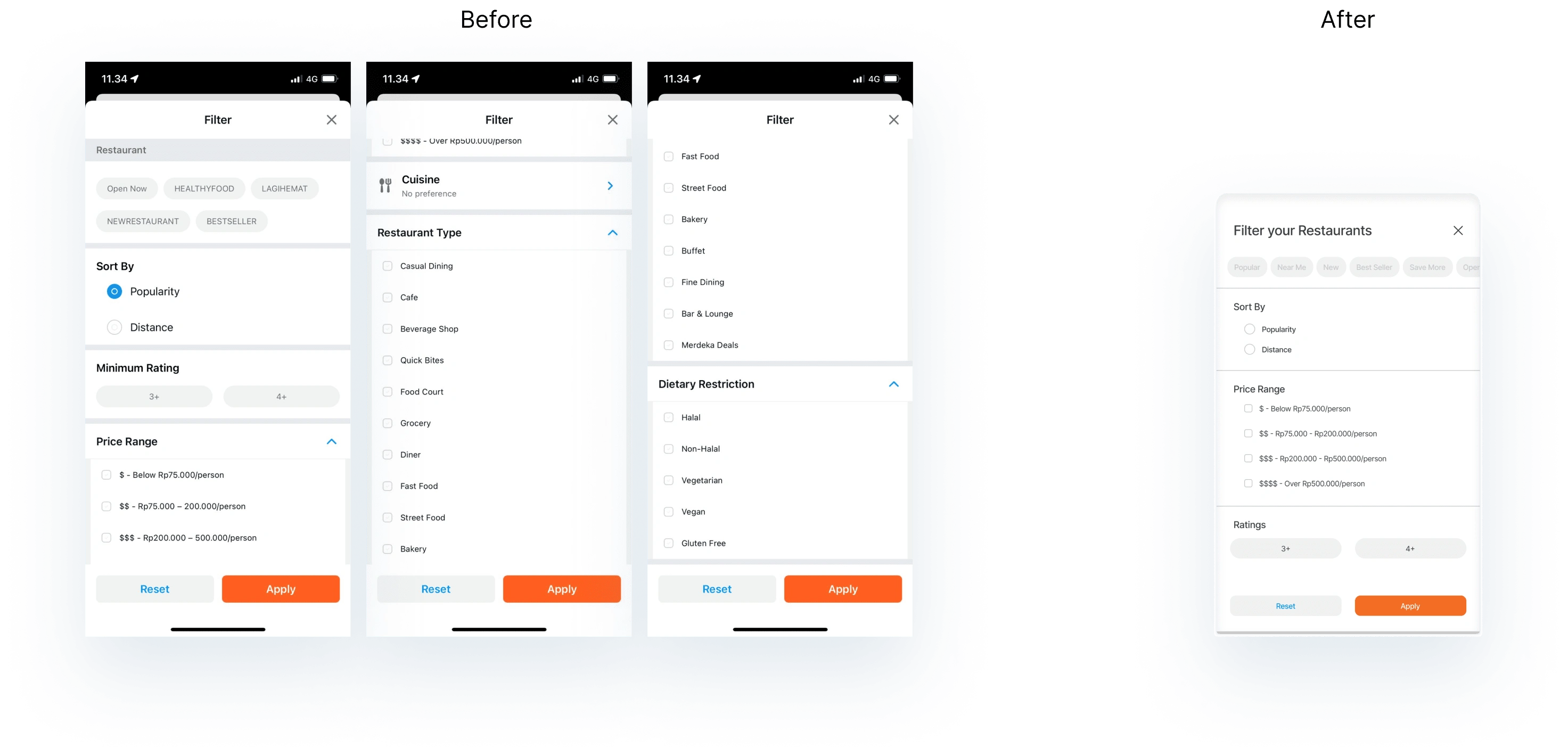
Problem #2 - Unadaptive filter feature
To simplify filter page, I decided to keep the basic filter options such as popular, nearest, newest, best seller restaurant, sorting restaurants based on the price range and ratings. The rest of filter options is moved to cuisine categories page. I also simplify the filter appearance by turning it into overlay at the bottom of the page
Prototype and Testing
Having solutions to user’s problem, I then developed the lo-fi and high fidelity wireframe into mock-ups based on UI components and design system
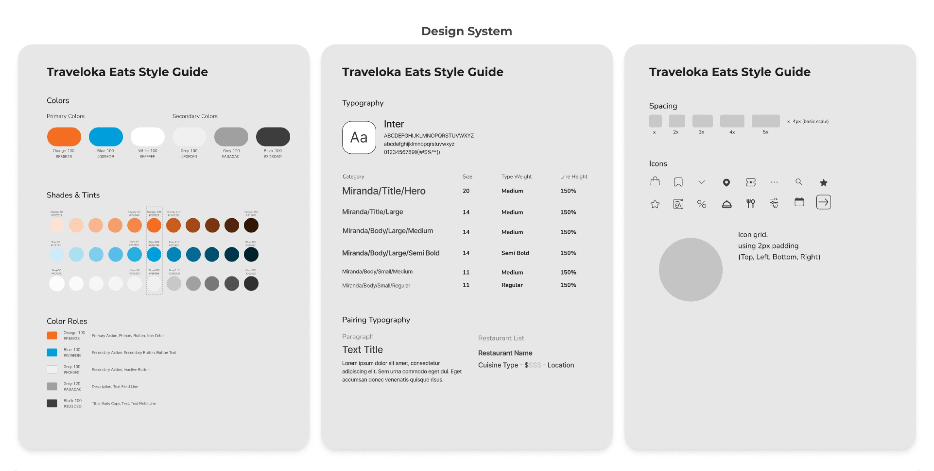
Design System
Creating a design system really helped me through prototyping process. Below is the design system adapted from Traveloka Eats Delivery’s UI
Mock-Up
Below is the final mock-up in a glance. I did minor tweaking for some of the elements here and there to further unify the design. I also used similar-style icons in order to avoid cluttered visual. Other elements such as menu cards, fonts, information hierarchy are adapted from current Traveloka Eats Delivery’s UI
Usability Testing
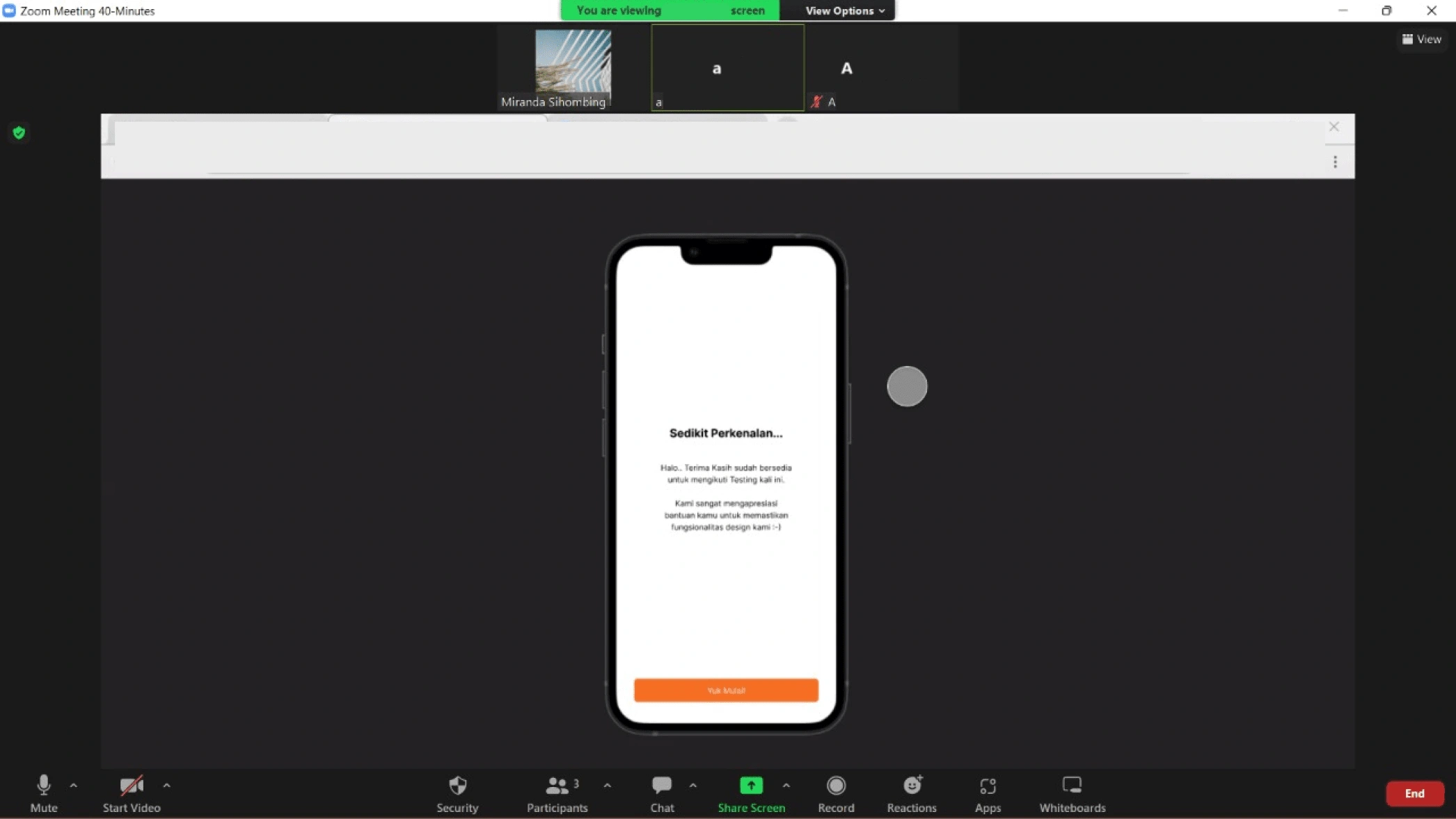
Although with limited participant and time to execute the test, I’m able to find gather insights about the design to be further developed. In this test I focused on the cuisine category section.
Conclusion🎁
Takeaways 📣
Traveloka Eats Delivery as food-ordering app has a lot of potential elements to improve. To gain user’s loyalty we need to repair or add elements that will become pull factor.
Challenges & Solution 📣
Being new to UI/UX Design, there are a lot of things that I’m not familiar with. From doing research to actually designing UI, even to the terms used is something new to me. Nevertheless, I’m very grateful to be helped by my team through research process. As for design process, I always try to look back to what the mentors at dibimbing bootcamp already taught us, and it helped me to solve design problems.
Lesson learned📣
Now I’m aware that user pays a lot of attention to details. It’s important for us designers to gather all insights from user, as they are the main target dan daily user of our app. By doing this research and designing process I believe I gain a lot of knowledge to be used in the future.
this project is strictly for design exploration only and not affiliated with Traveloka Eats.Like this project
Posted Jan 8, 2023
This research is to determine the push and pull factors impacting user’s motivation to stop or continue using Traveloka Eats Delivery.
Likes
0
Views
57
