Sketch Documentation Design Review
Sketch is a Mac app for designers to create, team up, prototype, and more. It also has a web app for sharing, feedback and handoff, and an iPhone and iPad app for previewing.
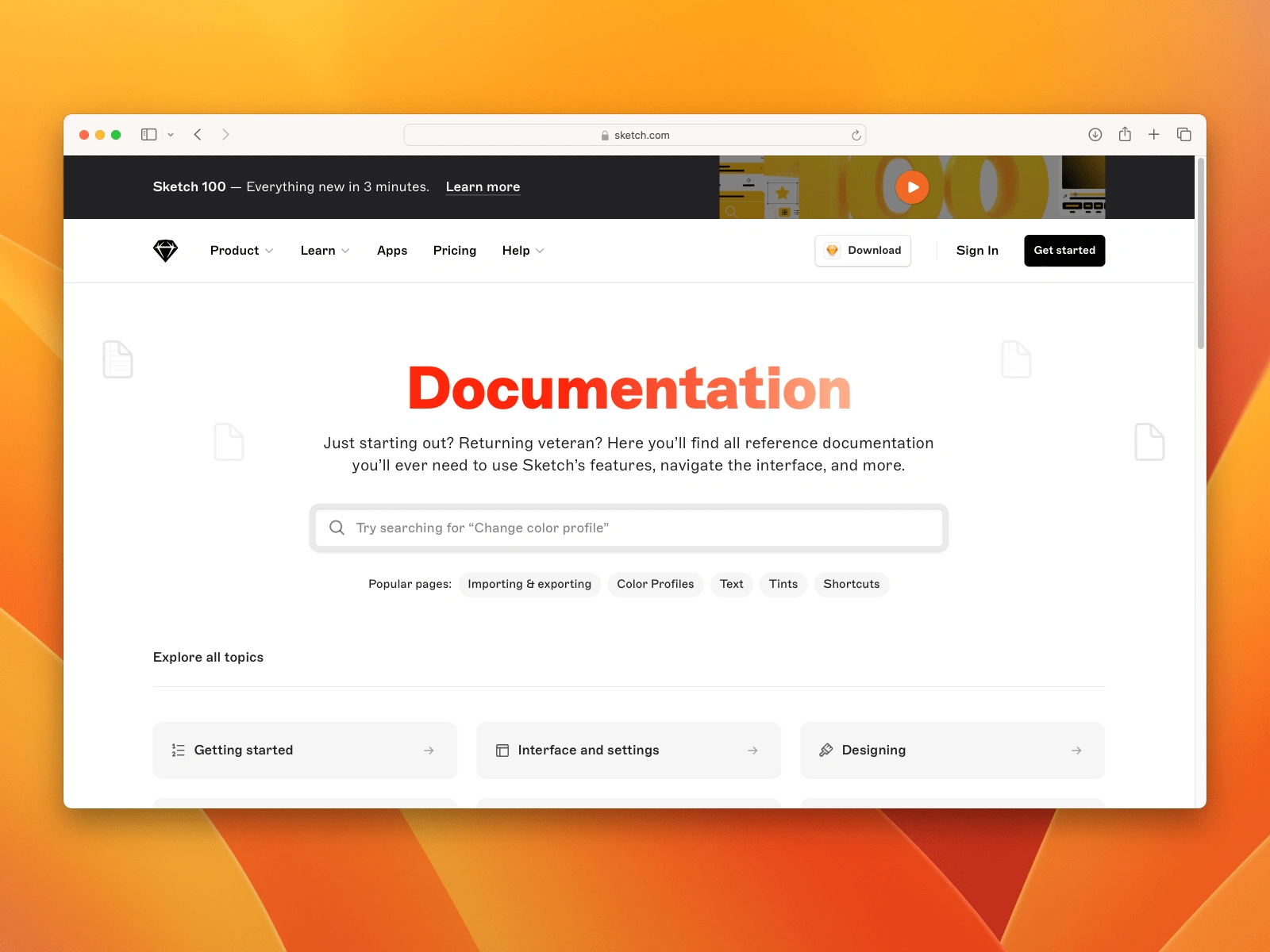
Sketch is a Mac app for designers to create, team up, prototype, and more.
UX Recommendations
Navigation
• Encourage exploration and discoverability. The current navigation side of Sketch lacks features such as collapsible navigation menus, which hinders users' ability to explore and discover content efficiently.
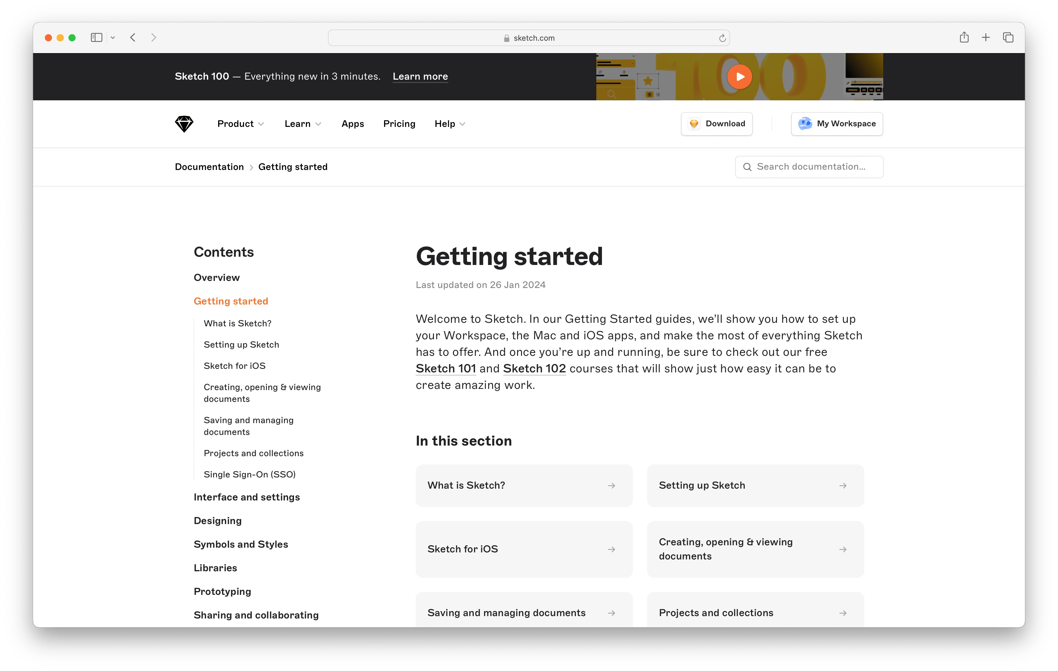
Figure 1.1 Currently, the navigation side of the documentation website presents all items in a static list without the ability to expand or collapse sections.
The absence of collapsible navigation menus means users cannot easily see the structure and hierarchy of the documentation. This can make it difficult for them to navigate through the content and find related topics. Apple Human Interface Guidelines (HIG) takes a different approach on promoting exploration by providing users with a clear overview of available sections and the ability to expand and collapse sections as needed (Figure 1.2)
Effective navigation should promote exploration by providing users with a clear overview of available sections and the ability to expand and collapse sections as needed. This allows users to uncover content progressively and avoid feeling overwhelmed by too much information at once.
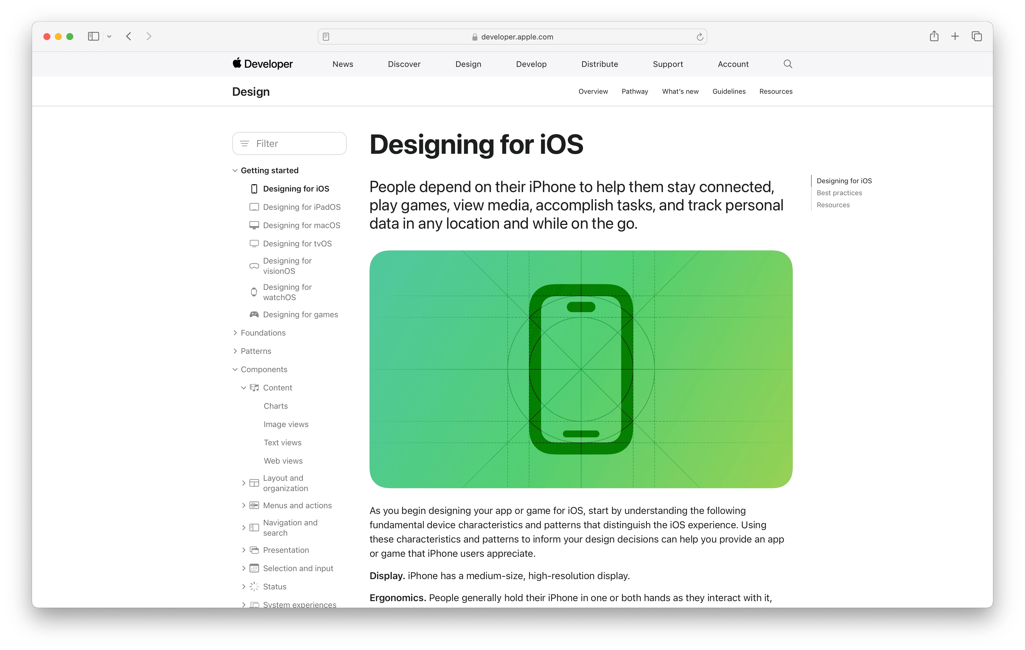
Figure 1.2 Apple's Human Interface Guidelines (HIG) documentation website promotes exploration by providing users with a clear overview of available sections and the ability to expand and collapse sections as needed.
• Increase the discoverability of the table of contents. Converting the table of contents into a sticky navigation that remains visible on the side as user scrolls through the page allows users to quickly jump between sections without having to scroll back to the top, improving navigation efficiency and user experience.
Currently, on larger screens, a significant portion of the screen is occupied by margins, and the table of contents is only accessible at the top of the page. By reducing the margins and implementing a sticky side navigation, Sketch can take full advantage of the large screen space, making it easier to read and navigate the documentation.
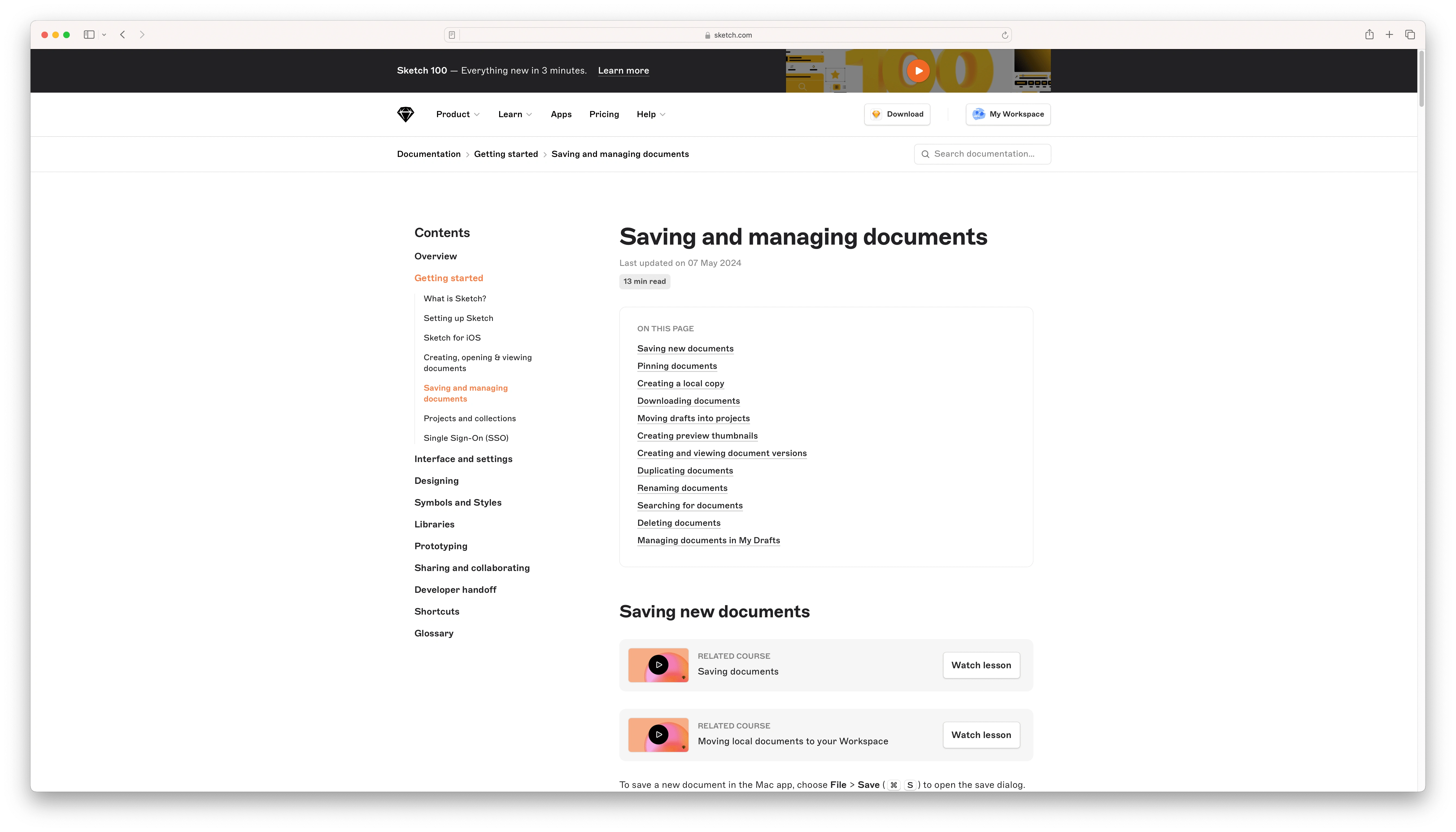
Figure 1.3 Currently, on larger screens, the table of contents is only accessible at the top of the page. By reducing the margins and implementing a sticky side navigation, Sketch can take full advantage of the large screen space, making it easier to read and navigate the documentation.
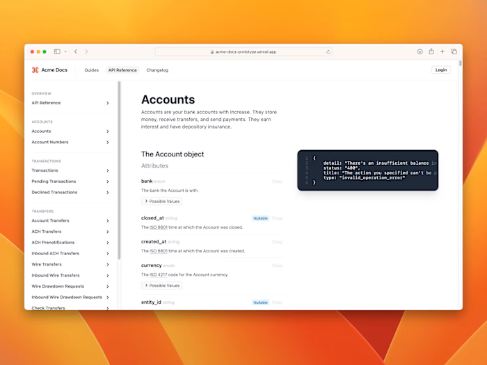
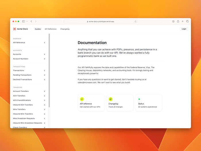
Increase Docs uses a sticky table of contents to give users feedback on scrolling progress and learn where they are on the page. It also added animation to increase the discoverability of the table of contents, and also to create delightful micro-interactions.
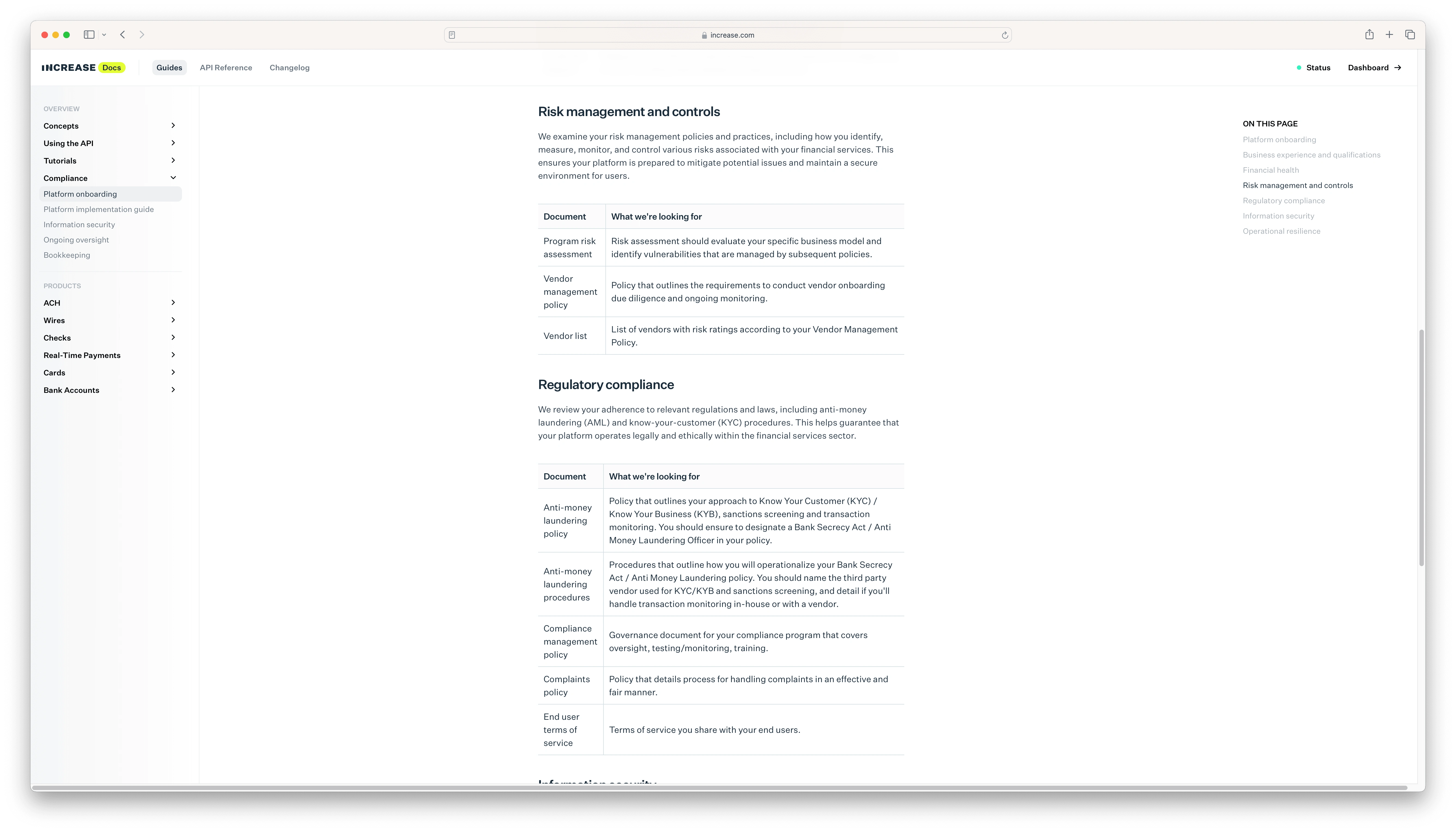
Figure 1.4 Increase Docs: The various sections of the sticky table of contents are bolded as user reaches them while scrolling.
• Increase the discoverability of the jump links. Provide a sticky index at the top of the page or jump links for each letter of the alphabet, allowing users to quickly navigate to the desired section in the glossary page.
While Sketch provided jump links for each letter of the alphabet at the top of of the page, the links of the alphabet could be implemented as a sticky top navigation as user scrolls down, increasing the discoverability of the jump links (Figure 1.5)
• Support keyboard navigation for glossary. Ensure the glossary is fully navigable using a keyboard. While supporting keyboard navigation for glossary when you already have a mouse can be a stretch, it can allow users with disabilities or those who prefer keyboard use to navigate efficiently. For example, a user can press ‘K’ to quickly navigate in glossary to terms that starts with ‘K’
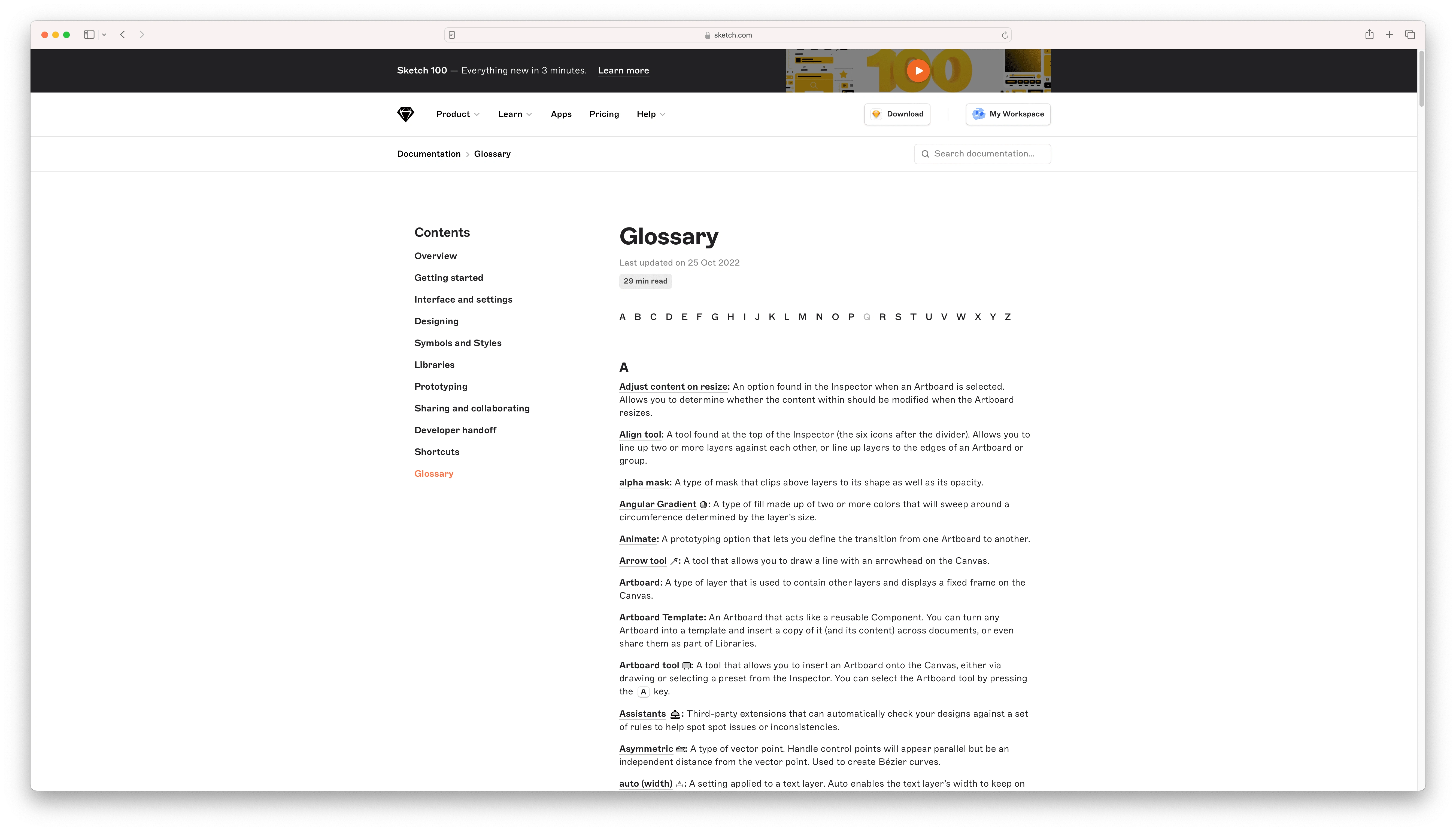
Figure 1.5 While Sketch provided jump links for each letter of the alphabet at the top of of the page, the links of the alphabet could be implemented as a sticky top navigation as user scrolls down.
Search
• Optimize for search (1) Improving the search functionality to group results by category and include links to related courses will significantly enhance the user experience. It will help users find the information they need more efficiently and provide them with a broader range of learning resources.
While Sketch provided relevant documentation search results and supported scanning by highlighting the search keyword throughout the results listing page, the search results do not include links to related courses.
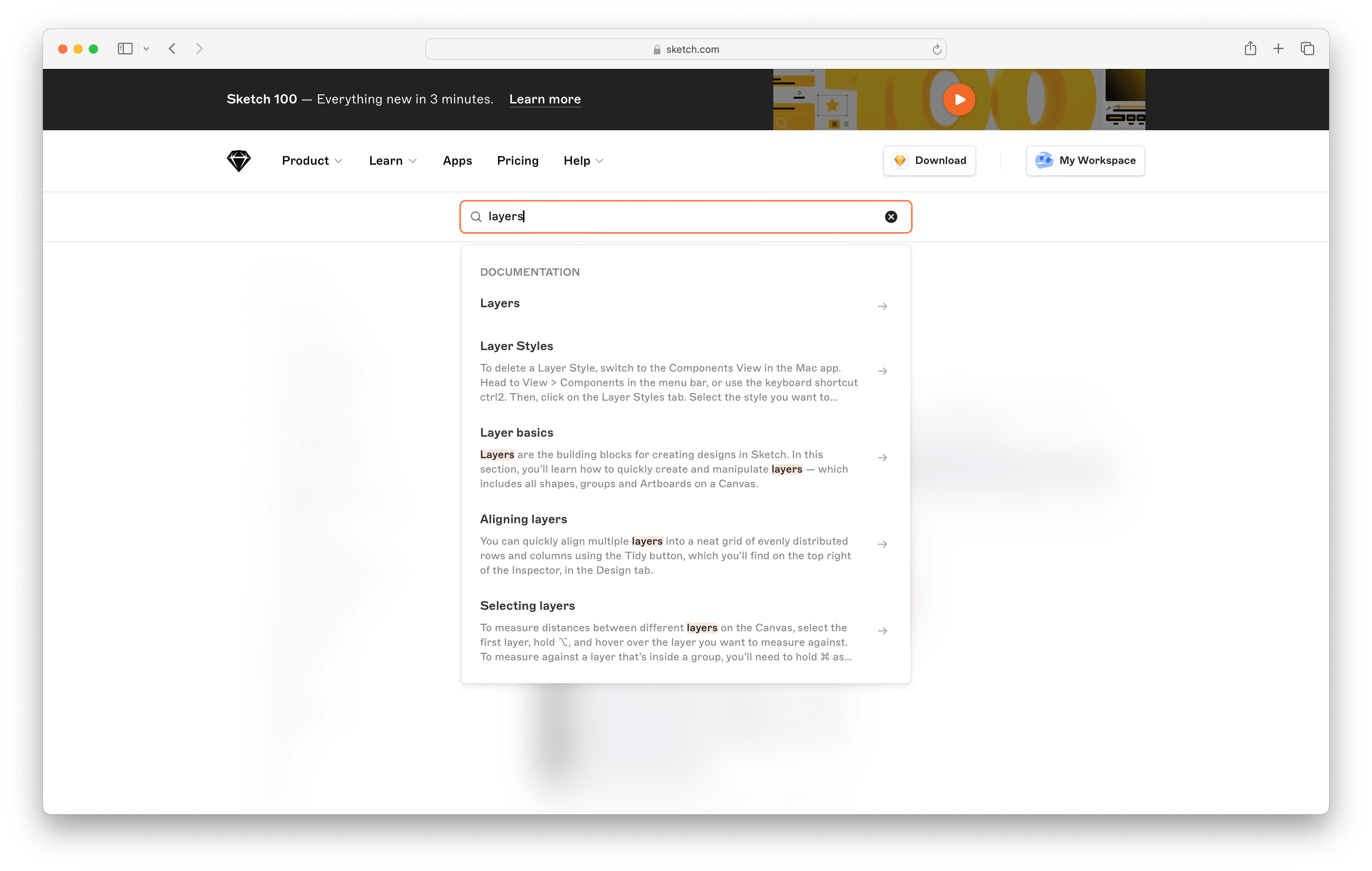
Figure 2.1 Sketch provided relevant documentation search results and supported scanning by highlighting the search keyword throughout the results listing page. However, the search results do not include links to related courses.
Figma implemented a search result grouping feature that organizes results into relevant categories. This can help users quickly identify the type of content they are looking for and navigate to the most appropriate section.
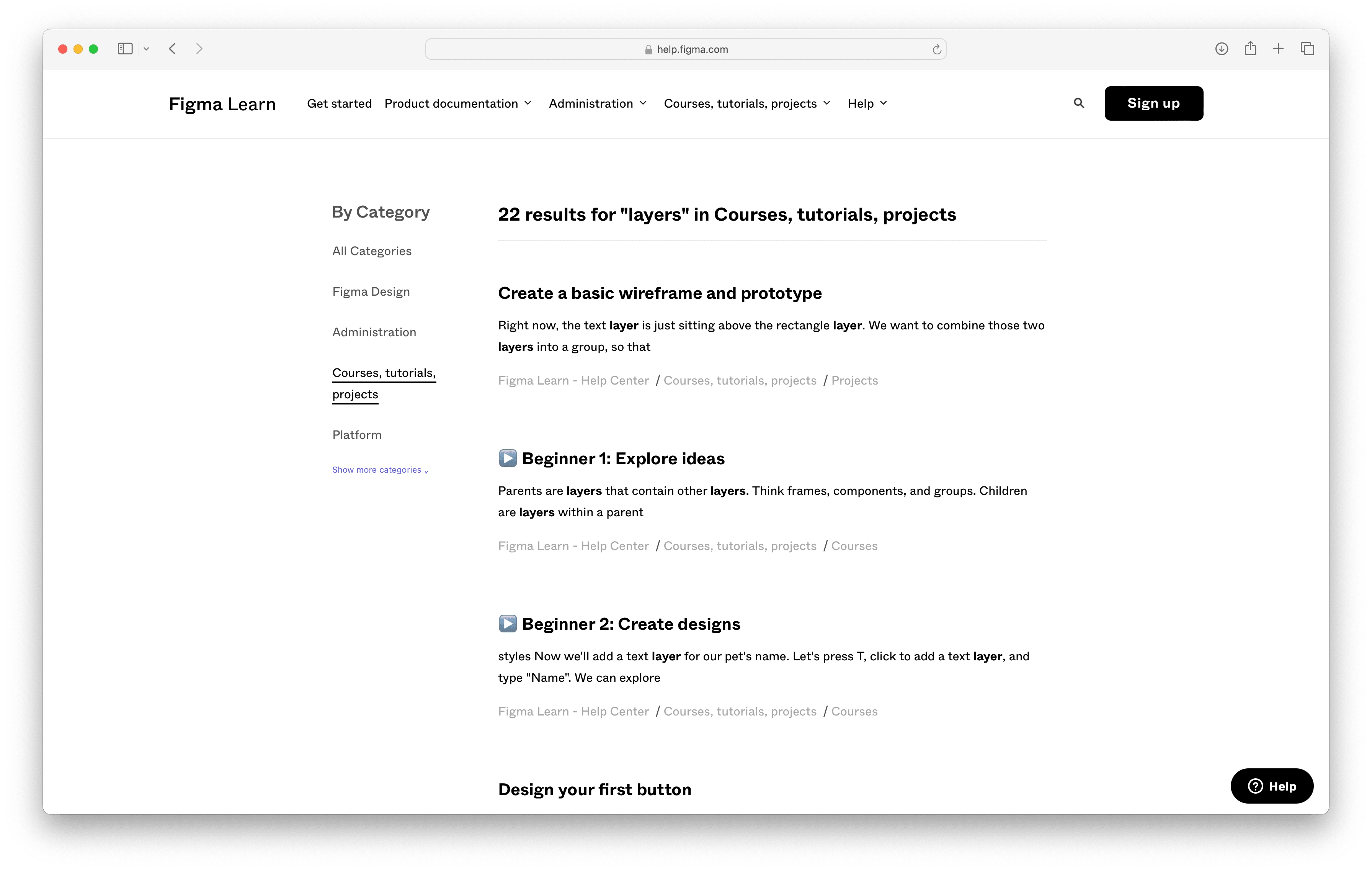
Figure 2.2 Figma provided not only relevant search results but also categorized them allowing for category-specific search results.
• Optimize for search (2) Include a search bar specifically for the glossary, enabling users to quickly locate terms. While Sketch provided a search functionality for the main documentation, it could also implement a search functionality within the glossary, offering quick access to definitions without navigating away (Figure 2.3)

Figure 2.3 While Sketch provided a search functionality for the main documentation, it could also implement a search bar specifically for the glossary, enabling users to quickly locate terms.
Interaction Design
• Implement tooltips or hover-over definitions for terms. Implement tooltips within the main documentation text, offers quick access to definitions without navigating away.
In the section “Masking shapes” (Figure 3.1), Sketch could implement tooltips for the terms in glossary (e.g. ‘alpha mask’) enhancing the user experience by providing additional context and information without navigating away to glossary.
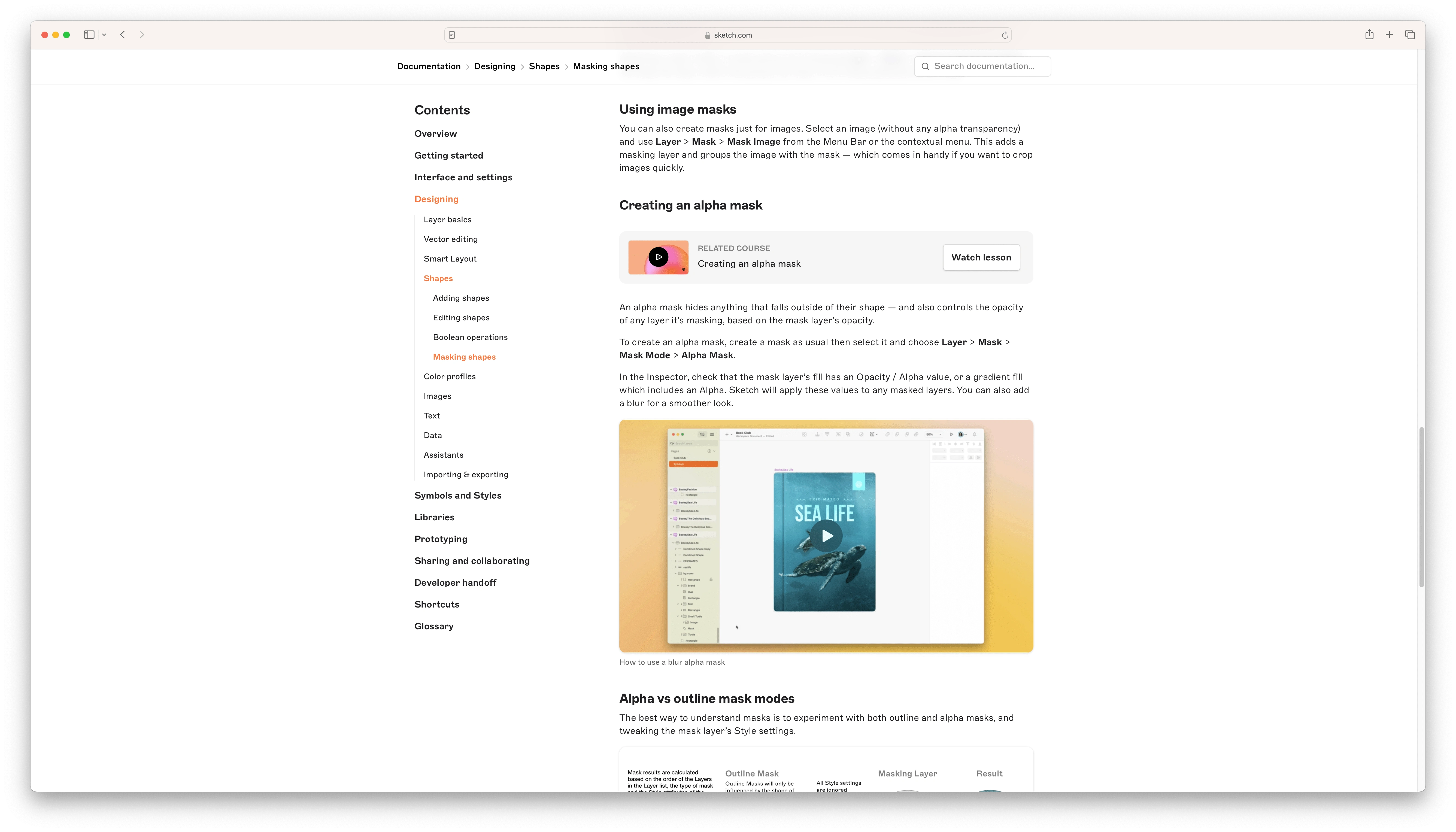
Figure 3.1 Sketch could implement tooltips for terms (e.g. “alpha mask”) by providing additional context and information without navigating away to glossary.

Figure 3.2 Sketch: A glossary for a documentation website involves ensuring that users can easily find and understand key terms and concepts.
Like this project
Posted Jun 21, 2024
Conducted an analysis of Sketch's documentation website, identifying key strengths and weaknesses to enhance user experience and site navigation.
Likes
0
Views
11

