Holy Oat, bold and earthy vegan ice cream
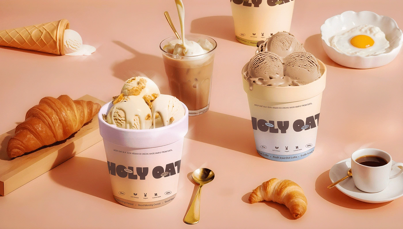
Product photography
Project
Holy Oat - Vegan Ice cream made from Oats
Challenges
The main challenge was creating something fun and memorable in the already crowded vegan market. Our goal was to find the perfect balance between playfulness and boldness, showing that vegan doesn’t mean boring, while also highlighting the natural, earthy vibe of our ingredients 🌿.
Solution
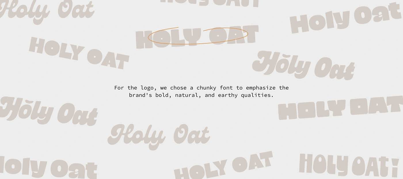
We chose big, chunky fonts to keep that grounded, earthy feel and paired it with soft pastel gradients to add a playful and fun twist to the branding 🌸🎨.
Product + packaging
Logo making
Logo
We combined a bold, chunky font with soft pastel gradients to create a playful, fun vibe for the brand. The goal was to introduce a unique element that not only stands out but also reinforces the brand's personality and essence.
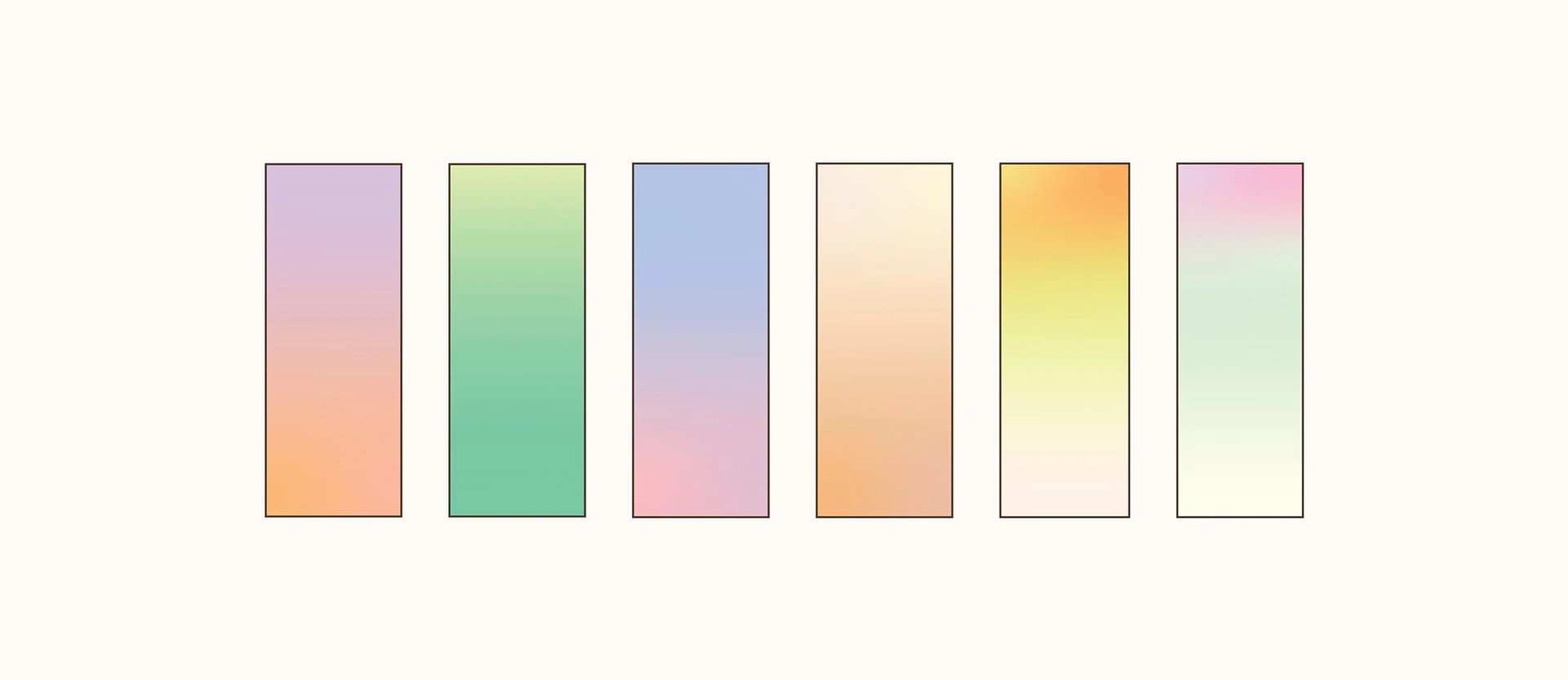
Color gradients
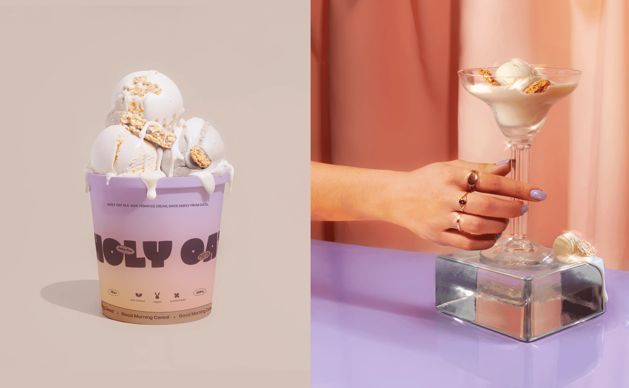
packaging
We created a cohesive icon that incorporates the logo font, using negative space to represent the brand’s core values:
Plants or oats: Symbolizing the vegan nature of the product.
Rabbit or animal symbol: Representing animal welfare.
Flowers: Highlighting the organic quality of the ingredients.

icons
The packaging is crafted from recycled carton and designed as a paper pot. It features a vibrant yet clean design, aimed at catching attention on the shelf without appearing cluttered.
The goal is to balance bold colors with simplicity, ensuring that key information remains easily readable.
Packaging
Picture photography
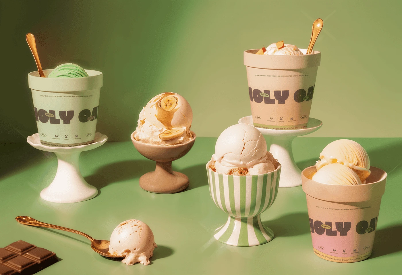
Product photography
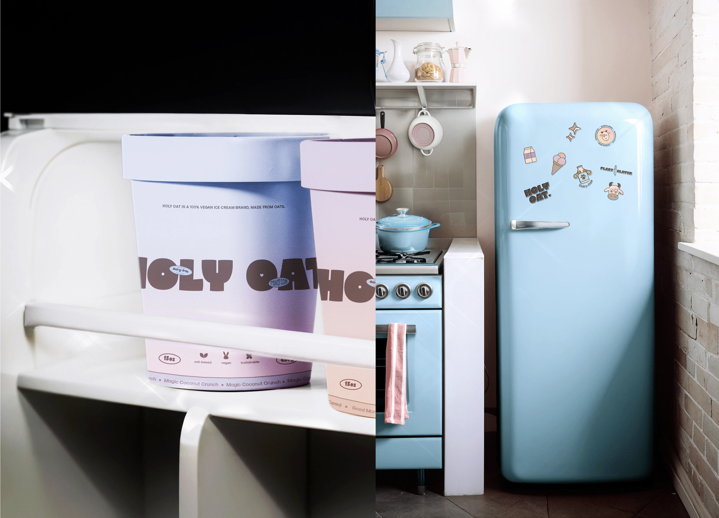
Collaterals
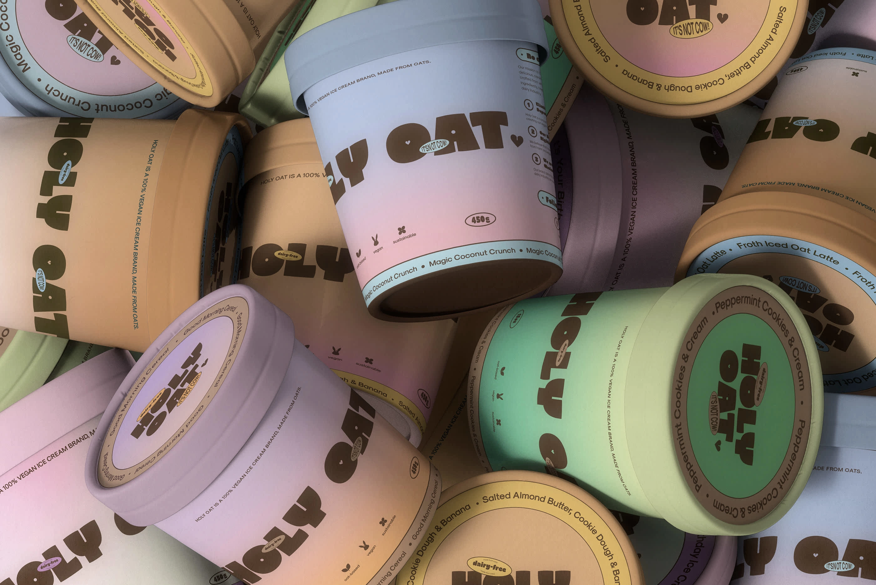
Packaging
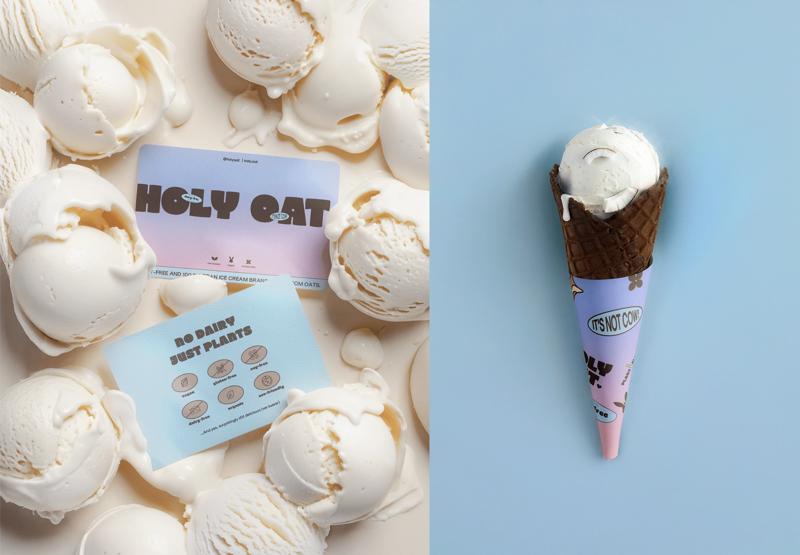
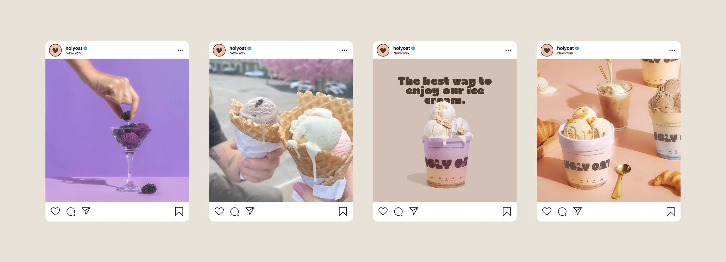
Instagram
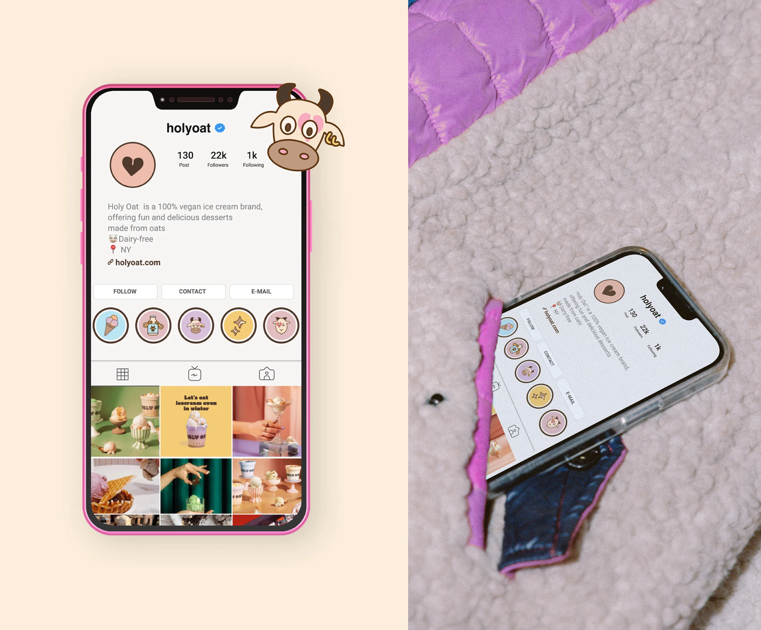
Instagram
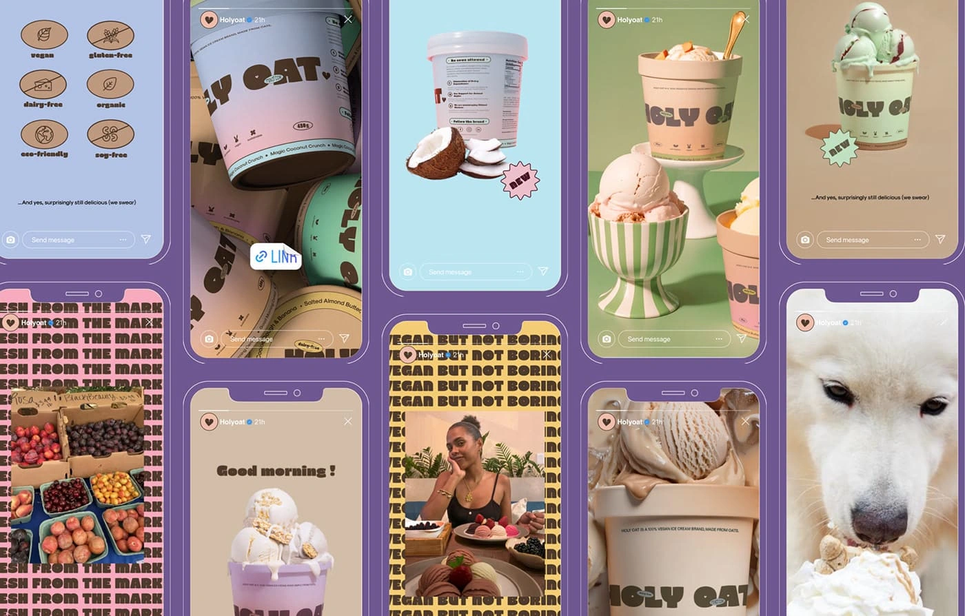
Stories
Follow me on instagram
Check out my portfolio
Thank you for watching 🫶🏻
Like this project
Posted Nov 12, 2024
This vegan ice cream branding blends bold fonts with pastel gradients to stand out, showing that vegan can be fun and earthy 🌿.
Likes
52
Views
391

