S&B E-Commerce Store Design

Karan Singh


Designing a Modern Shopping Experience for Healthcare Professionals
Overview
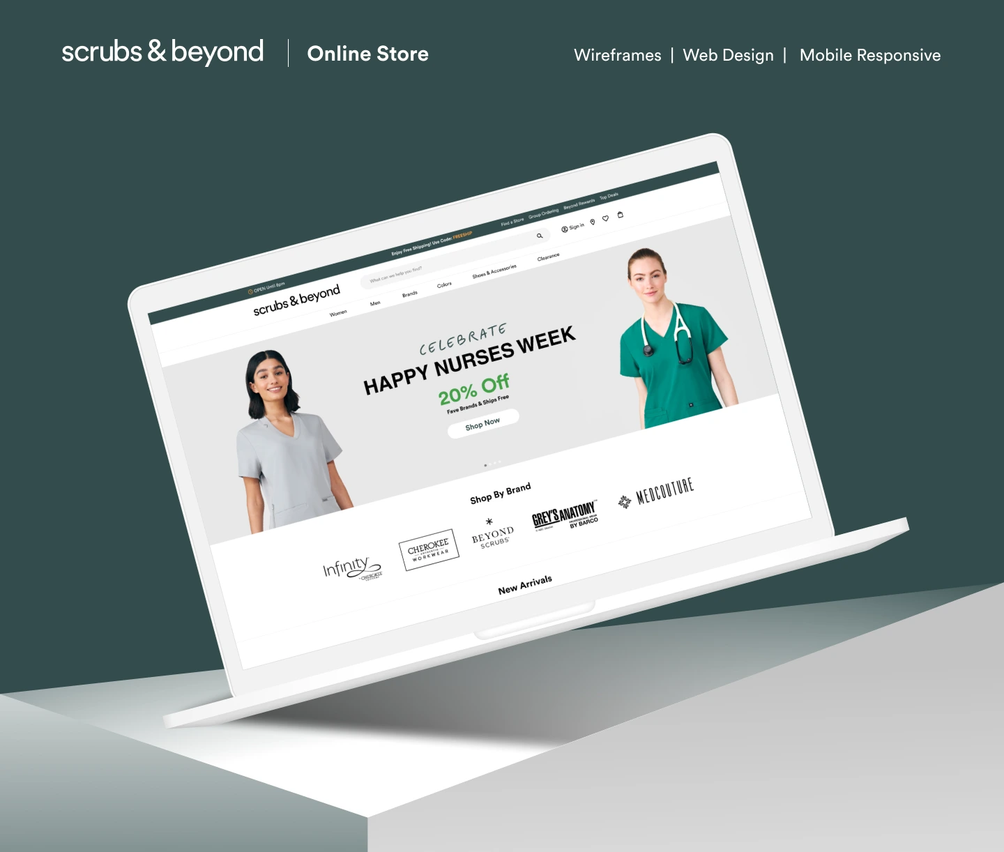
S&B is one of the largest retailers specializing in fashion-forward nursing scrubs and medical uniforms in the United States. With over 122 retail locations across 30 states, the company has built a trusted reputation by offering premium medical apparel and exceptional customer service.
As online shopping became a larger part of the customer journey, S&B needed a modern digital experience that reflected its brand while making it easier for healthcare professionals to discover, compare, and purchase products across devices.
Header
The Challenge
Healthcare professionals often have demanding schedules, leaving them with limited time to shop online. The existing experience made it difficult for customers to quickly find the right products and confidently complete their purchases.
Key Problems
Complex navigation with too many product categories.
Difficult product discovery for first-time visitors.
Limited visual hierarchy that reduced important product visibility.
Inconsistent user experience across desktop and mobile devices.
Product pages lacked sufficient information to support purchasing decisions.
Checkout experience contained unnecessary friction.
Visual design no longer reflected a premium retail brand.
Goals
The primary objective was to create an eCommerce experience that was intuitive, visually engaging, and conversion-focused.
The design aimed to:
Improve product discoverability
Reduce friction throughout the buying journey
Increase customer confidence
Create a premium shopping experience
Optimize the experience across desktop and mobile
Build a scalable UI system for future growth
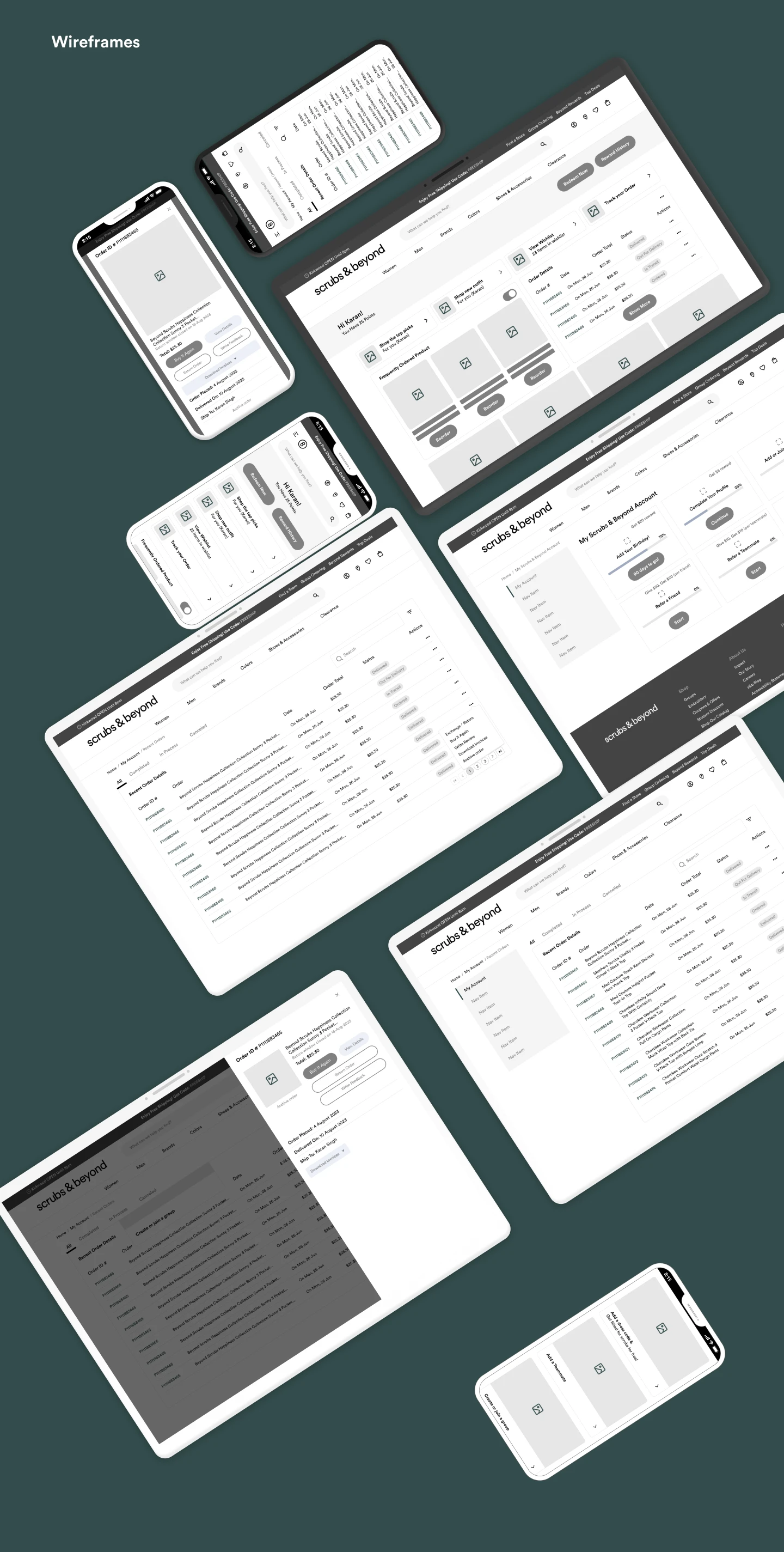
Wireframes
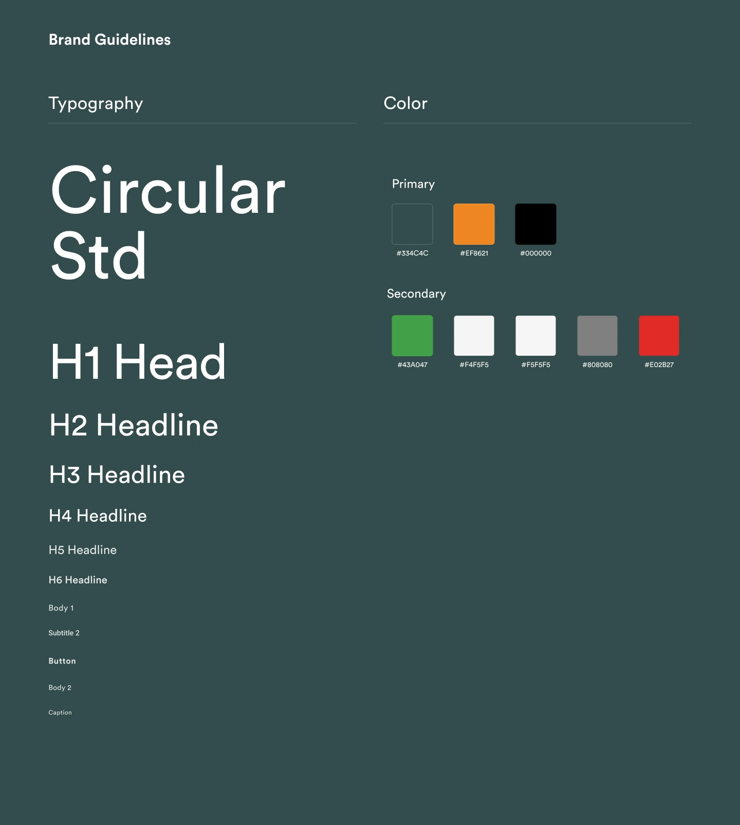
Typography & Color
My Role
Lead Product Designer
I was responsible for:
UX Research
User Flow Design
Information Architecture
Wireframing
UI Design
Responsive Design
Design System
Developer Handoff
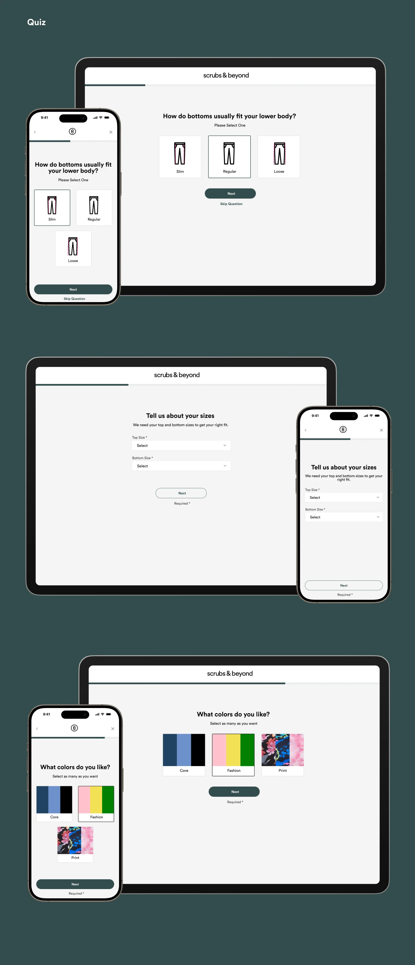
Quiz Design
Key Solutions
Simplified Navigation
A cleaner navigation system helps users reach products faster while reducing decision fatigue.
Impact
Easier product discovery
Better browsing experience
Reduced user frustration
Smarter Product Listings
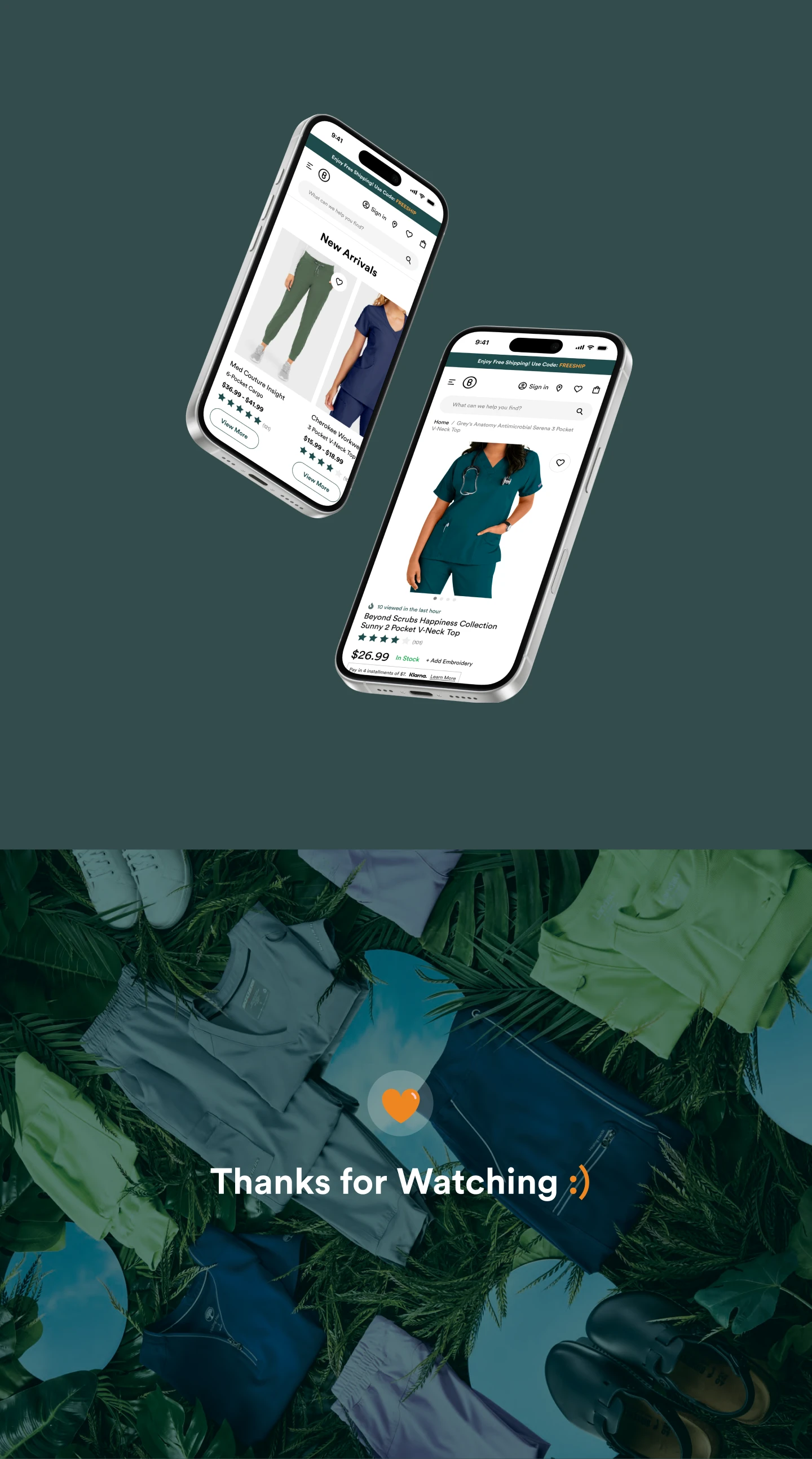
Product cards were redesigned to prioritize the information shoppers care about most:
Product image
Price
Available colors
Ratings
Quick actions
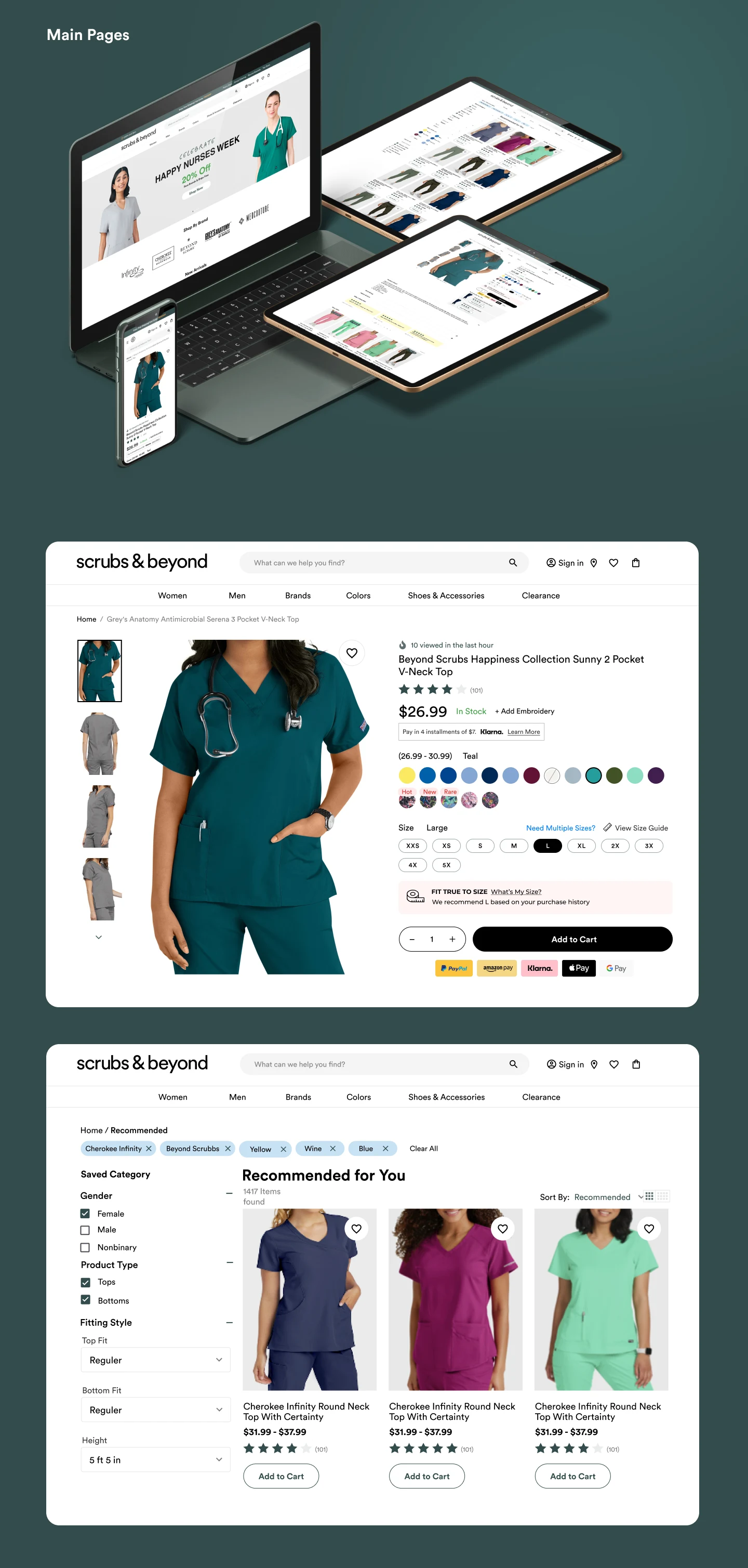
Product Details
Design Process
1. Information Architecture
I reorganized the product structure into clearer categories and simplified navigation so customers could reach products with fewer clicks.
2. User Flows
Designed streamlined user journeys for:
Browsing collections
Product search
Filtering products
Viewing product details
Adding items to cart
Checkout
Every flow was optimized to reduce cognitive load and eliminate unnecessary decisions.
3. Wireframing
Low-fidelity wireframes helped validate layout decisions before moving into visual design.
This allowed rapid iteration around:
Homepage hierarchy
Product listings
Product pages
Shopping cart
Checkout
4. Visual Design
The interface was designed to feel clean, modern, and trustworthy.
Design principles included:
Generous white space
Strong typography hierarchy
High-quality product imagery
Clear CTAs
Accessible color contrast
Mobile-first responsiveness
This enables users to compare products more efficiently.
Streamlined Checkout
The checkout process was simplified by removing unnecessary distractions and creating a clear step-by-step purchase flow.
The result is a faster, more confident buying experience.
Responsive Experience
Every screen was optimized for desktop, tablet, and mobile, ensuring a consistent experience regardless of device.
Results
The redesigned experience delivers:
✓ Faster product discovery
✓ More intuitive navigation
✓ Improved visual hierarchy
✓ Stronger premium brand perception
✓ Better mobile usability
✓ Scalable UI foundation
✓ Conversion-focused shopping experience
✓ Faster product discovery
✓ More intuitive navigation
✓ Improved visual hierarchy
✓ Stronger premium brand perception
✓ Better mobile usability
✓ Scalable UI foundation
✓ Conversion-focused shopping experience
What I Learned
Designing for healthcare professionals reinforced the importance of simplicity and speed.
Users often shop during short breaks or after long shifts, making efficiency critical. Every interaction should reduce effort, build confidence, and help users complete their purchase quickly.
By combining thoughtful UX strategy with a modern visual language, the redesigned experience creates a shopping journey that is both engaging and practical while supporting S&B's long-term digital growth.
Ready to Build a Product Your Users Will Love?
Great products aren't just beautiful they solve real problems, simplify complex workflows, and drive measurable business growth.
If you're building a SaaS platform, AI product, dashboard, or modern eCommerce experience, I'd love to help transform your vision into a polished, scalable product that users enjoy using.
Send me a message, and let's discuss your goals, challenges, and how thoughtful product design can help your business grow.
Like this project
Posted Aug 30, 2025
Design for S&B, a leading e-commerce store for nursing scrubs.
Likes
1
Views
10
Timeline
Nov 21, 2024 - Feb 14, 2025