My Product - UX/UI (SaaS)
Karan Singh
My Product - SaaS Platform
Transforming Complex Operations and Analytics into an Intuitive, Centralized Dashboard Experience.
Project Overview
Role: Lead UX/UI Designer (UX Architecture, Interface Design, System Layout)
Timeline: 2023
Tools Used: Figma
The Deliverable: End-to-end Web SaaS Application & Responsive Dashboard Ecosystem
1. The Challenge & Context
The client approached me at an early stage of product definition. Aside from a foundational logo, there was no established design system, user flow, or interface layout.
The core mission was to build a comprehensive SaaS platform that helps modern businesses monitor daily operations, organize complex work workflows, and visualize dense analytics data in one centralized hub. The chief obstacle was data density: building a system capable of handling extensive corporate metrics without causing cognitive overload or user fatigue.
The Core Problem Statement: How can we synthesize high-density corporate operational data and analytics into a cohesive, scalable UI that looks clean, operates seamlessly, and reduces friction for daily business operators?
2. Design Strategy & UX Architecture
Stepping into an early-stage project required defining the core product structure before laying down a single pixel. I focused heavily on establishing an intuitive information architecture.
User Research & Core Insights
Through stakeholder alignment and analysis of operational workflows, a few clear principles emerged:
The "Three-Second" Rule: Busy operators need to assess daily health metrics within three seconds of opening the main dashboard.
Flexibility Matters: A platform catering to various operational branches needs modularity—layouts must be easily scannable and context-aware.
System Scalability: The UI components needed a robust, atomic structure to handle future features as the SaaS tool scales.
Information Architecture Layout
└── Centralized Hub
├── Deep Analytics (Data Visualization & Reports)
├── Operational Center (Task & Workflow Management)
└── System Settings & Management Layouts
3. High-Fidelity UI Design
Moving into high-fidelity mockups, I designed a crisp, professional, and accessible SaaS interface optimized for long production hours.
Design System & Visual Strategy
Typography & Hierarchy: Established a clean, highly legible font scale built for numerical clarity and clean tabular data layouts.
Color Psychology: Leveraged a clean, corporate-focused primary color scheme to promote focus, utilizing vibrant accent colors strictly for key interactive elements, health statuses (success, warning, critical), and distinct analytics graphs.
Component Modularity: Designed customized data cards, unified filter states, and clean sidebar drawers to maintain continuity across diverse platform modules.
4. Key Features & Solutions
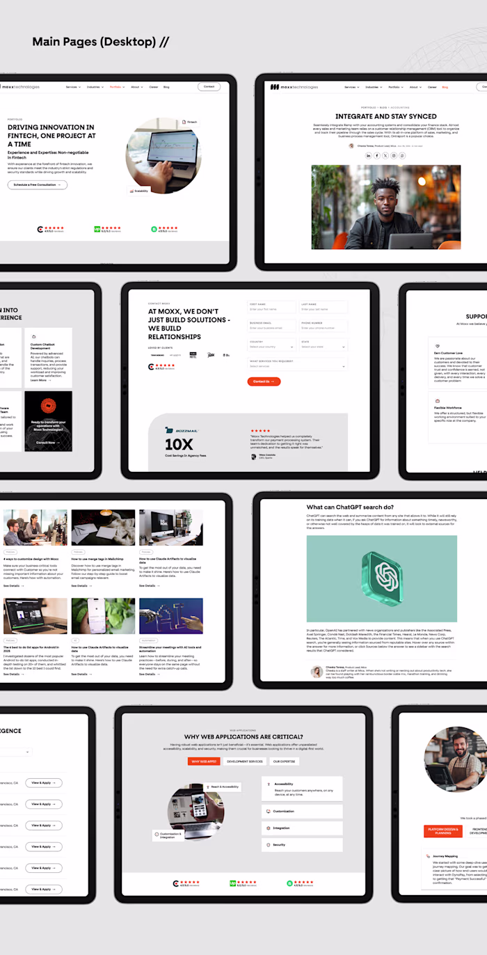
A. The Centralized Operations Dashboard
Instead of overwhelming users with numbers, the dashboard uses clear visual nesting. Micro-metrics are neatly organized inside cards, while major operational trends are prioritized using larger visual footprints.
B. High-Density Analytics & Data Visualization
Built custom charts and graphs designed for instant legibility. Users can quickly filter, slice, and scale datasets without having to dig through multi-layered menus.
C. Drawer & Amenities Layouts
To keep focus contextual, I integrated responsive side drawers and slide-outs. This allows users to view or edit deep structural details without losing their place in the broader application flow.
5. Results & Takeaways
The design successfully translated a vague, early-stage SaaS concept into a polished, market-ready corporate tool.
Design Scalability: By creating a thoroughly documented component library in Figma, engineering teams can build new modular blocks without breaking visual continuity.
Visual Clarity: Transitioning from data-heavy screens to a balanced, white-space-optimized layout significantly lowered user friction and visual fatigue.
Impact: The case study acts as a robust testament to how structural clarity and precise layout design can elevate complex, functional platforms into engaging digital products.
Ready to turn complex workflows into intuitive user experiences?
I partner with forward-thinking teams to design scalable design systems and high-performing digital platforms. Let's discuss your product goals.
How I can help your team:
End-to-End Product Design: Shifting your product from a blank canvas to a validated, high-fidelity launch.
Scalable Design Systems: Building organized, atomic Figma components that hand off seamlessly to your developers.
UX/UI Audits & Optimization: Analyzing your existing interfaces to pinpoint drop-offs, fix visual clutter, and boost operational efficiency.
Ready to talk strategy? Click "Inquire" or drop a brief summary of your project requirements, and let’s schedule a brief discovery call.
Like this project
Posted Dec 28, 2023
Designed a modern SaaS dashboard focused on workflow management, analytics, and streamlined user experiences for better productivity.