Motus Gratis: Mindful Movement in Logo Design
For Motus Gratis, an eco-conscious athleisure brand, I designed a logo that balances outdoor adventure with inner exploration. This project is simultaenously also a redesign approach for their current logo. The old logo looks like the following:

Current/ old logo of motus gratis
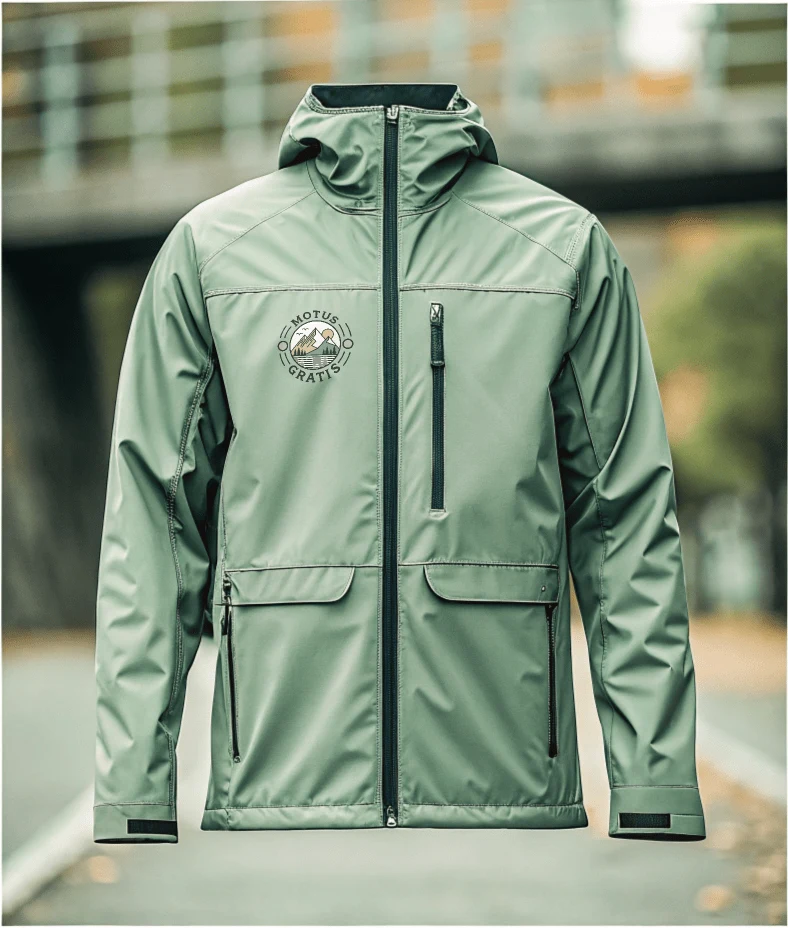
The new approach and design for the logo comes through as the following:
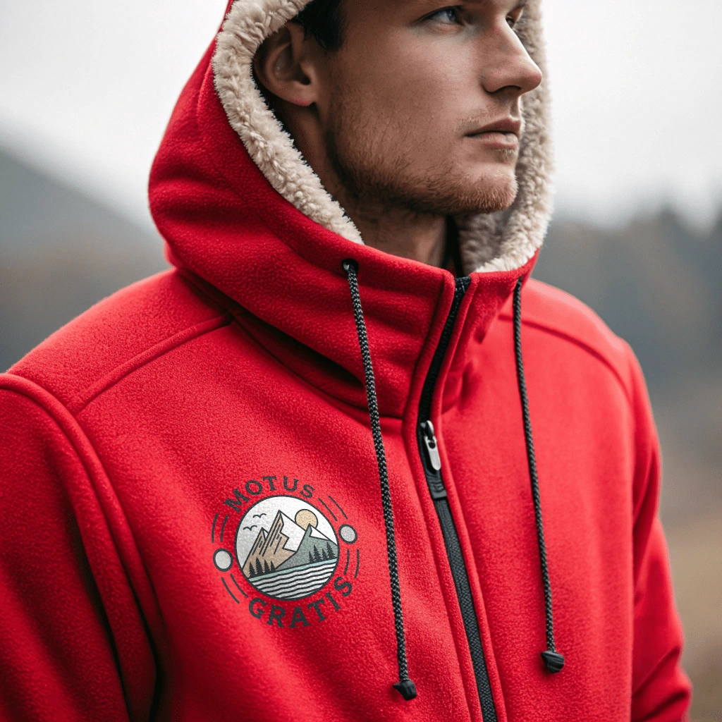
new logo on an Outdoor Jacket
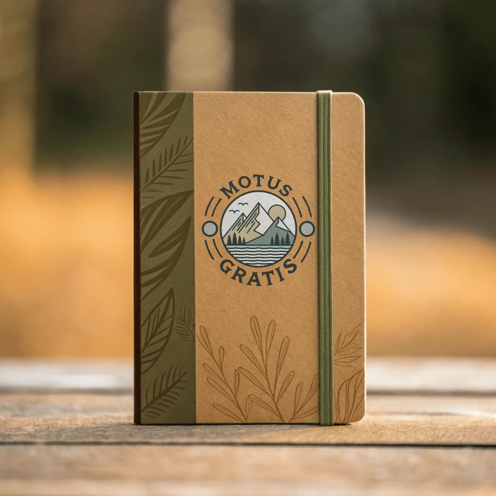
Key Elements for this design include:
Circular Design: Clean, balanced frame containing geometric mountain peaks and flowing lines, ensuring versatility across applications.
Natural Elements: Dual mountain peaks symbolize challenges and growth, while a subtle sun/moon element represents mindfulness and time.
Flow Elements: Wavy lines beneath mountains suggest movement, water, and breath - core elements of mindfulness practice.
Color Strategy: Earth-toned gradient flowing from forest green to ocean blue to grounding beige, reflecting brand values of sustainability and nature connection.
Balanced Proportions: Strategic placement of elements creates visual hierarchy while maintaining simplicity and recognition at various sizes.
The final design successfully merges athletic dynamism with mindful living, creating a versatile mark that works across digital and physical applications while embodying Motus Gratis's commitment to sustainable, conscious living.
Like this project
Posted Nov 22, 2024
Created brand identity for sustainable athleisure wear company. Designed logo combining mountain elements with flowing lines, representing mindfulnes adventure.
Likes
0
Views
33
Clients
Motus Gratis

