Portage Cars: Automotive Marketplace Redesign

Ella Sh.

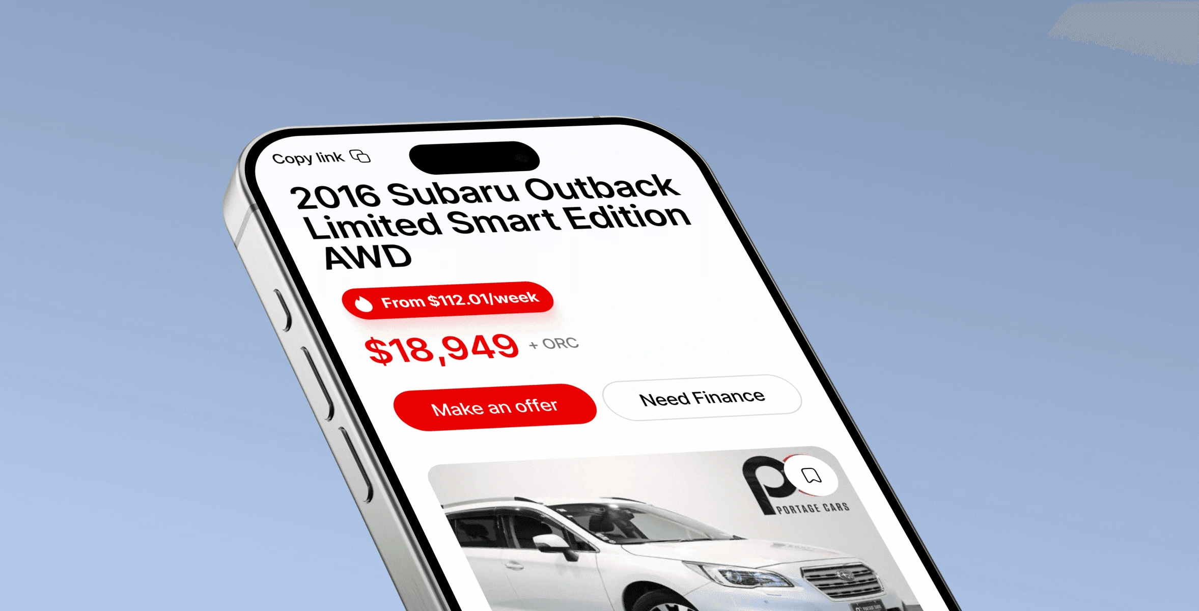
Portage Cars is one of New Zealand's largest used car dealerships, with six branches. The brand had a strong offline presence and a website that was not supporting one of its key business goals: generating leads and financing applications.
The audit found a structural problem, not a visual one. The interface lacked hierarchy and layouts were cluttered. Heavy use of red with oversized buttons created a sense of pressure rather than trust, which is the opposite of what you want when someone is deciding on a car. Content repeated itself, financial tools were poorly integrated, and contact forms were unnecessarily long. Meanwhile the trust signals that actually matter here, reviews, certifications, team visibility, were missing or buried.
Restructured, then redesigned. After aligning on priorities with the client I introduced clearer UX logic, simplified navigation, and rebuilt the key flows so the path from browsing to inquiry feels natural. The platform was rebuilt around clarity, transparency, and ease of use.
Visual recalibration. The signature red and blue were kept but used as accents rather than dominant elements. Lighter typography, more white space, and a clearer hierarchy to cut cognitive load.
Product presentation. Car listings were redesigned to carry complete, transparent information so people can compare options and decide with confidence. Filters and navigation were simplified toward the key actions. Structure was optimised for SEO at the same time, for long term visibility.
Result. A conversion oriented platform that reads clear and trustworthy, with a smoother journey from discovery to inquiry and a stronger brand perception. It works consistently across every device.
Timeline: 2 weeks. Year: 2025. I ran the audit and led the redesign.
Like this project
Posted Aug 28, 2026
UX/UI audit and redesign for one of New Zealand's largest used-car dealerships, rebuilt around lead generation and trust. Live at portagecars.co.nz.
Likes
0
Views
1
Timeline
Oct 1, 2025 - Nov 17, 2025