Too Yumm Packaging Design

Vishesh Mahendru


TooYumm:PackagingDesign
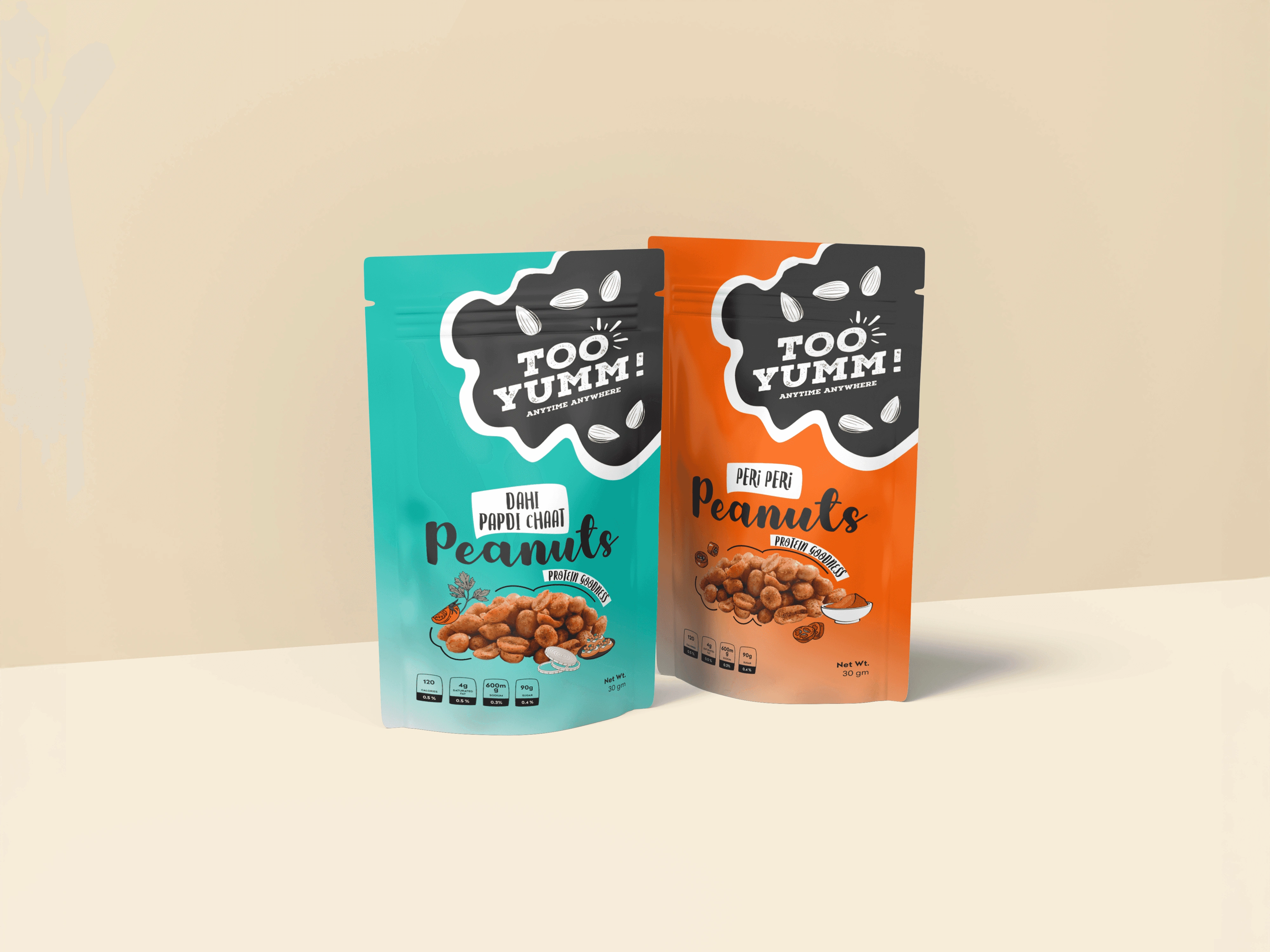
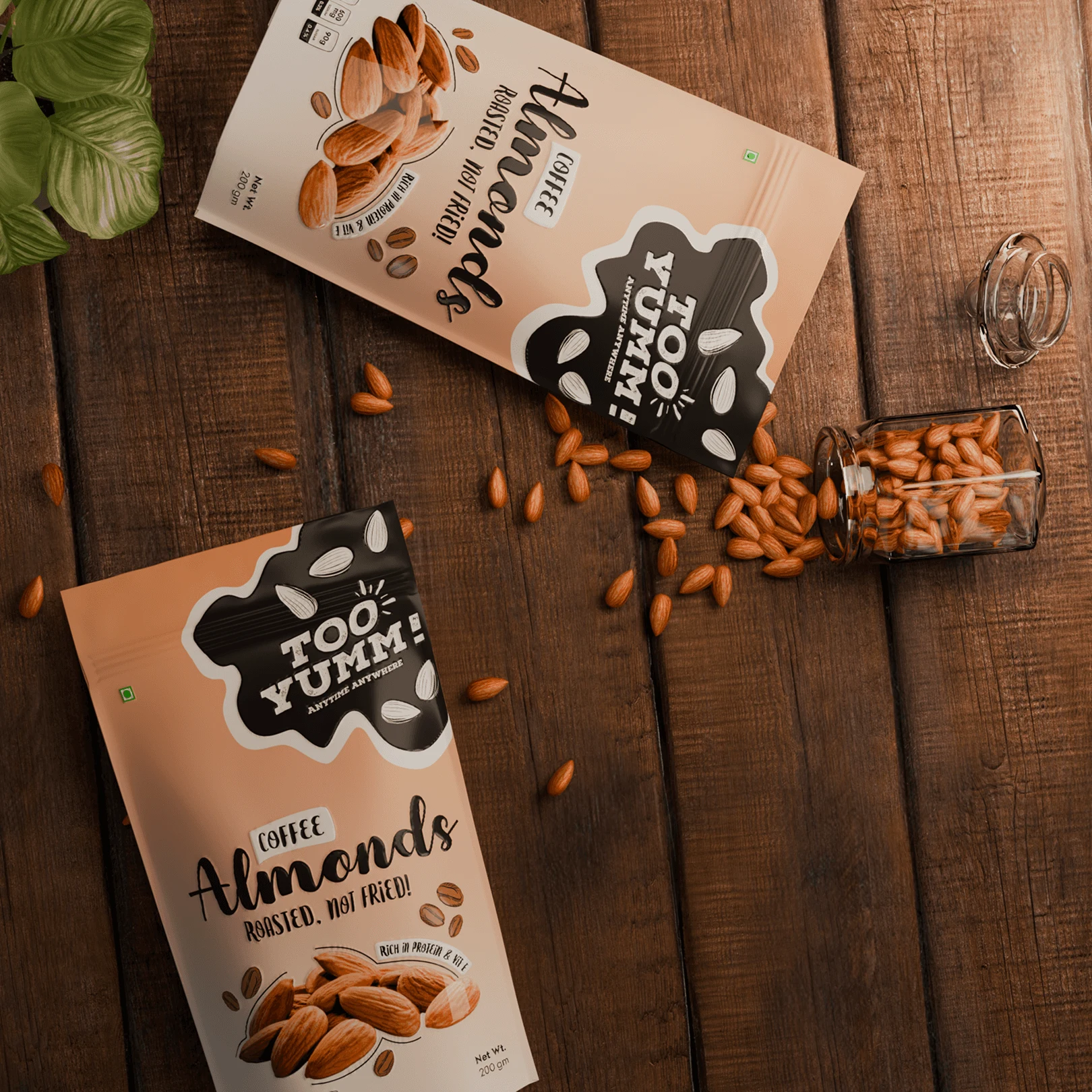
A bold and youthful packaging design for Too Yumm’s new line of flavored nuts — crafted to capture energy, flavor, and freshness while staying true to the brand’s fun, mass-appeal identity.
PACKAGING DESIGN
3D VISUALIZATION
This project was created while I was working as a part-time designer at Graphe in Kolkata, with valuable creative inputs and suggestions from the team. Too Yumm aimed to introduce a new range of healthy flavored nuts that felt energetic yet trustworthy. My goal was to bring that duality alive — crafting a packaging identity that felt flavorful, youthful, and confident on-shelf and online.
Problem
Flavored nuts are a highly competitive category dominated by cluttered visuals and inconsistent messaging. Too Yumm needed a design language that communicated freshness, flavor, and “roasted, not fried” health positioning in one clean visual frame.
The brief emphasized creating something visually punchy but not juvenile — something that consumers could trust as a healthier choice, while still connecting with the brand’s youth-centric tone. The packaging had to perform both online and on-shelf, with clear hierarchy, strong brand recall, and ingredient storytelling.
Concept
The idea was to personify flavor — giving each variant its own visual character through color and illustration. Instead of treating the packaging as static, it became a storytelling surface that hints at the experience inside the pouch.
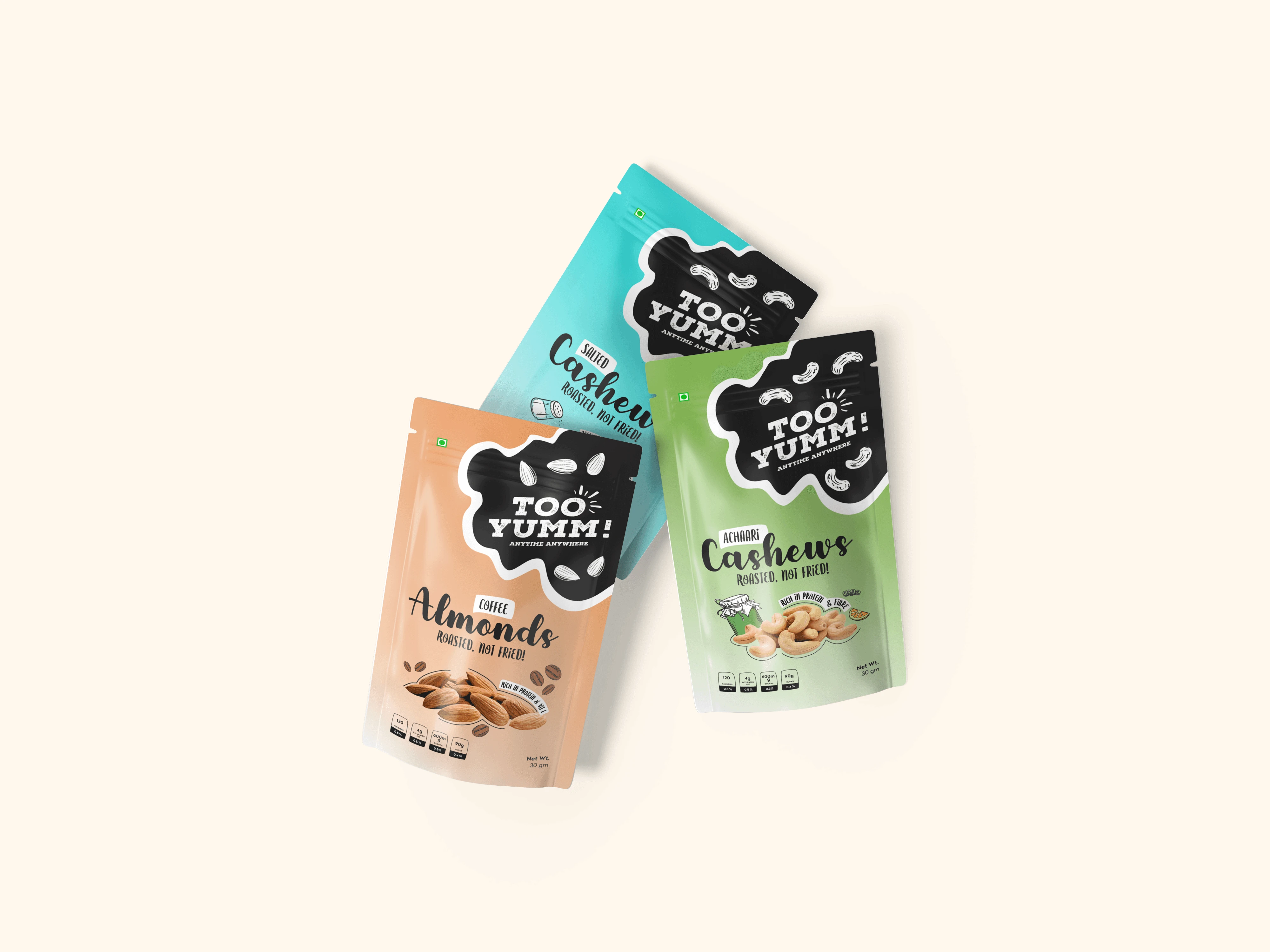
I built the visual system around vibrant color palettes that tied directly to each flavor (like green for Garden Green Tea, orange for Achari Cashews, etc.). Hand-drawn illustrations of ingredients and playful typography added a sense of movement and freshness. The front panel layout kept the Too Yumm logo as a confident anchor, while key info like “Roasted, Not Fried” and nutritional highlights were strategically placed for quick readability.
Solution
The final outcome was a cohesive, flexible packaging system that balances function and emotion — easy to scale across flavors and sizes, yet distinct in every variant.
Rendered in 3D for presentation using Blender and Photoshop, the visuals captured realistic material behavior and shelf presence. Each pack tells a micro-story: approachable, flavorful, and visually loud enough to break the monotony of its category. The result is a packaging line that feels fresh, confident, and unmistakably Too Yumm.
Like this project
Posted May 28, 2026
Designed impactful packaging for Too Yumm's new flavored nuts line, blending freshness and youthfulness.
Likes
0
Views
0