Shard — Real Estate Co-Ownership | Brand Identity & UI/UX

Mehar Hassan


SHARD
Own Together. Live Better.
Brand Identity / Creative Direction / UI/UX Design / Web Design / Digital Experience
A New Perspective on Real Estate Ownership
Making extraordinary properties feel more accessible through thoughtful design.
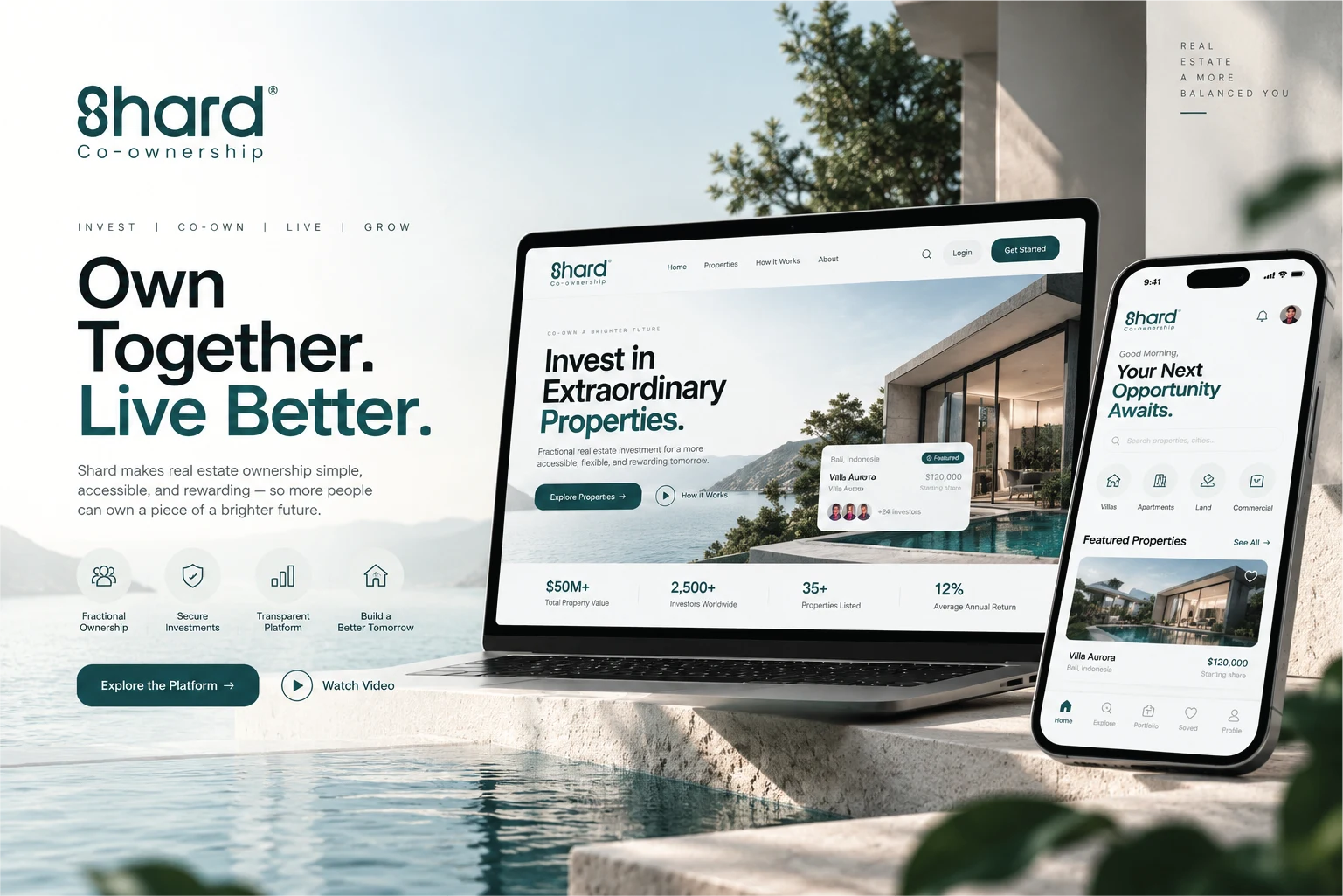
Shard is a conceptual real estate co-ownership platform that explores a modern approach to property investment.
Built around the idea that premium real estate ownership doesn't have to be an individual journey, Shard introduces a digital experience where people can discover exceptional properties, explore fractional ownership opportunities, and understand potential investments through a clean, intuitive interface.
The vision was to create a complete brand and digital experience that feels as premium as the properties themselves.
From the distinctive visual identity to responsive website layouts, interactive component concepts, and investment tools, every element was designed to communicate simplicity, confidence, and sophistication.
The idea: Own Together. Live Better.
01 / The Challenge
Making Complex Investments Feel Simple.
Real estate investment can feel intimidating, particularly when ownership structures, financial calculations, and property information become complicated.
The challenge was to imagine a digital experience that removes unnecessary visual complexity while preserving the detail investors need to explore opportunities.
Shard needed to communicate three essential values:
Accessibility
Make the concept of fractional ownership approachable through clear information architecture and intuitive user journeys.
Trust
Establish a credible visual language using refined typography, structured layouts, and consistent design patterns.
Premium Experience
Reflect the quality of luxury properties through beautiful imagery, sophisticated colors, and carefully balanced compositions.
The objective wasn't simply to make a property website look attractive. It was to design a cohesive experience that connects brand perception, property discovery, and investment exploration.
02 / Brand Strategy & Creative Direction
A Modern Approach to Real Estate Ownership.
The creative direction for Shard was inspired by the intersection of contemporary architecture, financial technology, and accessible luxury.
The visual identity embraces the sophistication of premium real estate without the unnecessary complexity often associated with financial platforms.
Brand Personality
Modern and sophisticated
Approachable and transparent
Premium yet understated
Trustworthy and structured
Confident and forward-thinking
The Creative Concept
INVEST / CO-OWN / LIVE / GROW
Four simple ideas form the foundation of the brand's communication.
The identity is designed to feel equally natural across luxury property photography, website interfaces, mobile applications, and marketing materials.
Rather than competing with architecture and property imagery, the visual language complements them.
The result is a brand experience that feels calm, confident, and intentionally designed.
03 / Logo & Visual Identity
One Symbol. Shared Possibilities.
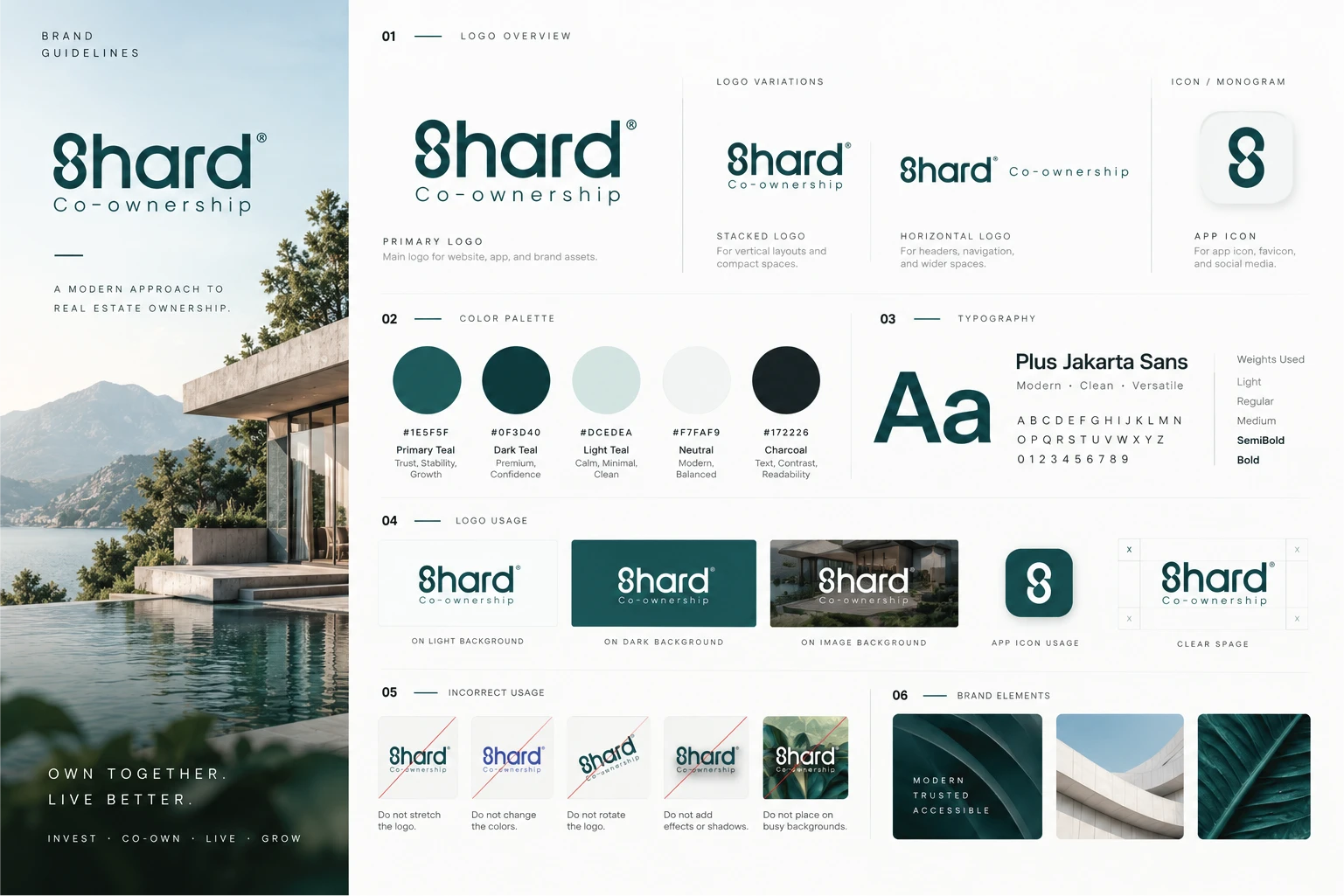
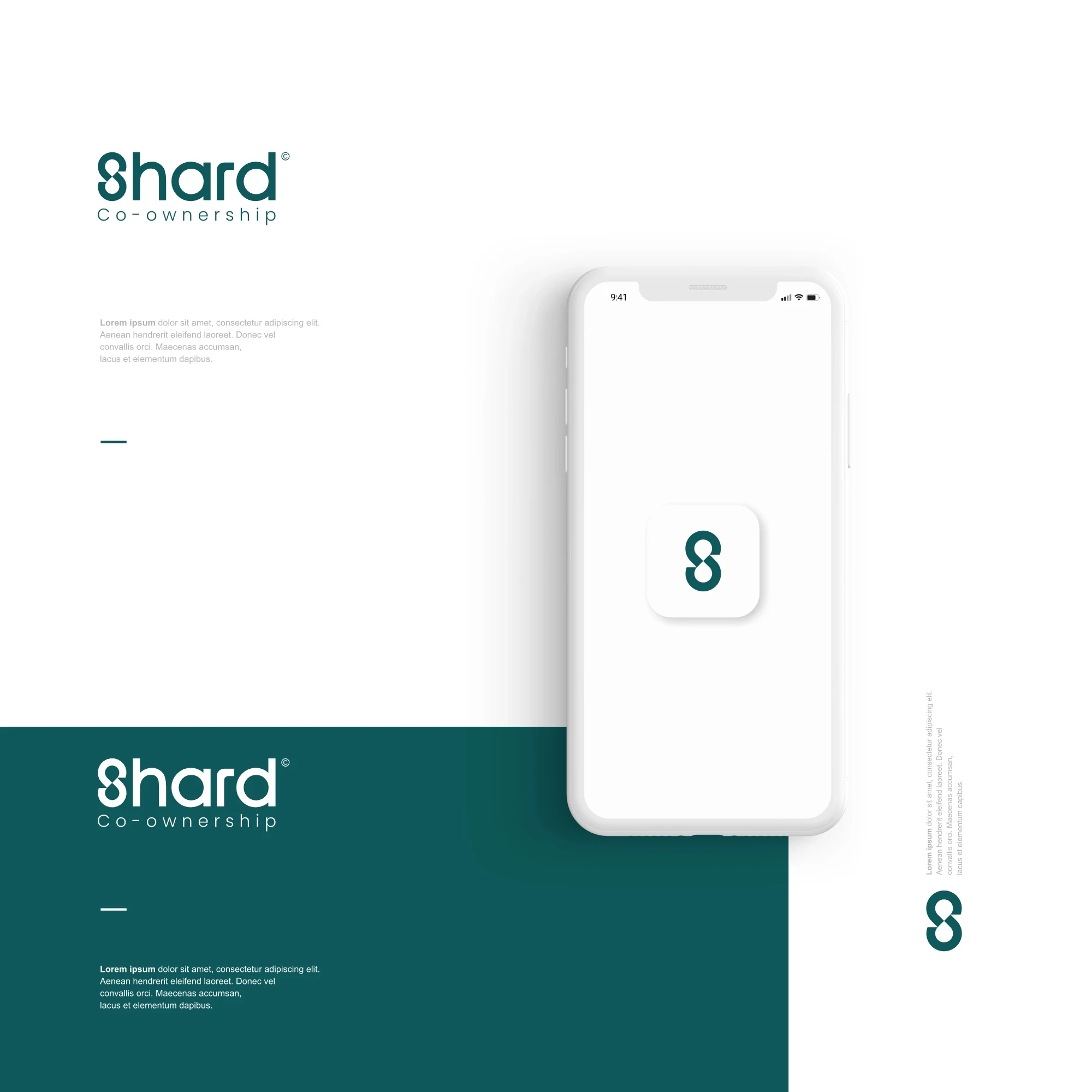
The Shard visual identity features a distinctive custom wordmark and an interconnected monogram.
The symbol's continuous form suggests connection, unity, and shared opportunity — visually supporting the concept of co-ownership.
Its minimal structure allows the identity to remain recognizable across applications, from full-size website headers to compact app icons.
Identity System
The brand presentation includes:
Primary wordmark
Horizontal and stacked logo configurations
Standalone monogram
Light and dark logo variations
Logo usage on photographic backgrounds
Clear-space and incorrect-usage guidelines
The goal was to establish a flexible identity that feels professional in financial contexts while remaining visually distinctive within the real estate industry.
04 / Color Palette & Typography
Colors That Communicate Confidence.
Shard's color system draws inspiration from coastal architecture, natural landscapes, and contemporary luxury.
A refined teal palette establishes the brand's personality, supported by light neutrals and charcoal typography.
Primary Teal — #1E5F5F
The central brand color, communicating stability, confidence, and a modern premium character.
Dark Teal — #0F3D40
Introduces depth and sophistication, particularly across navigation, buttons, and prominent interface elements.
Light Teal — #DCEDEA
Provides softer supporting tones for cards, icon backgrounds, and secondary interface elements.
Neutral — #F7FAF9
Creates open, minimal layouts with generous visual breathing room.
Charcoal — #172226
Ensures readable, high-contrast typography throughout the experience.
Typography — Plus Jakarta Sans
Plus Jakarta Sans was selected for its contemporary geometry, excellent readability, and ability to balance sophistication with simplicity.
Bold and semibold weights establish strong headlines, while regular and lighter styles support product details, descriptions, navigation, and interface labels.
Together, typography and color create a visual system that feels consistent across branding and digital products.
05 / Website Experience
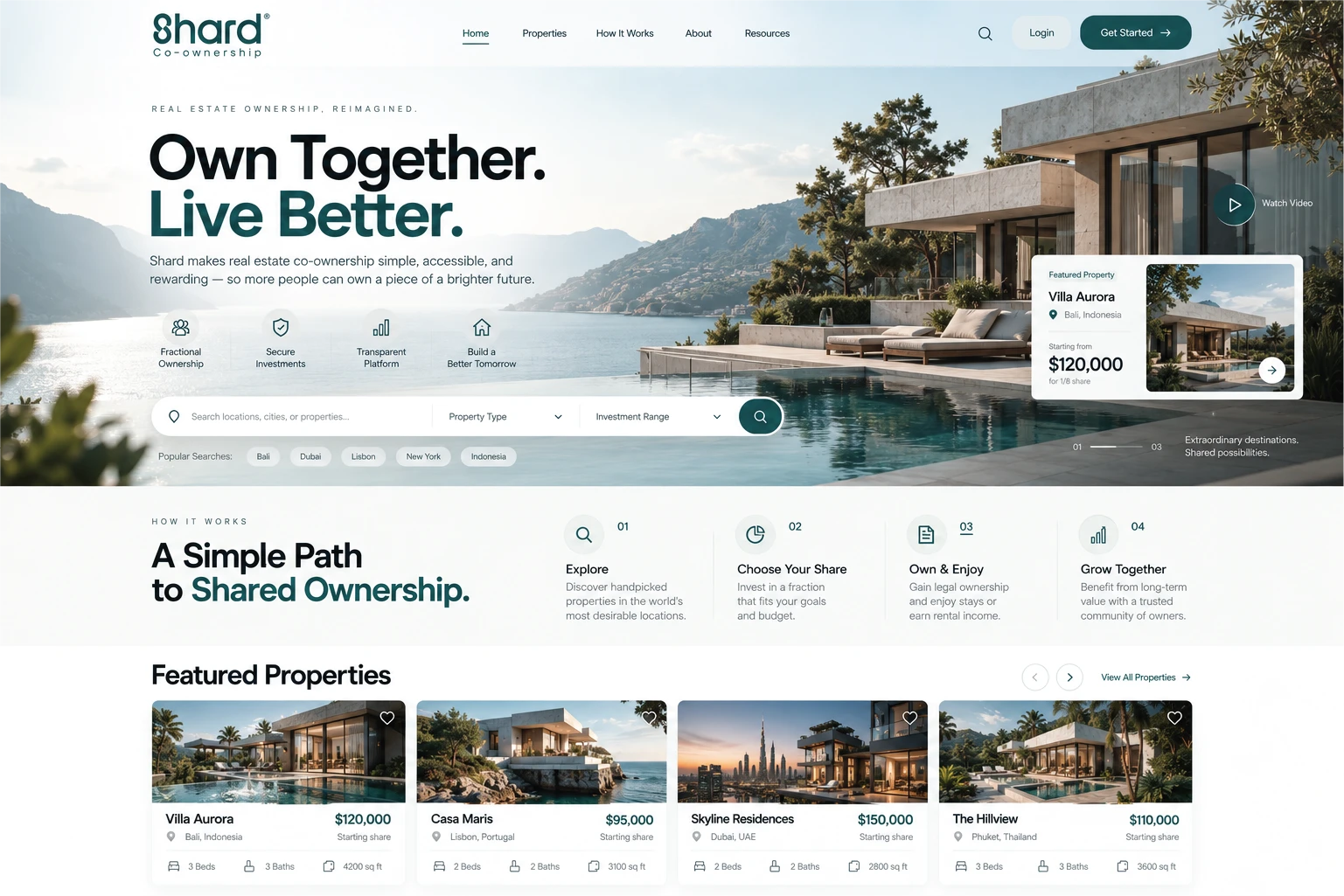
Discover Extraordinary Properties.
The website was designed around one central principle: helping users discover and explore properties without unnecessary friction.
The interface combines premium architectural photography with a clear content hierarchy, structured filtering, and an intuitive browsing experience.
Instead of presenting users with overwhelming information, the platform concept organizes property discovery into approachable steps.
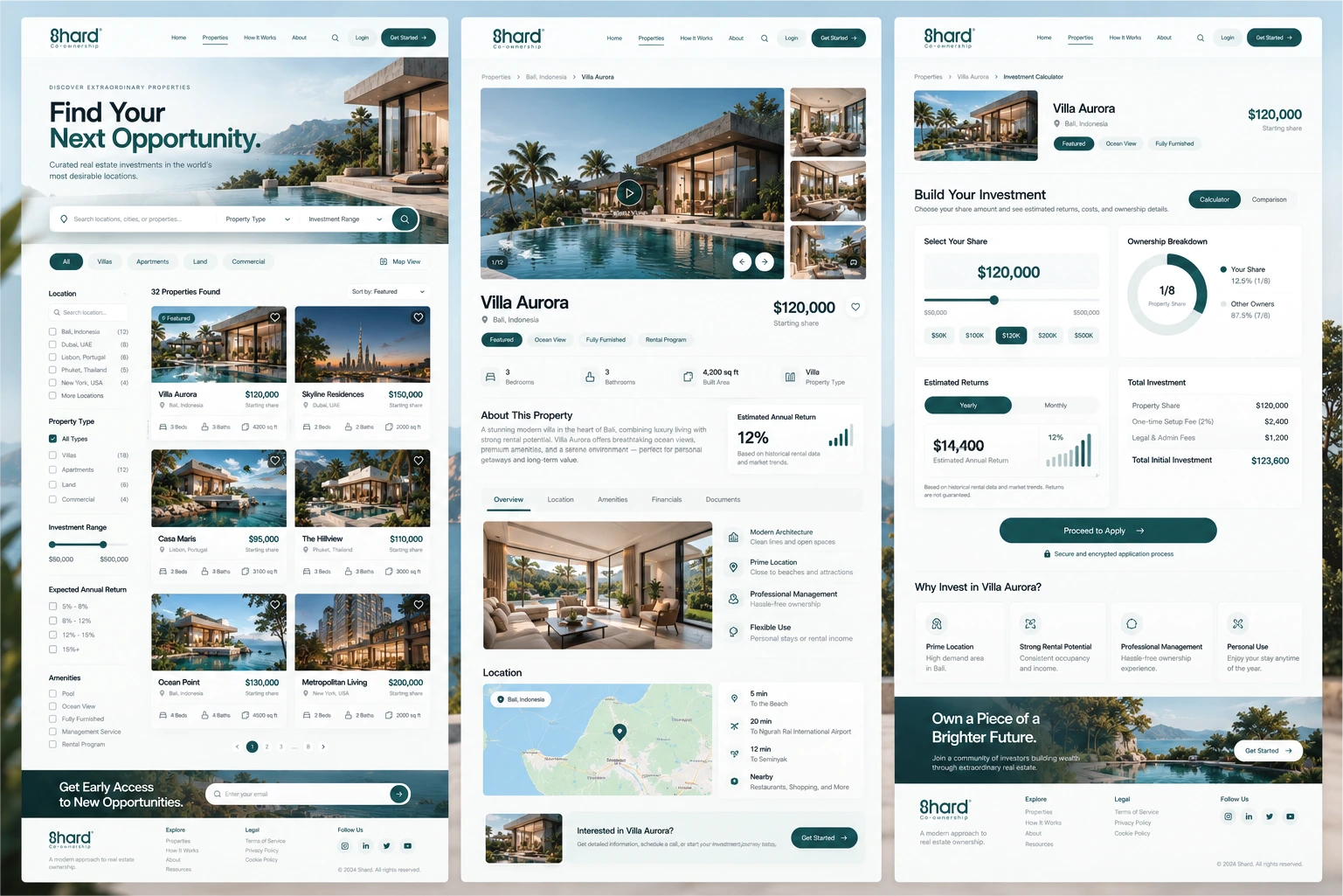
Property Discovery Page
The discovery experience includes:
Location-based search
Property type filters
Investment range controls
Expected return filters
Property amenities
Featured property cards
Grid-based property browsing
Map-view option
Each property card highlights essential information such as location, starting share price, property type, and key features.
The result is a visually balanced discovery interface that combines the emotional appeal of premium property imagery with practical information.
06 / Property Detail Experience
Every Detail. One Seamless Experience.
The property detail page was created to help potential investors understand a property before exploring an ownership opportunity.
The concept features an immersive image gallery alongside structured property information.
Rather than relying on lengthy, unorganized descriptions, information is divided into logical sections.
Key Features
Property Overview
A clear introduction to the property, highlighting its architecture, location, and essential specifications.
Visual Gallery
Large property photography paired with supporting images to create an engaging visual experience.
Property Information
Bedrooms, bathrooms, floor area, property type, and other essential details organized into accessible information blocks.
Location Exploration
An integrated map concept with nearby landmarks and travel-related information.
Ownership Information
Clearly presented details that guide visitors toward the next stage of exploring a potential investment.
Every section uses consistent components, spacing, typography, and iconography to support intuitive navigation.
07 / Investment Calculator UI
Turning Complex Numbers Into Clear Decisions.
One of the central interface concepts is Shard's interactive investment calculator.
The calculator was designed to make fractional ownership easier to explore through a visual, approachable interface.
Rather than displaying financial information in dense tables, the design organizes key figures into simple, digestible components.
Calculator Components
Investment Share Selection
A slider and predefined values allow users to visualize different ownership amounts.
Ownership Breakdown
A circular visualization illustrates the relationship between an individual's ownership share and other owners.
Estimated Returns
A dedicated panel presents hypothetical return scenarios with supporting charts and clear numerical hierarchy.
Total Investment
An itemized summary separates property share costs from additional fees to make the overall amount easier to understand.
Application Journey
A prominent call to action creates a clear next step after reviewing the investment details.
The calculator showcases how thoughtful UI design can translate complex financial information into an approachable digital experience.
All financial figures, returns, and property data shown in this concept are illustrative and should not be interpreted as verified investment performance.
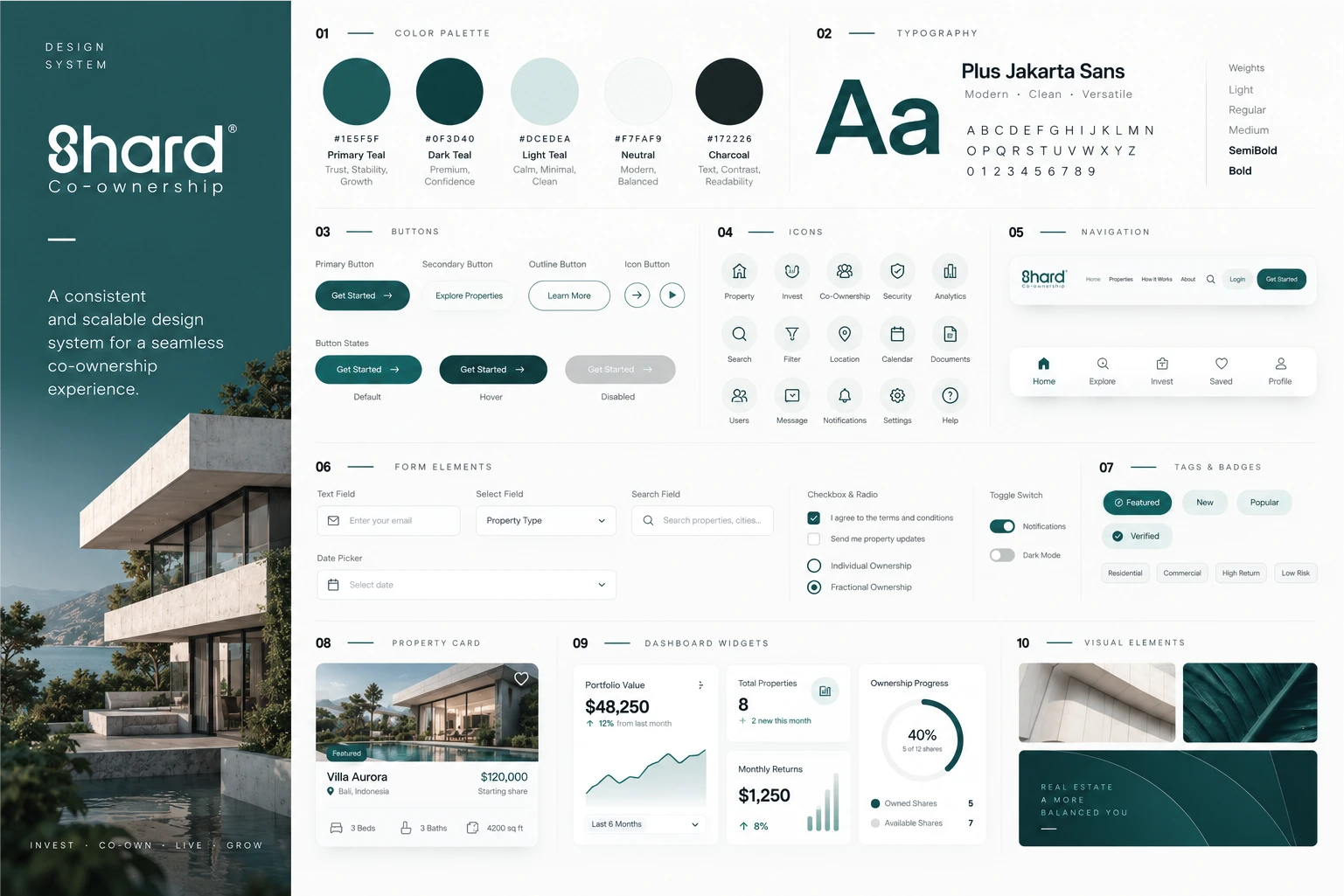
08 / Design System & UI Components
Built for Consistency. Designed to Scale.
A strong digital product requires more than attractive individual pages.
To establish consistency across the platform concept, I developed a structured visual design system covering the key interface patterns.
Core Components
Buttons
Primary, secondary, outlined, and icon-based button styles with defined visual states.
Navigation
Consistent desktop navigation and mobile navigation concepts built around simplicity and discoverability.
Forms & Inputs
Search fields, dropdowns, checkboxes, radio controls, date pickers, and selection components.
Property Cards
Reusable listing components that combine large property imagery with essential financial and property details.
Dashboard Widgets
Visual components for portfolio value, ownership progress, hypothetical returns, and investment summaries.
Icons
A coordinated icon library covering properties, investments, security, location, analytics, notifications, and account actions.
Tags & Badges
Subtle labels for featured properties, availability, and property categories.
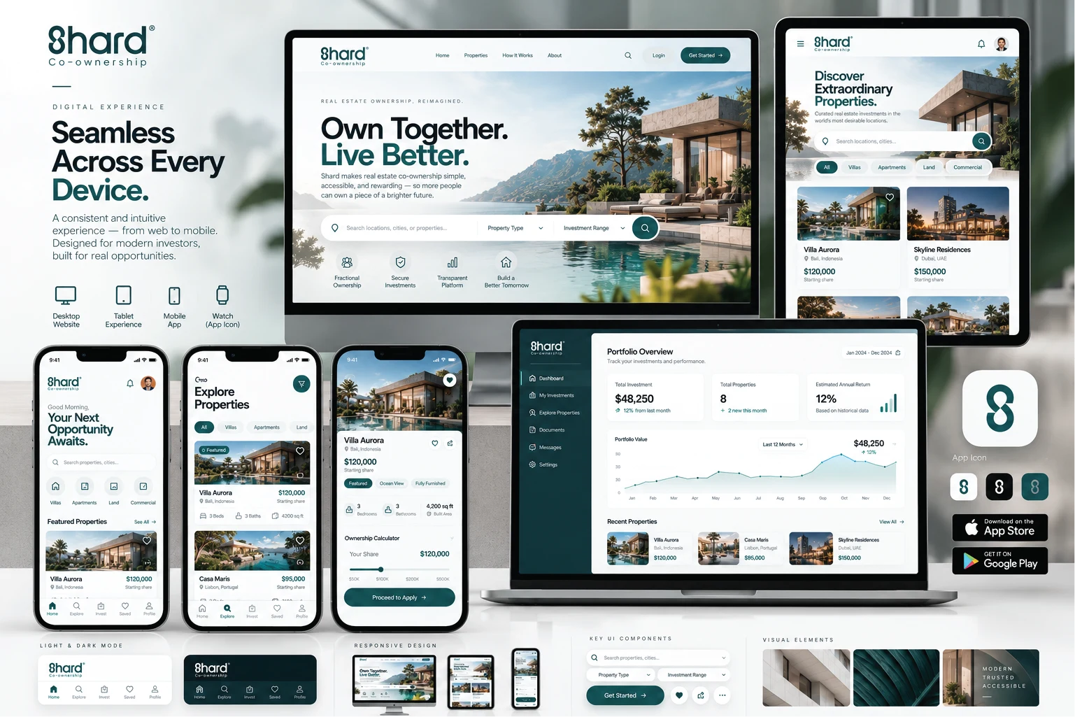
The system uses consistent spacing, rounded components, typography, and teal accents to maintain a polished interface across different screens.
09 / Responsive & Mobile Experience
A Seamless Experience Across Devices.
Shard's digital direction extends beyond desktop layouts.
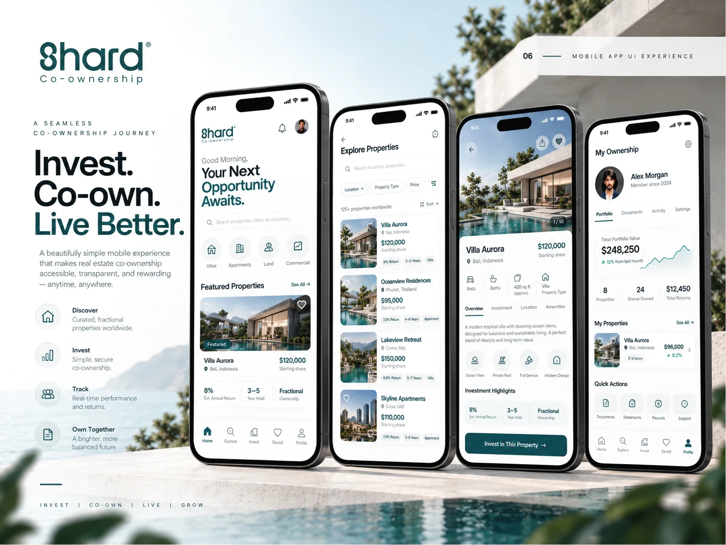
The mobile experience was designed to preserve the platform's visual identity while adapting navigation, content hierarchy, and property discovery to smaller screens.
Mobile Design Priorities
Simplified Navigation
Compact navigation patterns keep essential destinations within easy reach.
Property-First Discovery
Large property imagery, recognizable listing cards, and clear search tools prioritize the browsing experience.
Consistent Visual Language
The same typography, color palette, iconography, and interface components create continuity between desktop and mobile designs.
Focused User Experience
Clear calls to action and organized content reduce unnecessary distractions.
The objective was to create a flexible digital experience that feels naturally designed for each device rather than simply shrinking the desktop interface.
10 / Visual Storytelling & Art Direction
Luxury in Every Detail.
The visual direction uses architectural photography to establish an emotional connection with the brand.
Modern villas, open landscapes, coastal views, natural lighting, and understated interiors reinforce Shard's premium positioning.
Photography and interface design work together rather than competing for attention.
This approach extends throughout the brand presentation:
Architectural lifestyle imagery
Minimal editorial layouts
Premium website presentations
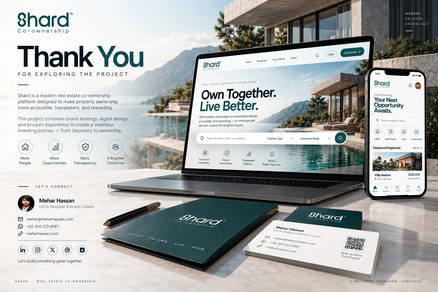
Desktop and mobile device mockups
Refined color and typography systems
Consistent brand applications
Every composition was developed to communicate the same central message: modern ownership, shared opportunity, and a better digital experience.
11 / The Final Outcome
A Connected Brand & Digital Experience.
Shard brings together brand identity, creative direction, UI/UX design, and product thinking into a cohesive real estate platform concept.
The final work demonstrates how a consistent design system can support both emotional storytelling and functional digital experiences.
From the recognizable logo and sophisticated teal palette to property discovery, detailed listings, investment calculator concepts, and mobile interfaces, every element is part of one connected design language.
The project illustrates a modern approach to PropTech design — combining the aspirational qualities of luxury real estate with the clarity expected from a digital financial experience.
What This Project Represents
A complete design exploration focused on:
A distinctive and scalable visual identity
Premium property discovery experiences
Clear presentation of complex information
Responsive website interface concepts
Reusable design-system components
Consistent visual communication across touchpoints
One Identity. One Experience. Endless Possibilities.
Project Information
Project: Shard — Real Estate Co-Ownership
Industry: PropTech / Real Estate / Investment Technology
Project Type: Conceptual Branding & Digital Product Design
Creative Scope:
Brand Identity / Logo Design / Creative Direction / UI/UX Design / Responsive Web Design / Design System / Digital Product Concept / Visual Presentation
Typography: Plus Jakarta Sans
Creative Direction: Premium, Minimal, Architectural, Modern
Designed by Mehar Hassan
Brand Designer • Visual Designer • Creative Builder
Website: meharhassan.com
Own Together. Live Better.
Hope you guys enjoy.
Do you want a new website design, I am available for work.
CONTACT ME
-----------------------
📧 hello@meharhassan.com
📱WhatsApp: +92 3224437730
Instagram: www.instagram.com/mehardesignx
Website: www.meharhassan.com
Like this project
Posted Oct 30, 2026
A premium real estate platform concept featuring brand identity, responsive website design, property discovery, and investment tools.
Likes
0
Views
1
Clients
Shard