Kratom Online: Nature-Inspired Brand Identity

Mehar Hassan


Kratom Online
A Nature-Inspired Brand Identity & Digital Experience
Brand Identity • Packaging Design • Creative Direction • Social Media • UI/UX Design
Project Overview
Kratom Online is a nature-inspired e-commerce branding concept built around simplicity, authenticity, and a modern visual experience.
The vision was to create a distinctive identity that feels organic yet premium, bringing together natural elements, thoughtful typography, elegant packaging, and a cohesive digital presence.
My goal was to develop more than a recognizable logo. I wanted to establish a complete visual language that could extend seamlessly across product packaging, social media, marketing materials, and an online shopping experience.
The result is a unified brand concept where every touchpoint shares the same personality, design principles, and attention to detail.
01 — The Creative Challenge
In a visually crowded marketplace, creating a recognizable identity requires more than attractive graphics.
The challenge was to balance three essential qualities:
Natural: Establish a visual connection with botanical origins through organic imagery, earthy tones, and nature-inspired elements.
Premium: Create polished packaging and brand applications that feel refined and professionally crafted.
Modern: Develop a clean, flexible identity that works consistently across physical products and digital platforms.
The overall direction needed to feel approachable without becoming generic, and sophisticated without losing its natural character.
02 — Brand Strategy & Creative Direction
Concept: Rooted in Nature. Designed for Modern Living.
The visual direction centers around organic simplicity.
Rather than relying on complicated illustrations or excessive decoration, I built the identity around a carefully selected green palette, expressive botanical photography, clean typography, and consistent graphic elements.
The result is a brand system that feels calm, recognizable, and adaptable across different applications.
Key Creative Principles
Organic Simplicity
Natural textures, botanical photography, and subtle leaf illustrations establish a connection to the brand's identity.
Visual Consistency
A structured design system ensures that colors, typography, icons, and layouts work together across every medium.
Modern Minimalism
Generous whitespace, carefully balanced compositions, and clear typography create a premium visual experience.
03 — Logo & Visual Identity
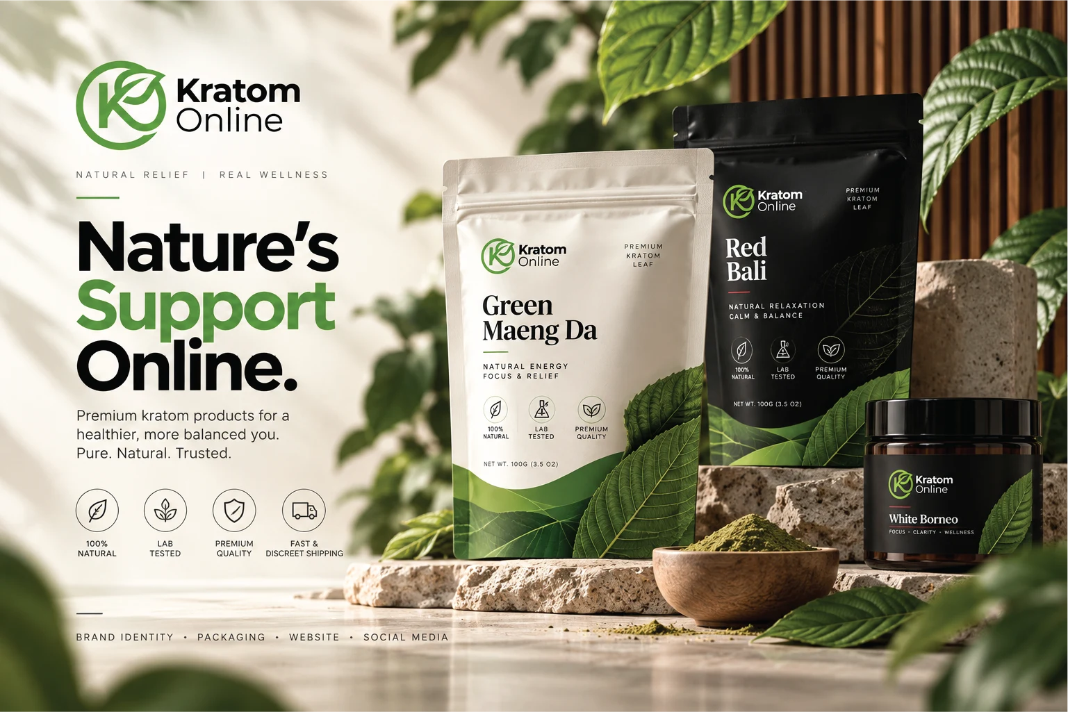
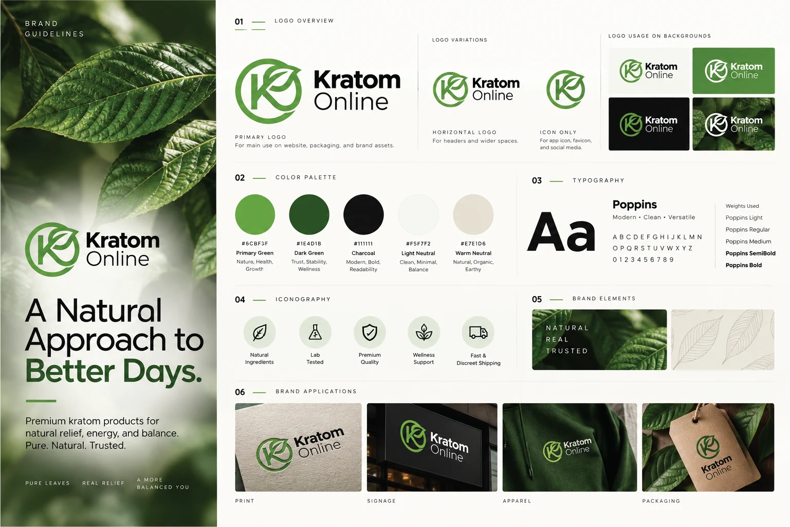
The Kratom Online logo combines a custom circular monogram with a stylized leaf symbol.
The letterform and botanical element work together to create a distinctive mark that communicates the nature-inspired positioning of the brand.
The identity includes:
Primary logo
Horizontal logo variation
Standalone brand symbol
Light and dark applications
Logo usage across different backgrounds
The icon was designed to remain recognizable at different sizes, from packaging and signage to mobile interfaces and social media profiles.
04 — Color Palette & Typography
A Palette Inspired by Nature
The visual identity uses a refined combination of botanical greens and soft neutral tones.
Primary Green — #6CBF3F
Brings freshness and a recognizable natural character.
Dark Green — #1E4D1B
Adds depth, balance, and a premium visual feel.
Charcoal — #111111
Provides strong contrast and readability.
Light Neutral — #F5F7F2
Creates clean, spacious backgrounds for modern layouts.
Warm Neutral — #E7E1D6
Introduces warmth and an organic, earthy aesthetic.
Typography — Poppins
Poppins was selected as the primary typeface for its modern geometric structure, readability, and versatility.
Bold weights establish strong visual hierarchy, while lighter weights provide balance and clarity throughout brand communications.
Together, the typography and color system create a recognizable and cohesive identity.
05 — Product Packaging Design
Packaging was one of the central elements of the project.
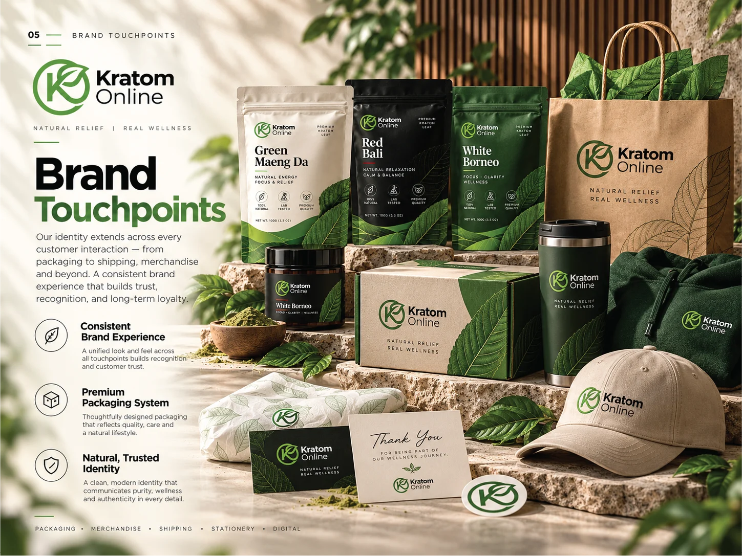
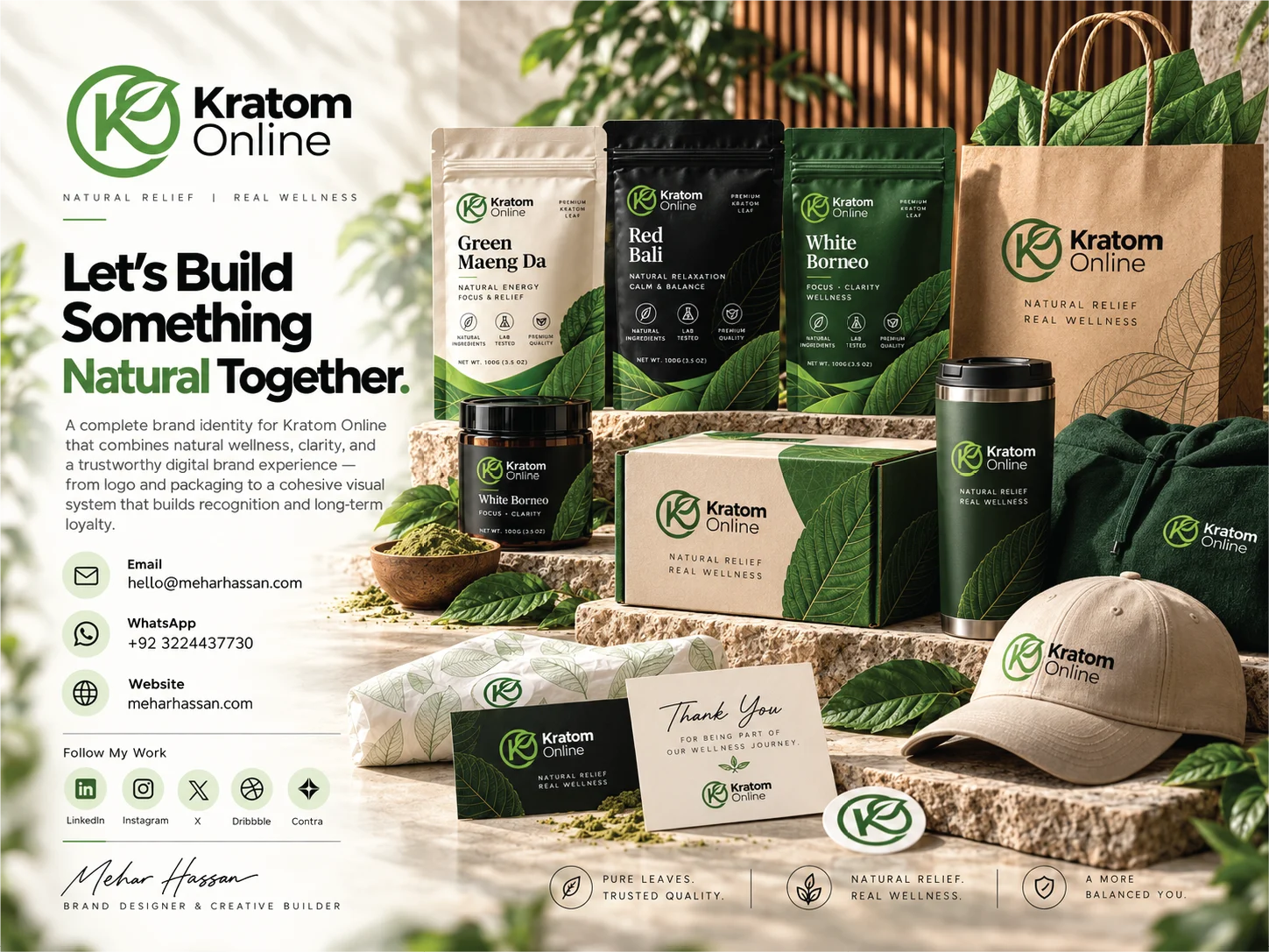
I developed a unified visual direction for multiple product variations, ensuring that each package maintains a recognizable brand identity while allowing individual products to stand apart.
The packaging concepts include:
Green Maeng Da
Red Bali
White Borneo
Product pouches and containers
Shipping boxes and branded bags
Supporting packaging accessories
Each design combines botanical illustrations, clear product typography, consistent logo placement, and a structured visual hierarchy.
Different color treatments help distinguish product variations while maintaining the same overall design language.
The objective was to create packaging that looks professional, feels premium, and remains visually consistent across the complete product collection.
06 — Social Media & Campaign Design
A strong brand identity should feel equally recognizable outside its packaging.
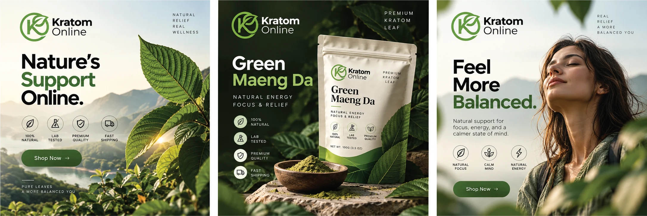
I extended the visual system into a series of social media graphics designed around nature-inspired imagery, product presentation, and modern editorial typography.
The campaign explores different visual approaches:
Brand Awareness
Nature-focused compositions, bold messaging, and distinctive brand colors.
Product Spotlight
Premium product photography and packaging-focused layouts that give individual products a clear visual presence.
Lifestyle & Brand Storytelling
Human-centered imagery combined with soft natural environments and thoughtful compositions.
Each design uses consistent typography, colors, iconography, and visual hierarchy to create a unified social media presence.
07 — Website UI/UX Design
The next stage was translating the physical brand identity into a digital shopping experience.
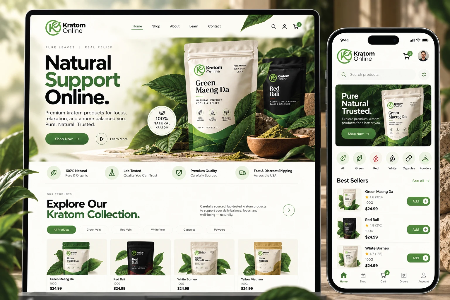
I designed a responsive e-commerce website concept that brings the botanical visual direction into a modern, intuitive interface.
The website combines large product imagery, structured layouts, clear navigation, and carefully placed calls to action.
Desktop Experience
The desktop design focuses on:
High-impact hero sections
Clear product categories
Featured product collections
Product cards with pricing and shopping actions
Consistent visual branding
Spacious layouts and readable typography
Mobile Experience
The mobile interface follows the same design principles while prioritizing ease of navigation and product discovery.
Key interface concepts include:
Mobile-friendly navigation
Search and category browsing
Product listings
Shopping cart access
Clear calls to action
Consistent layouts across screen sizes
The goal was to create a seamless visual connection between the product packaging and the online shopping experience.
08 — Brand Touchpoints & Applications
To demonstrate the flexibility of the identity, I extended the brand into a variety of physical and digital applications.
These include:
Product packaging
Branded shopping bags
Shipping boxes
Business stationery
Merchandise and apparel
Product labels and accessories
Social media graphics
Website and mobile interface concepts
Promotional materials
Every application follows the same visual language, creating a connected brand experience from the first impression to the smallest detail.
09 — Final Outcome
Kratom Online demonstrates how thoughtful creative direction can bring multiple design disciplines together into one cohesive brand experience.
From the distinctive logo and nature-inspired color palette to premium packaging, social media campaigns, and responsive website concepts, each element was designed to feel part of the same visual system.
The final concept highlights the importance of consistency, simplicity, and strong visual storytelling.
More than a collection of individual designs, this project represents a complete brand experience built around clarity, recognition, and thoughtful execution.
My Role
Brand Designer & Creative Director
Brand Identity Design
Logo Design & Visual Systems
Packaging Design
Typography & Color Direction
Brand Guidelines
Social Media Campaign Design
Website UI/UX Design
Responsive Interface Concepts
Mockup Presentation & Art Direction
Tools & Creative Disciplines
Adobe Photoshop • Adobe Illustrator • Graphic Design • Brand Identity • Packaging Design • UI/UX • Creative Direction
Designed by Mehar Hassan
Brand Designer • Visual Designer • Creative Builder
Portfolio: meharhassan.com
Like this project
Posted Oct 30, 2026
A complete visual identity featuring logo design, premium packaging, brand guidelines, social media campaigns, and responsive website design.