Smile Origin: A New Perspective on Dental Branding

Mehar Hassan


SMILE ORIGIN
A New Perspective on Dental Branding
Brand Identity | Logo Design | Visual Identity | Social Media | Brand Applications | Website & Mobile App UI
Healthy Smiles. Brighter Tomorrows.
Project Overview
Smile Origin is a conceptual dental care brand built around a simple belief: a beautiful smile begins with a comfortable, confident experience.
Dental clinics often rely on clinical colors, conventional symbols, and formal communication. Smile Origin explores a different approach, combining modern minimalism, soft aesthetics, and a welcoming personality to make dental care feel more approachable.
The creative challenge was to build a complete visual identity that communicates professionalism without feeling intimidating, while introducing warmth and personality into every brand interaction.
From the logo to printed materials, social media graphics, website design, and mobile appointment-booking experiences, the project explores how thoughtful design can transform the perception of a healthcare brand.
Project Information
Brand: Smile Origin
Industry: Healthcare / Dental & Aesthetic Dentistry
Project Type: Conceptual Brand Identity & Digital Experience
Creative Direction & Design: Mehar Hassan
Services: Brand Identity, Logo Design, Visual Identity, Typography, Social Media Design, Brand Applications, Website UI, Mobile App UI
01 — The Challenge
Making Dental Care Feel More Human.
For many people, visiting a dentist can feel stressful or uncomfortable.
Traditional dental branding often emphasizes clinical environments and medical professionalism, leaving little room for friendliness, emotional connection, and reassurance.
The challenge was to create a brand that feels different.
Smile Origin needed an identity that could communicate trust and expertise while maintaining a calm, welcoming, and contemporary personality.
The solution required a visual system that was distinctive, flexible, and consistent across physical and digital touchpoints.
Our design objectives:
Build a recognizable and meaningful visual identity.
Create a calming, patient-friendly brand atmosphere.
Balance professional credibility with warmth.
Develop a consistent system for print, social media, and digital experiences.
Make the brand memorable through simplicity.
02 — The Big Idea
Every Great Smile Has an Origin.
The creative direction was inspired by the relationship between dental care, personal confidence, and the simple act of smiling.
Rather than using complicated medical imagery, the identity focuses on two universally recognizable elements: a tooth and a smile.
This concept became the foundation of the visual language.
Soft colors, elegant typography, generous white space, and organic shapes work together to build a brand experience that feels peaceful, friendly, and refined.
The Creative Philosophy
Less clinical. More personal.
Less intimidating. More welcoming.
Less complexity. More confidence.
03 — Logo Design & Concept
A Smile Within a Smile.
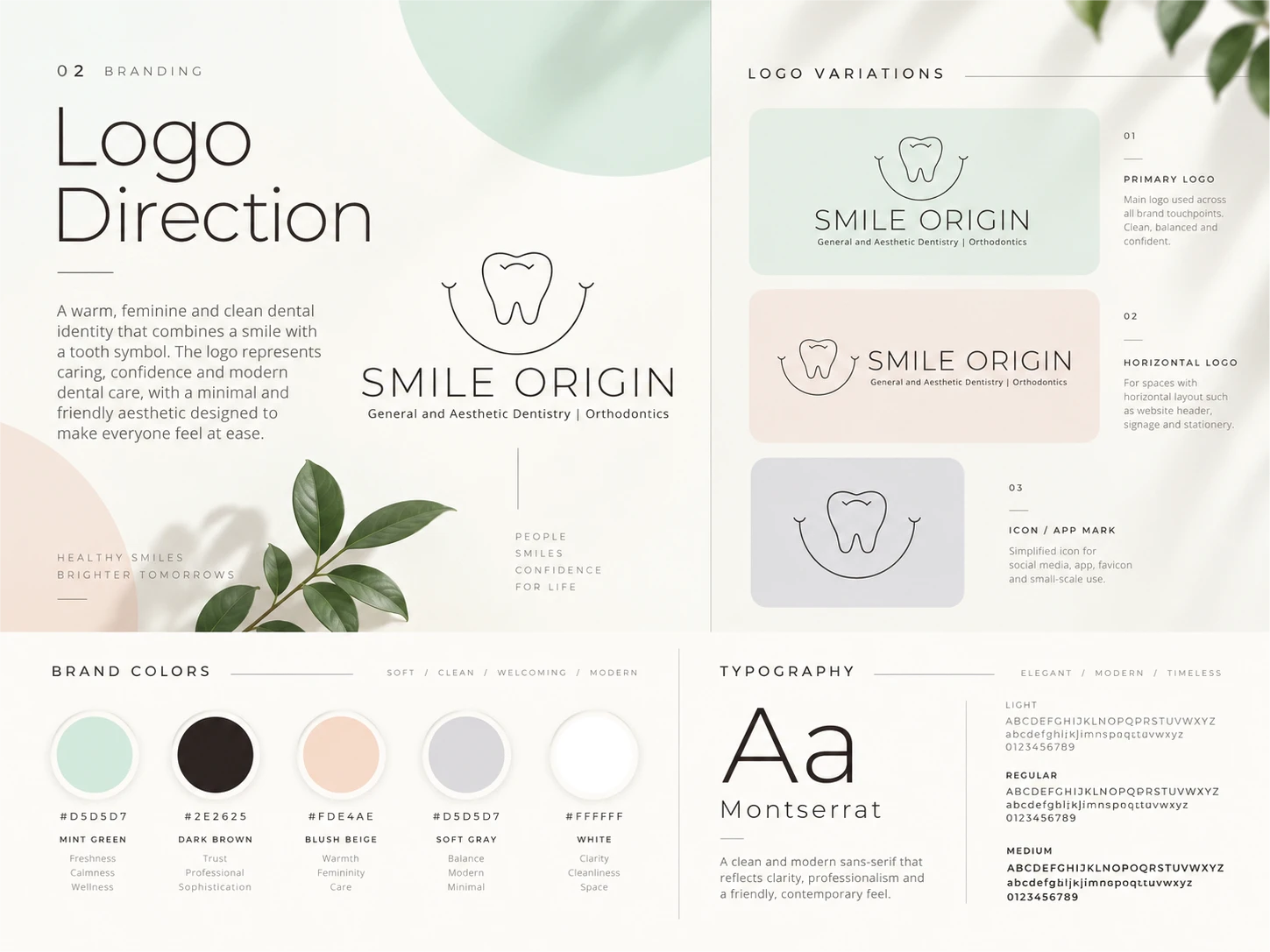
The Smile Origin logo combines a minimal tooth illustration with a curved smile-shaped element.
The tooth establishes an immediate connection to dentistry, while the surrounding curve adds an emotional dimension, representing happiness, comfort, and confidence.
The symbol's simple line structure creates a distinctive identity without relying on excessive detail.
The wordmark uses refined, lightweight typography to complement the organic shape of the icon.
Together, these elements establish a visual personality that is sophisticated yet approachable.
Logo System
The brand identity includes three primary applications:
Primary Logo: The tooth-and-smile symbol positioned above the Smile Origin wordmark.
Horizontal Logo: A compact arrangement for website headers, stationery, and signage.
Standalone Icon: The simplified tooth-and-smile mark for profile images, app icons, and smaller brand applications.
The objective was to create a recognizable identity that works across different sizes, materials, and backgrounds.
04 — Brand Colors
A Palette Designed to Feel Calm.
Color plays an important role in shaping how patients perceive a healthcare environment.
For Smile Origin, the palette moves away from conventional medical blues and introduces softer, warmer tones.
Mint Green — Calm & Freshness
The primary brand color represents wellness, balance, and reassurance. It creates a relaxing foundation throughout the identity.
Blush Beige — Warmth & Care
A soft peach-inspired tone introduces a gentle, personal feeling that helps balance the clinical nature of dental services.
Dark Brown — Trust & Sophistication
Used primarily for typography and logo applications, the deep neutral tone communicates professionalism while remaining softer than pure black.
Soft Gray — Balance & Simplicity
A supportive neutral that maintains visual hierarchy across layouts and printed materials.
Warm White — Clarity & Space
Clean backgrounds and generous negative space allow the identity to feel modern, light, and welcoming.
Together, these colors establish a consistent, calming visual atmosphere.
05 — Typography
Simplicity Creates Confidence.
Typography is a defining element of Smile Origin's visual identity.
The selected direction uses modern, geometric sans-serif typography, combining elegant lightweight headings with readable supporting text.
Typography Direction: Montserrat
Light and regular weights give the wordmark and large headlines a sophisticated, contemporary appearance.
Medium weights improve readability for informational content, while carefully controlled spacing creates an open, balanced layout.
The typography system is designed to perform consistently across brand presentations, printed materials, digital interfaces, and social media.
The result is an understated yet confident visual language.
06 — Social Media Design
A More Beautiful Way to Communicate Care.
Smile Origin's social media identity extends the same calming design language into digital storytelling.
Instead of overwhelming audiences with dense information and aggressive promotional graphics, the campaign embraces clean layouts, warm imagery, reassuring messages, and carefully balanced typography.
The three-post creative direction focuses on:
A Smile That Feels Like You
A human-centered visual highlighting natural smiles, personal confidence, and the emotional side of dental care.
Care Begins With a Smile
A brand-focused composition communicating the importance of comfortable, welcoming dental experiences.
Small Details. Big Smiles.
A minimalist promotional design celebrating everyday care, attention to detail, and the importance of oral wellness.
Soft color blocking, subtle organic shapes, and consistent placement of the Smile Origin logo connect the campaign to the wider brand identity.
The result is an approachable, polished social media direction that feels both informative and aspirational.
07 — Website Experience
Digital Dentistry, Beautifully Simplified.
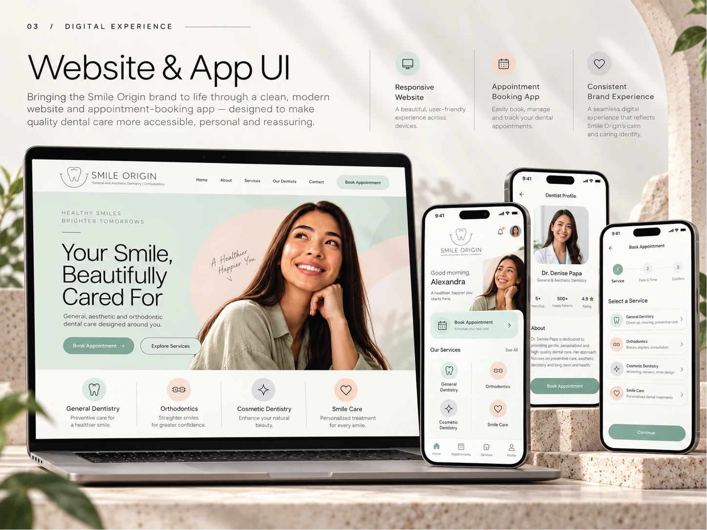
The Smile Origin website concept was developed to bring the brand's calm, patient-centered philosophy into a modern digital environment.
The hero section introduces the practice through friendly portrait photography, a clear value proposition, and an inviting appointment-booking action.
Rather than presenting users with excessive information, the website prioritizes clarity and simplicity.
Key Website Features
A welcoming homepage with a strong brand introduction.
Clear navigation for dental services.
Dedicated sections for general, cosmetic, and orthodontic care.
Prominent appointment-booking calls to action.
Responsive layouts for different screen sizes.
Consistent colors, typography, and imagery.
The result is a digital identity designed to communicate professionalism while making the patient experience feel personal and approachable.
08 — Mobile App Experience
Better Care Starts With Better Experiences.
The Smile Origin mobile app concept explores a streamlined patient journey, making it easier to discover services and manage dental appointments.
The interface follows the same principles as the brand identity: simplicity, accessibility, and visual harmony.
Core App Screens
Home Dashboard: A personalized interface featuring services, appointment access, and useful information.
Dentist Profile: A clean layout introducing dental professionals and their areas of expertise.
Appointment Booking: A straightforward process for selecting treatments, choosing a date, and confirming an appointment.
Mint-green buttons, rounded interface elements, soft backgrounds, and simple iconography maintain consistency throughout the experience.
Every screen was designed to help patients navigate confidently without unnecessary visual distractions.
09 — Brand Touchpoints
One Identity. Every Interaction.
A successful brand extends far beyond its logo.
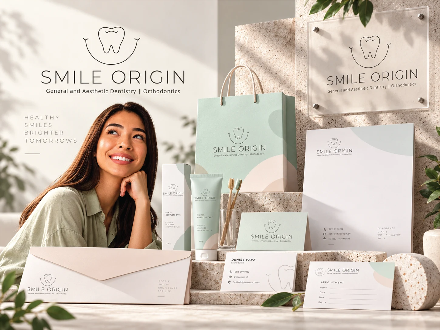
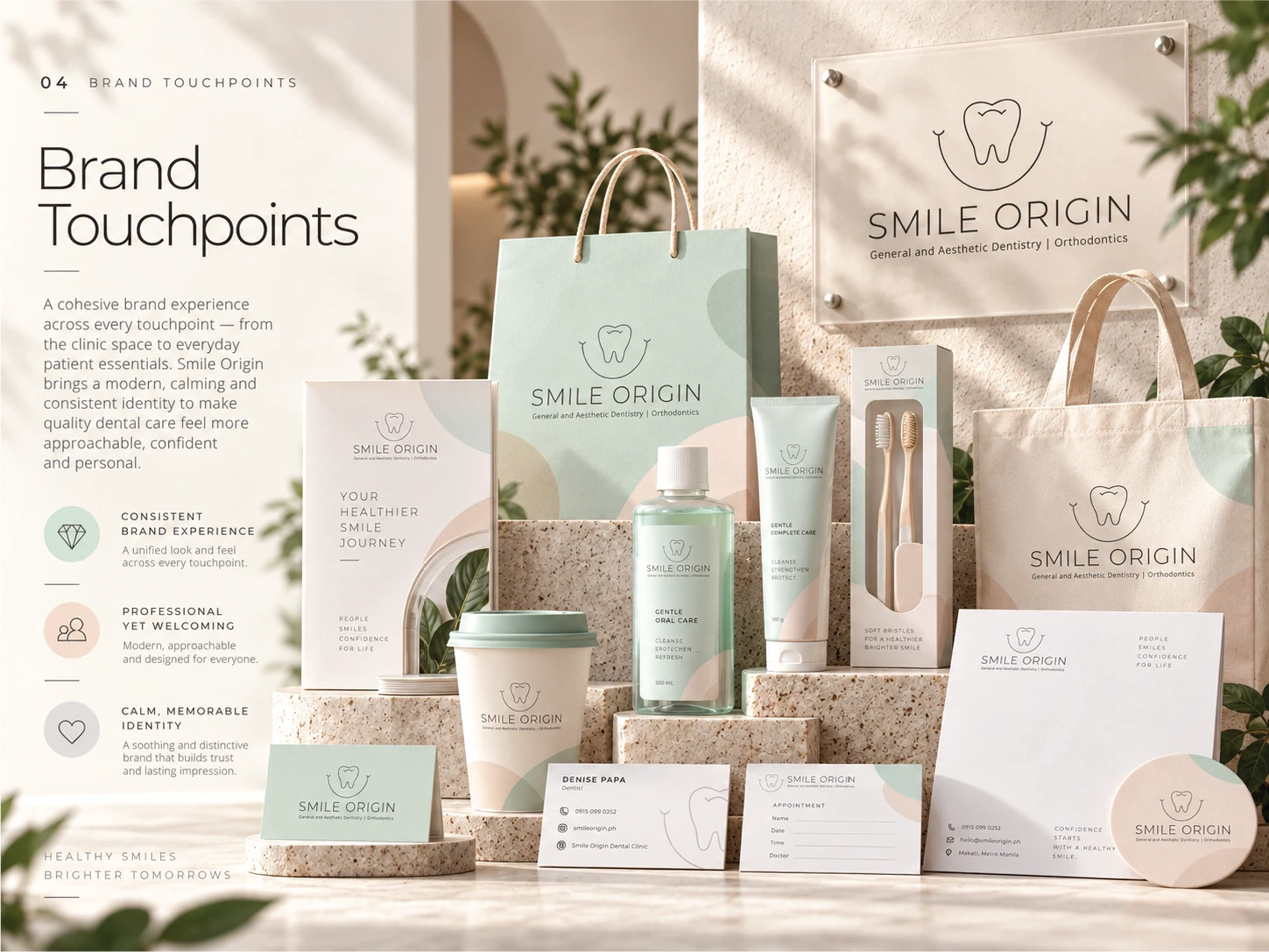
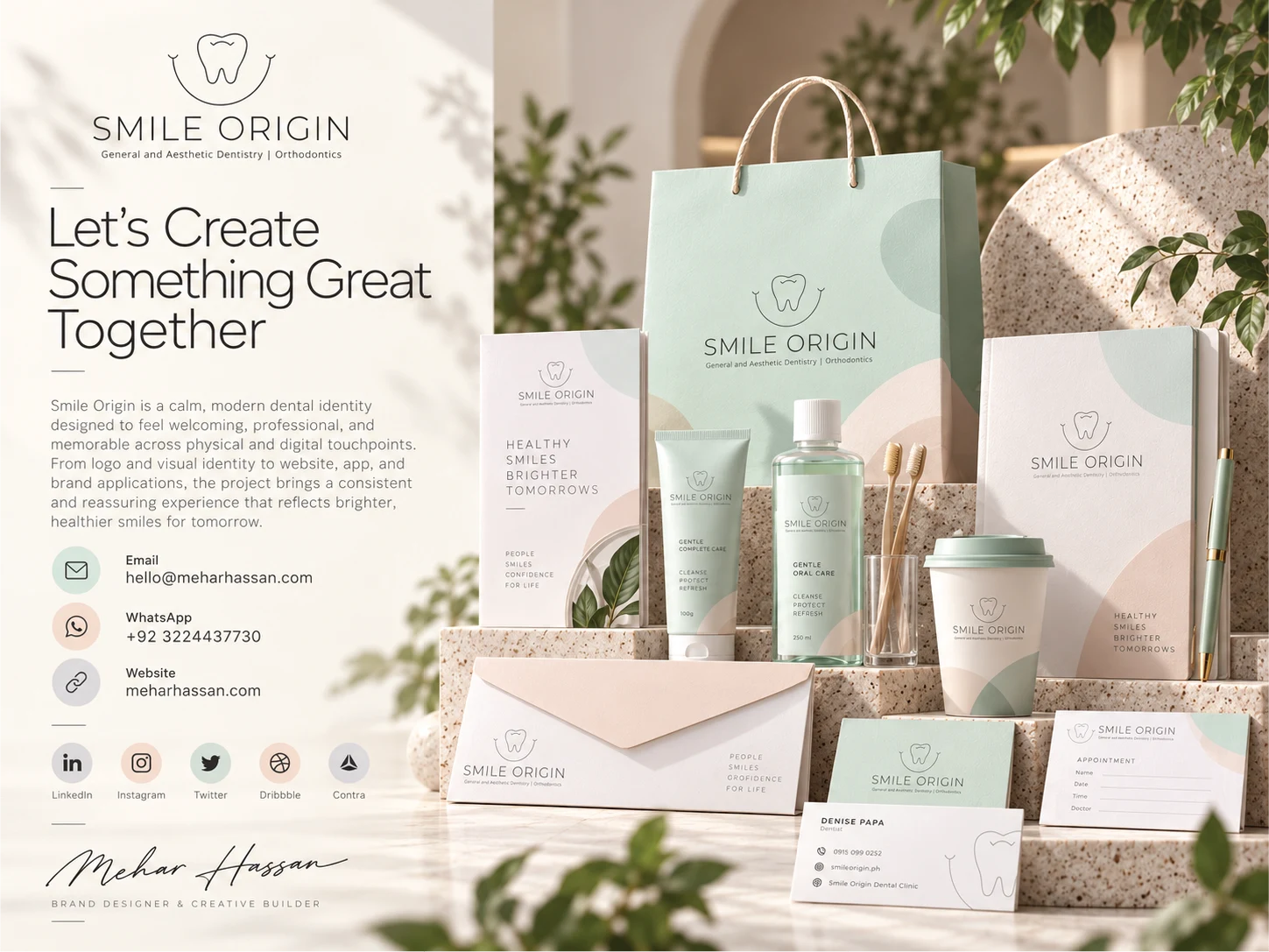
The Smile Origin identity was applied across a collection of physical touchpoints designed to reflect the same calm and welcoming visual language.
Brand Applications Include:
Business cards and professional stationery
Appointment cards
Envelopes and printed documents
Dental care product packaging
Toothpaste and oral care concepts
Branded paper bags and tote bags
Beverage cups and promotional merchandise
Clinic signage
Each application explores how the identity can remain recognizable through consistent color usage, controlled typography, and thoughtful logo placement.
The intention was to make every branded object feel part of one unified visual world.
10 — Design Outcome
A Brand Built Around Confidence.
Smile Origin demonstrates how a healthcare identity can combine professional credibility with a warm, modern personality.
The project brings together thoughtful logo design, calming colors, contemporary typography, engaging social media, refined brand applications, and intuitive digital interfaces.
Rather than treating each deliverable as a separate design exercise, the entire creative direction was built around one cohesive concept.
A brand experience that feels reassuring, recognizable, and human.
The result is a complete conceptual identity that transforms traditional dental branding into something calmer, friendlier, and more emotionally engaging.
11 — Let's Create Something Great Together.
I’m Mehar Hassan, a multidisciplinary Brand Designer and Creative Builder specializing in visual identities, graphic design, websites, and digital experiences.
I help businesses turn ideas into distinctive brands that connect with people and create memorable experiences.
Whether you're building a new brand or refreshing an existing one, I'd love to collaborate.
Email: hello@meharhassan.com
WhatsApp: +92 322 4437730
Website: meharhassan.com
Connect: LinkedIn | Instagram | X (Twitter) | Dribbble | Contra
Thank you for exploring Smile Origin.
Creative Direction & Design — Mehar Hassan
© 2026 Mehar Hassan. Conceptual Portfolio Project.
Like this project
Posted Oct 30, 2026
Designed a modern dental brand concept featuring logo identity, pastel visual systems, packaging, social media, website UI, and mobile app design.