E-commerce App
Xavier Pincay
An e-commerce App that markets and promotes electronic items.

Challenge
Build an app based on the current Makkax® website that attracts attention with an intuitive use that markets and promotes the electronic items that the company has for sale, in addition to showing the new products to be entered, news, offers, and promotions.
Context, Research & Identify the Need
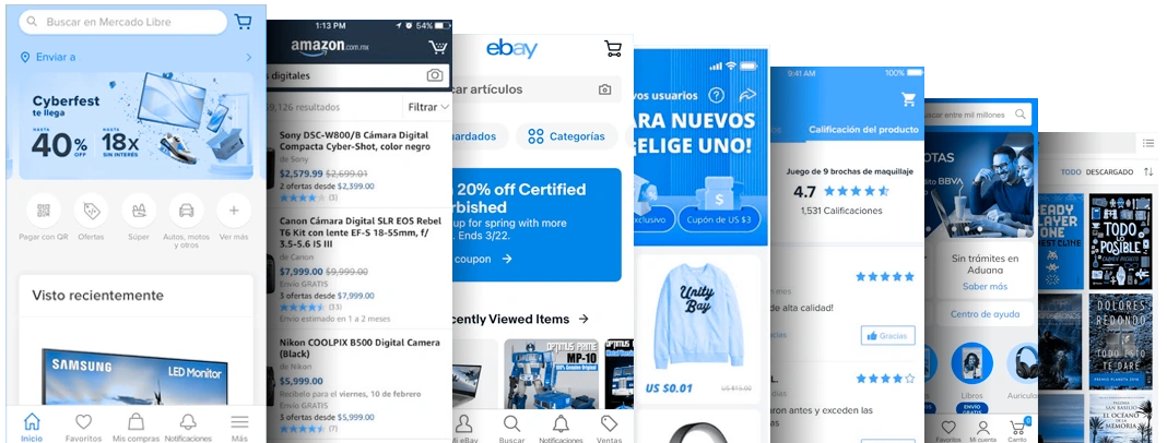
The Makkax® company seeks to have better sales and to be able to approach all types of public from another medium on the web. At the moment they are well-received by selling to wholesalers, but they need to reach the final consumer directly. Although the website they have lately been updated to a more «technological and futuristic» visual mode, they are not having the sales they would like to have through their website. They want to have a more dynamic medium and without resorting to their website or a mobile-web. They want their brand to be on today’s smartphones.
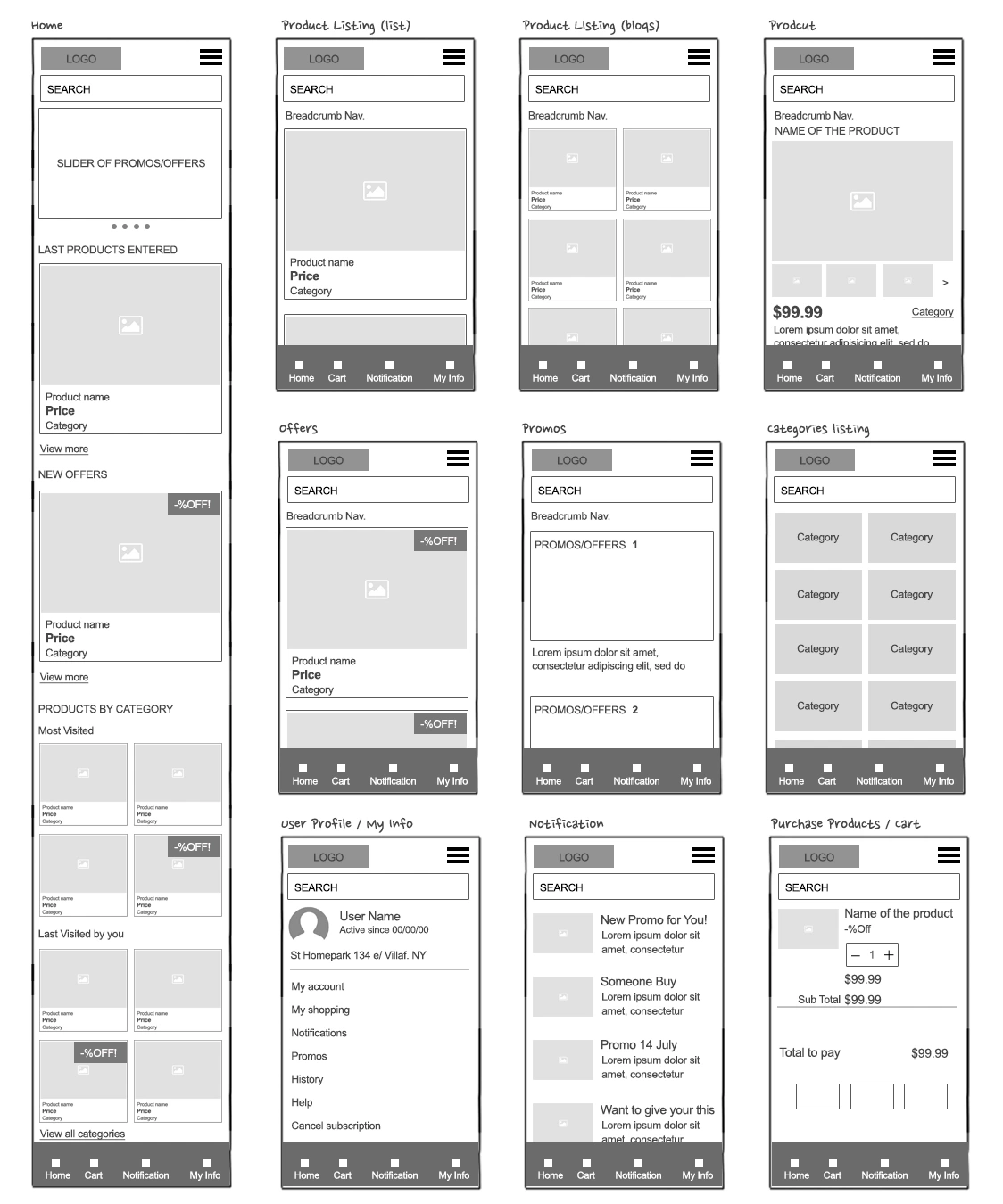
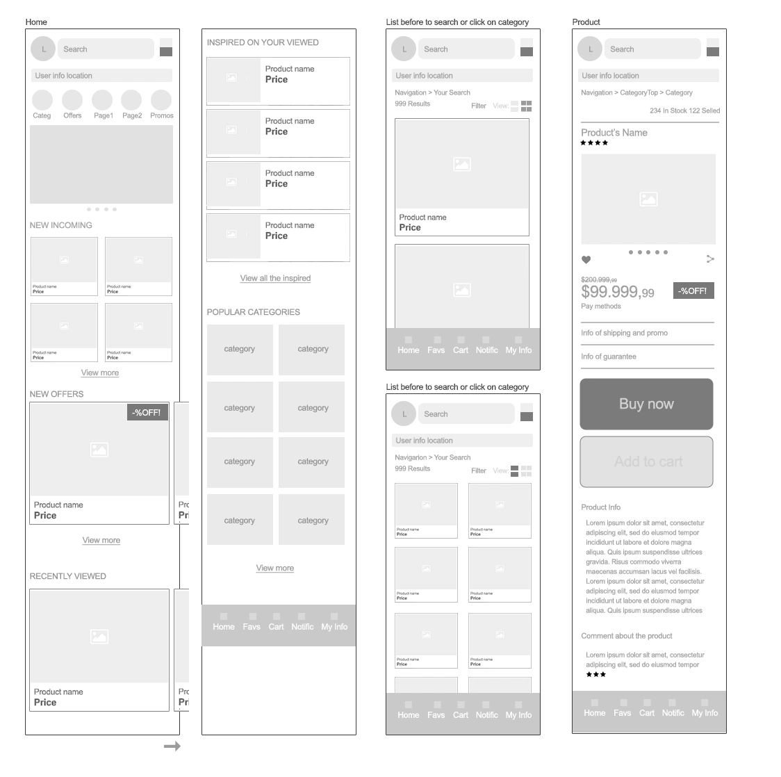
First Draft
For the first wireframe attempt, I tried to focus on the products and promotions that the company may have, leaving the less relevant information for a different section. Trying to first show how the web shows without much information about places or phones.
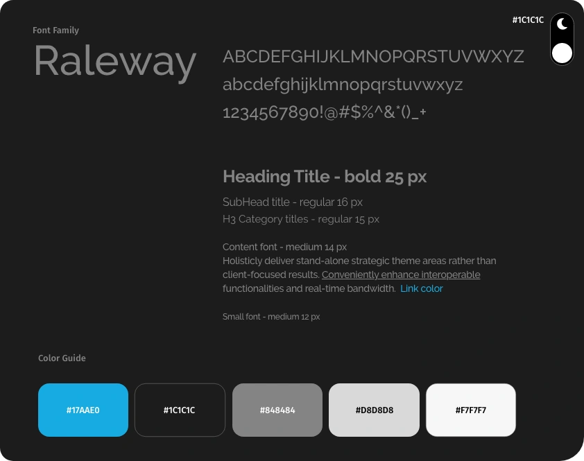
Concepts & View Language
In meetings with the company, we reached a consensus on the concepts of colors, structure, and visualization. I proposed so that the site is not completely black (in the background) because absolute black is not always visually comfortable, but we agreed to leave it as absolute 000 because of their current website, but, with the variation of being able to create a version “Bright” of the application, and we concluded in only changing the design of the background, and leaving the fonts and more casual content in a medium tone which allow working well in dark as well as bright’s environments, with the CTA colors in light blue. We get the following visual scheme:
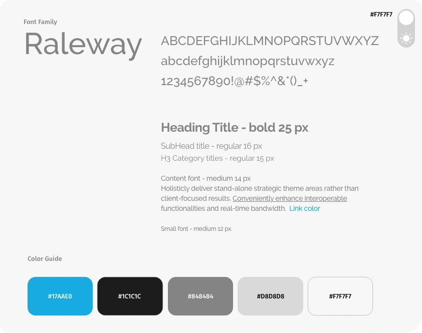
Dark Mode:
Wireframe
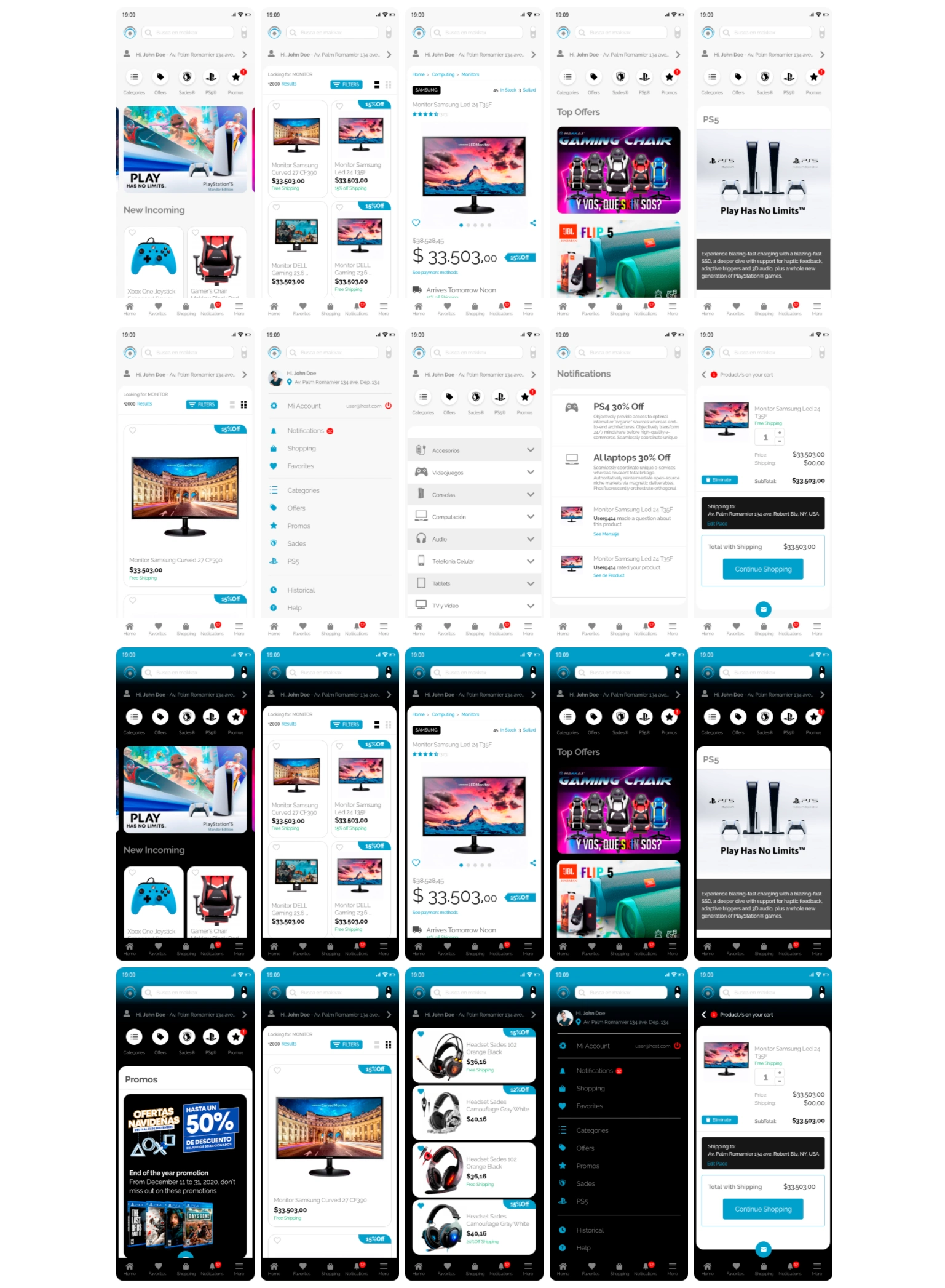
After adapting and testing the colors so that it works well in dark and light environments, the menus and content were reorganized to always have it at hand so that the user can click to buy without much thought.
Final Product
Like this project
Posted May 8, 2021