Helix.ai - LLM Research Landing Page

Doug

Doug Silkstone

Helix AI - Protein Folding Landing Page Concept

Brief: Design exploration for a computational biology startup focused on AI-powered protein structure prediction. Live Site: Helix.ai Context Journal

Challenge: Communicate cutting-edge science without alienating non-technical visitors. The visual language needed to feel both scientifically credible and distinctly modern.
Approach:
Built with Next.js 16, React 19, and React Three Fiber
Custom WebGL kaleidoscope effect using Bayer matrix ordered dithering — a nod to early scientific visualization while feeling fresh
Morphing 3D geometry (icosahedrons, tori, spheres) represents molecular complexity
Subdued violet palette balances "serious science" with visual intrigue
Monospace typography and grid-based layout reinforce precision
Technical Highlights:
Custom GLSL shaders for real-time dithering and optional metaball effects
Sub-50ms inference stats animated with scroll-triggered counters
Development debug panel for rapid shader iteration
Fully responsive with graceful 3D fallbacks on mobile
Outcome: A concept that positions AI protein folding as accessible and visually memorable - science that feels alive.
Helix AI is a computational biology startup developing AI-powered protein structure prediction technology. Their platform enables researchers to model protein folding with unprecedented speed and accuracy — work that traditionally required supercomputers and months of analysis can now be accomplished in milliseconds.

The Challenge

Communicating Complexity Without Alienating

Protein folding sits at the intersection of biology, chemistry, physics, and machine learning. The science is profound — understanding how amino acid chains fold into three-dimensional structures unlocks everything from drug discovery to disease treatment. But this complexity creates a communication problem.
The core tension: How do you make cutting-edge computational biology feel accessible to investors, researchers, and potential partners without dumbing down the science or resorting to generic "tech company" aesthetics?
Most biotech sites fall into predictable patterns:
Stock photos of DNA helices and scientists in lab coats
Blue-and-white clinical palettes that feel sterile
Abstract data visualizations that communicate "we're technical" without conveying any actual understanding
Dense scientific jargon that excludes non-specialist audiences
Helix AI needed something different. A visual identity that could:
Communicate scientific credibility to researchers and domain experts
Feel innovative and distinctly modern to investors and partners
Create an emotional connection that abstract data cannot
Stand apart in a crowded biotech landscape

The Concept

Finding the Visual Metaphor

The breakthrough came from studying protein structures themselves. Proteins aren't random - they're highly organized, symmetrical, almost architectural in their complexity. Alpha helices spiral with mathematical precision. Beta sheets fold into pleated patterns. Quaternary structures arrange subunits into symmetric assemblies.
This led to the central concept: the kaleidoscope.
A kaleidoscope transforms simple elements through reflection and rotation into complex, mesmerizing patterns. This mirrors protein folding itself — simple amino acids assembling through predictable rules into intricate three-dimensional structures. The metaphor works on multiple levels:
Visual complexity from simple components — just as proteins emerge from chains of amino acids
Symmetry and order within apparent chaos — reflecting the organized nature of molecular biology
Continuous transformation — representing the dynamic folding process
Beauty in mathematical precision — connecting science to aesthetic experience

Design Philosophy

Serious Science, Living Art

The design walks a deliberate line between scientific credibility and visual intrigue.
Color Palette: Subdued Violet
We rejected the predictable biotech blues and greens. The deep violet palette (#0a0510 background, #8b5cf6 primary) feels both sophisticated and slightly unexpected. Purple has historical associations with experimentation, alchemy, and discovery - appropriate for a company pushing the boundaries of computational biology.
The palette shifts subtly across sections, introducing emerald tones for statistics (suggesting growth and precision) and cyan accents for technical content. These aren't arbitrary - each color variant maps to content type, creating an intuitive visual hierarchy.
Typography: Precision and Legibility
Two typefaces serve distinct purposes:
JetBrains Mono for headers and labels - the monospace treatment reinforces precision, suggesting code and computation
Inter for body text - exceptional legibility for longer-form content
Extensive use of letter-spacing (tracking-wider, tracking-widest) creates visual breathing room, preventing the technical density from feeling overwhelming.
Grid System: Engineering Aesthetic
A 12-column grid provides structure without rigidity. Borders between sections are subtle (border-border at ~92% lightness) — present but not distracting. The overall effect suggests technical blueprints or engineering drawings, reinforcing the precision theme.

Technical Implementation

The Stack

Next.js 16 with React 19 — latest stable versions for optimal performance
React Three Fiber — declarative Three.js for the 3D kaleidoscope scenes
Custom GLSL Shaders — hand-written for precise visual control
Motion (Framer Motion) — smooth entrance animations and scroll effects
Tailwind CSS v4 — utility-first styling with OKLch color space support
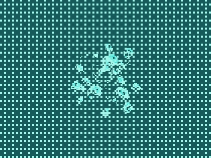
Science that feels alive.
Built with Next.js 16, React 19, Three.js, and custom GLSL shaders.
Like this project

Posted Nov 28, 2025

Communicate cutting-edge science without alienating non-technical visitors. The visual language needed to feel scientifically credible and distinctly modern.

Likes

3

Views

10

Timeline

Oct 1, 2025 - Ongoing

Clients

Helix