Project Idea: Neo-Brutalist Travel Website Design This desig...
Purva Patel
Project Idea: Neo-Brutalist Travel Website Design
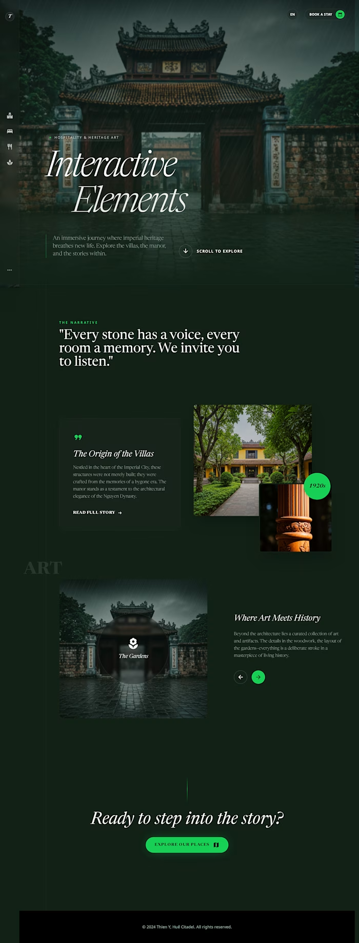
This design is very different from normal WordPress websites. It looks bold, modern, and creative, which makes it perfect for a special travel website.
I have designed the main pages with a strong magazine-style look:
Home Page: A bold landing page with big bright green text, dark colors, and a side menu. It feels like a digital magazine.
Itinerary Page: A timeline page that shows daily travel plans using boxes, lines, and clear fonts, just like a magazine spread.
Gallery Page: A fun photo grid where images overlap. Location names move when you interact with them.
The design uses dark colors, strong borders, and shadows to look unique and modern.
Do you think we should also add a Packing List or Travel Details page in the same style?
Like this project
Posted Jan 25, 2026
Project Idea: Neo-Brutalist Travel Website Design This design is very different from normal WordPress websites. It looks bold, modern, and creative, which ma...