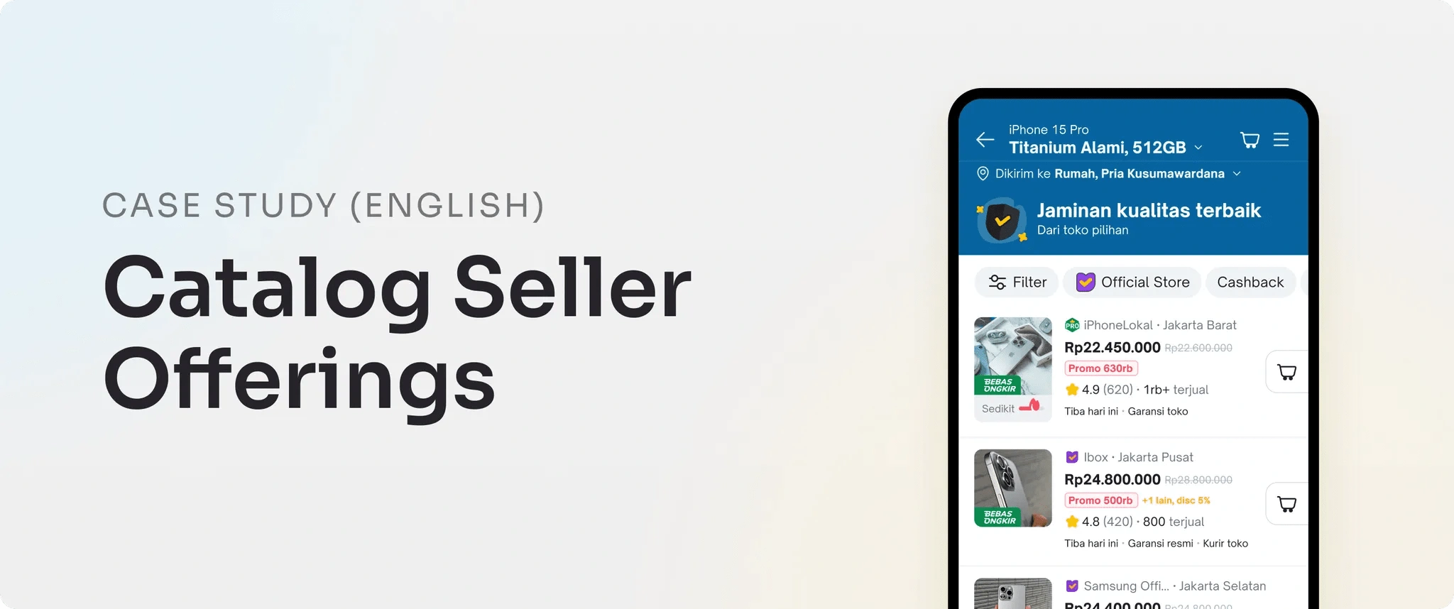
Revamping Seller Offering on Catalog Page
Pria Kusumawardana
The seller offering in the Tokopedia catalog is a list of products of the same type, including important information such as price, promotions, seller type, warranty, reviews, and discounts from various stores. The main touchpoints in the user experience include the search page, search results, detailed catalog, and product list (seller offering) within the catalog page.
Why are there catalogs? Before catalogs, sellers had to switch back and forth between the SRP (Search Results Page) and the PDP (Product Detail Page) to compare products. Catalogs simplify this process by consolidating product information in one place.
Scope and Timeline
I handled the entire project from start to finish, covering several areas including in-depth research, ideation, mockups, prototyping, usability testing, and bug bash to enhance the discoverability of the seller offering page. Given the short timeline, the empathize stage was conducted only by reviewing past research at Tokopedia, expert reviews, and competitor analysis.
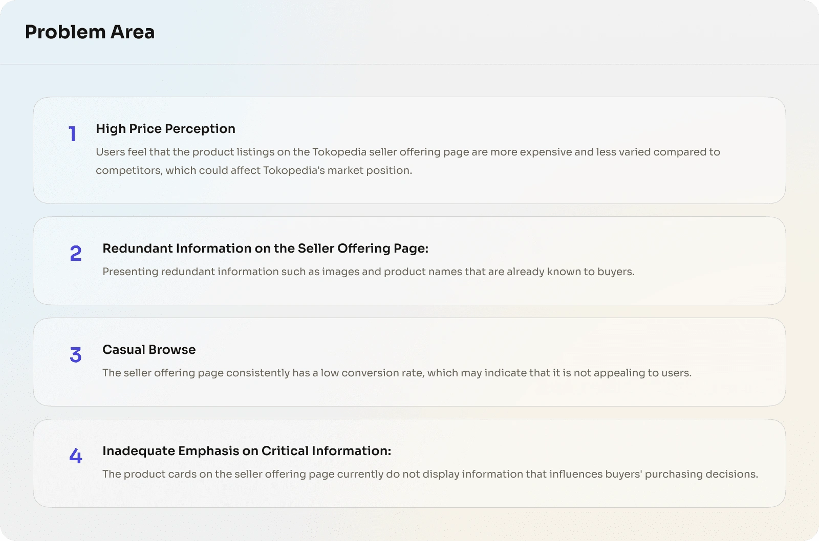
Problem Area
Based on the findings from the Product Manager team, they identified several issues on the seller offering page in the catalog, as follows:
Goal and Objective:
Optimizing interactions to help users make better shopping decisions. Based on the issues identified by the Product Management team, the objectives of this project are as follows:
Success Metric:
Coversion Rate 0.02% → 0,25%
1. The process of gathering insights.
We delve deeper into user behavior on Tokopedia, the information that influences purchasing decisions, and the most effective information structure for an optimal shopping experience. To achieve this, I employed several methods:
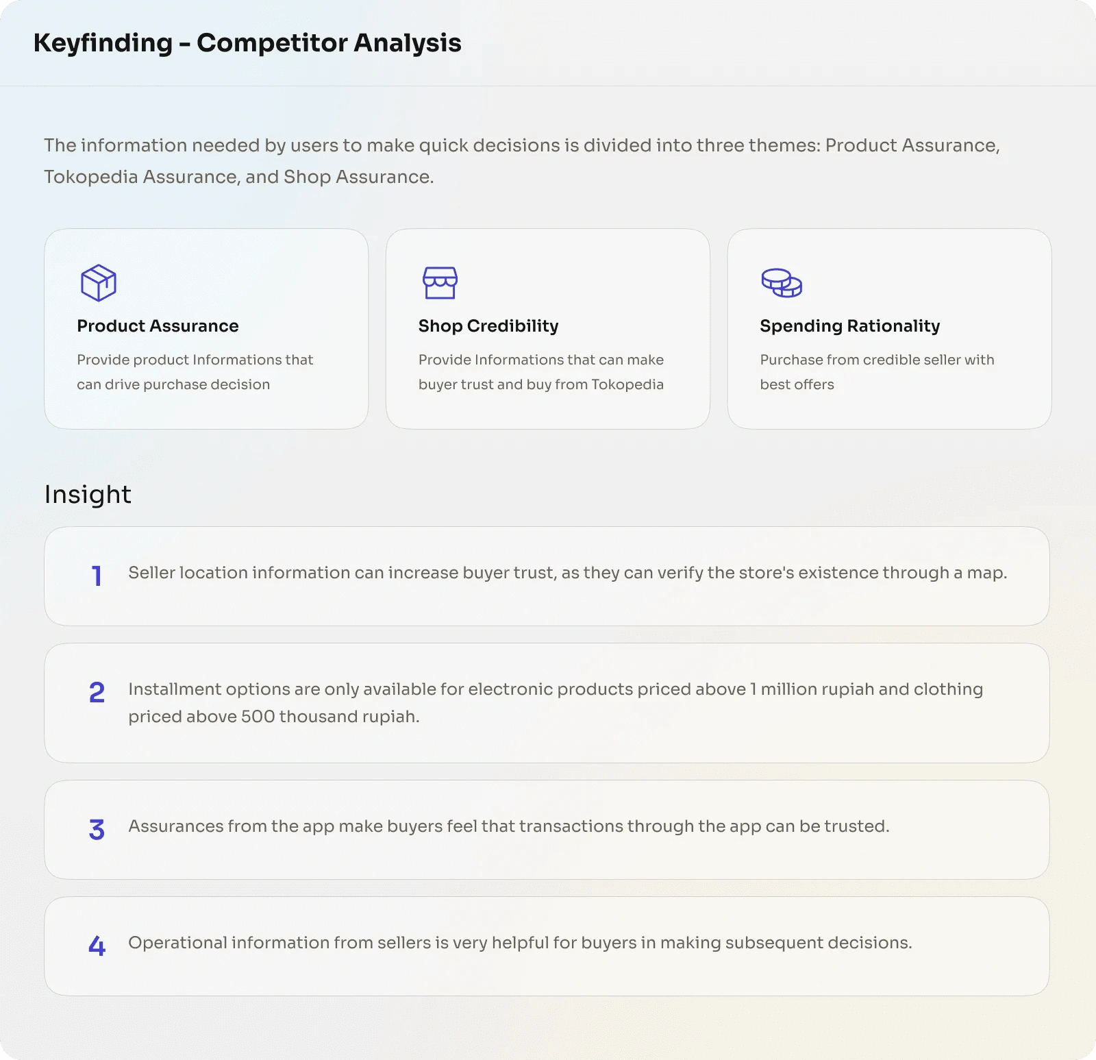
a. Competitor Analysis:
Searching for useful information for users so they can quickly make purchasing decisions by analyzing competitors such as BliBli, Shein, Lazada, eBay, Temu, and AliExpress. The focus was on the Product Detail Page and Store Page for the Electronics, Apparel, Body Care, and Skin Care categories to gain deeper insights.
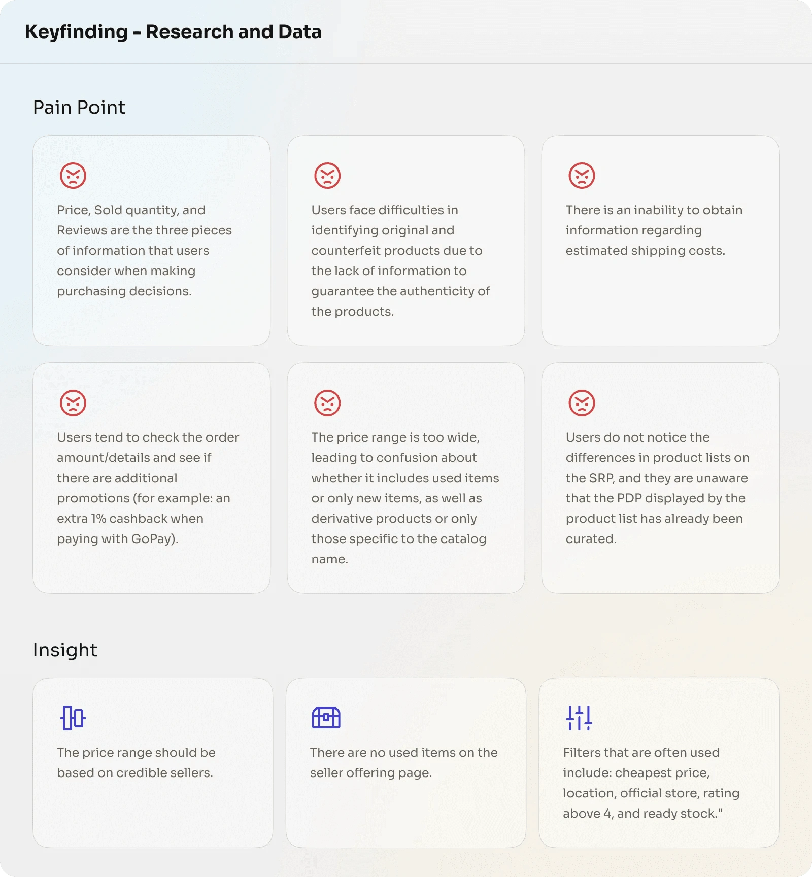
b. Research & Data:
The Tokopedia research team has gathered the latest data on buyer behavior and recent studies on the catalog page. By leveraging previous research, the main focus is on identifying pain points and obtaining insights that can enhance the information on the seller offering page. Additionally, the overall user purchase behavior report is also taken into account to ensure a better and more integrated user experience.
2. Design Foundation
Based on the research results and data we have gathered, this information is summarized as a reference for designing the seller offering page with a focus on user experience. The design aims to enhance engagement and ease for users in finding and selecting products.
Problem statement
How might we deliver comprehensive & inspiring product information that can drive buyer purchase decisions while assisting them in acquiring trusted products from reliable sellers from catalog page Tokopedia?
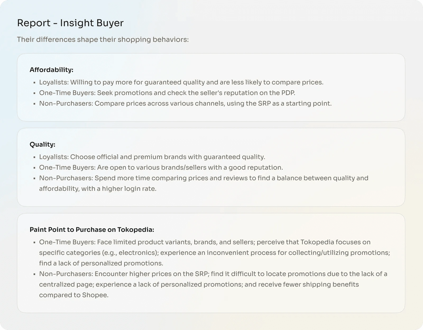
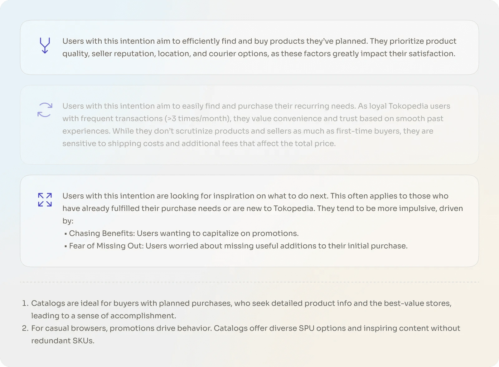
Understanding Buyer Behavior based on intention
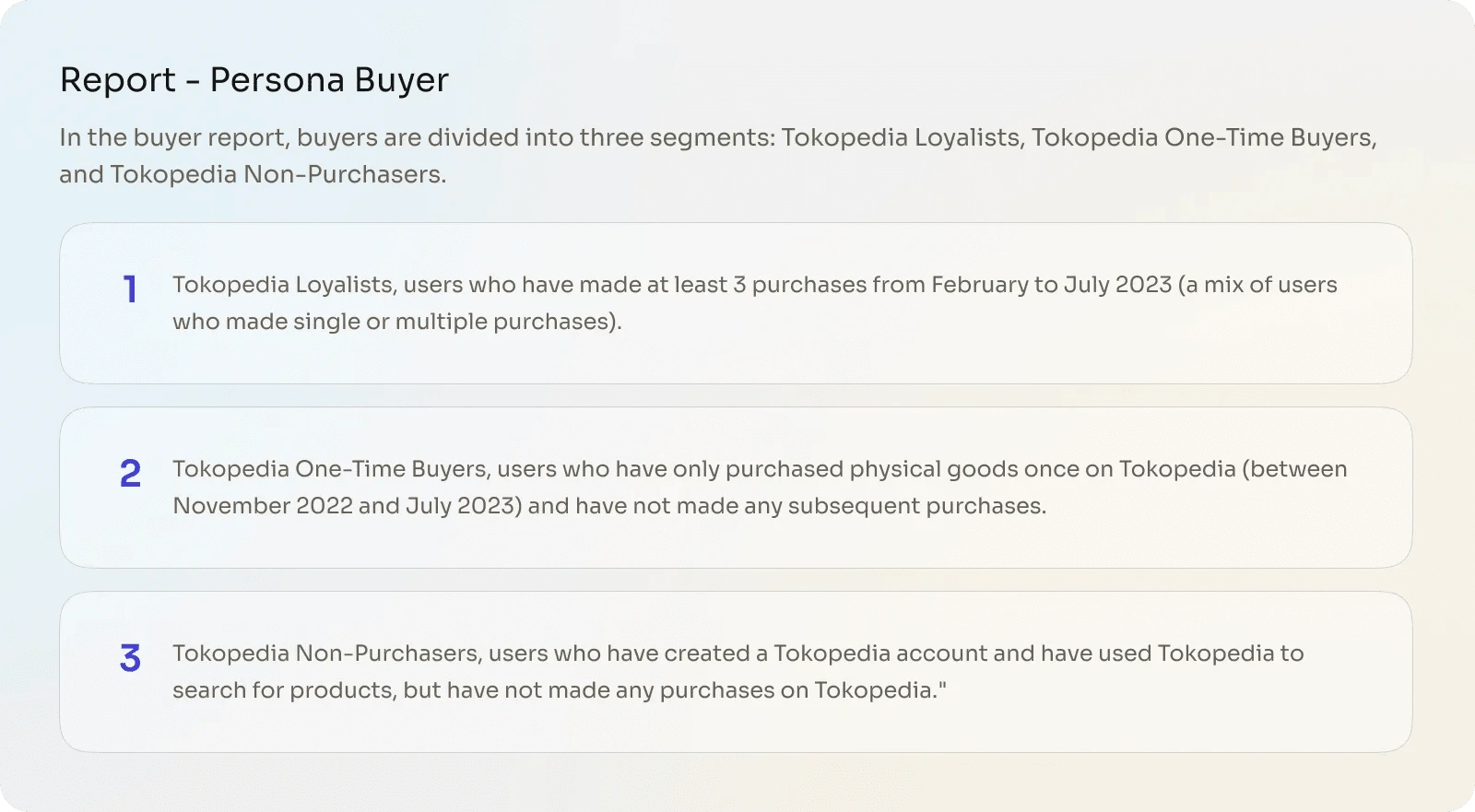
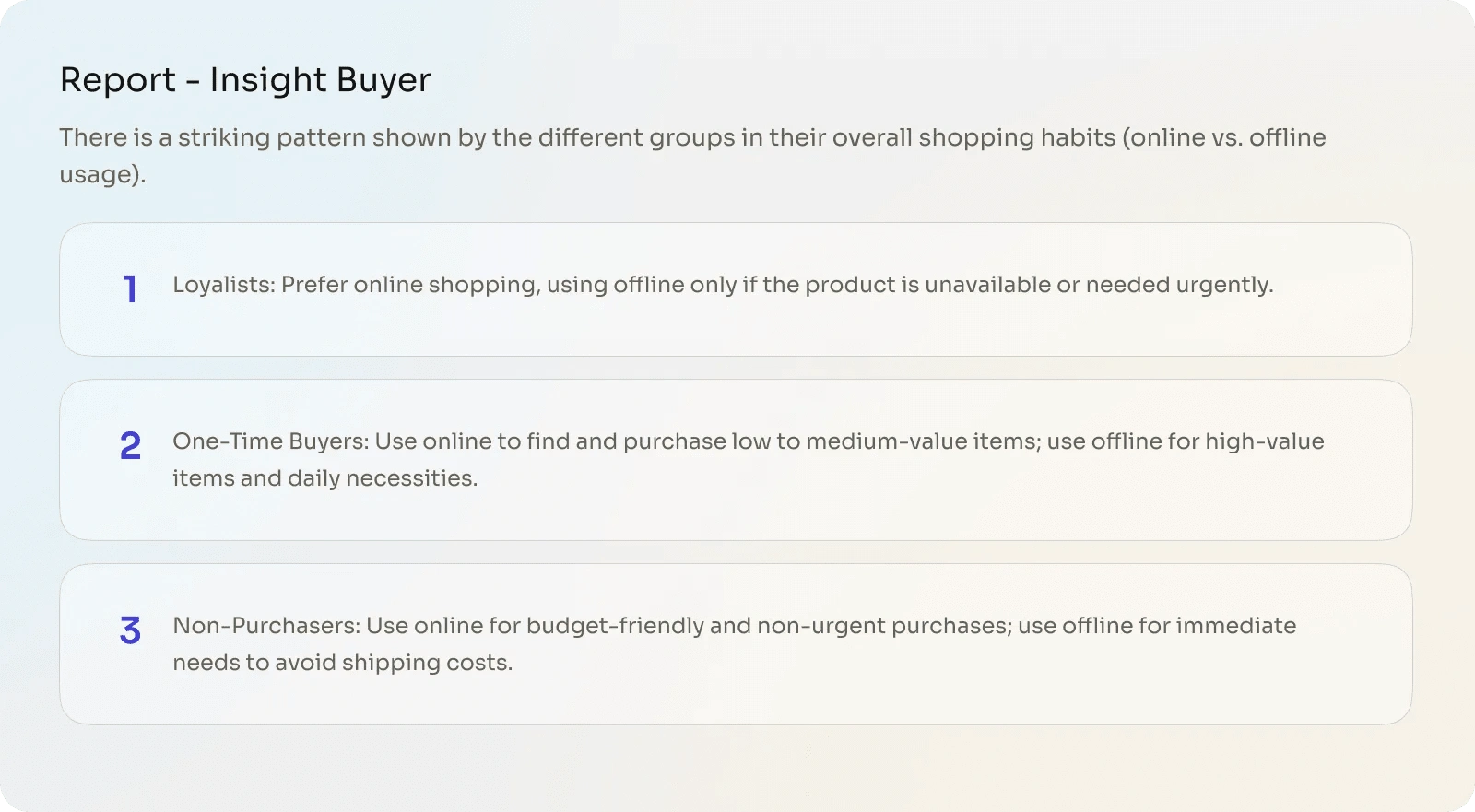
From the buyer report, buyer behavior on Tokopedia based on intent is divided into three categories: Planned Purchase, Casual Browse, and Repurchase. To focus on enhancing the user experience, the Repurchase category will be excluded as it does not align with the focus of the seller offering page.
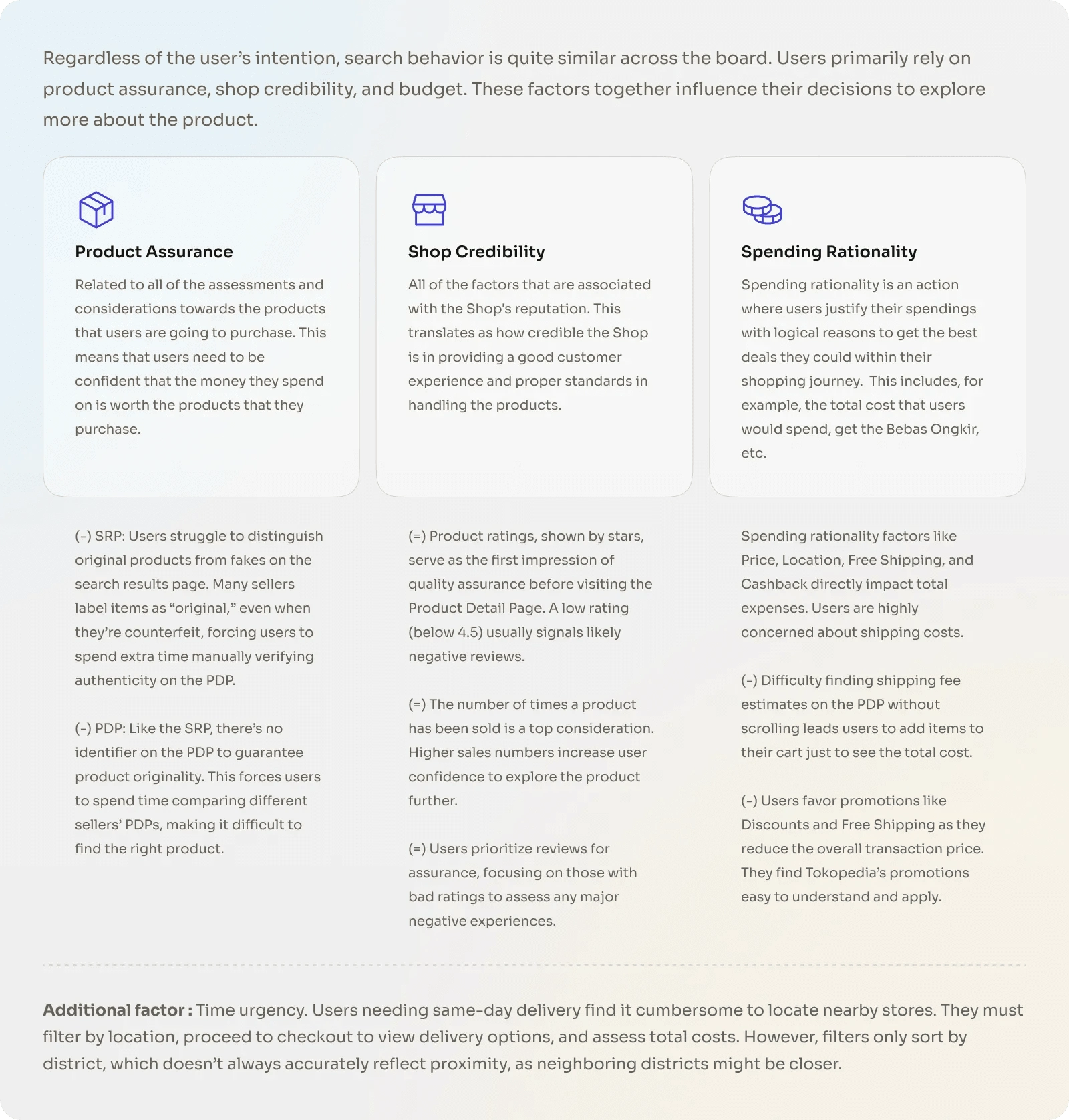
Factors that drive buying intent
There are three main factors that influence the user experience in making a purchasing decision regarding a product: ease of navigation to find products, trust in reviews and the seller's reputation, and the product's alignment with the user's personal needs.
3. Solution, Ideation & Iteration
Solution: Design Concept
From the analysis and synthesis results, we emphasize user experience by providing the best and most trusted sellers and products, tailored to the specific needs of each customer to ensure their satisfaction and comfort.
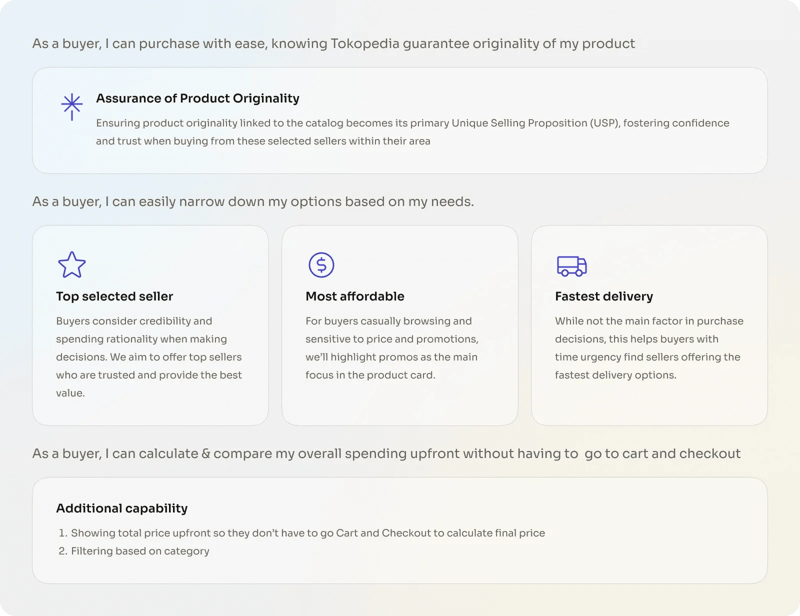
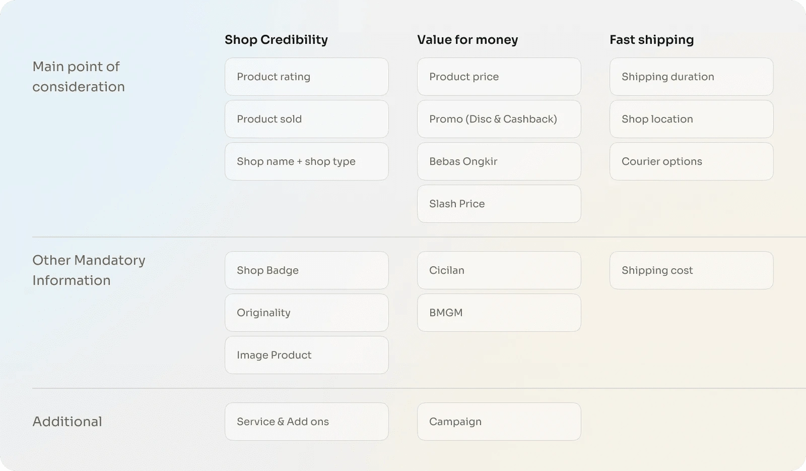
Solution: Attributes Mapping
Based on the synthesis results, we developed an attribute mapping to facilitate design prioritization, with a primary focus on enhancing user experience. This detailing ensures that each design element is optimized to effectively meet the needs and preferences of users.
Information Architecture & Structure Page
Defining the information architecture and page structure focuses on creating an intuitive navigation flow, making it easier for users to quickly access and find information. With a clear and organized structure, the user experience becomes more efficient and enjoyable when interacting with the content.
Moodboard
Wireframe & Design Exploration
Through this exploration, we aim to enhance the user experience by presenting information more effectively and structurally. This approach is expected to strengthen the navigation flow, making it easier for users to quickly find the information they need, while also creating a more intuitive and comfortable interaction, thereby increasing overall satisfaction.
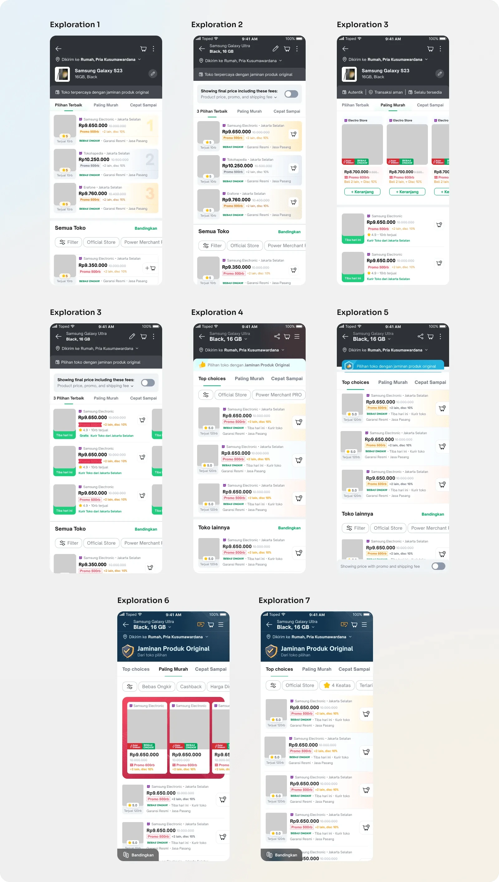
UI Design
After various explorations, we chose to implement the sixth exploration in the UI phase to create a more user-friendly interface. Meanwhile, the seventh exploration will be used as a comparison in Usability Testing (UT) to measure the effectiveness of the solution in enhancing the overall user experience.
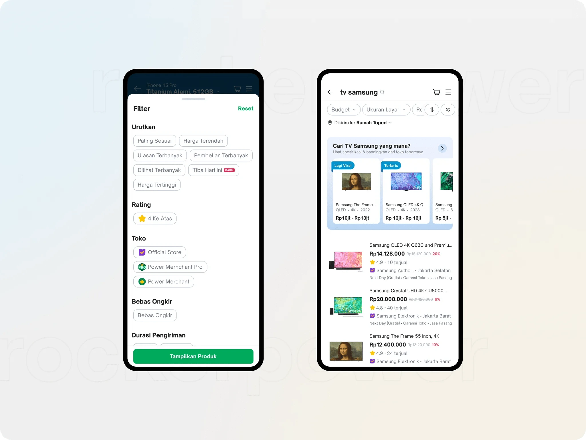
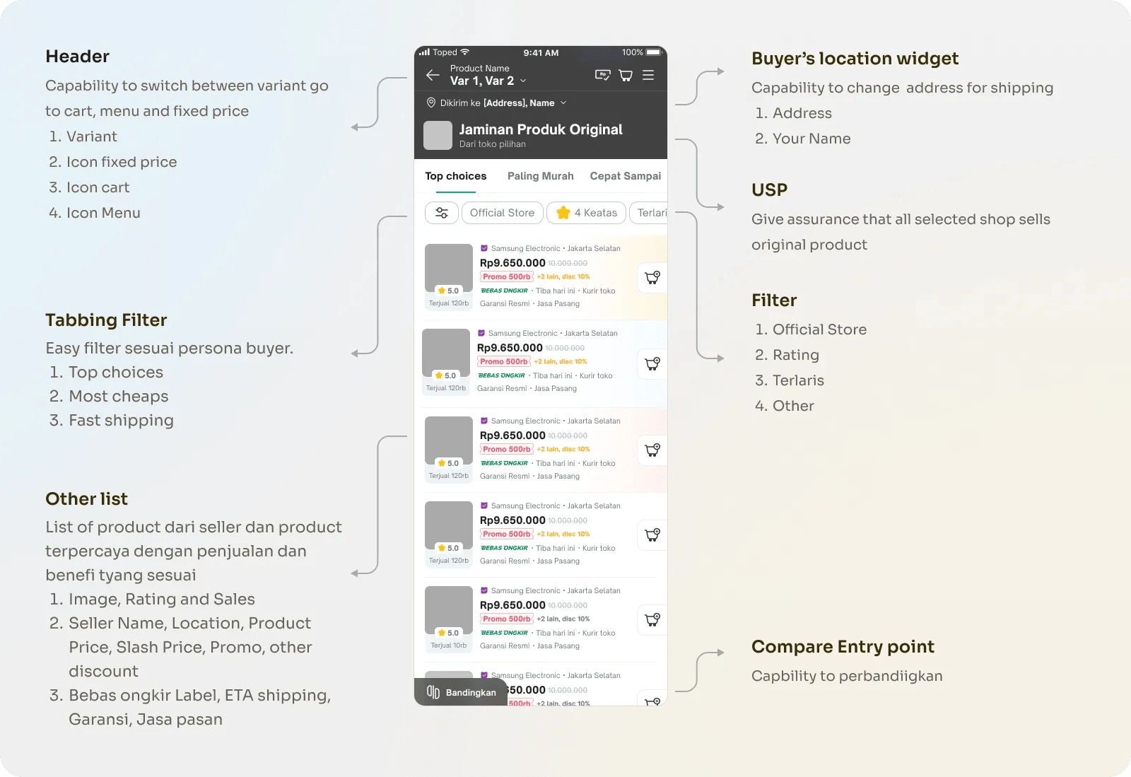
Filter and Search Funnel
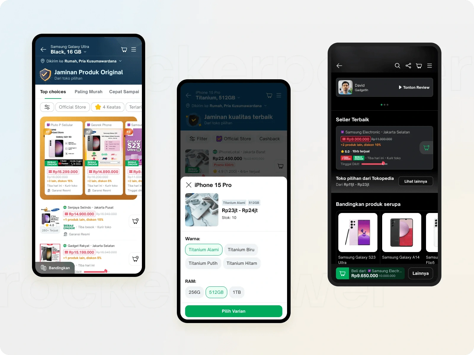
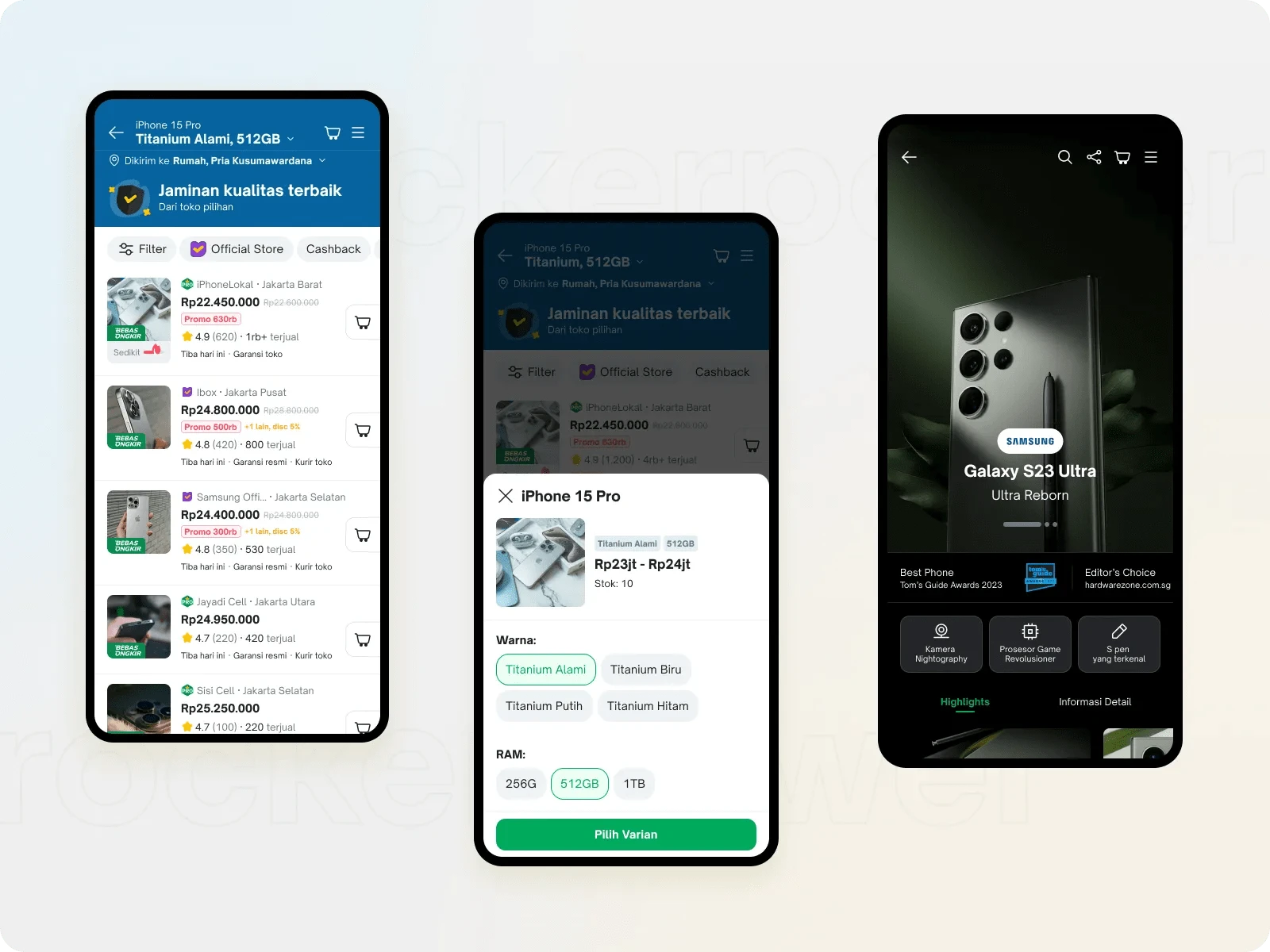
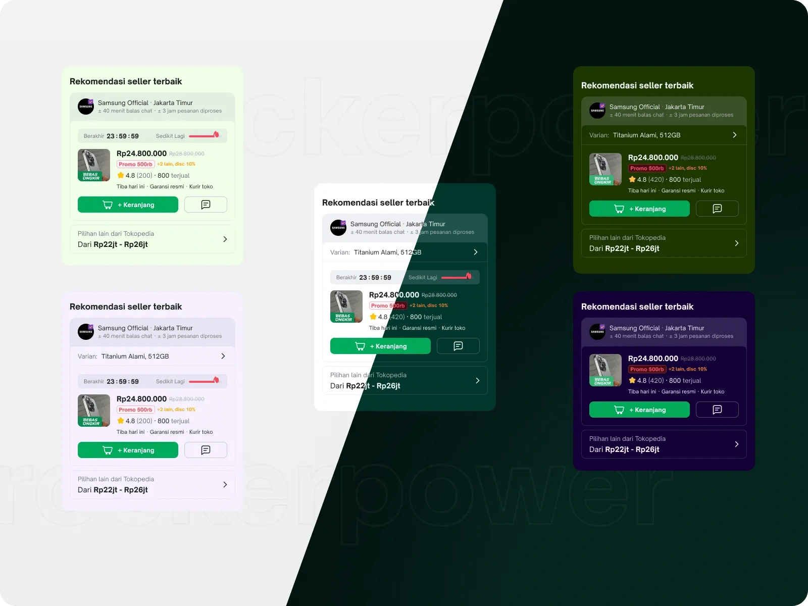
Seller Offering Catalog Page
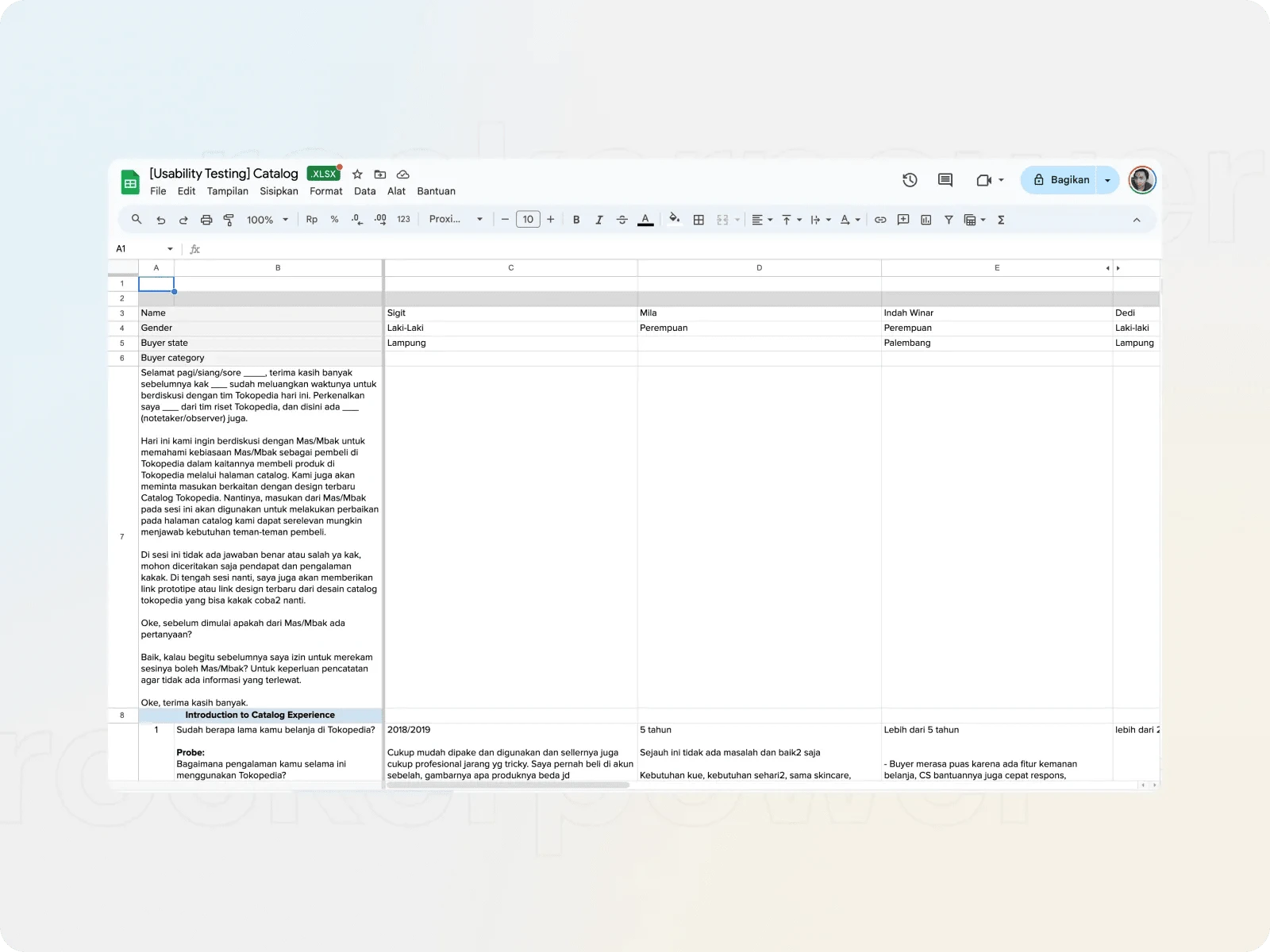
Prototype & UT plan
To maximize the user experience in Usability Testing (UT), we collaborated with the Product Manager, Designer, and Research teams to develop a detailed UT plan. This plan includes selecting the appropriate participants, developing questions focused on user interactions, and creating prototypes specifically designed to evaluate and enhance the comfort and ease of use of the product.
Usability Testing
We recruited participants with specific criteria to gain insights into the user experience, including purchase frequency, interactions with the catalog, and navigation skills. Focusing on these five main categories allowed us to select five representative participants for the trial, aiming to enhance the quality of the user experience.
Refine
After conducting Usability Testing, we gained important insights focused on the user experience:
The features for best picks, lowest prices, and fast shipping were found to be less helpful, as participants tended to apply filters only once or twice according to their needs.
Nearly 80% of participants preferred a layout that was purely a list, as it provided a simpler and more straightforward experience that aligned with their preferences.
Like this project
Posted Nov 11, 2024
Revamping the seller offering page to catch more buyer