ExoraSphere - Enterprise Portal Revamp for a Global Workforce.

Parag S.


Overview
Disclaimer: This case study showcases a design POC created for a real enterprise client. Sensitive information such as the client's name, internal data, and branding has been masked due to confidentiality agreements.
The objective of this case study is to highlight design approach, problem-solving process, and the technical considerations that shaped the project.
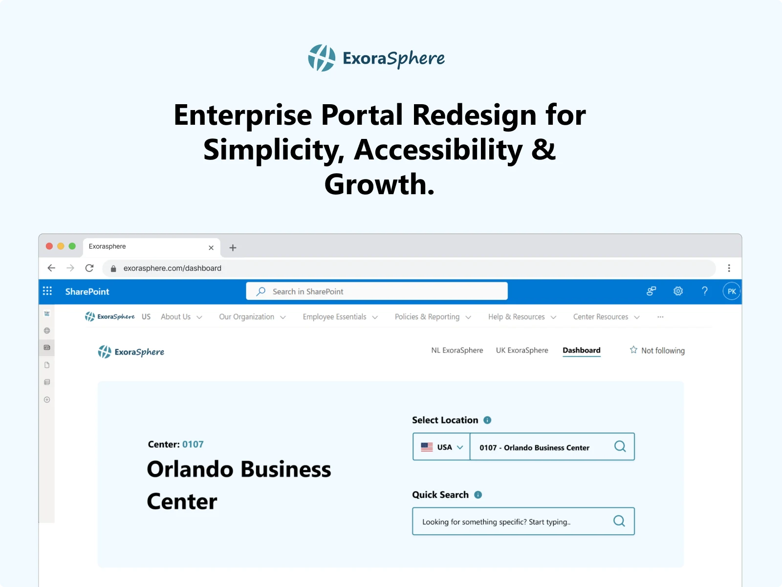
ExoraSphere represents a large-scale internal enterprise portal designed to help employees search, view, and manage center-specific operational data across multiple global regions. The portal is a vital tool for supporting teams with fast, reliable access to critical information for day-to-day operations.
The existing system suffered from inconsistent UI patterns, poor mobile responsiveness, and a lack of scalability.
The project focused on modernizing the portal’s design, enhancing usability, improving mobile accessibility, and introducing scalable UI/UX solutions for a distributed workforce.
A React-based solution was baselined as the tech stack to be embedded within SharePoint, aligning with the organization’s existing infrastructure.
System Constraints
Existing System Dependencies
The redesign needed to integrate with pre-existing backend systems, existing SharePoint structures, and existing data sources. SharePoint was central to the client's access and content management.
Scalability for Global Teams
The solution had to support a growing, globally distributed workforce without introducing complex maintenance overheads, ensuring consistent performance across regions.
UI/UX Challenges Identified
During the initial audit of Exosphere’s portal, several key usability and design issues were uncovered that impacted user efficiency, scalability, and mobile accessibility:
Cluttered Layout & Poor Information Hierarchy: Overcrowded forms, scattered fields, and inconsistent alignment made information hard to scan and workflows unintuitive.
Inconsistent Typography & Visual Hierarchy: Random sizing of titles, labels, and buttons, with no clear distinction between primary actions and supporting content, impacted readability and user focus.
Lack of Responsive, Mobile-Optimized Design: The interface prioritized desktop, resulting in cramped layouts, excessive horizontal scrolling, and usability issues on mobile devices.
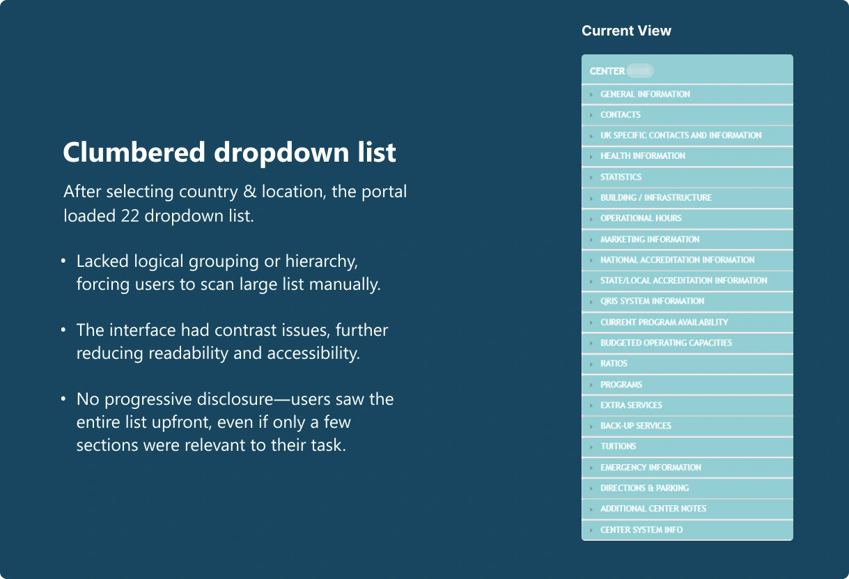
Overwhelming Data Exposure: Complex, lengthy forms with no progressive disclosure led to user fatigue and reduced efficiency.
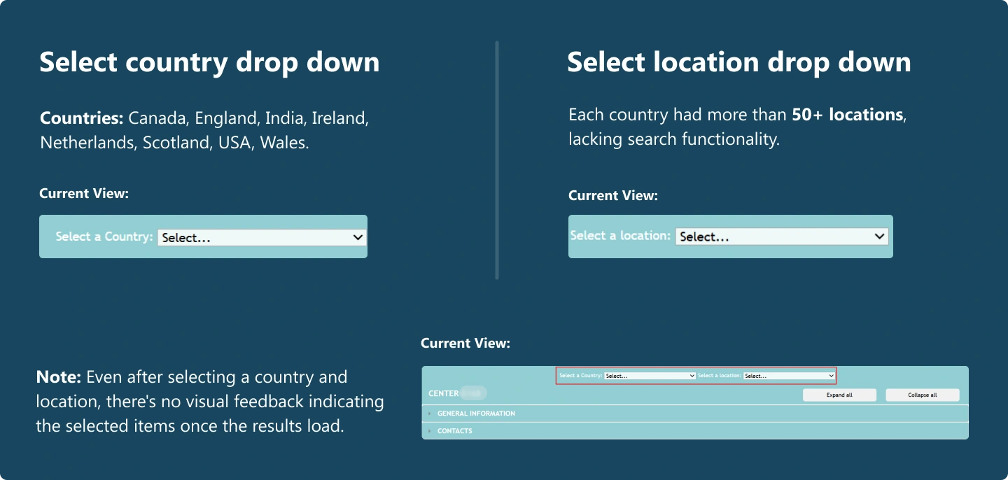
Step 1: Select the desired country and corresponding center location.
Step 2: Navigate to the specific data point within the selected center location to perform the desired action.
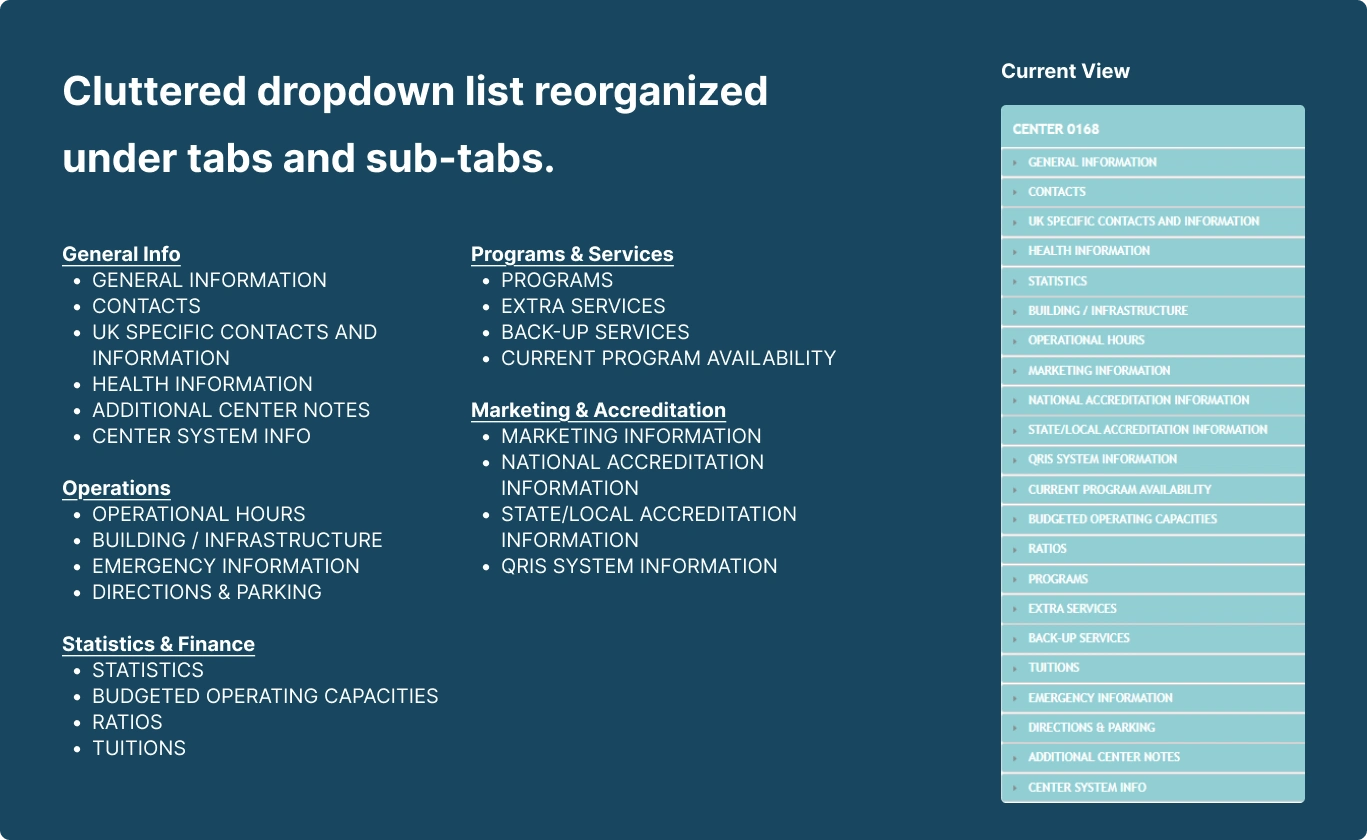
The portal was data-intensive and lacked intuitive search functionality, forcing users to rely on memory to navigate lengthy, unstructured dropdown lists for performing action in the desired center data.
Design Approach
The redesign is aligned with core business goals and operational objectives, ensuring the solution drives measurable impact.
At the same time, user-centric principles shaped the user flows, prioritizing simplicity, efficiency, and ease of navigation.
Unified Location Search for Faster Navigation
Streamlined center location search by merging country and location dropdowns into a single, searchable field.
This reduced visual clutter, simplified workflows, and enabled users to find center data faster and with fewer clicks.
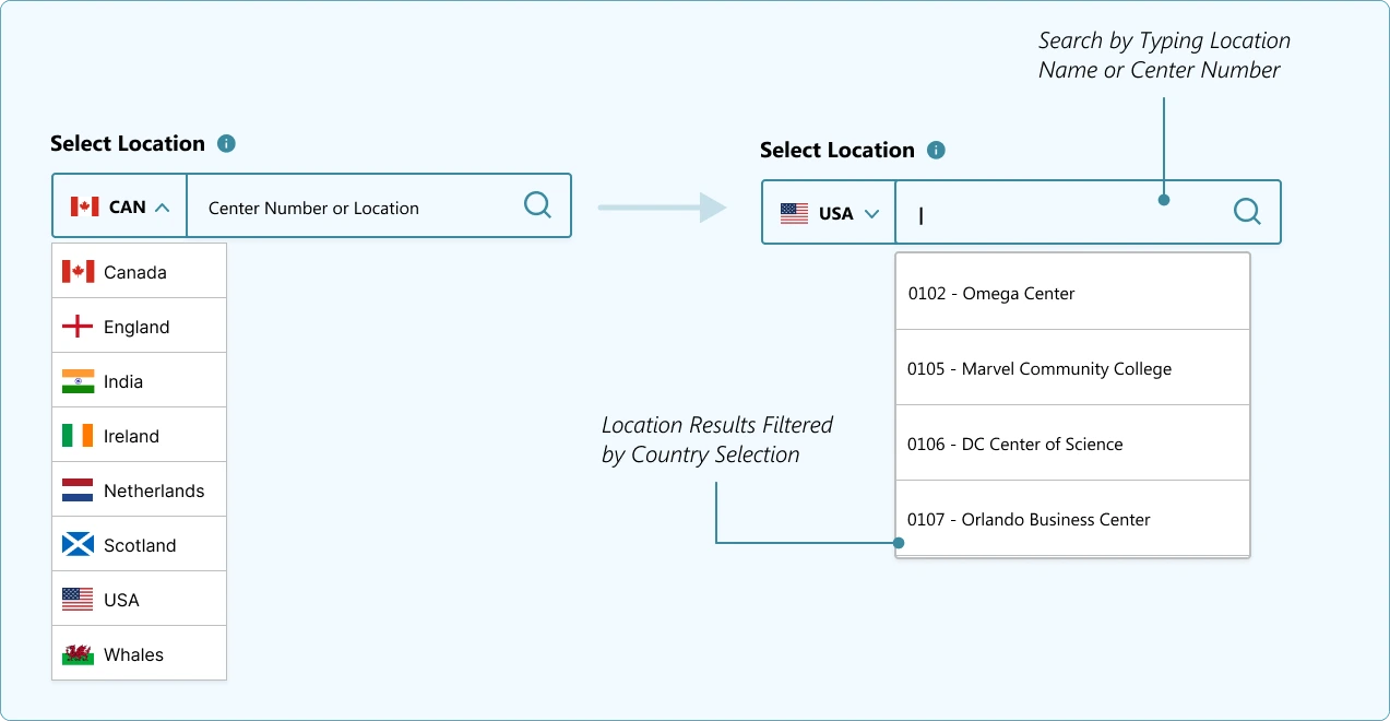
Locations update by country with elastic search for real-time filtering.
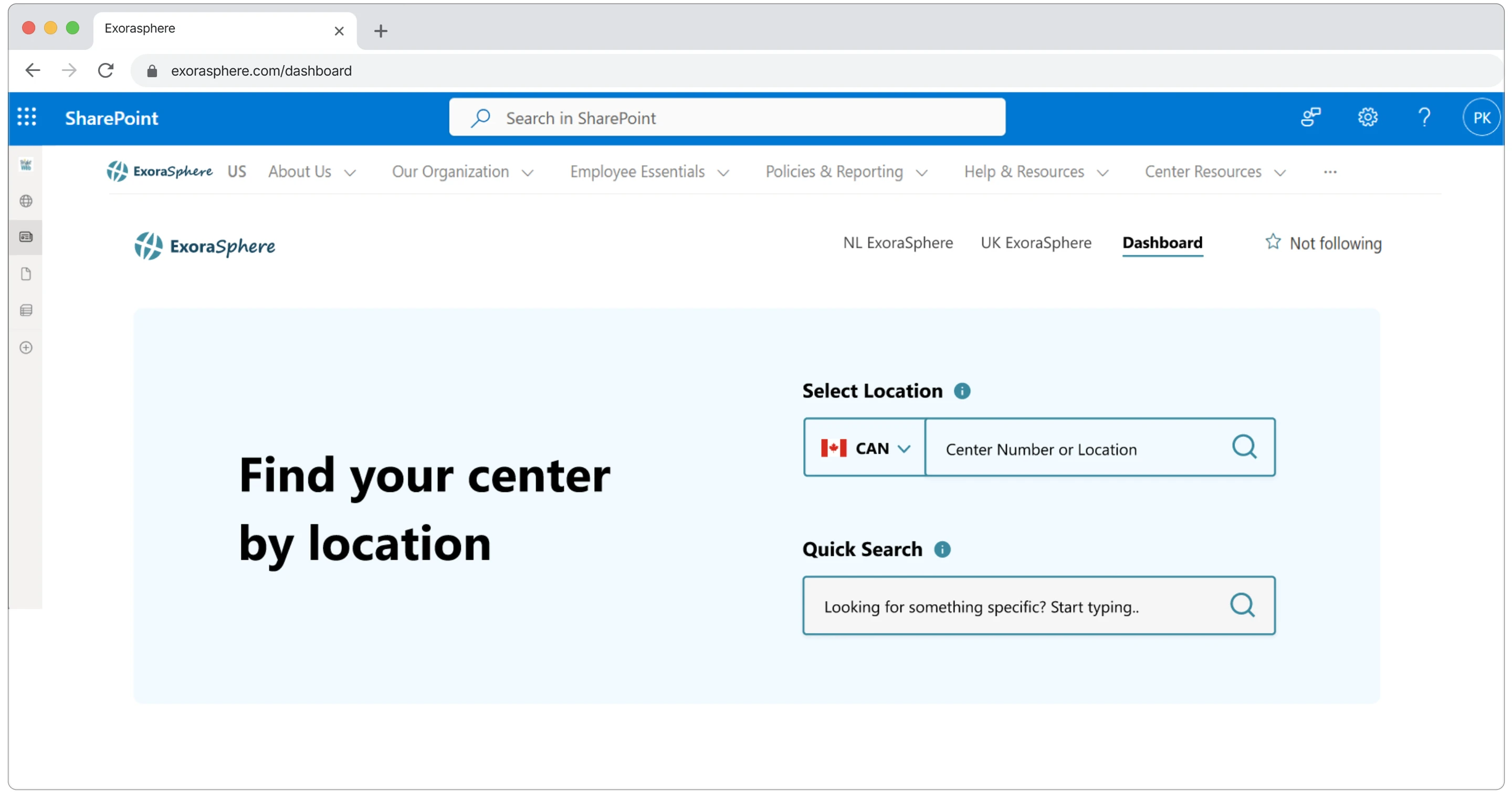
Initial Screen - Quick Search becomes available after selecting a center location.
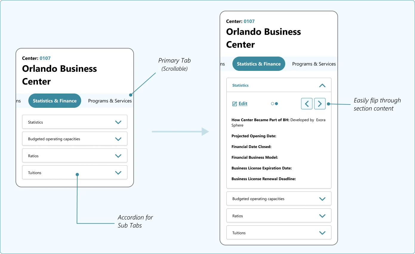
Organized Data Grouping with Tabs and Sub-Tabs
Data was logically grouped into tabs and sub-tabs, reducing clutter and allowing users to access relevant information quickly without overwhelming the screen.
Mobile-Friendly Design with Progressive Disclosure
To address poor mobile usability and excessive horizontal scrolling, tabs and sub-tabs were redesigned as collapsible accordions on mobile devices.
This ensured a clean, organized layout with progressive disclosure of information, allowing users to expand only the sections they need, reducing cognitive load and minimizing vertical scrolling fatigue.
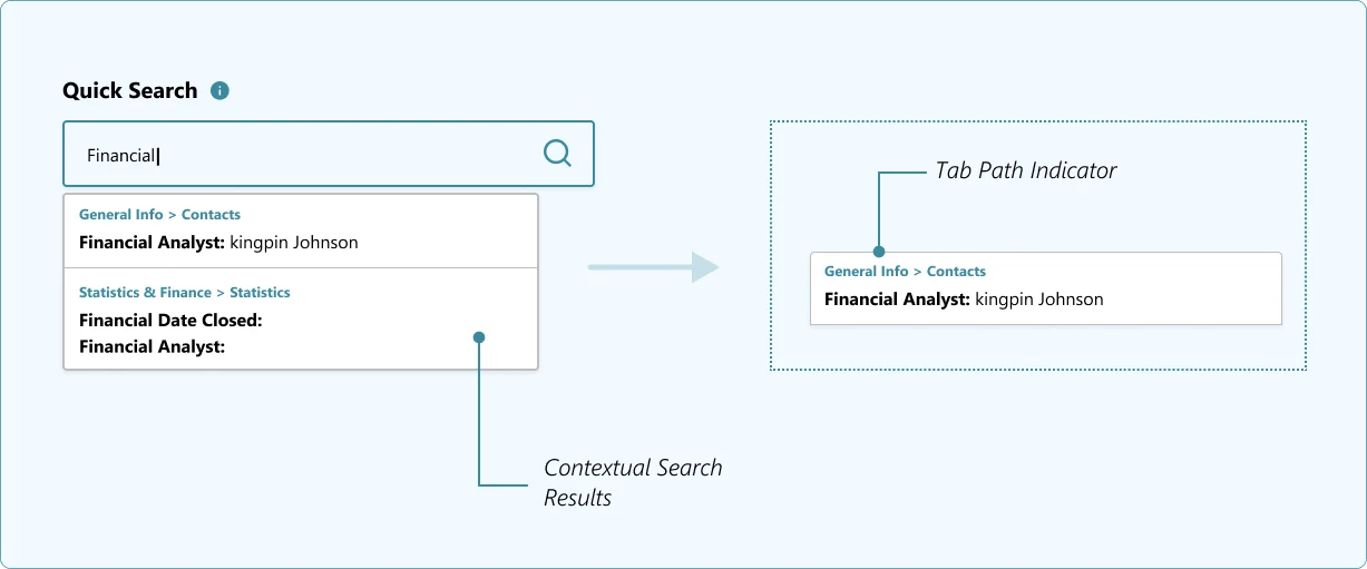
Quick Access - A time-saving feature for rapid data access.
Quick Access search field, enables users to instantly filter and locate specific data points without navigating through multiple sections, significantly reducing task completion time.
Focused Edit Experience with Vertical Stepper
Introduced a vertical stepper to segment long edit forms into clear, manageable sections.
Users can directly access and edit specific areas without being overwhelmed by ungrouped, dense fields, enhancing clarity and reducing cognitive load during data updates.
Outcomes & Impact
Reduced page clutter with grouped tabs, accordions, and progressive disclosure.
Faster data access with unified dropdowns and Quick Search.
Optimized mobile experience with responsive layouts and collapsible sections.
Simplified edit workflows using vertical steppers.
Consistent, scalable UI system ready for future expansion.
Like this project
Posted Jul 3, 2025
Revamped a global enterprise portal to simplify complex workflows, reduce visual clutter, and improve mobile accessibility for distributed teams.
Likes
0
Views
11


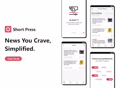
ShortPress - News You Crave, Simplified.
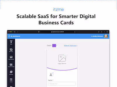
Itzme: Redefining Virtual Business Cards with Scalable SaaS.
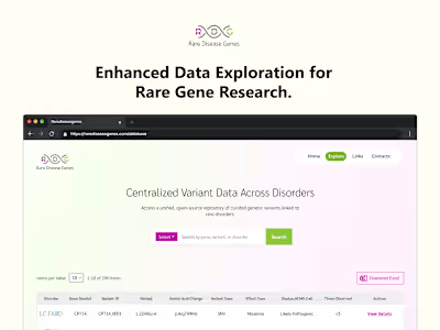
Rare Disease Genes - Global Clinician-Focused Platform Redesign.