Apex Cool Labs Brand Identity Design
Felice Della Gatta
I first met Evy when she was the chief marketing officer at a startup in San Francisco. She had hired me for a rebrand there, and we’d stayed in touch ever since. During one of her deep dives into strength training recovery hacks, Evy discovered that removing heat via your palms between workout sets speeds up recovery and boosts athletic performance.
The thermoregulation rabbit hole she fell into led her to Ariel Paul, a rock climbing physicist who had just started experimenting with a portable palm-cooling device of his own invention. A few months later, Evy and Ariel teamed up to launch Apex Cool Labs and reached out to me to design the face of their new brand.
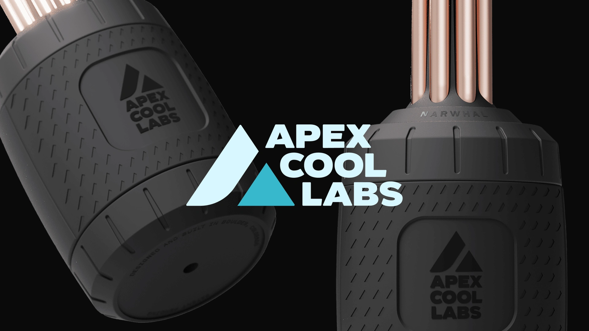
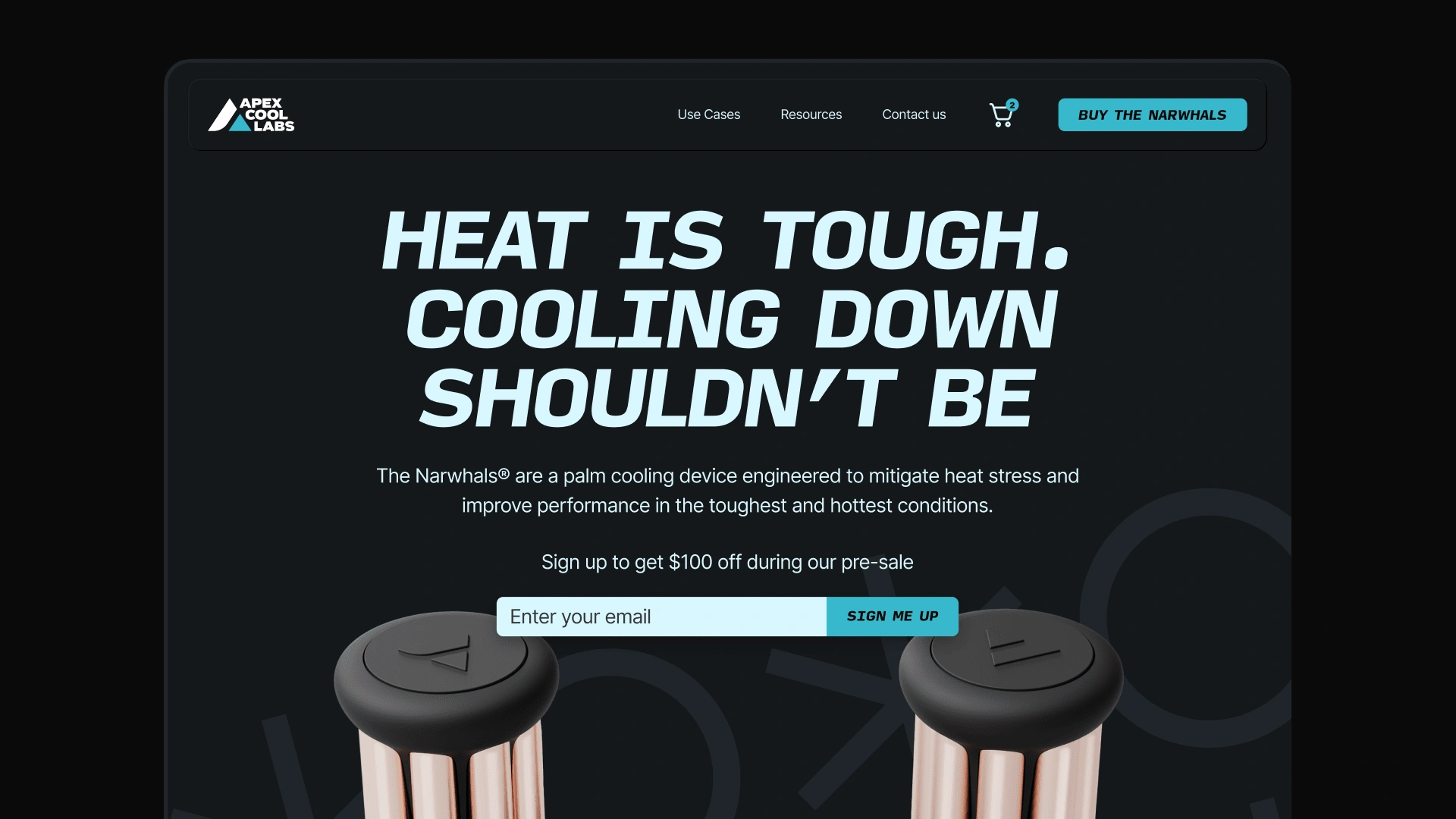
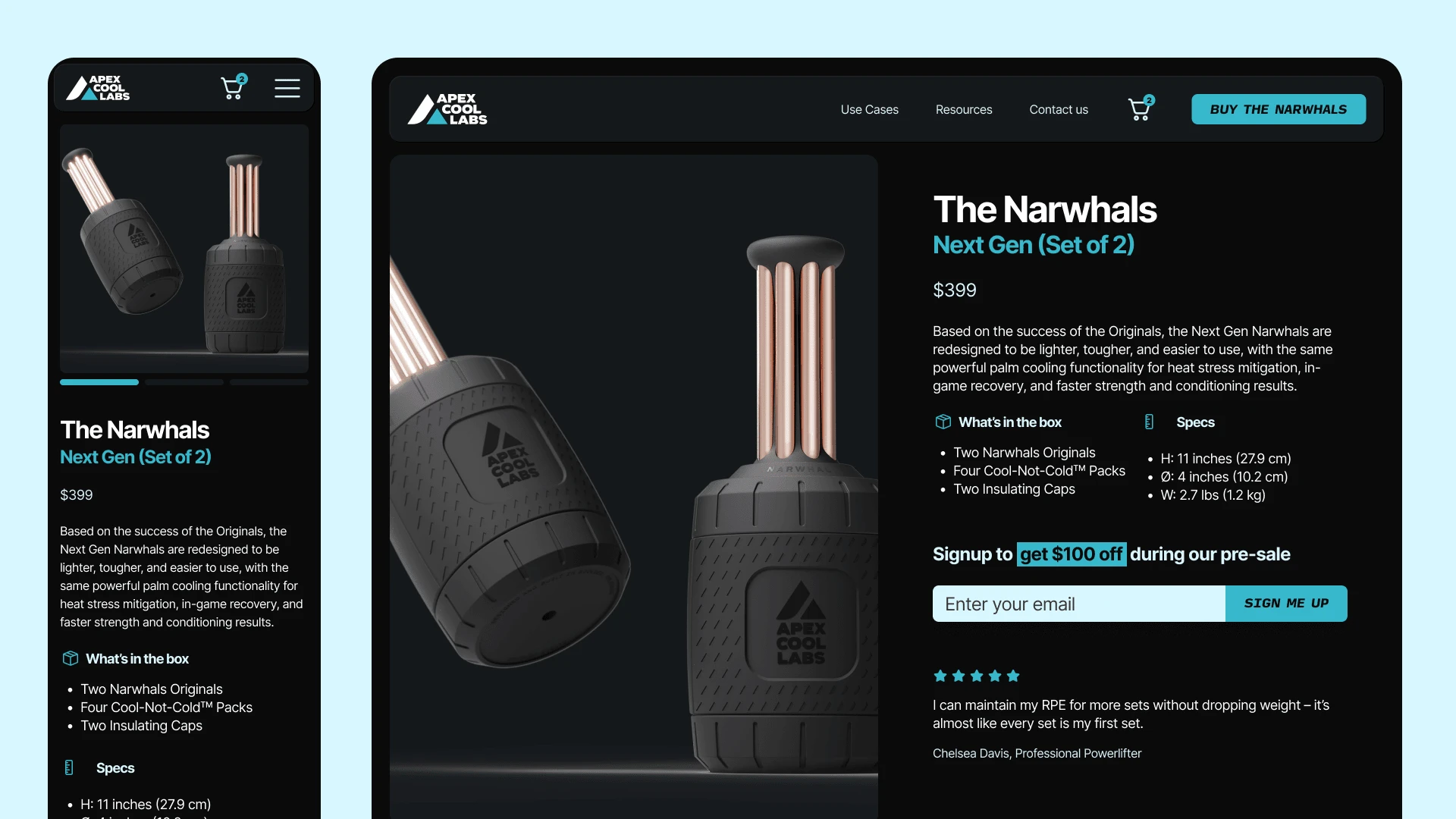
The product, which they would later call "the Narwhals," owes its name to the smooth cooling rods protruding from the top of its cylindrical base, resembling the horn of a narwhal (Fittingly, narwhals also live in the cold waters of the Arctic).
We kicked things off by diving into their vision, competitors, and the attributes they wanted to infuse into the brand. At the time, the focus of the initial brand platform was all about athletes and performance. But things took an unexpected turn when firefighters started using the Narwhals to combat heat stress caused by the extreme conditions they’re exposed to daily. The product was then redesigned to be tougher and more durable, and the brand got a light refresh to reflect that and welcome and include the new segment.
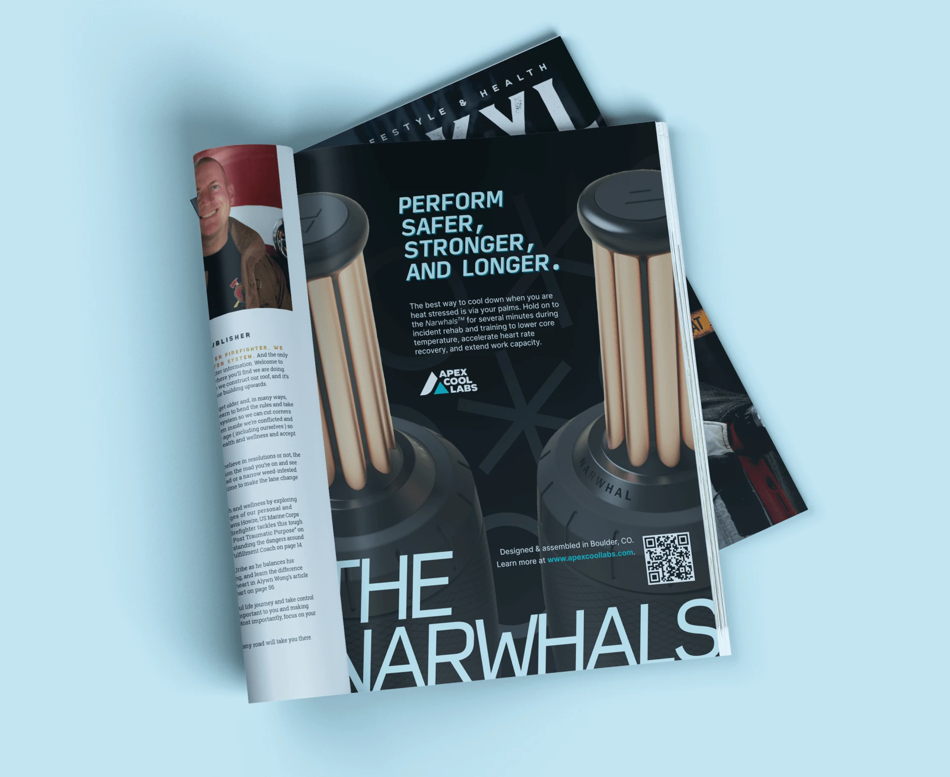
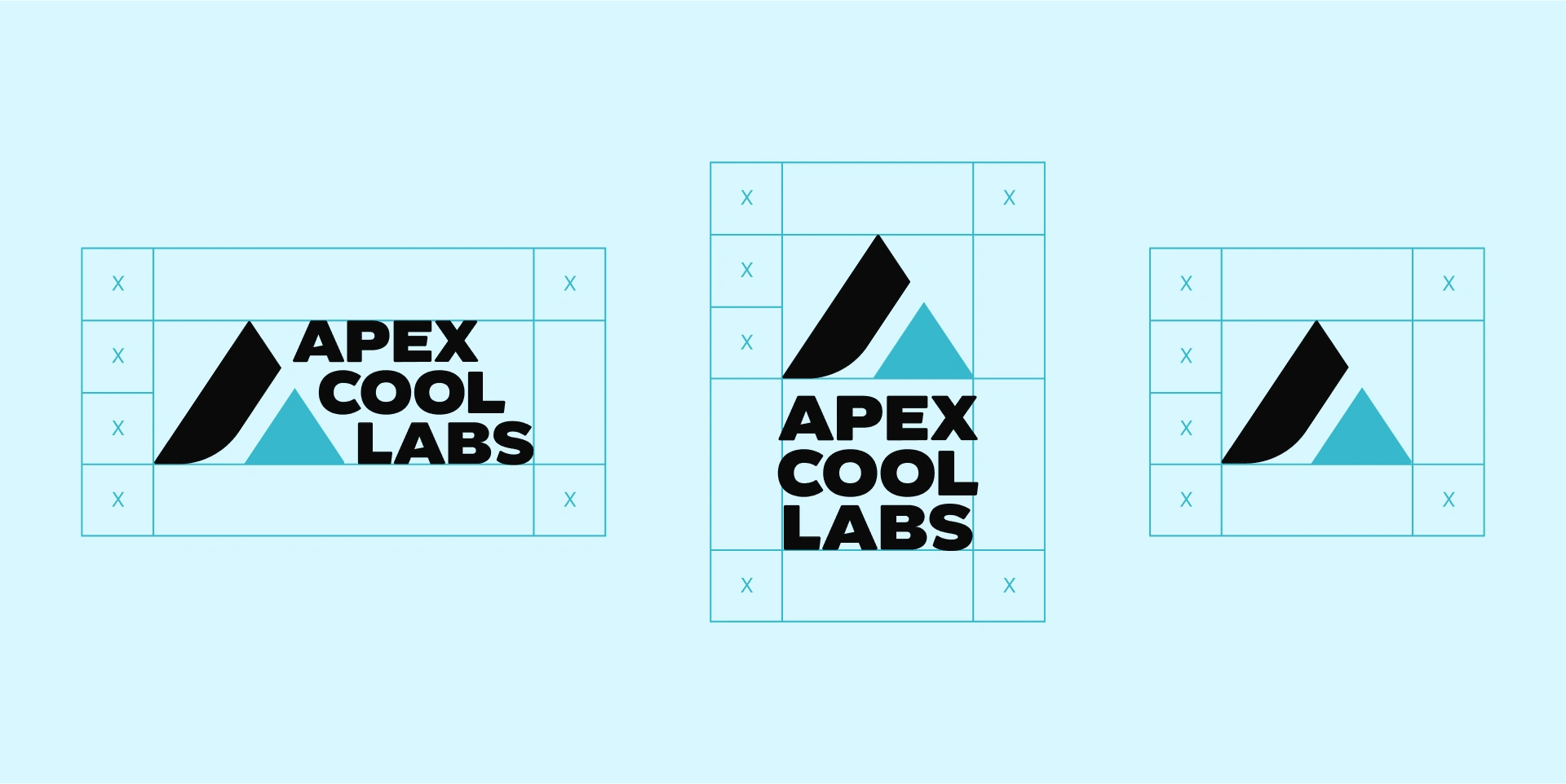
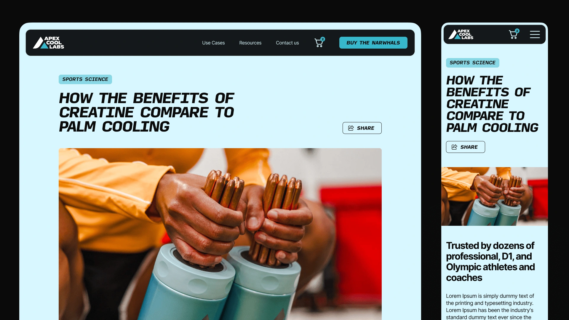
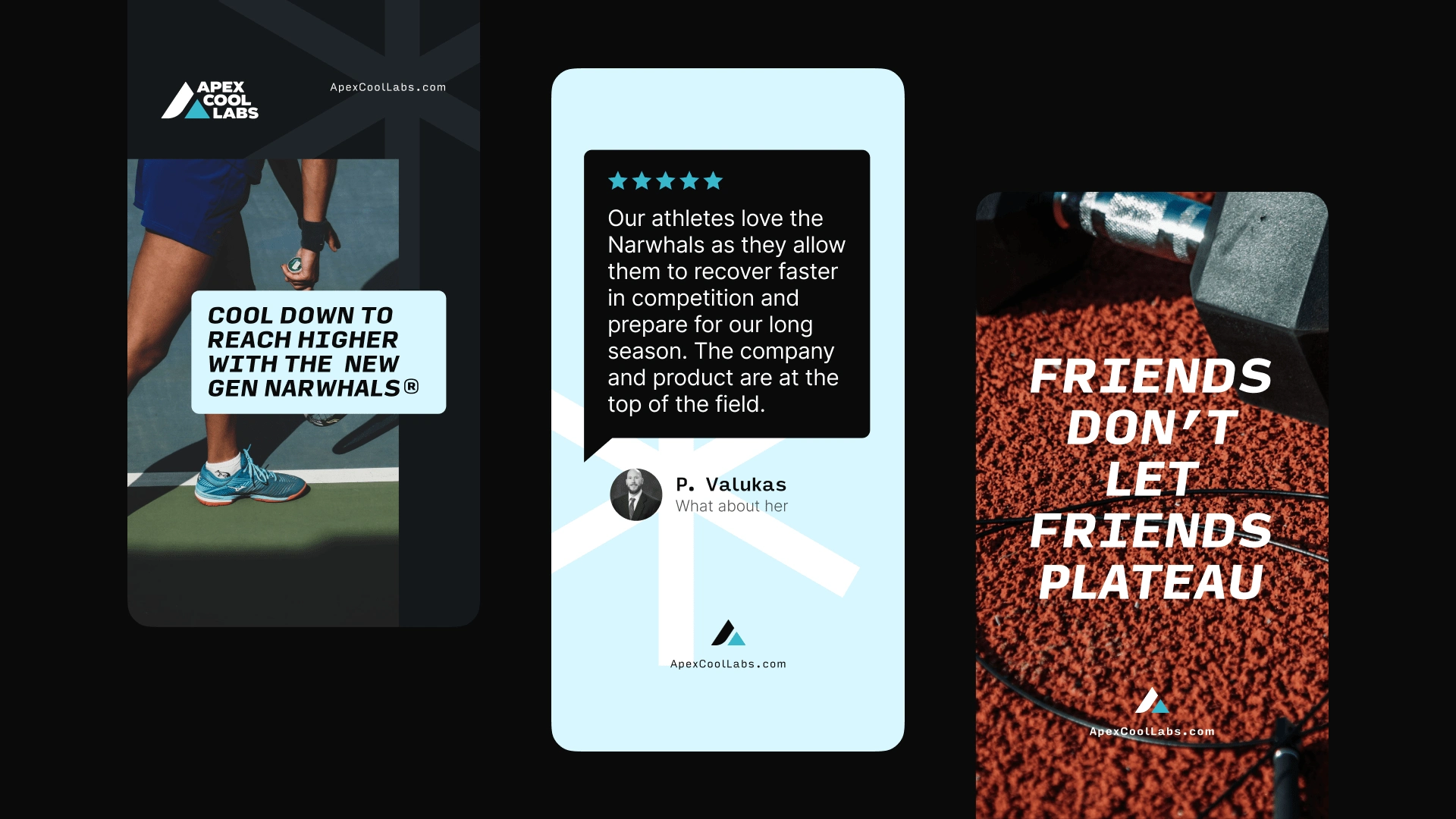
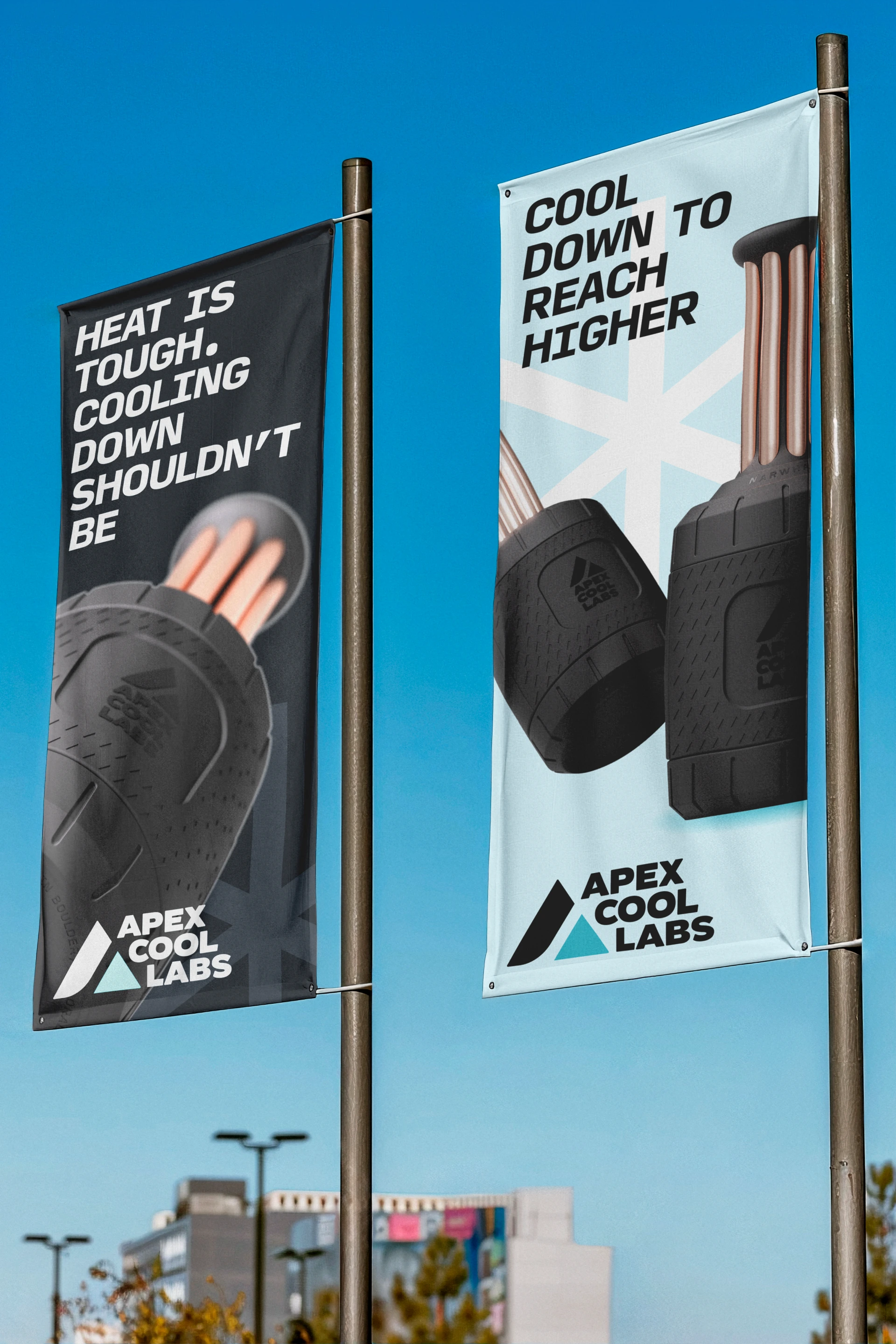
For the visual identity, we aimed for a bold, rugged aesthetic that embodies strength and performance. The color palette is dominated by deep, rubbery matte blacks, evoking durability and practicality, while accents of light blue hint at the cooling effect of the Narwhals themselves. The logo, with its sharp, angular shapes paired with the brand’s blocky display type, suggests precision and dynamism, reinforcing the technical nature of the brand and its focus on pushing the envelope of safety and performance for both athletes and first responders.
Like this project
Posted Oct 8, 2024
Bold, rugged aesthetic embodying strength and performance for Apex Cool Labs brand identity.
Likes
0
Views
1
Clients
Apex Cool Labs