Generation Carbon Brand Identity
Felice Della Gatta
While volunteering for The Carbon Almanac, I found myself working alongside a passionate group of fellow Italians, who later invited me along to start Generation Carbon, an Italian volunteer-based organization focused on educating younger generations about climate change.
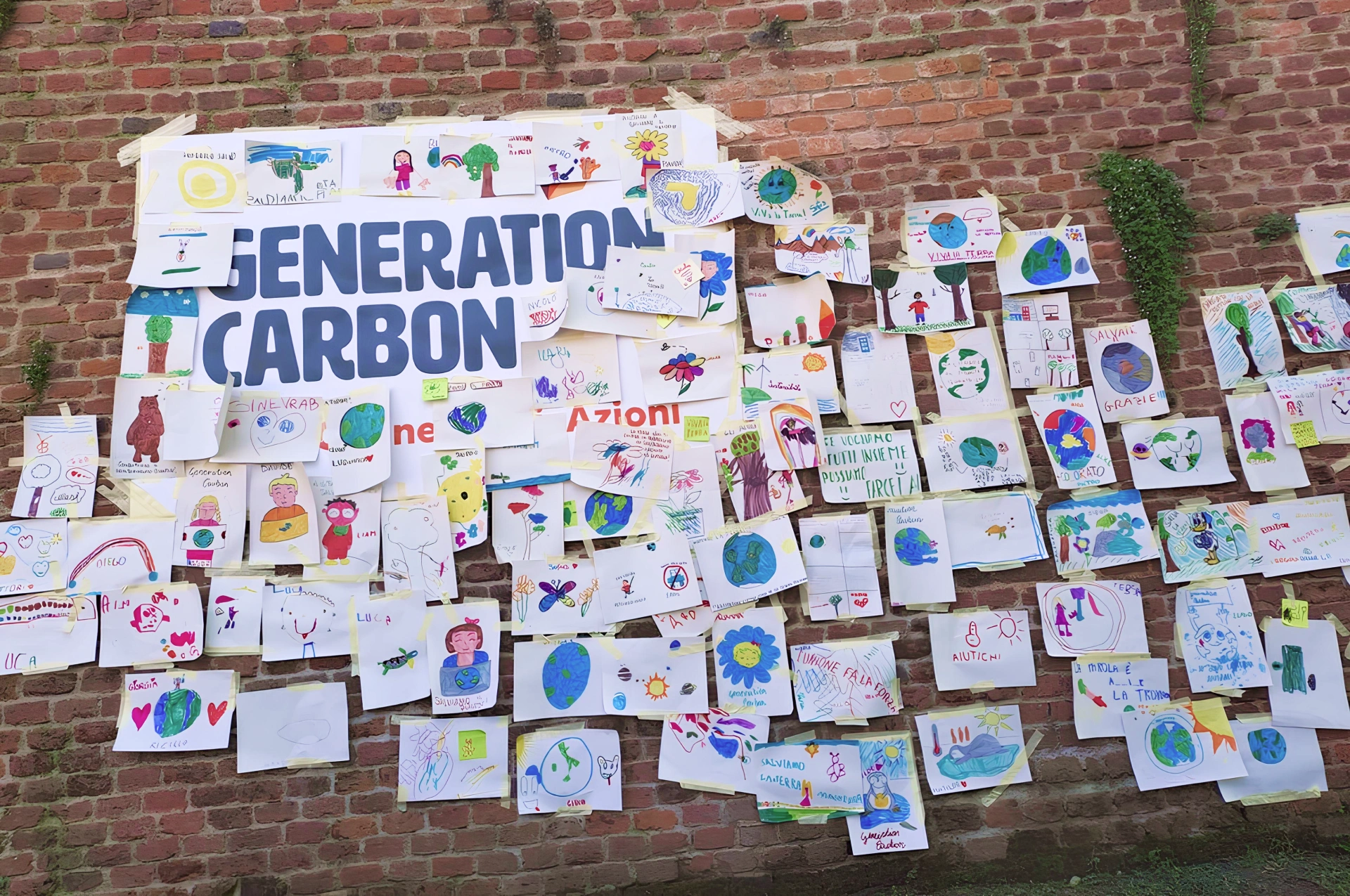
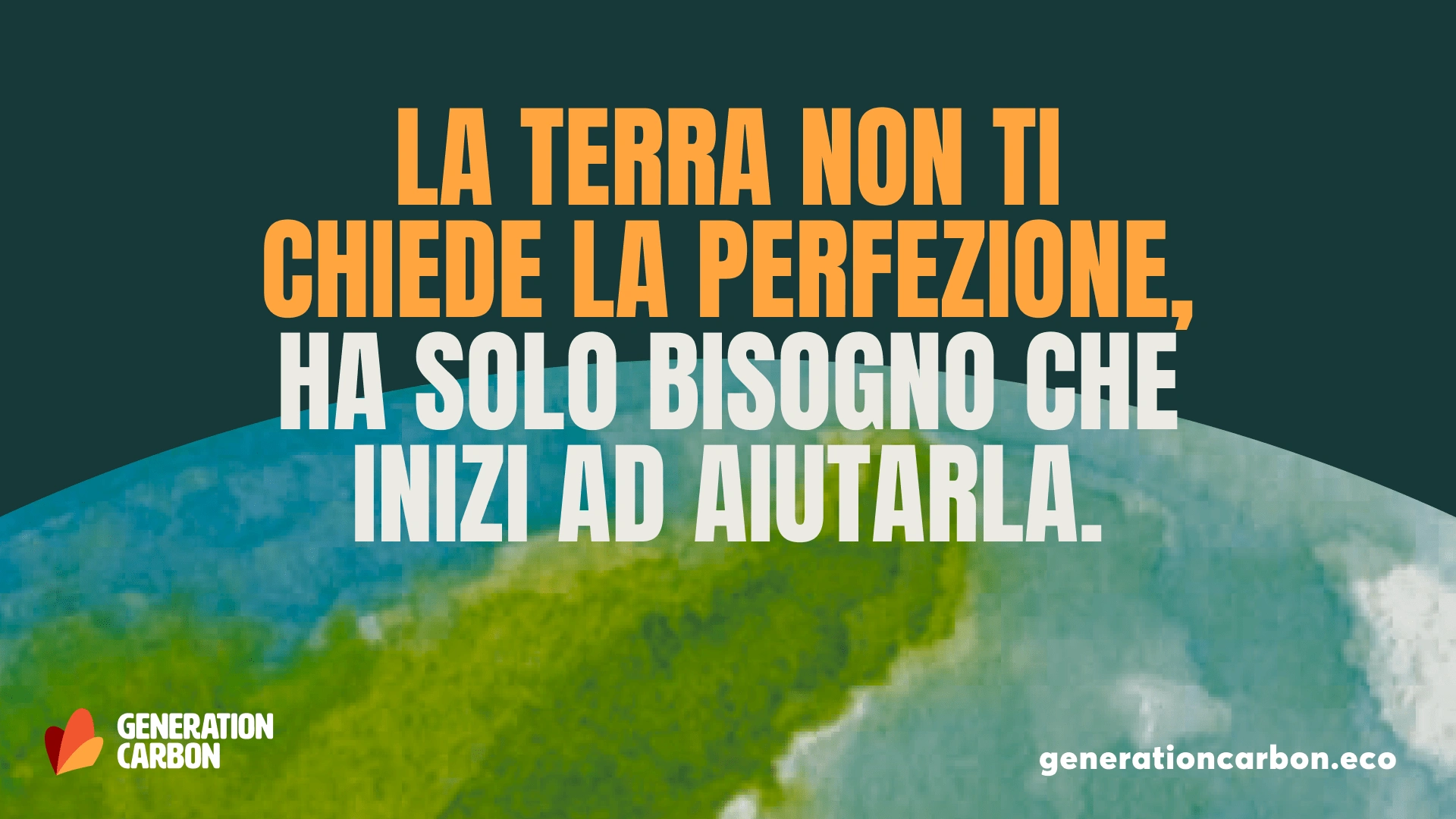
We needed a brand identity to help carry our mission forward, so we talked about what that might have looked like. Generation Carbon focuses on educating students—specifically kids, teens, and young adults—about the issues and solutions to climate change. Our identity needed to resonate with this younger audience and the institutions whose support was fundamental to our mission.
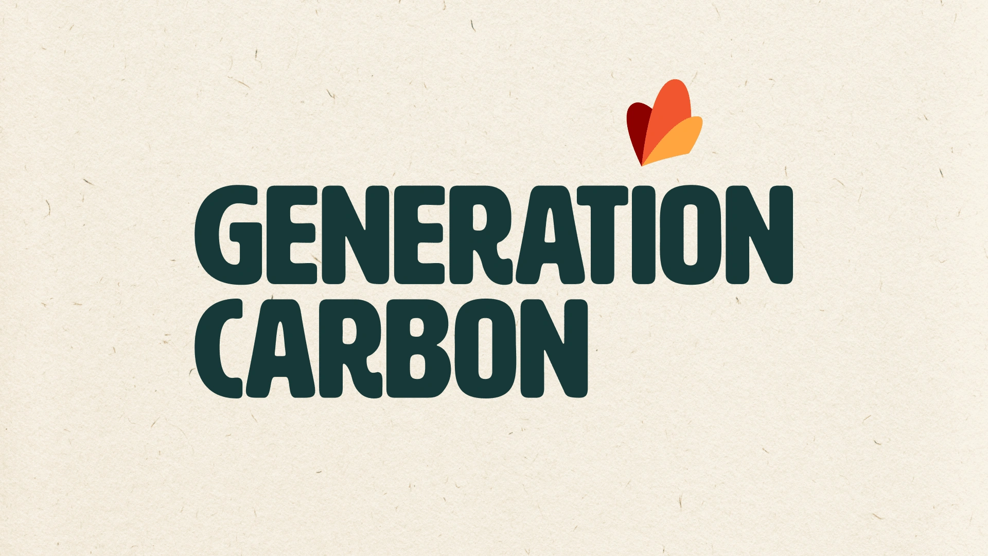
Loss of biodiversity is probably the most tangible effect of climate change. Scientists claim that over one million species risk becoming extinct in the coming decades. Among these animals, the monarch butterfly stood out as the perfect metaphor for the radical transformation our team is working towards. Its distinctive form and color allowed us to create a logo that worked on multiple levels. The stylized, simplified icon of the monarch butterfly became the brand’s signature, with an extremely stylized design that might also resemble a burning flame—a nod to the urgency of our work at Generation Carbon.

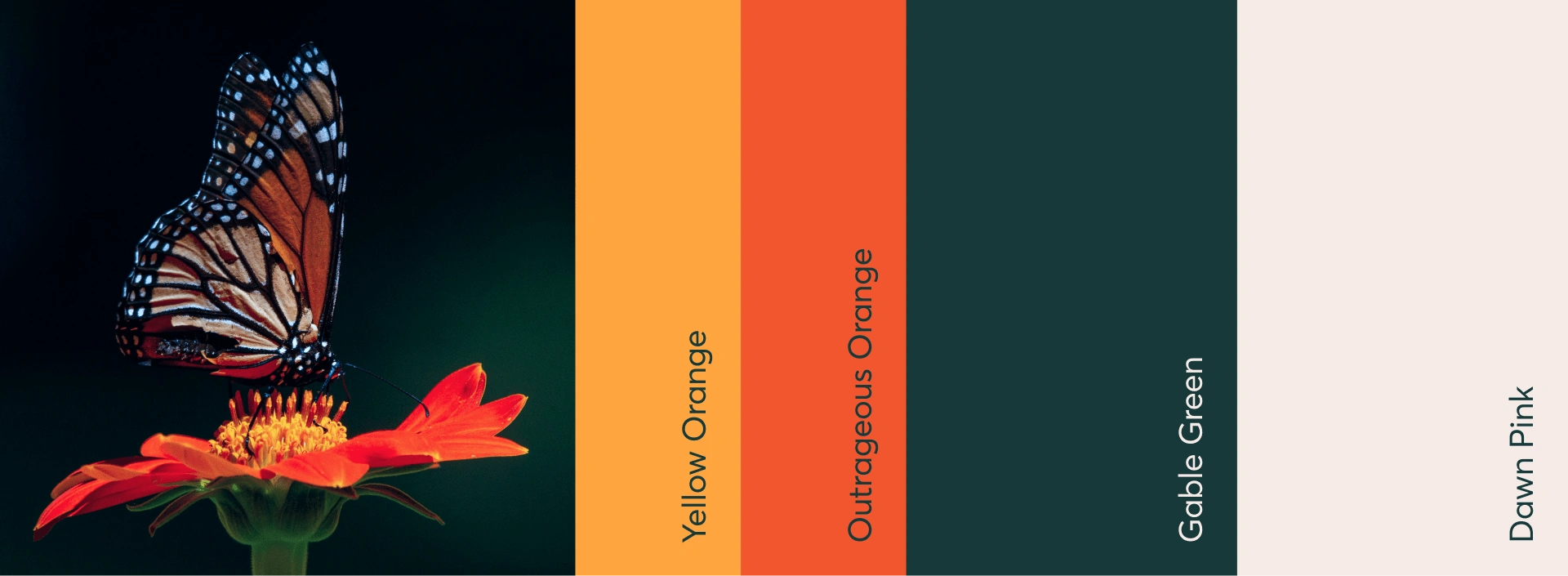
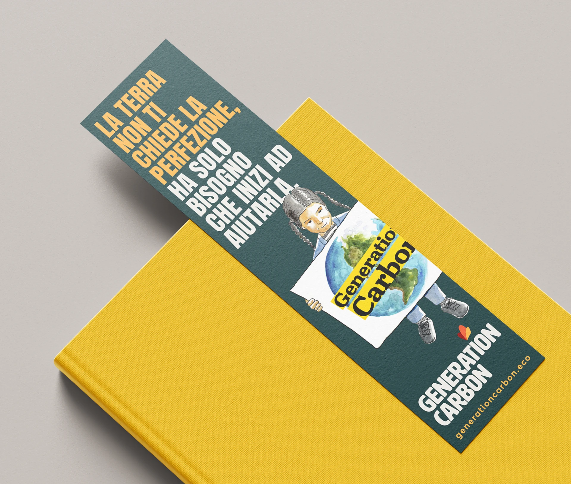
To appeal to the younger audience, I paired the butterfly icon with a friendly and blocky typeface with an organic character reminiscent of worn-out woodblock letters. The colors reflected the butterfly's vibrant palette, using deep oranges for the icon and a rich, dark green for the text and other elements of the identity. The orange serves as a striking accent against the grounded, earthy green, balancing energy with stability.The response to the monarch butterfly logo proposal was immediate and enthusiastic. The team instantly connected with the design, and it became the cornerstone of Generation Carbon’s brand.
Since launching the new identity, the team has made incredible strides. Thanks to strategic partnerships with local organizations and under the patronage of the Italian Ministry of Environment and Energy Security, our educational programs reached over 25,000 students in 2024 and are set to reach 38,000 more in 2025.
Like this project
Posted Oct 8, 2024
Brand identity design project for an Italian nonprofit focused on educating kids on climate change issues and solutions.
Likes
0
Views
5
Clients
General Carbon Corporation