UX-Focused Banner Design for Wired
Chris Love
Banner ADS
Wired is one of the oldest publications that delivers vital news about the tech industry. They have changed with the times, but they stay true to the medium that grew their brand the most, print media.
Here, I will show how applying UX principles can positively affect the performance of these banners and the thinking it takes to create digital media that affects users.
Contributions: design, ideation, concept, layout
APPROACH
Given that we could use the branding materials anyway we could, I focus mostly on structure and user experience. First, I wanted to show variation. So I constructed banners that focused on a variety of topics. Politics, Tech, Culture. Casting a bit of a wide net could help to bring in new users this far down the funnel.
Then I thought about how good a deal this was. So I decided to create a text-only banner that showcased the offer more prominently. I also wanted to put the name of the event in the background with motion, so the offer will maintain prominence.
RESULTS
After running for a couple of weeks, Wired sent us the performance results of our chosen banners. We decided to run the yellow and the purple, and the neon green dominate banners.
I have to admit, our team had some preconceived notions on which banners would be successful, but the ones that performed the best were the ones that were structured based on user experience.
The text-based ads worked better because they had a hook that people were interested in. Plus, the design focused more on the offer, which would be more appealing to users who are familiar with the Wired brand.
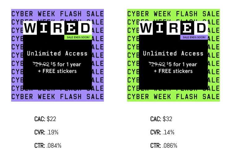
CAC: Customer Acquisition Cost
CVR: Conversion Rate CTR: Click-Through Rate
CONCLUSION
The final results showed that the previous designs were probably fatigued and needed some new imagery. I also believe that the structure of the ads helped with performance. The centered black card leads the users' eye to the offer and other vital information, like the sale ending soon, and communicates that the offer will allow users to gain unlimited access. The card also acts as a fake button, which makes the offer clickable. Plus, the team thought that the neon green would perform better since it was considered a best practice, but the purple seemed to be a bit more refreshing and more subdued compared to the loud green.
These numbers were significant because of what they meant when compared to previous performance. The purple creative had the lowest CAC and highest CVR and solid CTR in years. Across paid advertising, the banners drove 413 subscriptions at a $24 CAC, which was +11% more efficient than the CAC allowable. YoY, 97% more subscriptions were driven in that timeframe compared to Cyber Week in the previous year.
Like this project
Posted Sep 29, 2025
Designed UX-focused banners for Wired, improving subscription rates.