Hoops Chiropractic Website and Branding
Brian Hoops
My wife is awesome – she owns and operates her own chiropractic office. Since she started the business back in 2007, I’ve created her logo and website designs. She was stuck with the old website for quite a few years and was long overdue for a new version. I also felt that her logo could be improved without straying too far from the original design (signage is expensive!).
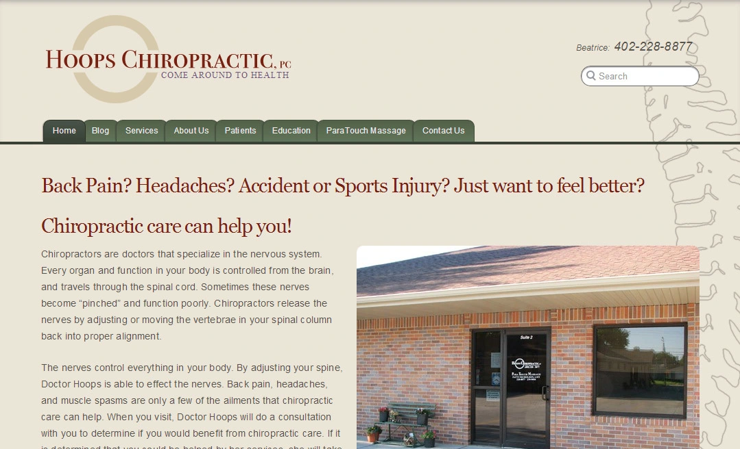
Her previous website and logo. Yeah we can do a lot better. This was many years ago!
Goals
The wife and I worked together to come up with some goals for the redesign:
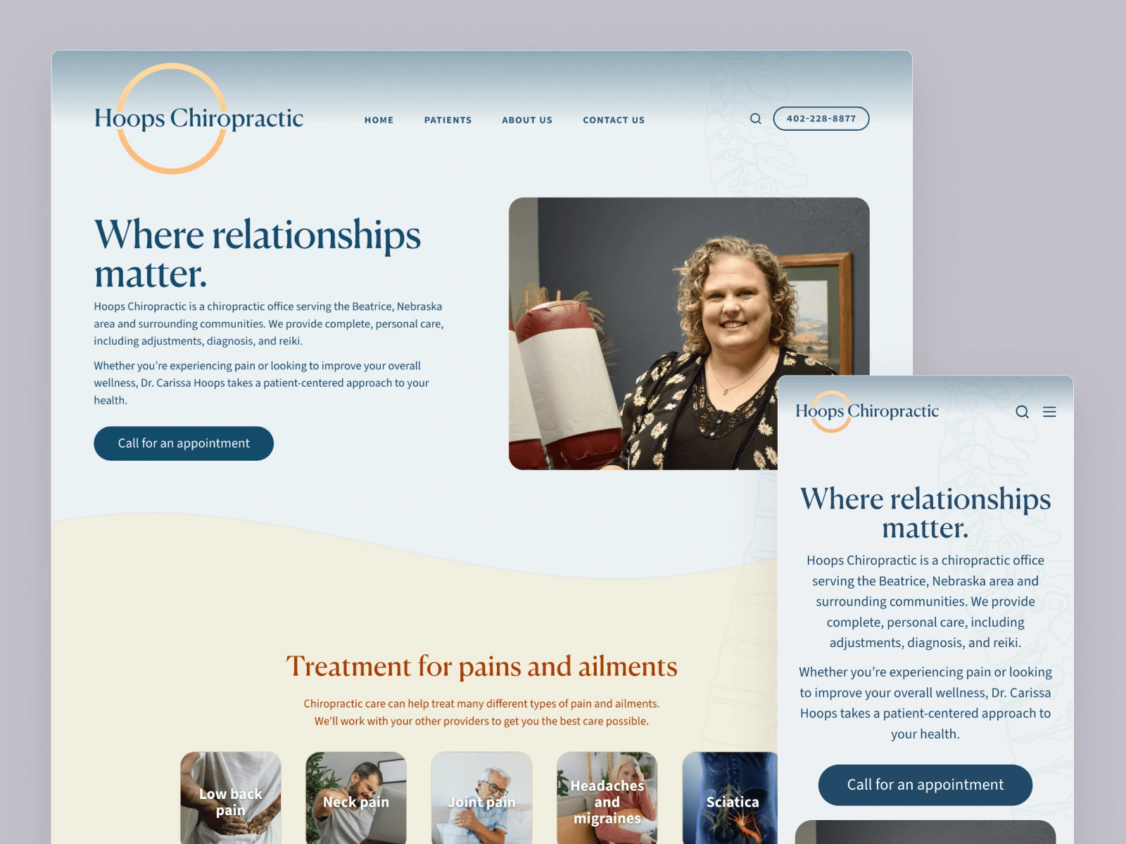
Modernize the branding, without straying too far from the original intent.
Provide better and more up-to-date information. We thought a lot about the questions she gets from patients all the time, and wanted to make that info more accessible.
Make the site more graphical / less text-heavy / easier to scan.
“Flatten” the site structure so key information isn’t so spread out across different pages.
Redesign highlights
The website is live – check it out if you wish.


Large and small logo sizes.
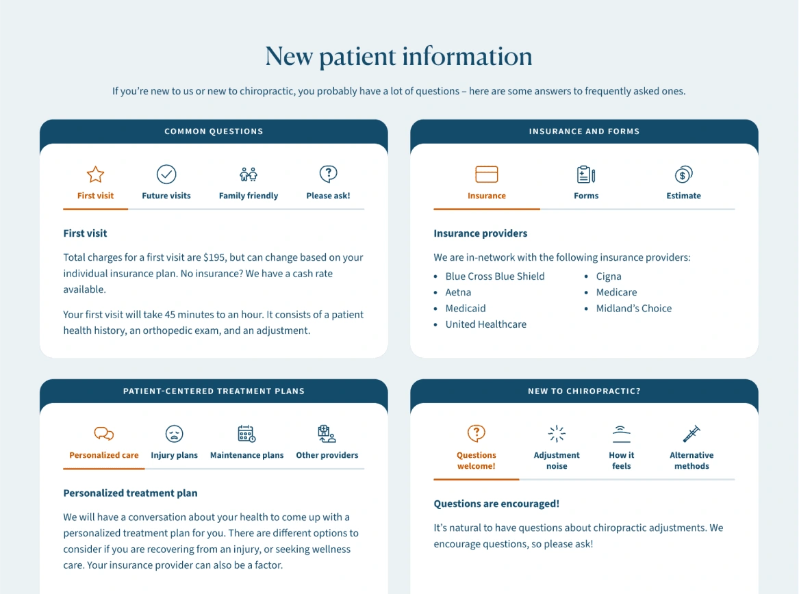
New patient information section. A lot of effort spent on crafting content, designing the UI, and designing the iconography.We incorporated updated photos of the office into the design – helping new patients feel at ease when they come in for the first time.Website footer section
Typography
The logo and primary headings are set in the elegant Canela Deck typeface. Other text is set in Source Sans, with a small-caps variant used sparingly.
Iconography
“Standard” icons come from the beautiful Feather icon set. Most of the other icons come from the wonderful Health icons set. These icon sets work pretty well together.
I created a few icons myself, because I could not find any equivalents. This was a fun challenge, and I did my best to mimic the style of the other sets, so they blend right in.
Performance
I made it a personal goal to have the website be very performant. While there is probably some further optimization to do, I’m proud with the result so far with Lighthouse mobile performance.
Like this project
Posted Sep 27, 2023
A long overdue website redesign and brand refresh for my wife's business.
Likes
0
Views
21