Aromazone Reinvented: The 'At-a-Glance' Revolution in Personaliz
Aromazone Rebranding: Decoding Beauty at a Glance
In this innovative rebranding project for Aromazone, I was challenged to revolutionize the brand's visual identity with a primary focus on their unique selling point: personalized product creation. The core concept, "At-a-Glance," aimed to instantly communicate to customers which products could be used as active ingredients in personalized formulations and which were ready-to-use.
Key features of the "At-a-Glance" concept:
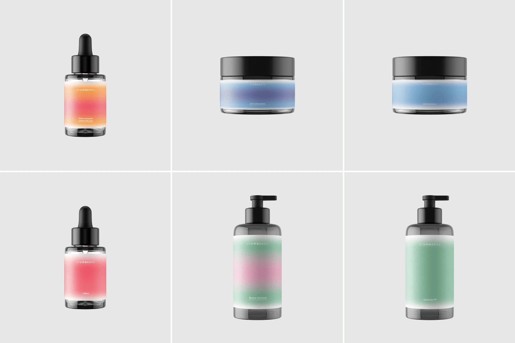
Color Coding System: Each color represents a specific active ingredient or product category, allowing customers to quickly identify product types and potential uses.
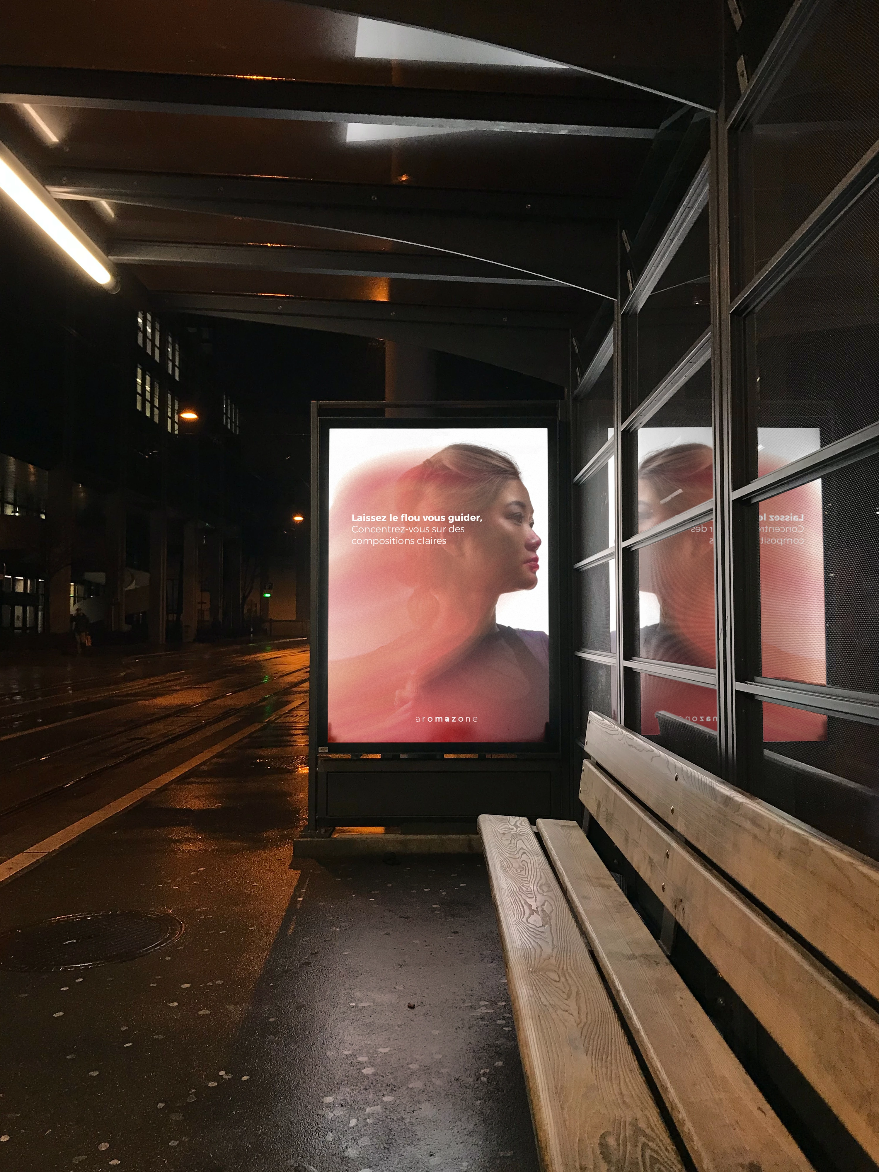
Gradient Storytelling: For personalized products, gradients visually represent the blend of ingredients, giving an immediate understanding of the product's composition.
Visual Distinction: Clear visual differentiation between customizable ingredients and ready-to-use products, enabling customers to navigate the product range effortlessly.
Intuitive User Experience: The design facilitates quick decision-making, whether a customer is looking to create a custom product or purchase a pre-made solution.
Brand Consistency: While introducing this new visual language, we maintained Aromazone's authentic and innovative brand image in the natural beauty space.
Implementation Challenges:
Balancing information density with visual clarity to maintain the "At-a-Glance" effectiveness.
Ensuring the color system was comprehensive enough to cover all product categories while remaining easily distinguishable.
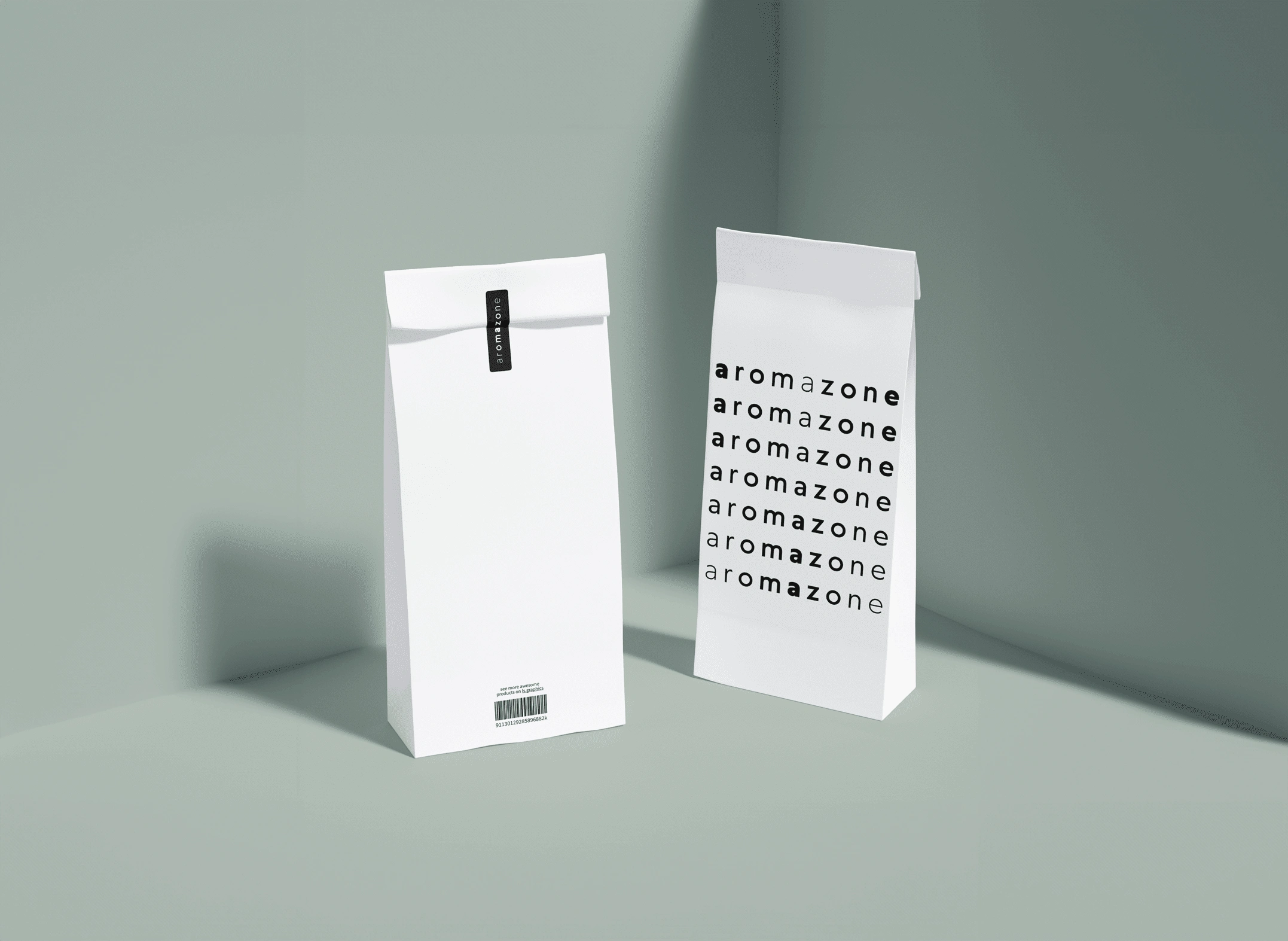
Designing packaging and digital interfaces that clearly communicated the "At-a-Glance" concept across all touchpoints.
Beyond Visual Design: Cultivating an Aromazone Lifestyle
While the "At-a-Glance" concept formed the cornerstone of Aromazone's visual rebranding, we extended the project's scope to encompass a holistic brand experience. This led to the creation of 'L'Aube', a bespoke brand magazine that complements the new visual identity.
'L'Aube' (meaning 'The Dawn' in French) serves multiple purposes:
Educational Tool: It helps customers understand the "At-a-Glance" system, featuring guides on how to read product packaging and create personalized formulations.
Inspiration Source: The magazine showcases various product combinations and recipes, encouraging customers to explore the full potential of Aromazone's customizable range.
Brand Storytelling: 'L'Aube' provides a platform to share Aromazone's philosophy, ingredients sourcing stories, and commitment to natural beauty.
Community Building: By featuring user-generated content and success stories, it fosters a sense of community among Aromazone enthusiasts.
Trend Forecasting: The publication keeps customers informed about upcoming trends in natural and personalized beauty, positioning Aromazone as an industry leader.
The magazine's design incorporates the new visual language, using the color coding and gradient systems to create a cohesive brand experience that extends beyond product packaging.
Like this project
Posted Aug 27, 2024
Designing a visual language where colors and gradients instantly communicate product composition and customization potential


