
The story: every B2B founder I know has lost an account they never saw slipping. The renewal was in 18 days. Engagement had quietly dropped 42%. Support tickets were piling up. And nobody knew — because the truth was scattered across five tools, three spreadsheets and one person's memory. That is the problem iPulseOS exists to kill.
What iPulseOS is: an AI-powered Business Command Center that unifies fragmented business operations, data and signals into actionable intelligence. Its core experience answers four questions, in order — What is happening? What matters? What needs attention? What should I do next? Its positioning is Signal → Insight → Action: a business dashboard, an AI assistant and an operational command center in one surface. Here is the story of each screen I designed.
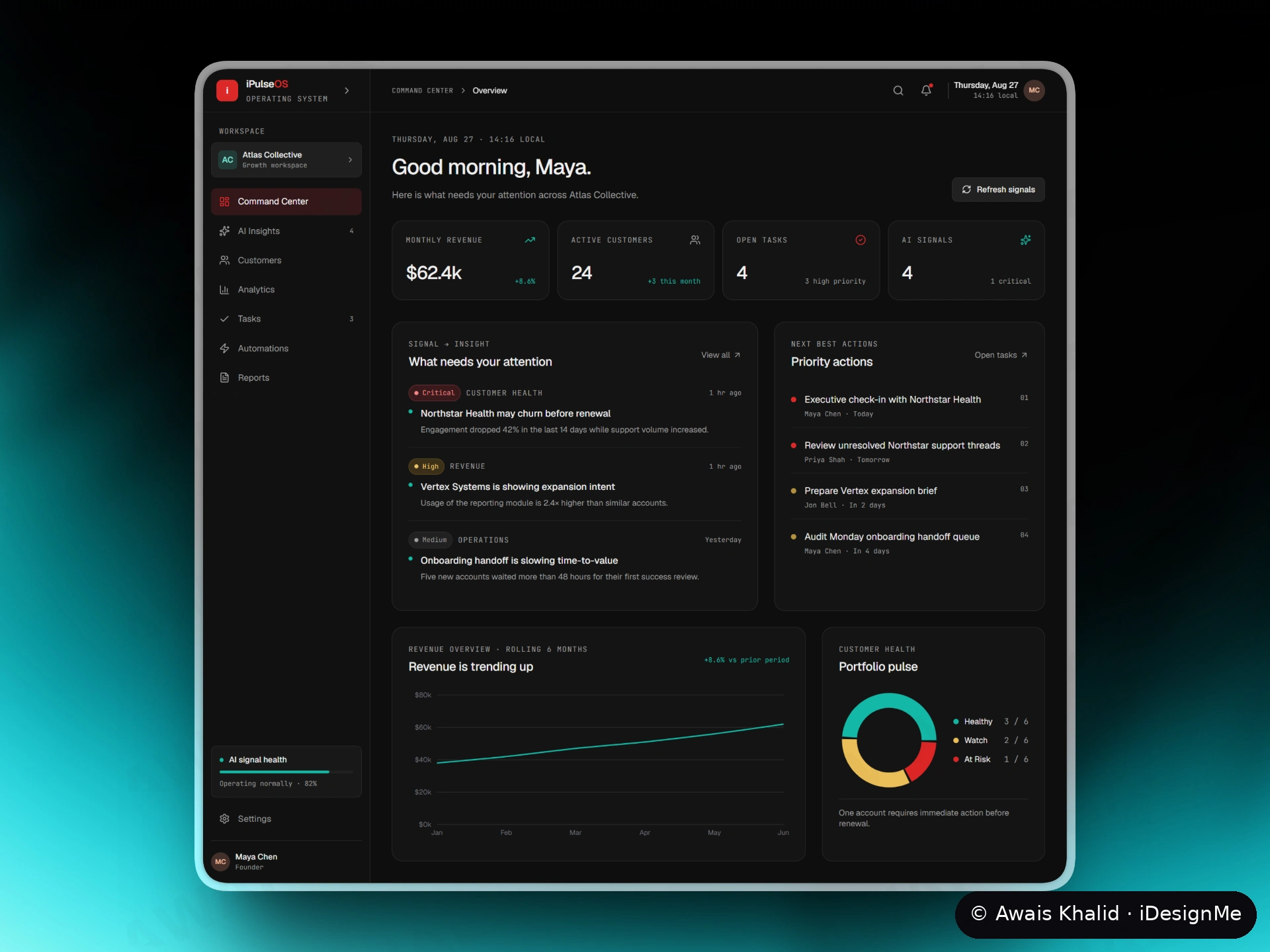
01 — Command Center · "What needs my attention today?" The founder's first screen is a morning briefing, not a data dump. A personal greeting, four numbers that run the business (revenue, active customers, open tasks, live AI signals), and then the point of the whole product: "What needs your attention" — signals ranked and written in plain language ("Northstar Health may churn before renewal"), beside "Priority actions" that say exactly what to do next. Design decision: hierarchy is the feature. Attention is the scarcest resource in a small company, so the page spends it deliberately — crisis first, celebration later.
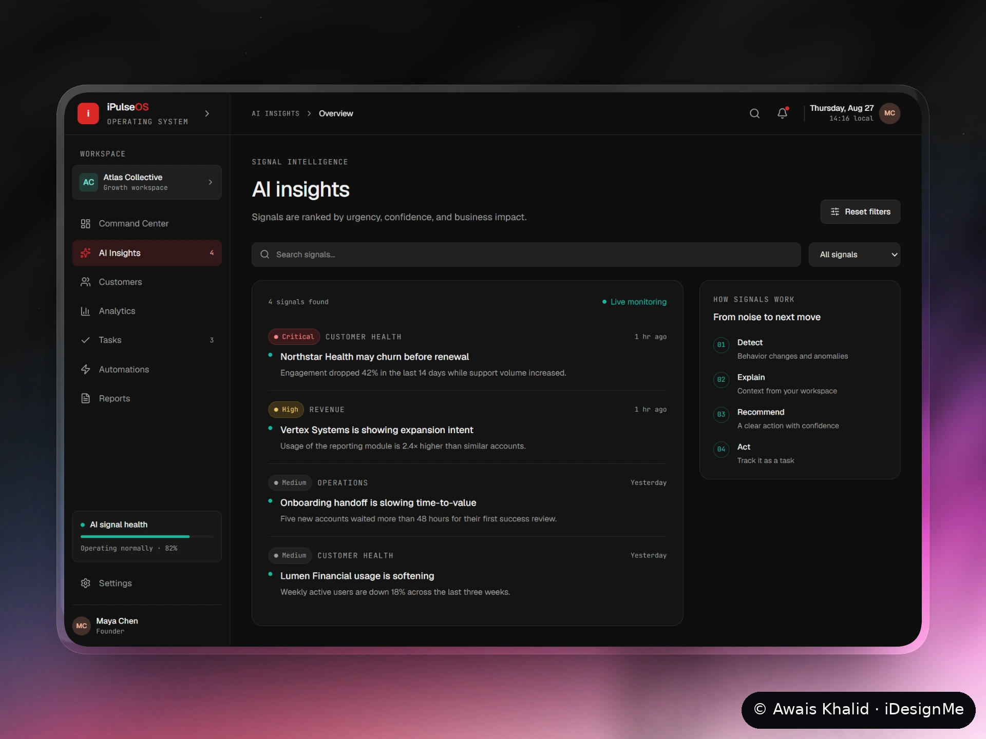
02 — AI Insights · From noise to next move. Raw monitoring produces hundreds of events; a founder can act on maybe four. This page ranks every signal by urgency, confidence and business impact, and labels it by severity (Critical / High / Medium) and kind (Customer Health, Revenue, Operations). The right rail explains the machine in four steps — Detect, Explain, Recommend, Act — because an AI recommendation a user doesn't understand is a recommendation they won't follow. Design decision: every signal shows its evidence ("Engagement dropped 42% in the last 14 days while support volume increased"), so trust is earned per-signal, not asked for blindly.
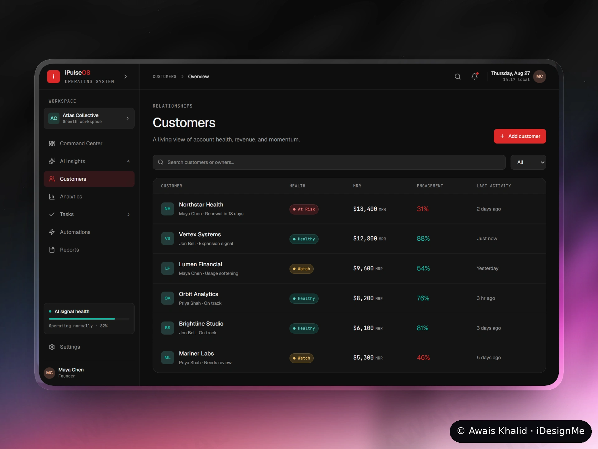
03 — Customers · Every account, one glance. The portfolio as a living table: health state (Healthy / Watch / At Risk), MRR, engagement, owner and last activity for each account. Design decision: the account is one consistent object everywhere in iPulseOS — the same Northstar Health you meet in a critical signal is the row you open here, the task you assign and the automation you arm. No re-learning, no lost context as you move from insight to action.
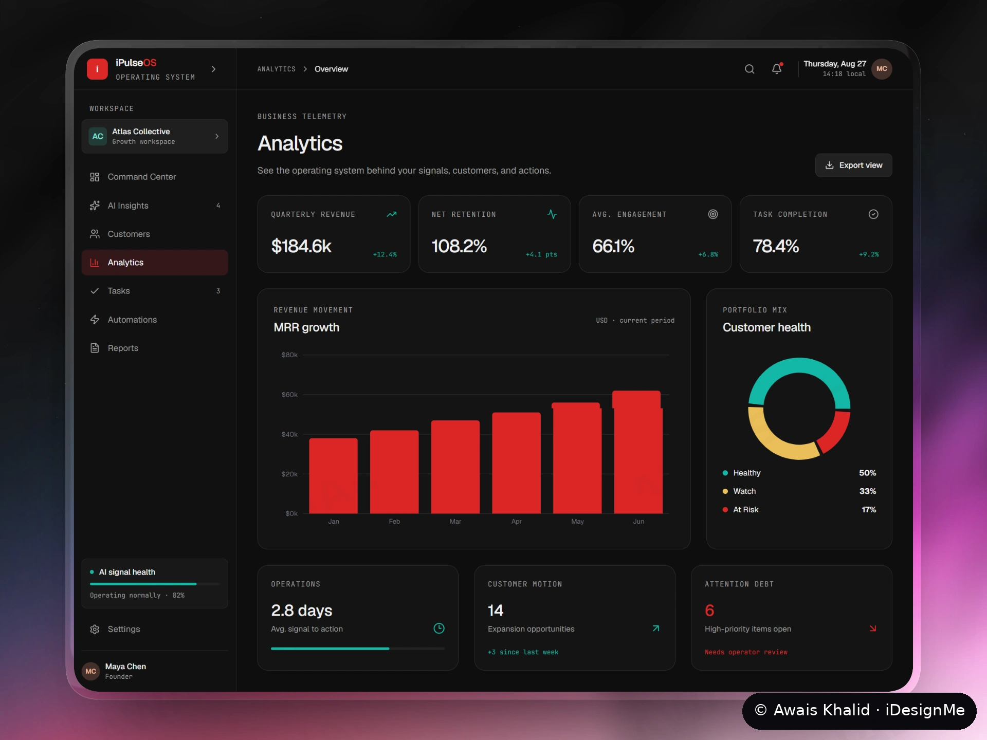
04 — Analytics · Proof the loop is working. Founders don't need more charts; they need to know if the machine is paying off. So the headline metric is net retention, and beside the usual revenue and engagement numbers sit two metrics most dashboards never show: average signal-to-action time (how fast the team moves once the product speaks) and attention debt (the high-priority items still open — the work nobody has owned yet). Design decision: measure the product against its own promise. If Signal → Insight → Action is the claim, the analytics page is where it proves itself.
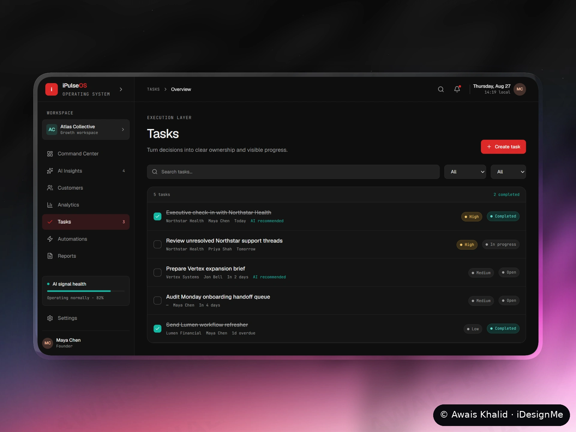
05 — Tasks · Decisions become ownership. An insight that doesn't become someone's job is just anxiety with better typography. The Tasks layer turns signals into assignments with an owner, a due date, a priority and a visible status — some flagged "AI recommended", so the human can see which work the machine proposed and which they chose themselves. Design decision: accountability is designed, not assumed — every task names a person and a deadline, in the open.
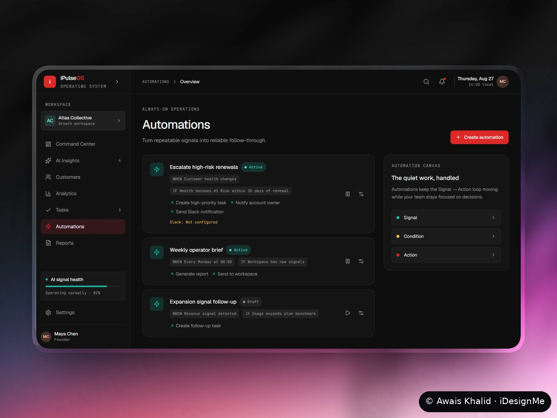
06 — Automations · The quiet work, handled. The final step: repeatable signals shouldn't need a human to notice them at all. Automations are written in plain WHEN / IF / THEN language a non-technical founder can read and trust — "IF health becomes At Risk within 30 days of renewal — create a high-priority task, notify the account owner, send a Slack alert." The canvas on the right reduces every rule to Signal → Condition → Action. Design decision: automation people can't read is automation people switch off; the rule is the interface.
The system underneath: one dark, calm design language across all six surfaces — red reserved for action and risk, teal for healthy signal, amber for watch — so state reads in a glance even at portfolio scale. Typography and spacing stay quiet on purpose: the data is the loudest thing on every screen.
The principle: designing AI products is mostly designing trust. Every recommendation in iPulseOS shows its evidence, its confidence and its owner — the machine proposes, the human decides. That is what turns a dashboard into a command center.
I designed the full iPulseOS product surface end-to-end in Figma — six modules, one design system, developer-ready handoff. Building a B2B or AI product whose users have to trust what it tells them? Let's talk.
0 likes · 1 view · Nov 8, 2026
AI command center that turns customer signals into action — churn risk, expansion intent and account health for B2B teams, designed end-to-end in Figma.
