
The story: SephBeat sells music sample packs through Shopify — and behind the storefront, an admin was spending their day hunting. Finding a pack, checking its samples, filtering by tempo, fixing a price: every small job meant screens, detours and dead ends. The redesign brief was unglamorous and measurable — make the daily admin work faster. A task audit of the old flows against the new ones is where the result comes from: admin task time cut by 40%.
What SephBeat is: a dark, focused admin panel for a sample-pack catalogue — packs, samples, prices, tags and downloads — built inside Shopify's world but designed for how producers and catalogue managers actually work: by ear, and by BPM. Here is the story of each screen.
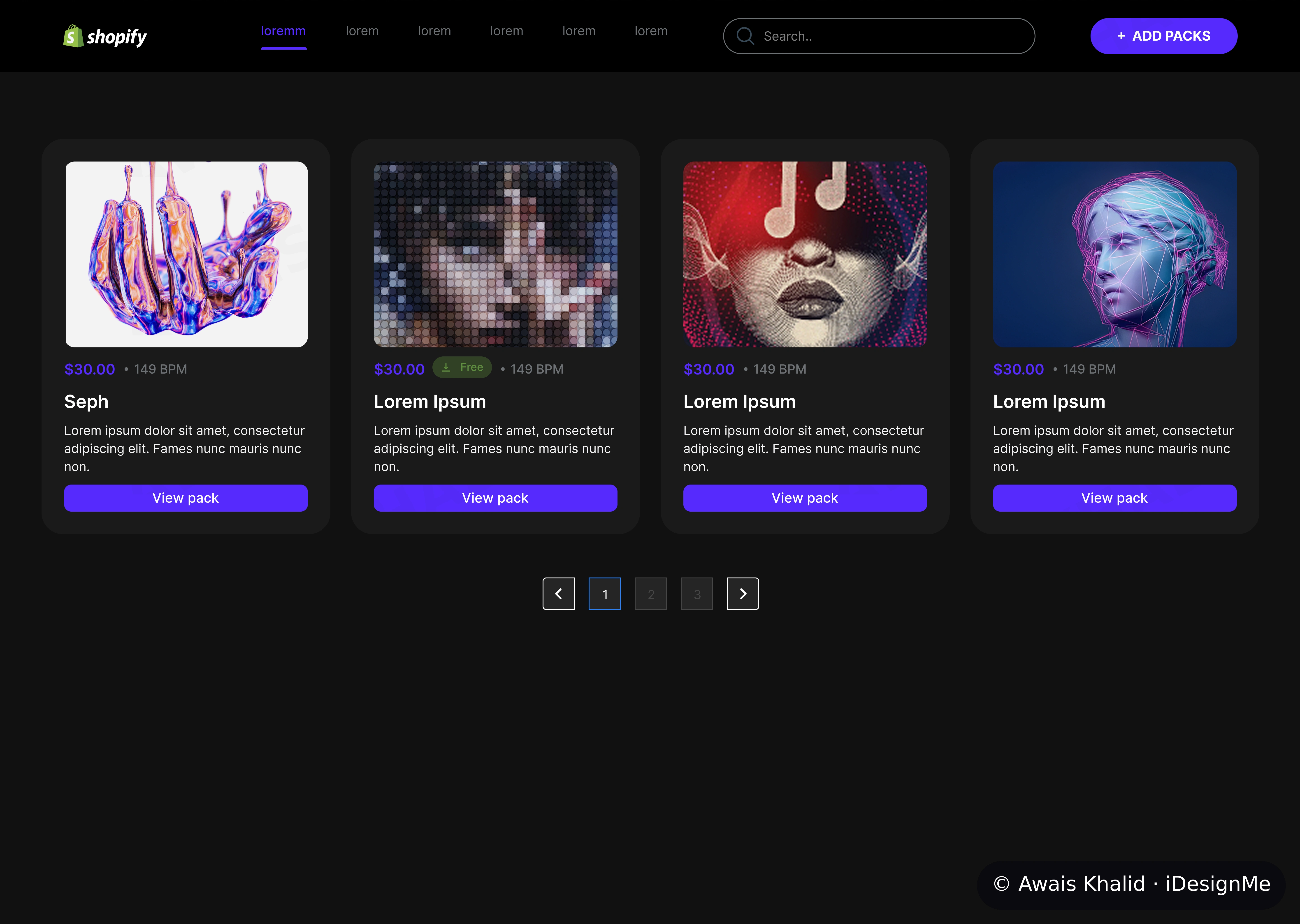
01 — The Catalogue · Find the pack before you finish typing. The dashboard is the whole catalogue as a grid of pack cards, and each card carries the three facts a manager reaches for first: cover art, price, and BPM — tempo is printed on the card, not buried in a detail page, because in this business tempo is identity. Search sits in the header, Add Packs is one click, and pagination stays quiet at the bottom. Design decision: an admin panel's first job is retrieval speed — the grid is a finding tool, not a poster wall.
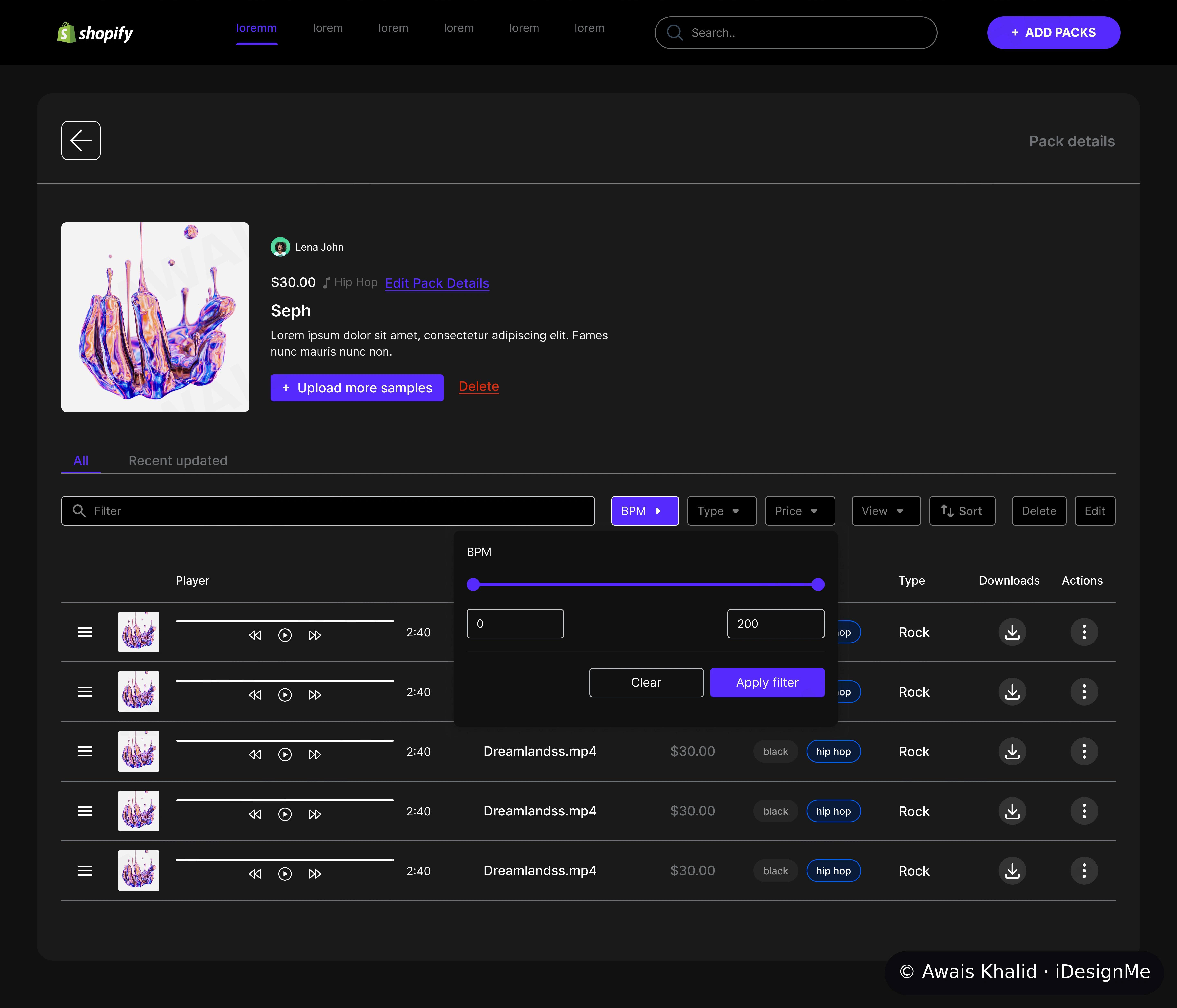
02 — Inside a Pack · The BPM filter is the headline act. Open a pack and you get its samples as playable rows — but the signature interaction is the filter bar: BPM becomes a range slider (0–200) you drag until the tempo fits, alongside Type, Price, View and Sort. In the old flow, tempo-hunting meant opening packs one by one; here it is one gesture across the whole list. Design decision: design the filter around the attribute the users actually think in. For sample packs, that attribute is BPM — so BPM got the biggest, fastest control on the page.
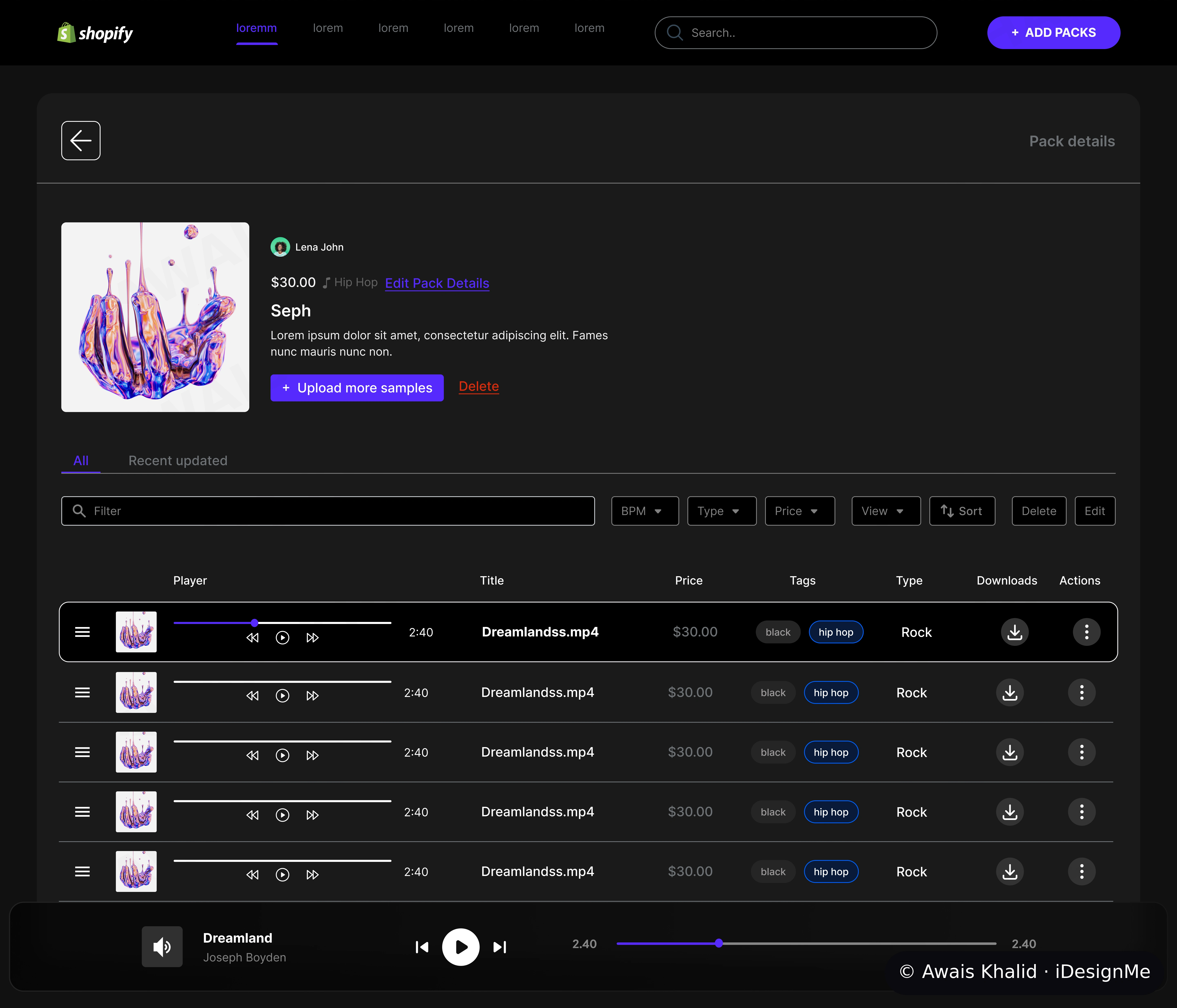
03 — The Player · Listen without leaving the job. Every sample row plays in place — waveform, play controls, duration — with the file's title, price, tags, type and download count in the same row, and a persistent player bar docked at the bottom keeps the current track ("Dreamland") playing while you keep working the list. Design decision: in a music tool, listening is not a detour from the work; listening IS the work. The old design made you choose between hearing a sample and managing it — the redesign refuses that choice.
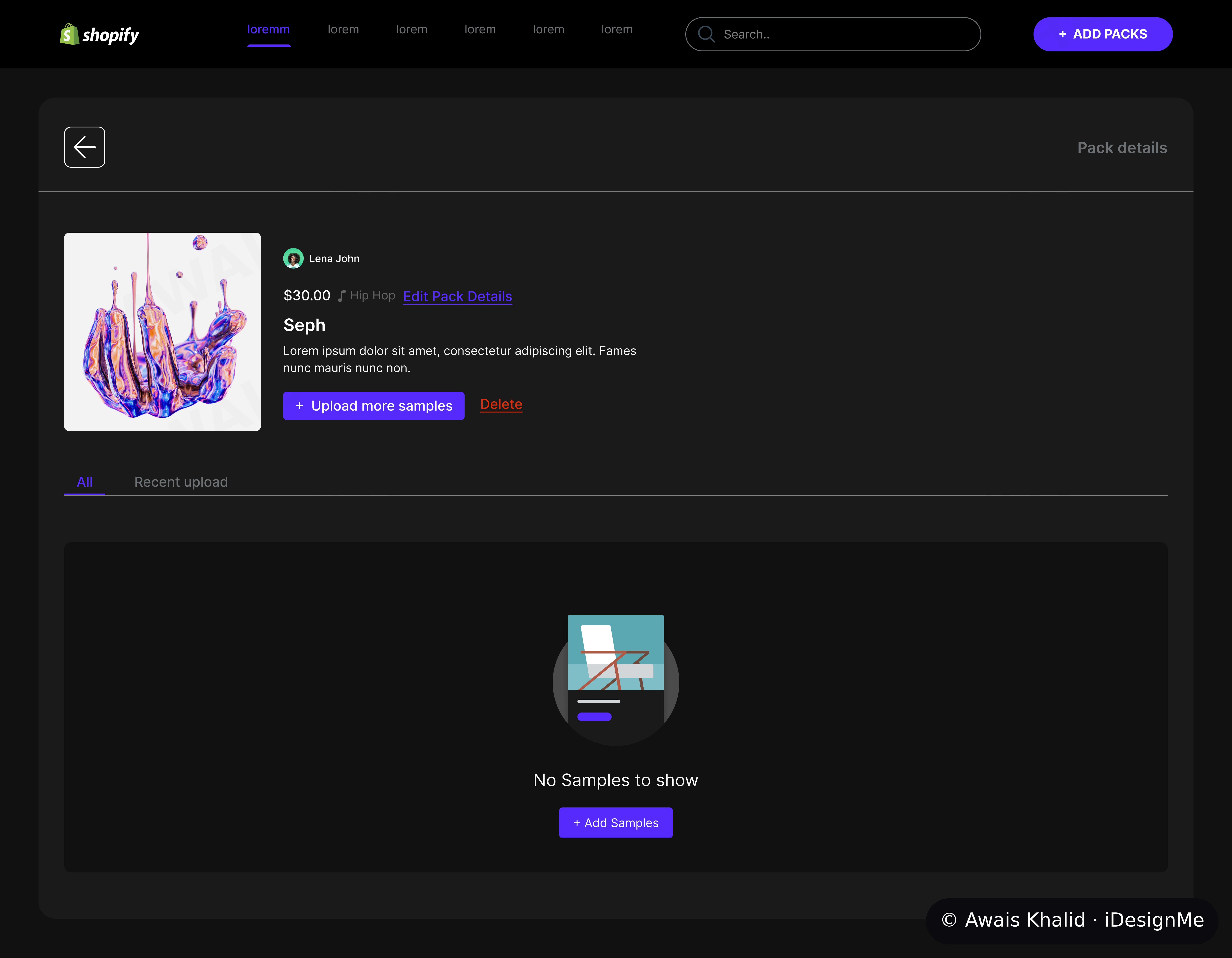
04 — The Empty State · Designed, not forgotten. A pack with no samples yet doesn't show a broken page or a shrug — it shows a clear state ("No Samples to show"), an illustration, and the one action that fixes it: Add Samples. Design decision: empty states are where admin time quietly leaks — a confused minute here, a support question there. Every state in this panel, including the empty ones, was designed to point at the next action.
The system underneath: one dark theme tuned for long working sessions, one violet action colour used sparingly so it always means "do this", and the same pack/sample objects behaving identically everywhere they appear. Consistency is what makes a panel feel fast before you've measured anything.
The outcome: admin task time cut by 40% — measured by auditing the old flows against the redesigned ones, counting the steps and detours removed from the daily jobs. I designed the SephBeat admin end-to-end in Figma. Running a catalogue, a store or an internal tool your team lives in all day? Let's talk.
0 likes · 1 view · Nov 8, 2026
The problem: the admin panel behind a Shopify app for music sample packs forced staff through extra steps, detours and hunting to complete daily tasks.
