Built with Kajabi
Kajabi Website Redesign for BeamBod

Poncho Black

BeamBod:
Kajabi Website Redesign for Online Gymnastics
Project overview
BeamBod brings adult gymnastics training online through guided classes that people can follow from home.
Founded by the team behind Dalecki Strength Gymnastics, the business offers training around skills such as handstands, rings, and flexibility. Its audience includes people discovering gymnastics-inspired exercise and experienced movers developing their skills.
I worked on BeamBod’s Kajabi website redesign.
My role focused on the website’s design and implementation within Kajabi, considering how visitors encountered the brand, explored its training, and found the next step.
The project brought the presentation of the business and its training content into a coordinated website experience.
The design objective
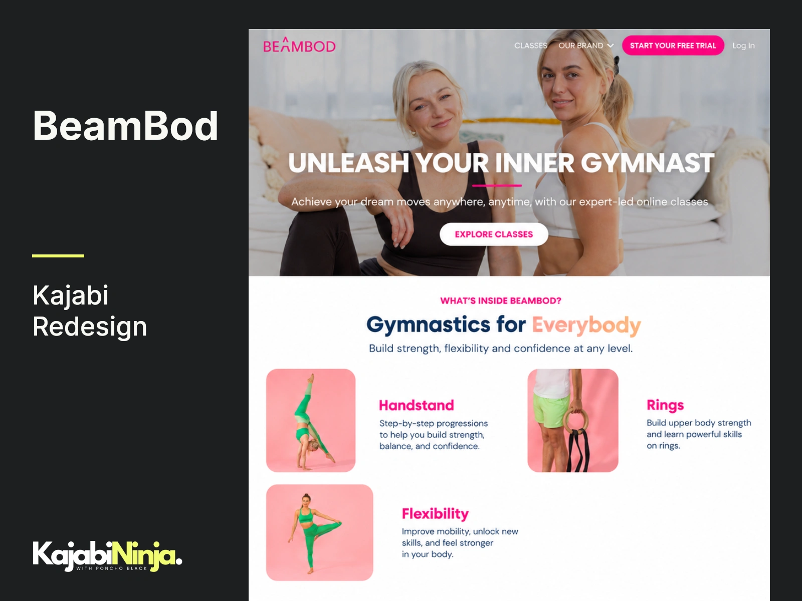
The website needed to communicate a distinctive offer: gymnastics-inspired training that people could access online.
That required balancing aspiration with explanation.
The imagery could show the skills people wanted to develop, while the surrounding content needed to explain how the training worked and where a visitor could begin.
I approached the redesign around three priorities:
Introduce the training concept quickly.
Organize the available information into a readable sequence.
Make the relevant next actions easy to identify.
These priorities shaped the page structure, visual hierarchy, and placement of calls to action.
My role
I handled the Kajabi website redesign work directly.
The scope focused on page presentation and implementation, bringing together content, imagery, typography, spacing, and navigation within the website.
I considered how those elements worked as a whole. A strong opening section needed supporting information further down the page. Training categories needed enough explanation to be useful. Calls to action needed to appear alongside the context that made them relevant.
The work involved translating those relationships into layouts within Kajabi.
Introducing the brand
The opening section was an important part of the redesign.
Visitors needed to recognize the type of training being offered and understand that it was available through online classes.
I approached the introduction with a clear hierarchy: the main message, supporting explanation, training imagery, and an identifiable next step.
The goal was to establish the offer before asking visitors to explore it in greater detail.
For a movement-based business, imagery also carries information. It helps visitors recognize the activity and picture the skills involved. I considered its placement alongside the written content so that the two supported each other.
Organizing the training information
BeamBod’s training includes several distinct areas, including handstands, rings, and flexibility.
Those categories provide useful entry points into the offer. Each represents a different interest or training goal that a visitor might bring to the website.
I approached their presentation as part of the page’s information structure.
The category names needed to be easy to scan, while supporting descriptions provided enough context to distinguish them. Imagery helped make the differences visible.
This gave the training information a defined place within the wider page, connecting the introductory message with a closer look at what BeamBod offered.
Explaining the class experience
Understanding the training category is one part of a visitor’s decision. Understanding the experience of taking a class is another.
The website also needed room to explain the guided format and how people could follow the training.
I considered the relationship between those explanations and the surrounding sections. Information about the class experience belonged within the reading journey, where it could answer questions raised by the offer.
The design used headings and supporting content to separate the main ideas, helping visitors move between an overview of the training and more practical detail.
Establishing a consistent visual system
Consistency across the website was a central design consideration.
I worked with the relationship between headings, body text, imagery, buttons, and section spacing. These elements needed to establish a recognizable rhythm as visitors moved through the content.
Headings introduced each section. Supporting text developed the idea. Images illustrated the training. Buttons provided the relevant next action.
I considered those roles throughout the layouts so that different sections could serve their own purposes within a shared visual direction.
The intention was to make the website feel coherent while giving each part of the content appropriate emphasis.
Making the next step visible
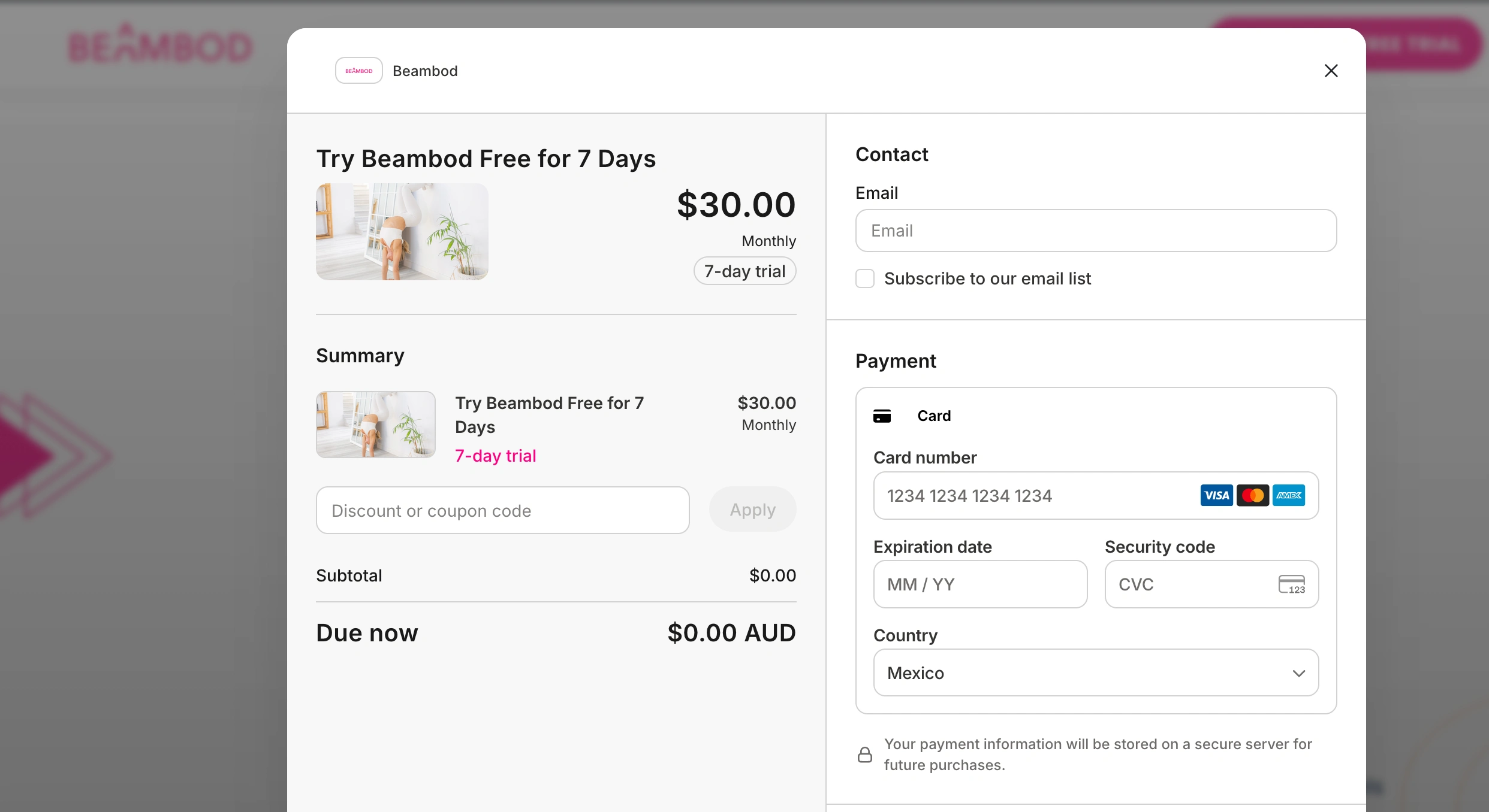
The website includes opportunities to explore the classes and start a free trial.
I considered how those actions appeared within the page.
Their placement needed to correspond with the information visitors had encountered. An introductory action could invite exploration, while later sections could provide further context for taking the next step.
Button wording and destination also needed to agree, allowing visitors to understand where a click would take them.
My work in this area concerned the presentation and placement of website calls to action.
Adapting the layouts to mobile
I considered how the website’s content behaved on smaller screens.
When a layout moves from desktop to mobile, image-and-text sections may stack, headings occupy more lines, and spacing has a greater effect on the reading experience.
I reviewed the ordering and presentation of those elements within the responsive layouts.
The focus was on keeping the offer understandable, the training information readable, and the next actions identifiable as the screen size changed.
Implementation and review
I implemented the redesign within Kajabi and reviewed the relevant website experience.
The review considered page presentation, navigation, calls to action, and the behavior of the layouts across screen sizes.
I looked at how the sections worked together, checking the relationship between the opening message, training information, supporting explanations, and next steps.
This provided an opportunity to address layout and navigation details within the redesign scope.
Delivered work
The project resulted in a Kajabi website redesign for BeamBod.
My contribution focused on the website’s page structure, visual presentation, and implementation within the platform.
The work brought together the brand introduction, training information, supporting content, and calls to action as parts of the website experience.
Project details
Client: BeamBod
Platform: Kajabi
Service: Website redesign
Specialist: Poncho Black, Kajabi Ninja
Planning a Kajabi website redesign?
Share your current website and what you want the redesign to address.
We can review the pages, identify the priorities, and discuss the scope, timing, and next steps.
BeamBod Checkout System
Like this project
Posted Oct 9, 2026
Redesigned BeamBod's Kajabi website with updated page layouts and clearer navigation to help visitors explore its online gymnastics programs.
Likes
0
Views
0