Built with Kajabi
Desmond Griffiths Kajabi Website Redesign

Poncho Black
Verified



Desmond Griffiths:
Kajabi Website Redesign & Implementation
Bringing a Custom Website to Life in Kajabi
Desmond’s project involved redesigning and building his website inside Kajabi, including the Home, Coach, Consult, and FAQ pages.
I handled the implementation myself: custom layouts, HTML and CSS, shared styling, mobile adjustments, navigation, and the revisions that followed. The design used Cormorant and Jost typography with gold accents, which gave me a clear visual direction to carry through the website.
The brief was to bring those pages together into a consistent experience while giving each one enough flexibility to suit its content. The homepage introduced Desmond and connected visitors with his services. Coach and Consult needed dedicated spaces to explain those services. FAQ needed a simpler layout where visitors could find answers.
My job was to make those designs work inside Kajabi, including the parts you cannot judge from a homepage screenshot.
What I was responsible for
I worked directly in Kajabi, building and refining the pages with custom code and CSS.
That included the larger layout decisions, such as how sections were arranged, and the smaller details, such as card spacing, heading sizes, mobile menus, and where a link landed when someone clicked it.
The main areas of work were:
Building the featured page layouts and custom sections.
Applying the typography, colors, and recurring design elements.
Creating shared CSS and standardizing repeated code.
Refining the header, footer, and navigation.
Adjusting layouts for desktop and mobile.
Updating internal links and section anchors.
Working through feedback and tracking revisions during QA.
There was no handoff between a designer and a separate implementation team. I handled the build and the refinements, so feedback could be translated directly into changes on the Kajabi pages.
Making the pages feel connected
One of the main considerations was how to keep the website consistent without repeating the same layout everywhere.
The Home, Coach, Consult, and FAQ pages serve different purposes. They also contain different amounts and types of content. A layout that suits an introduction does not automatically suit a longer service explanation or a page of questions and answers.
I used the shared visual system to connect them.
Cormorant carried the larger headings, while Jost supported body text and navigation. Gold accents provided a recurring detail across the designs. I worked through the sizing, spacing, and application of those elements so they felt related from page to page.
That consistency also extended to the less noticeable parts of the website: navigation elements, recurring sections, and shared headers and footers.
Those details matter when someone moves beyond the homepage. The visual direction needs to continue through the pages where they spend time reading about a service or looking for an answer.
Building Home, Coach, Consult, and FAQ
On the homepage, I worked on the relationship between the introduction and the service entry points.
The page needed to give visitors a starting point, then provide routes into the rest of the website. I refined the section layouts, heading hierarchy, spacing, and alignment of those entry points.
For Coach and Consult, I implemented dedicated layouts that gave the service content room to develop.
I kept the core styling consistent but made adjustments around the content of each page. This involved working through section spacing, text widths, and the alignment of elements placed alongside one another.
Longer content needed particular attention. When a paragraph changes length, it can affect the balance of an entire section. That becomes more noticeable when two elements sit side by side on desktop and then stack on mobile.
The FAQ page called for a different approach. Here, the work focused on making questions recognizable and keeping the supporting text readable. The page retained the website’s typography and shared elements, while its content structure supported browsing through individual questions.
Across these pages, I reviewed how the layouts behaved with the actual content in place. That is where a design starts to reveal the details that need adjustment.
Working through the Kajabi implementation
A substantial part of this project happened underneath the visible design.
I used custom HTML and CSS to implement the sections, then worked on standardizing code and styles across the pages.
When the same design pattern appeared more than once, I reviewed how it was being handled. Shared CSS gave those recurring elements a common foundation, while individual sections could still receive the adjustments they needed.
This was useful during revisions. A change to a recurring style needed to be considered wherever that style appeared, including pages with different content lengths and layouts.
I also paid attention to how the sections responded when content was edited inside Kajabi. Text changes can affect spacing, alignment, and the relationship between adjacent elements. Reviewing that behavior was part of refining the implementation.
The work was a combination of building new sections and going back through them to resolve details. Some changes were visible immediately. Others only became apparent when checking another page or screen size.
Navigation, mobile layouts, and the details between pages
Navigation was part of the build, including the shared menu, mobile menu, internal links, and links placed within page content.
I worked through those connections alongside the design revisions. A link needed to take visitors to the intended page or section, and the mobile menu needed to fit the smaller-screen experience.
Section anchors required attention too. Linking to a section is only part of the task. The position where someone arrives also affects whether the destination makes sense when it appears on screen.
For responsive layouts, I reviewed what happened as desktop sections stacked on smaller screens.
That included text sizing, spacing between elements, card alignment, and the relationship between headings and their supporting content. I also worked through shared header and footer details as part of the wider page implementation.
These checks went beyond making a desktop layout smaller. Each section needed to remain understandable when its arrangement changed.
Handling revisions
The project included an ongoing revision process, with feedback organized through a QA tracker.
I used that process to connect individual requests with specific page changes. It helped keep track of the work across multiple pages and made the revisions easier to review.
The requests covered both visual details and website behavior: section spacing, card alignment, navigation, anchors, links, and shared components.
Some refinements were local to one section. Others needed a wider check because they affected a recurring element or shared style.
That was a significant part of my contribution. I stayed involved beyond the initial page construction, working through the implementation details as feedback came in.
What the work delivered
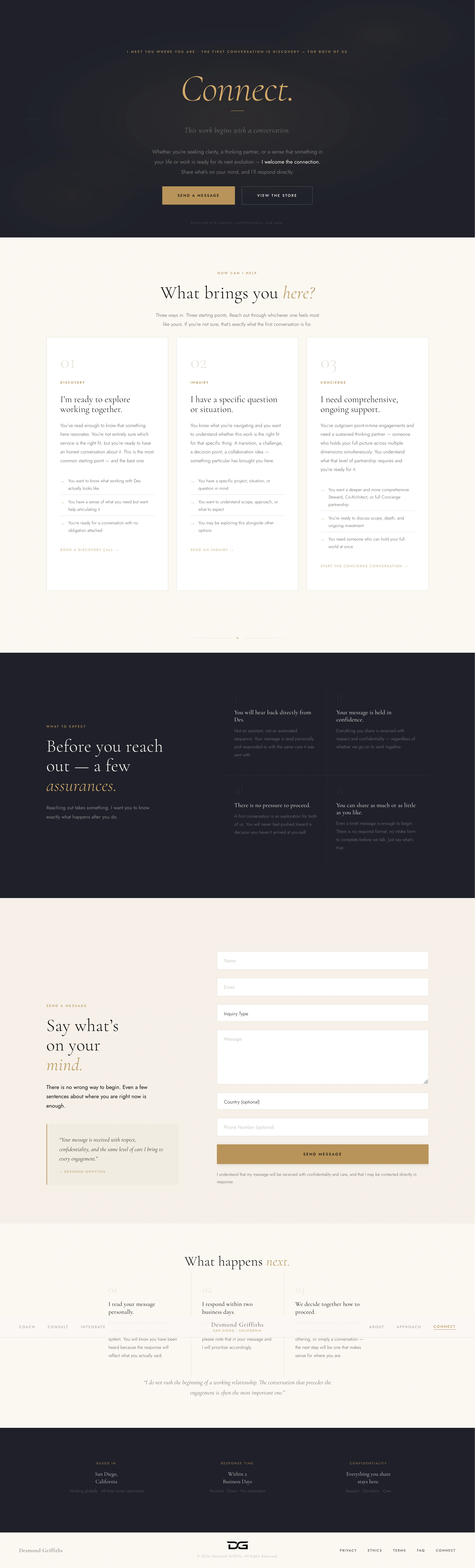
The project brought the featured pages into a consistent Kajabi website design, with custom layouts and shared styling connecting the experience.
Home provided the introduction and service entry points. Coach and Consult gave those services dedicated pages. FAQ organized supporting information. Cormorant, Jost, gold accents, and recurring website elements carried the visual direction across them.
My work covered the page implementation, the responsive refinements, and the connections between pages, alongside the tracked revision process.
The screenshots show the visual result. A walkthrough adds another part of the story: how the navigation connects the pages, how the sections behave on mobile, and how the individual layouts work together.
Client: Desmond Griffiths
Platform: Kajabi
My role: Website redesign and front-end implementation
Tools and techniques: Kajabi, custom HTML, CSS, shared styling, responsive adjustments, and tracked QA
If you have a Kajabi website that needs this kind of work, send me the current site and the pages you want to improve. I handle the design implementation and revisions directly.

Desmond Griffiths - Coach
Desmond Griffith - Connect
Like this project
Posted Oct 9, 2026
Redesigned Desmond Griffiths’ Kajabi website with custom layouts, responsive styling, and connected Home, Coach, Consult, and FAQ pages.
Likes
0
Views
1