Refreshing Brand Identity through Digital Advertising
Abdul Hasan
Refreshing Brand Identity through Digital Advertising
Contra ko is baar bhi wahi masla hai: aapne "features" toh likh diye hain, lekin "Design Process" aur "Professional Structure" ki kami hai. High-quality approval ke liye aapko headers aur thodi zyada depth chahiye hogi.
Is version ko use karein, isme maine Project Overview aur Impact ko mazeed professional banaya hai:
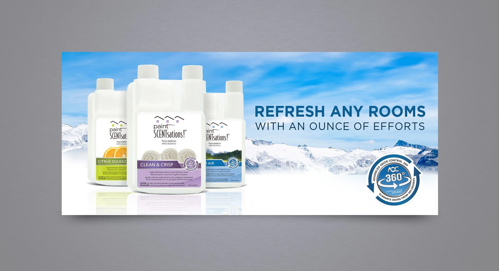
Project Title: Scent-Infused Living — Visual Identity & Hero Banner Design
Project Overview I was commissioned to design a high-impact digital hero banner for a niche home improvement product: paint scent additives. The goal was to pivot the product's image from a "utility hardware item" to a "lifestyle home essential."
The Challenge How do you visualize a "scent" in a static banner? The client needed to communicate two things simultaneously: the freshness of the product and the "Ounce of Effort" USP (Unique Selling Proposition). The layout had to be clean enough for a website header but bold enough to drive conversions.
My Creative Strategy
Visual Metaphor & Atmosphere: I utilized a panoramic mountain range as the hero background. This instantly triggers a psychological association with "purity" and "fresh air," providing a visual context for the product’s scent.
Product Grouping & Hierarchy: Instead of scattering the bottles, I grouped the scent varieties (Citrus, Lavender, etc.) to showcase range, while positioning the flagship "Clean & Crisp" bottle in the foreground for focus.
Typographic Hierarchy: I implemented a modern sans-serif typeface with varied weights. By making "Ounce of Effort" the largest element, I ensured the viewer understood the brand’s core value proposition within the first 2 seconds.
Trust Integration: I seamlessly embedded the "360° Odor Control" badge using a subtle glow effect, ensuring it acts as a secondary "trust signal" without distracting from the main product shot.
The Result
Created a cohesive, professional banner that successfully repositioned a functional product into the lifestyle category.
Delivered a high-resolution, web-optimized asset that maintains clarity across desktop and mobile displays.
Tools Used
Adobe Photoshop (Compositing & Retouching)
Adobe Illustrator (Vector Branding & Badges)
Like this project
Posted Jan 2, 2026
I designed a lifestyle hero banner for a paint additive brand, using visual metaphors and clean hierarchy to turn a utility product into a home essential.