Corporate Visual Storytelling: Presentation Design
Abdul Hasan
Corporate Visual Storytelling — High-Impact Presentation Design
Project Overview
This project showcases a series of premium presentation decks designed for corporate communication, business reviews, and brand storytelling. The goal was to move beyond bullet points and create a visual narrative that enhances speaker authority and audience retention.
The Challenge
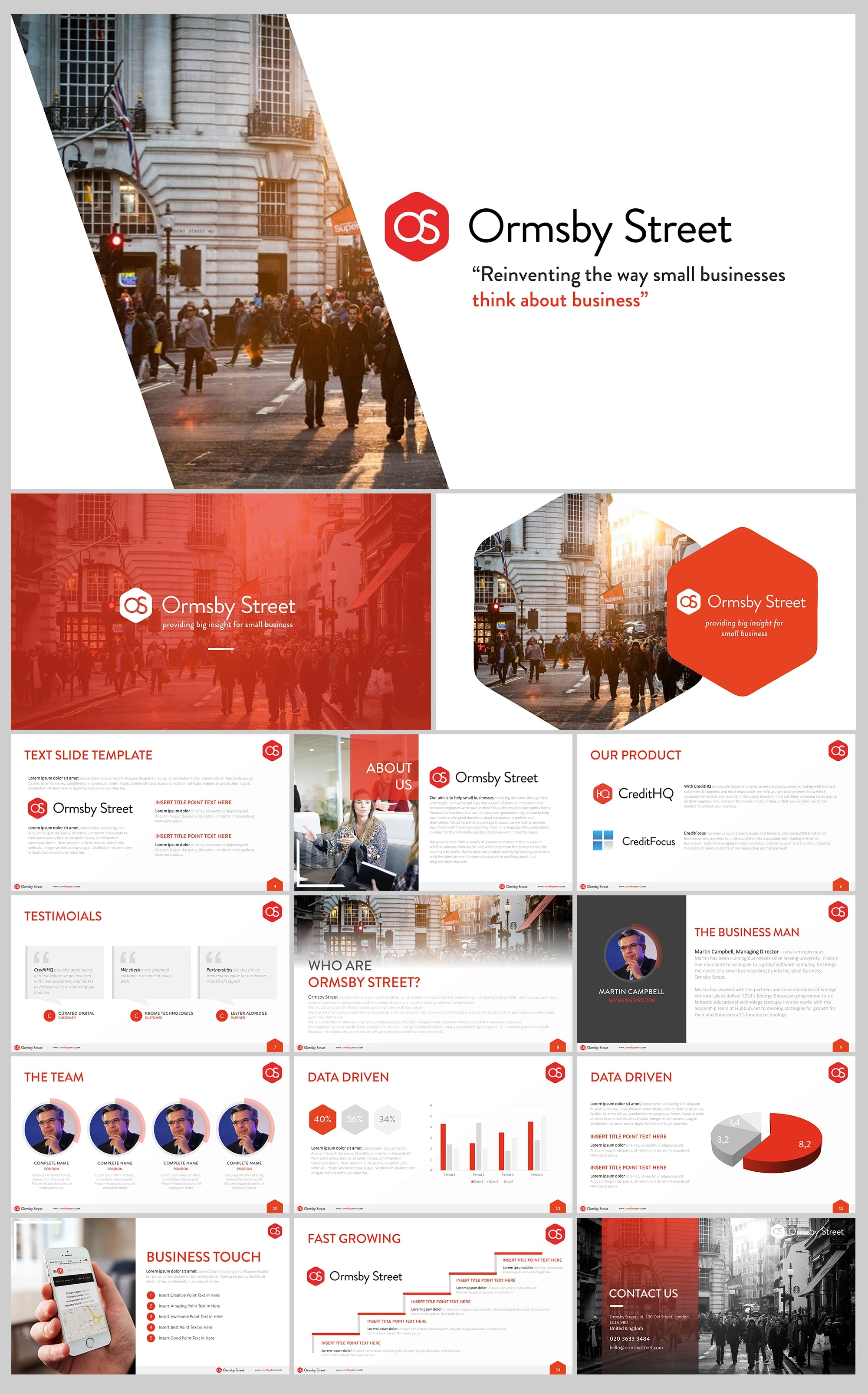
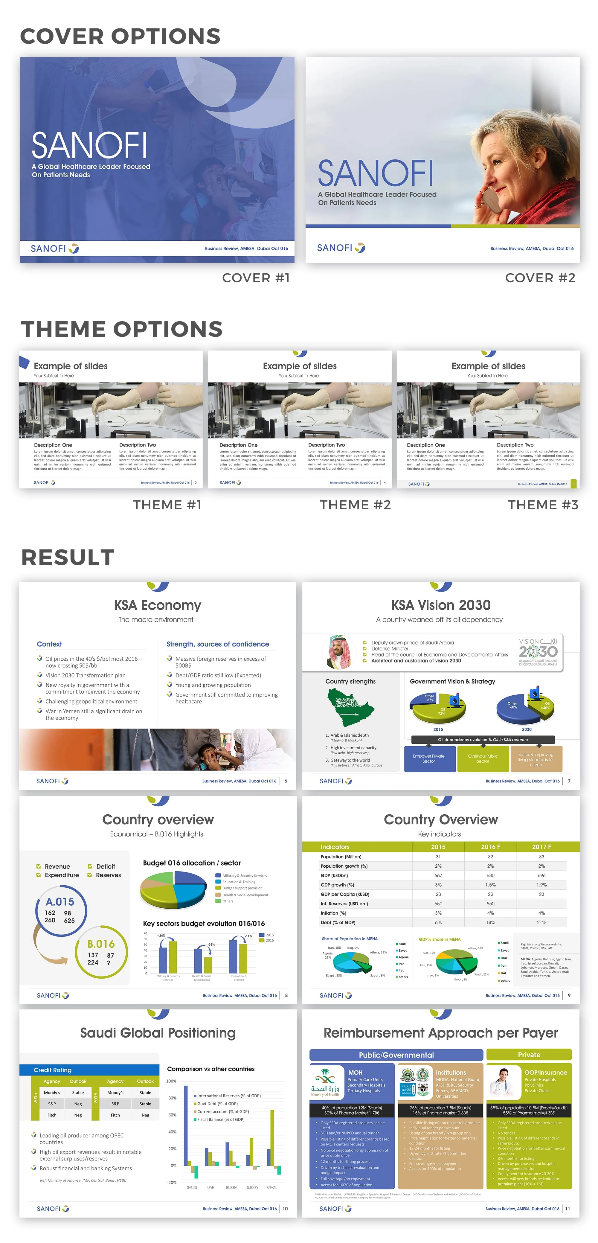
Corporate presentations often suffer from "information overload." The challenge was to take dense datasets, financial indicators (like KSA Economy or Saudi Global Positioning), and brand guidelines (like Sanofi or Ormsby Street) and present them in a clean, professional, and engaging layout without losing technical depth.
My Creative Solution
Data Visualization: I transformed complex charts, credit ratings, and indicators into intuitive infographics. By using custom-designed pie charts, bar graphs, and maps, I made financial data easy to digest at a glance.
Layout Hierarchy: I implemented a strict visual hierarchy using consistent typography and margins. This ensures that the most critical "Key Takeaways" are the first thing the audience notices.
Brand Consistency: For each deck, I developed a unique "Theme Option" (Covers and Master Slides) that aligns perfectly with the brand’s identity, ensuring a professional and cohesive look from the first to the last slide.
Imagery & Negative Space: I strategically used high-quality editorial photography and balanced negative space to give the content "room to breathe," preventing visual fatigue during long presentations.
The Result
Delivered boardroom-ready presentation decks that effectively communicate complex business strategies.
Created scalable master templates that allow clients to maintain brand consistency for future updates.
Successfully translated abstract corporate concepts into compelling visual stories.
Tools Used
Microsoft PowerPoint (Master Slides & Animation)
Adobe Illustrator (Custom Vector Assets)
Adobe Photoshop (Image Retouching & Compositing)
Like this project
Posted Jan 23, 2026
I design high-impact presentation decks that transform complex data into visual stories using custom data viz, clean hierarchy, and brand-consistent layouts.