Unified Fintech Platform for Late-Stage DPD Resolution
Abdul Hasan
Capitalogic | Unified Fintech Platform for Late-Stage DPD Resolution
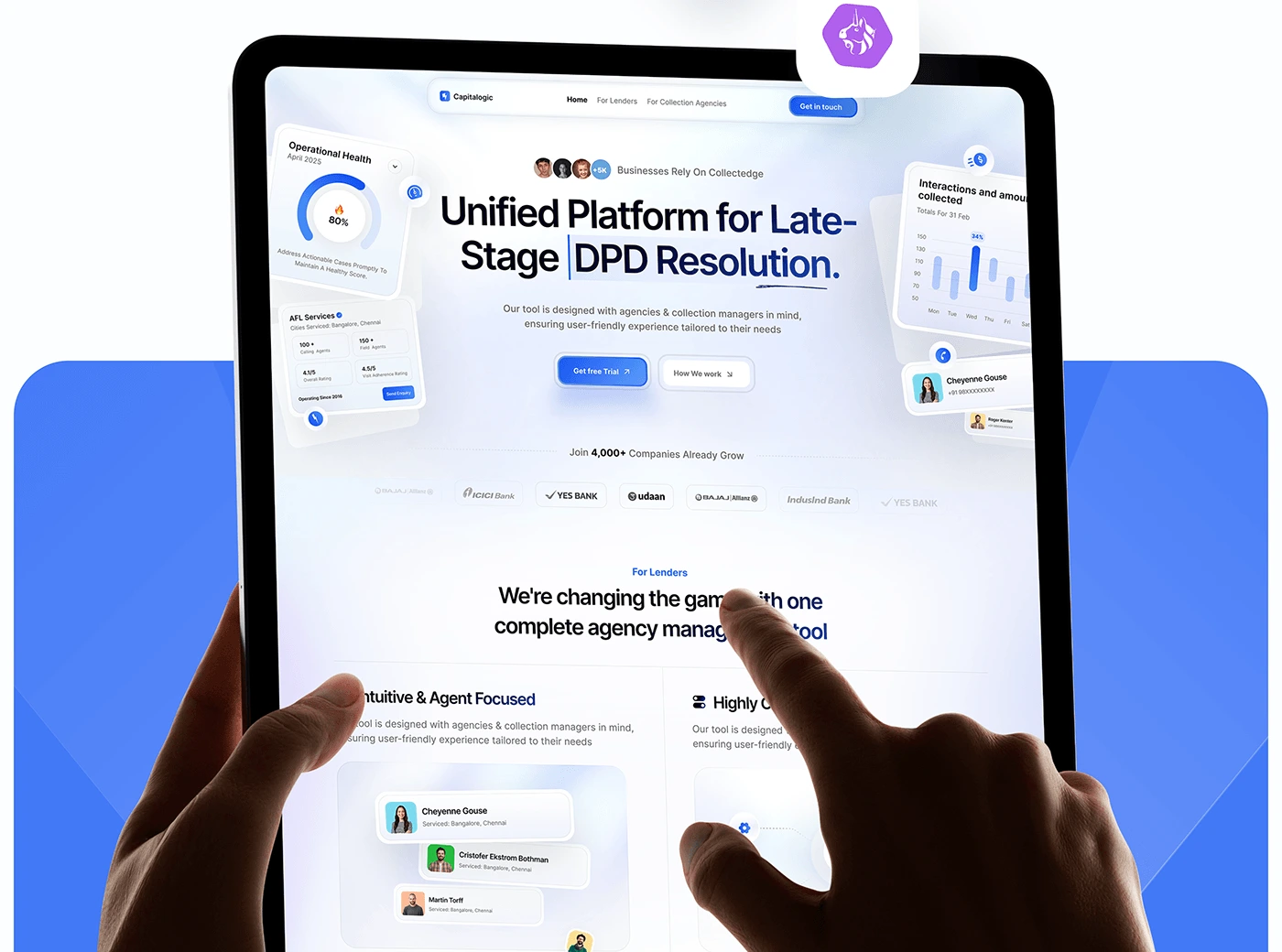
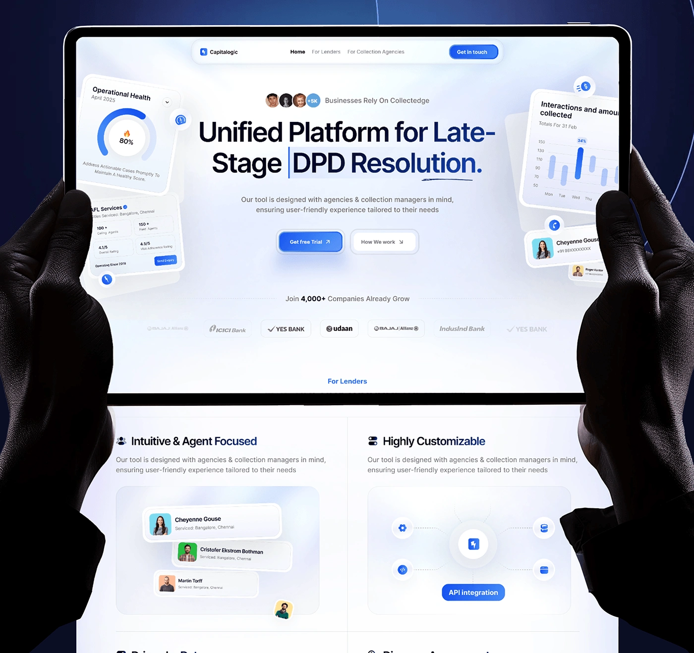
I led the end-to-end UI/UX design for Capitalogic, a B2B SaaS platform designed to streamline financial collections. The project’s core objective was to simplify high-density financial data into actionable insights for agency managers.
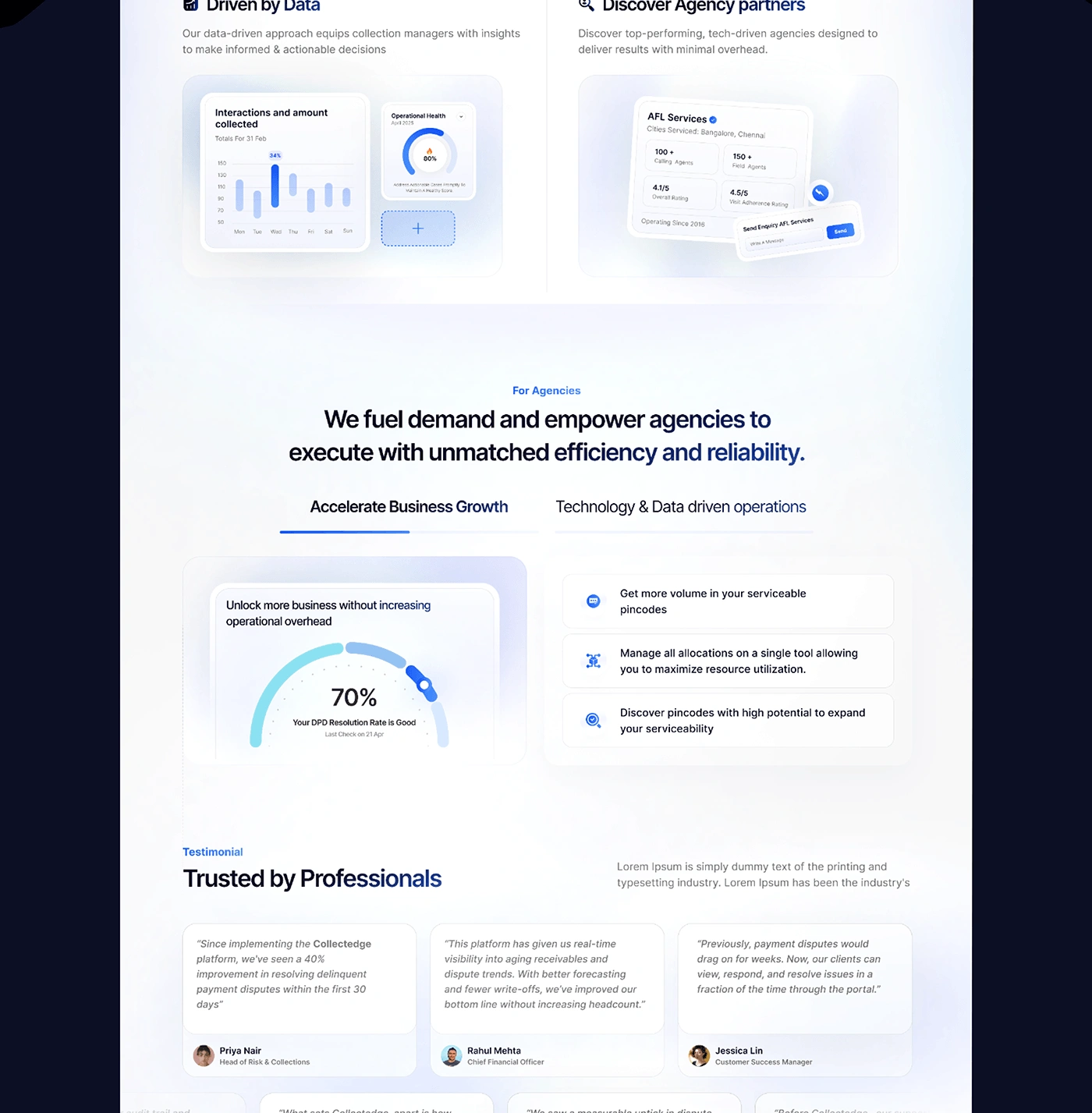
The Challenge Financial collection managers deal with massive datasets, specifically "Days Past Due" (DPD) metrics. The existing systems were cluttered, leading to cognitive overload. The challenge was to create a dashboard that could display complex operational health without sacrificing speed or clarity.
My Design Strategy
Information Architecture: I prioritized a 12-column grid system (260px margins, 16px gutters) to ensure that the massive amount of data remained organized and responsive across enterprise-level displays.
Glassmorphic UI: To reduce visual fatigue, I implemented a clean, glassmorphic aesthetic. This allows for clear layering of information, making the interface feel modern and lightweight.
Data Visualization: I designed custom progress rings and interactive bar charts. Instead of just showing numbers, these visuals allow managers to identify collection trends at a single glance.
Psychology of Color: Used a deep navy and electric blue palette. In Fintech, these colors are psychologically proven to establish trust, security, and professional authority.
The Result
Delivered a high-fidelity, scalable design system ready for developer handoff.
Transformed complex DPD data into an "at-a-glance" dashboard, significantly reducing the time managers spend on data interpretation.
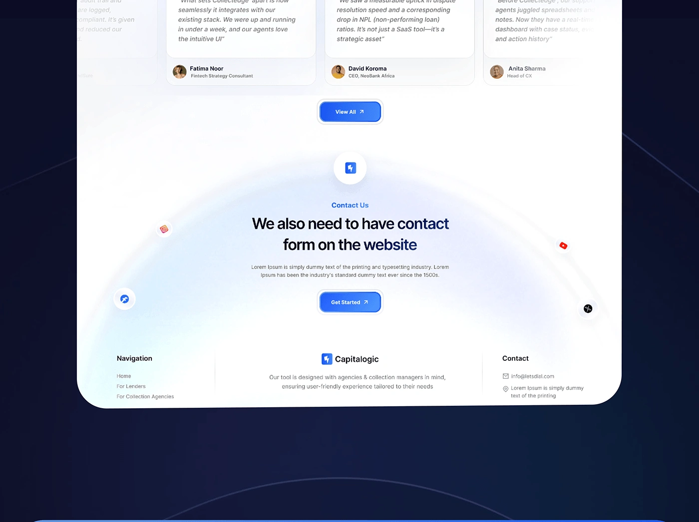
Created a cohesive visual identity that differentiates Capitalogic in a traditional B2B market.
Tools Used
Figma (UI/UX Design & Prototyping)
Adobe Illustrator (Custom Iconography)
Like this project
Posted Jan 2, 2026
I designed a high-fidelity SaaS dashboard for Capitalogic, using a 12-column grid and glassmorphism to simplify complex fintech data into actionable UX insights