Hostic space web UX redesign that increased booking rate by 60%

Akinbo Oluwakemisola

Project Overview
Project: Linderra Website Redesign
Industry: Holistic / Wellness Space
Role: UI/UX & Website Designer
Tools: Figma (Design), Wix studio (website development)
Linderra is
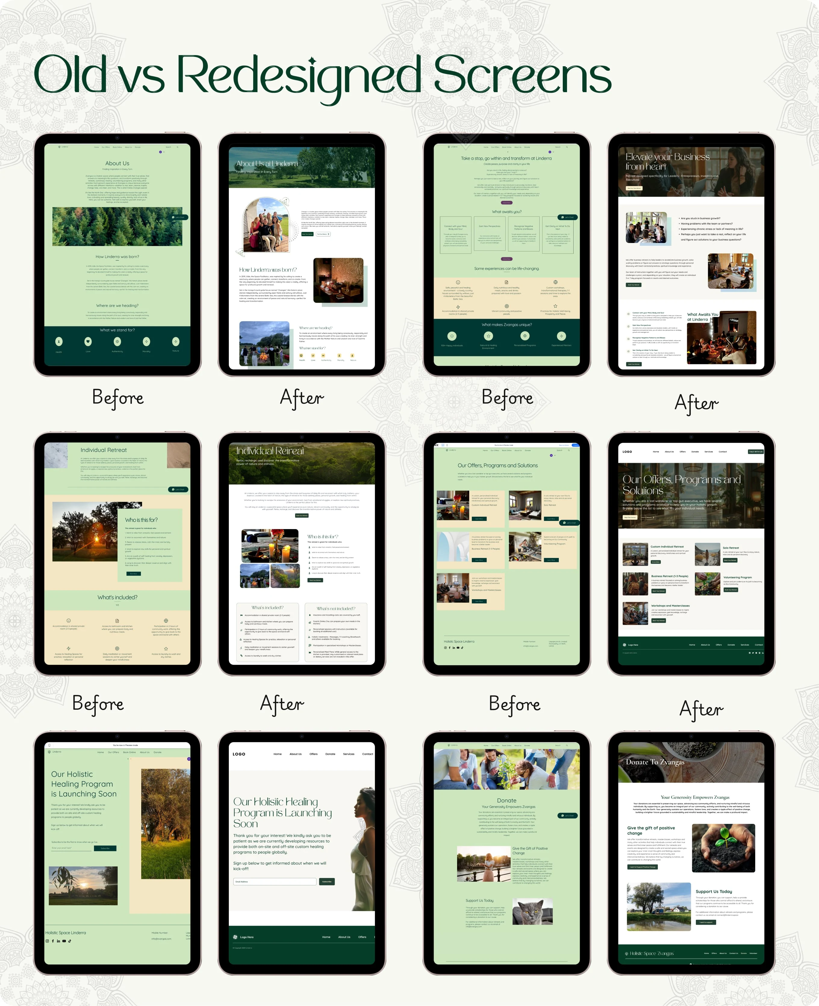
I partnered with a holistic Space "Linderra" which focuses on wellness, balance, and intentional living to redesign their outdated website and create a more modern, engaging, and conversion-driven user experience. The original site struggled with poor structure, poor color contrast, dated visuals, and unclear navigation, making it hard for users to trust the brand or take action.
The Problem
The existing website had good intentions but struggled with:
Visual clutter that contradicted the brand’s calming message
The design looked outdated and didn’t reflect the brand’s professionalism
Poor choice of colour and poor contrast
Users finds it hard to navigate or find key services
The mobile experience was clunky and slow
No clear user journey from curiosity → trust → booking
Goals & Objectives
The redesign aimed to create:
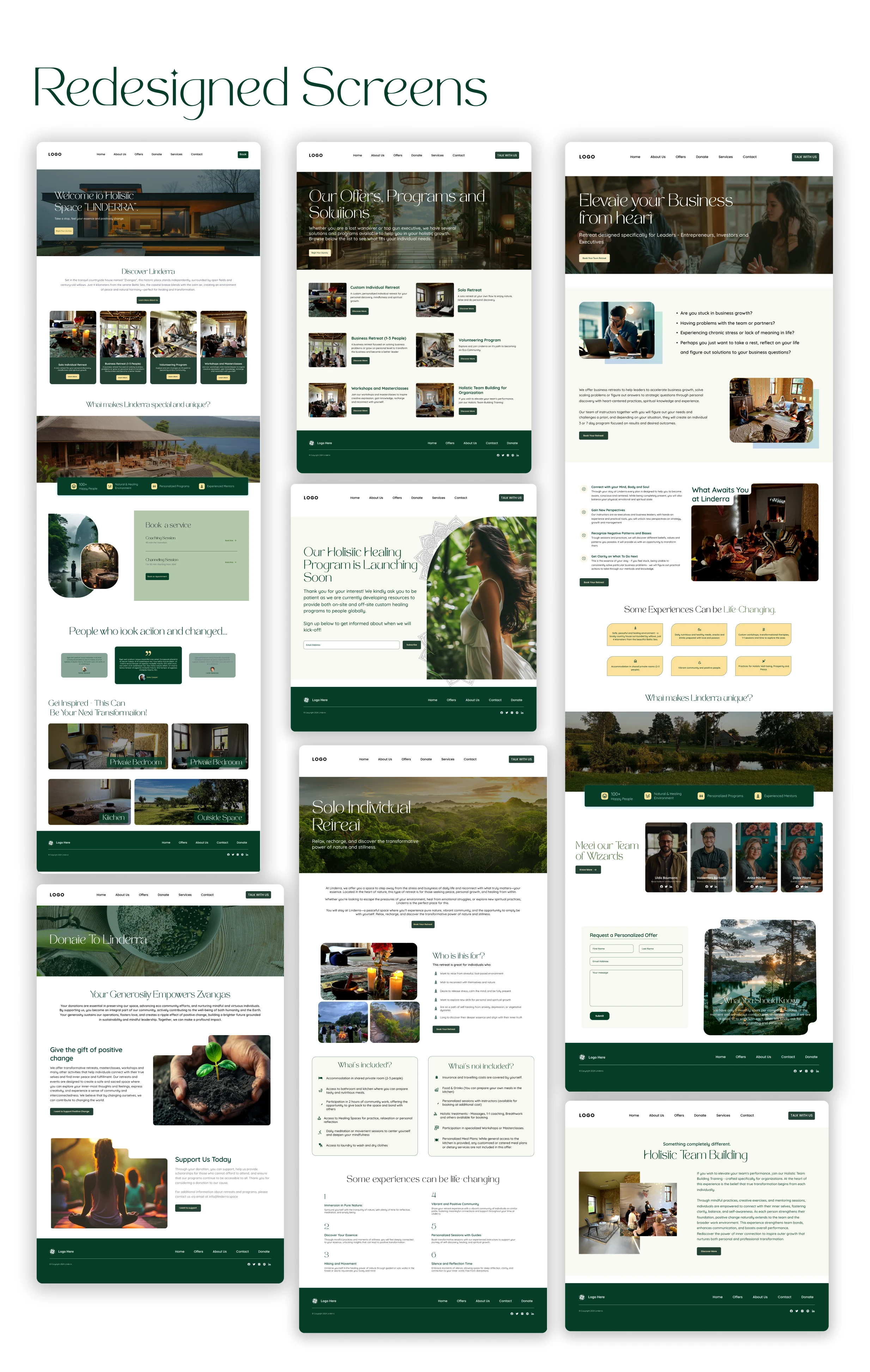
Simplified homepage layout with a strong hero and call to action
Refined color palette to enhance clarity, color contrast for better readability, and clearer visual hierarchy across all pages.
Highlighted services with modern icon blocks and better structure
Introduction of testimonials and trust indicators
Optimization of every page for mobile with clear CTAs
Addition of booking functionality
Design Approach & Thinking
a. Simplified Information Architecture
Content was restructured to answer three questions quickly:
What is Linderra?
Who is it for?
What can I do next?
This reduced friction and helped users self-orient within seconds of landing on the site.
b. Visual Language
Soft, neutral color palette to evoke calm and balance
Generous white space to allow the content to breathe
Subtle typography choices that feel human, not clinical
Minimal UI elements to avoid visual noise
The design avoids loud calls-to-action in favor of gentle guidance.
Like this project
Posted Oct 14, 2025
I redesigned a holistic website, transforming it from an outdated layout with poor color contrast into a modern, user-friendly experience with 60% booking
Likes
1
Views
2