Phranakhon Saimai: Packaging Design and Storytelling
Objective: To design a packaging for a local Thai snack from the province of Ayutthaya that can upgrade the value of the product, and narrate the stories of the origin province that the snack is famous for.
Thailand is a land of deep culture and history. Each province has its own unique traditional food or snack that embodies its identity. One such snack is Roti Saimai, a colorful crepe filled with sugary hair, which hails from the ancient capital city of Ayutthaya, filled with beautiful temples. Our project involved designing a brand identity and packaging for this delectable treat, highlighting the rich cultural heritage of Ayutthaya and the wider Thai community, known for their welcoming and warm smiles.
Background Research
In order to better understand the product and its culture and stories, background research on the location, and the snack was conducted.
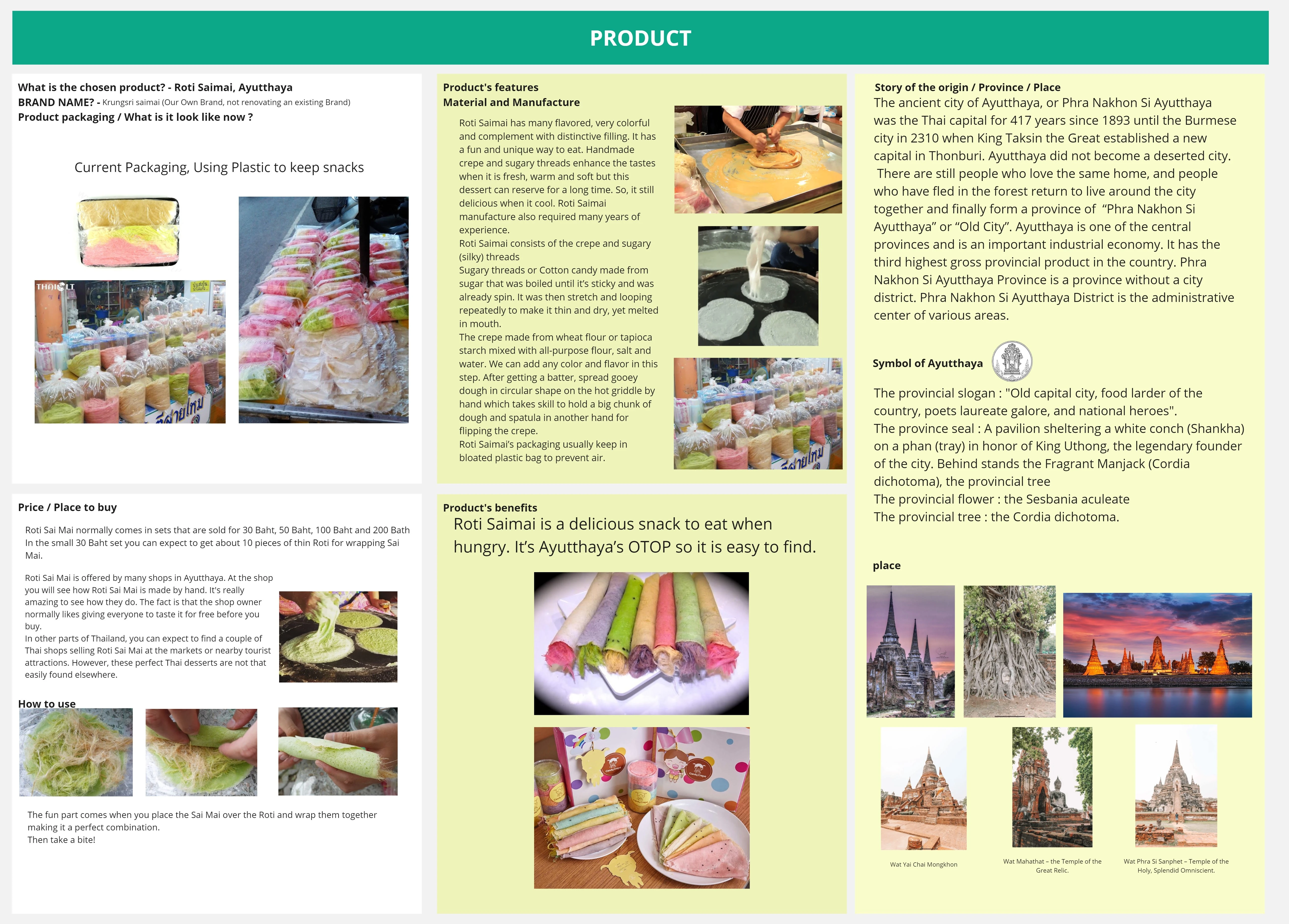
A snapshot of the background information of the product and its location.
Traditionally, the snack is being prepared by hand, placing the crepe dough on a hot stove until cooked and taken out. Sugaring threads were then placed on the crepe rolled into a shape similar to spring rolls and eaten. The location of which the snack is popular was the ancient city of Thailand known for its temple and rich history.
Insights
As the packaging was mostly plastic bag, tied by a plastic string, cleanliness and hygiene concern was raised. Compared to the classic, and royal mood and tone of the ancient city of Ayutthaya, the plastic bag packaging does not reflect the image of a snack that comes from a royal province which degrades the brand image of the snack itself. Furthermore, the plastic packaging does not showcase the identity of Ayutthaya province nor Thailand, making tourists who purchase the snack not being aware of the culture and stories of the product.
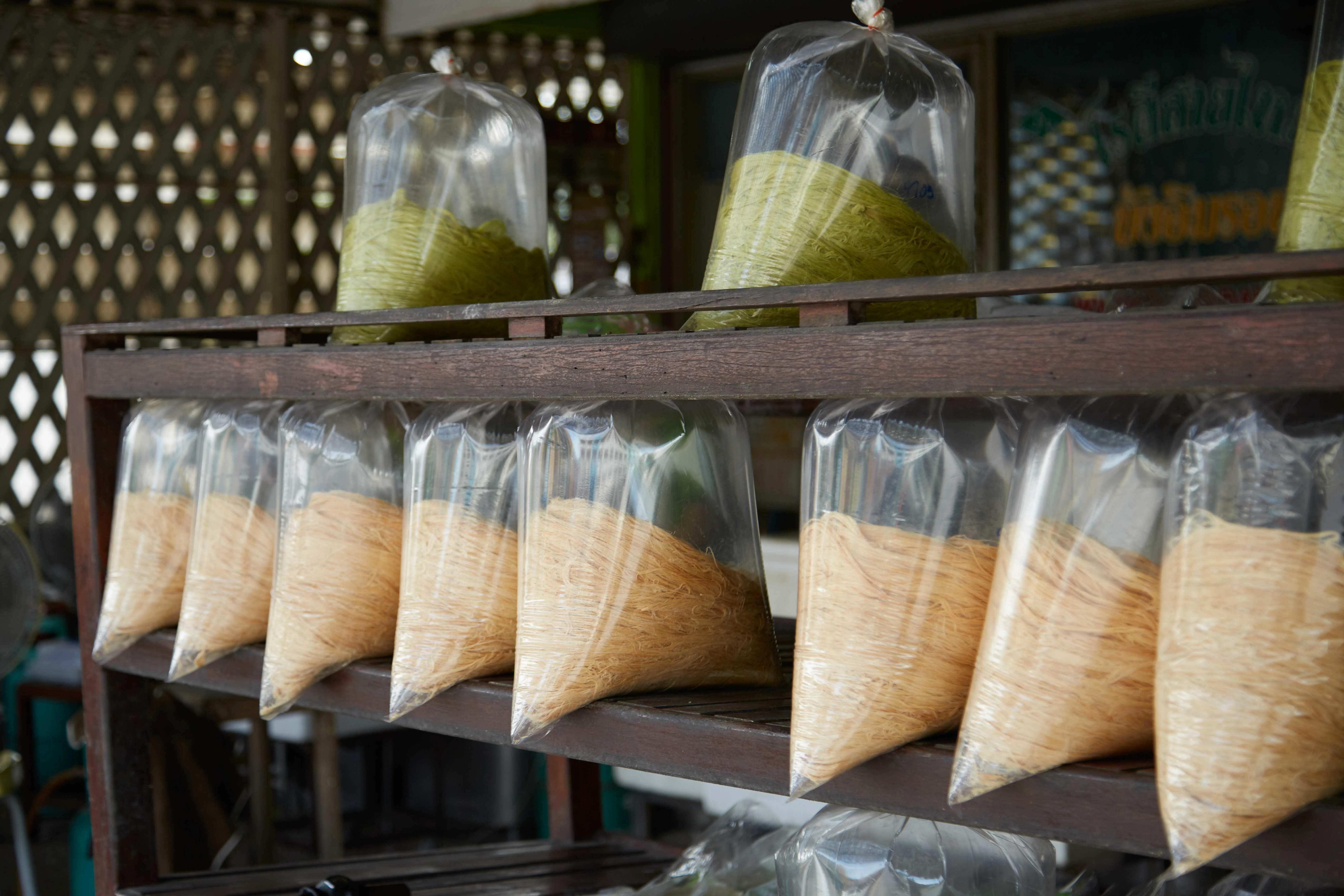
How might we design the packaging of Roti Saimai in order to convey the identity of Ayutthaya province and elevate the eating experience of the consumer?
Ideas Development
After properly defining our problem statement, we set out to brainstorm ideas on how, what, and why the packaging design of the packaging should look like.
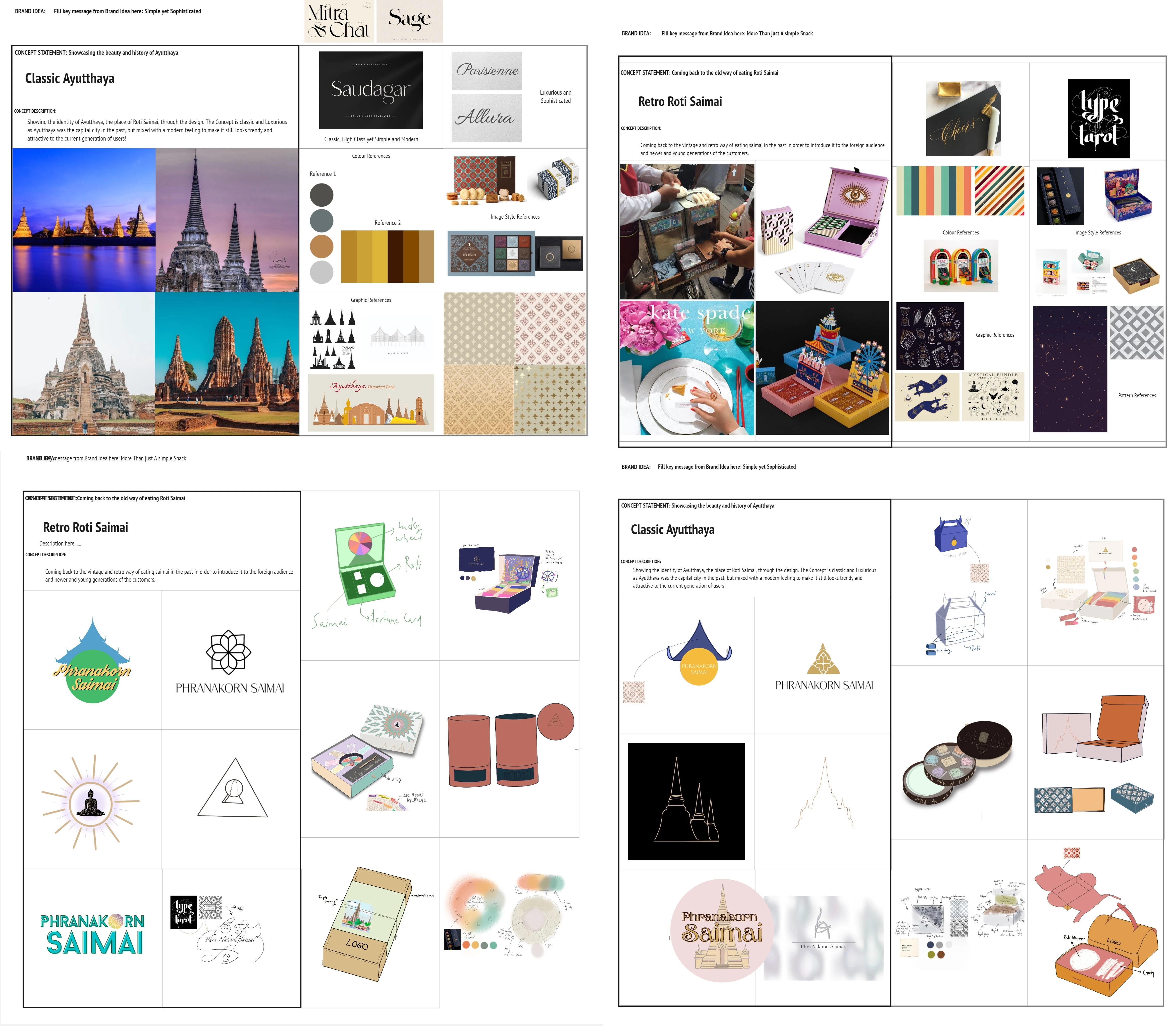
A snapshot of concept brainstorming
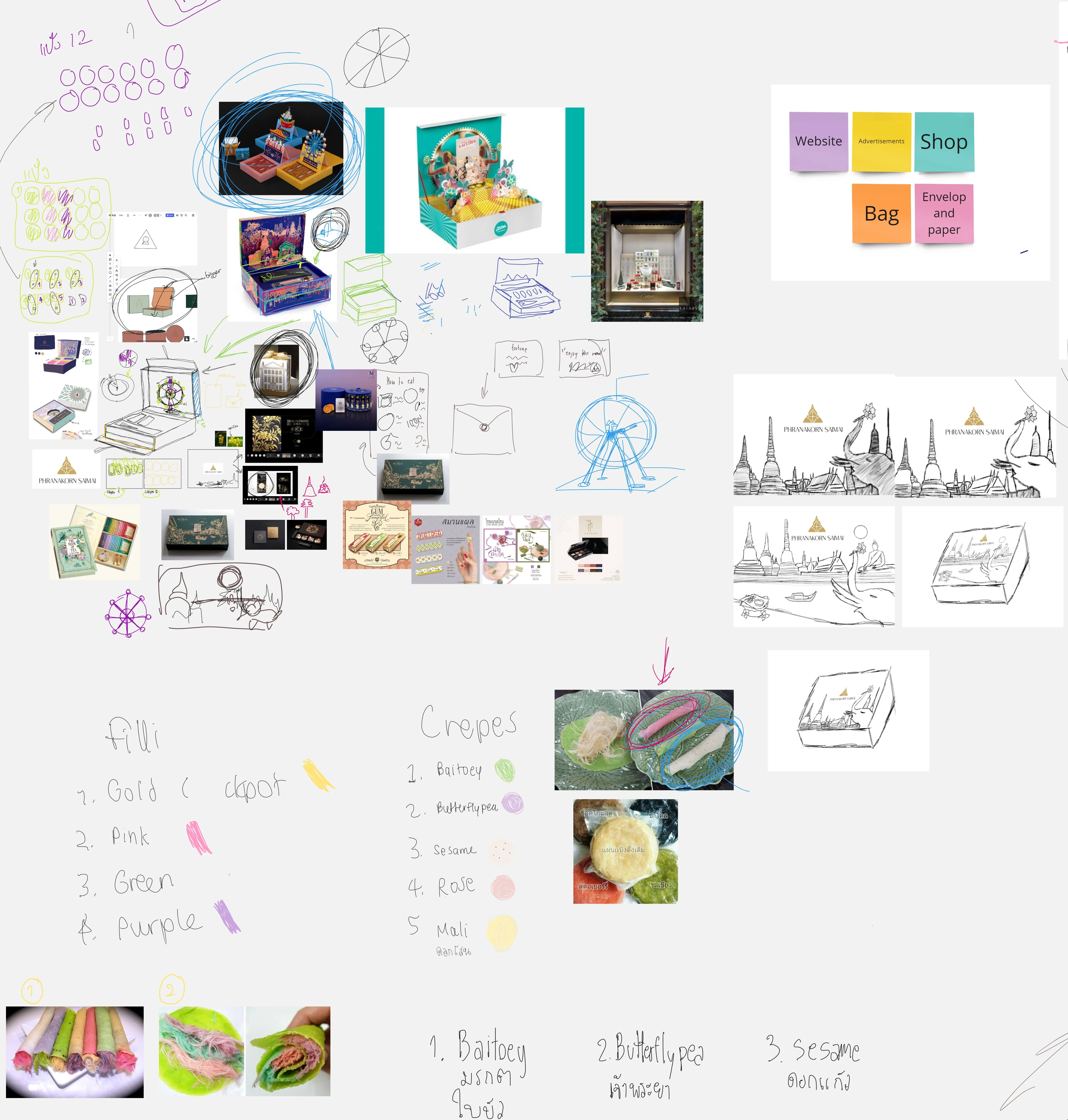
A snapshot of sketching and discussion process on Miro
Final Packaging Design: Traveling back through time twice
Traveling back through time twice, one is Eating roti Saimai the old, retro way, and another is the classy and ancient Ayutthaya city. You can find out more about the history and stories of Ayutthaya from the packaging design, and eat Roti Saimai in the old way by playing Lucky Wheel commonly found in temple fairs in the late 1990s and early 2000s. The overall aesthetic of the design is classy and luxurious just like our brand image. The box is one mild color outside and colorful inside, resembling the roti saimai.
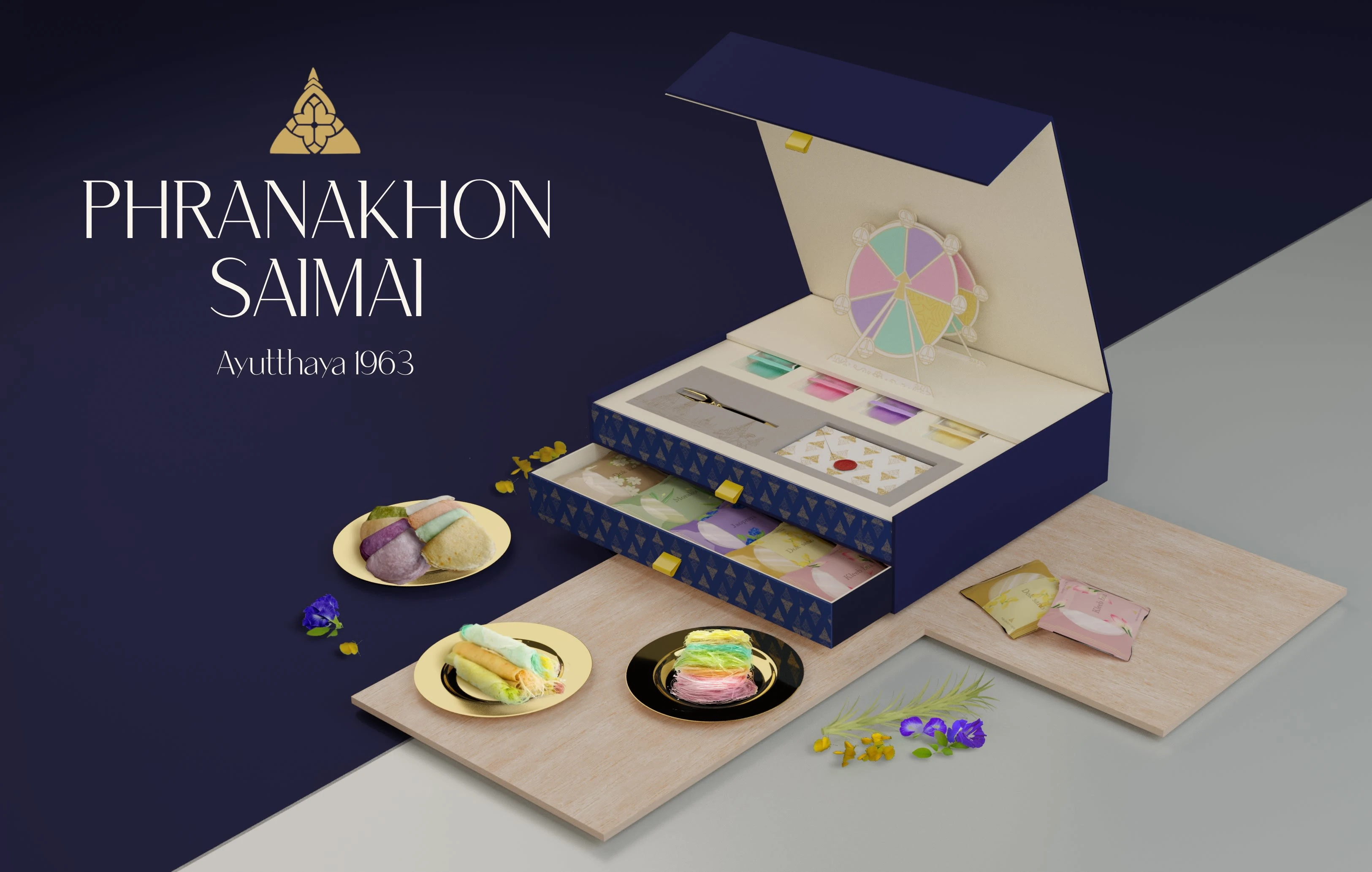
The concept of the packaging tells the story of a spinning wheel lottery, an old Thai game popular among youngsters.
The consumers can indulge in an interactive experience with our product by spinning the paper wheel included in the box. The resulting color will determine the color and flavor of the crepe they can enjoy from the bottom shelf. Each crepe is uniquely named after elements found solely in Ayutthaya, adding an element of discovery and adventure to the snack experience.
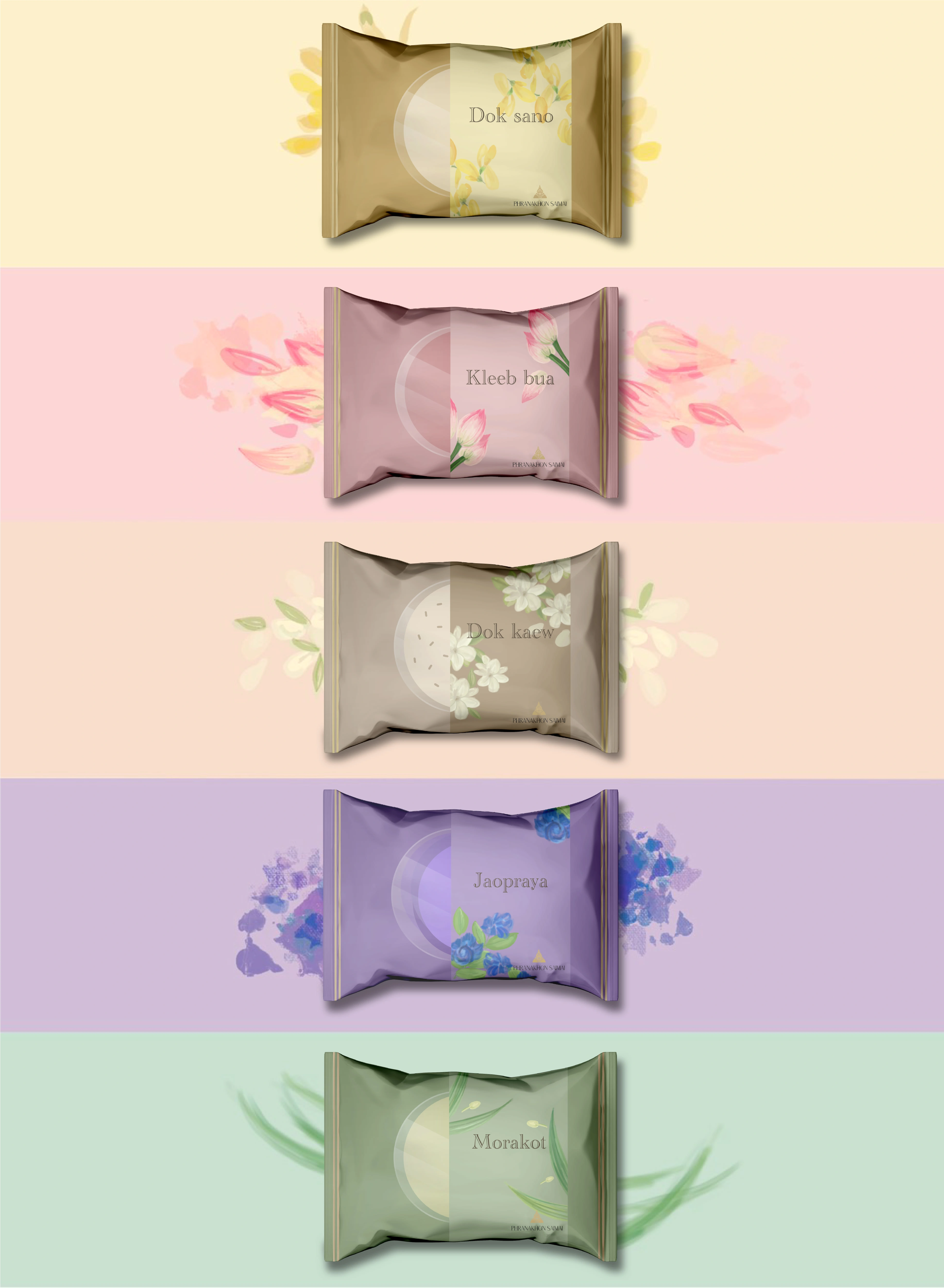
The packaging of each crepe represents flowers and locations native to only Ayutthaya province and Thailand.
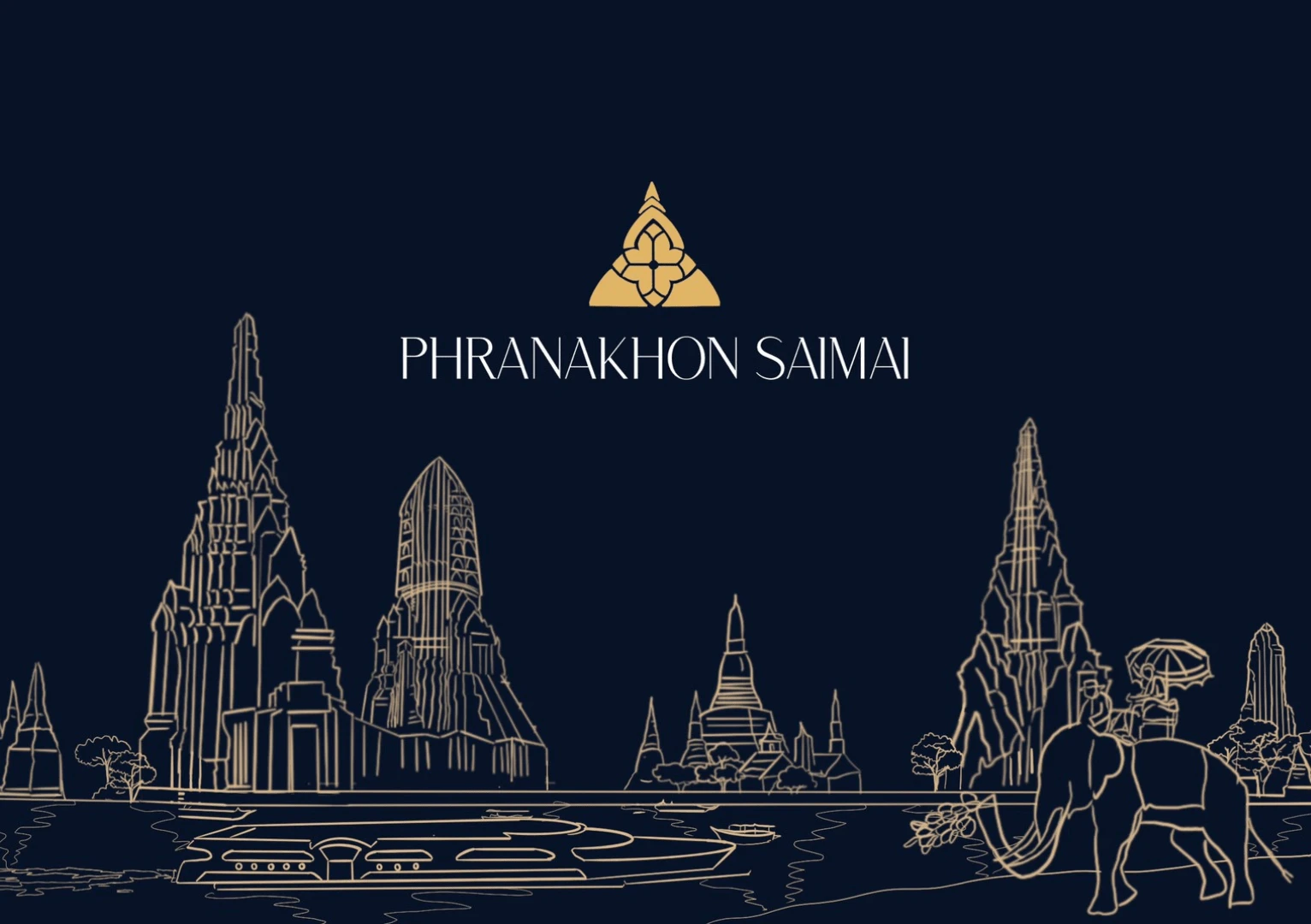
The cover design of the packaging box, depicts the ancient temple of Ayutthaya in its prime era.
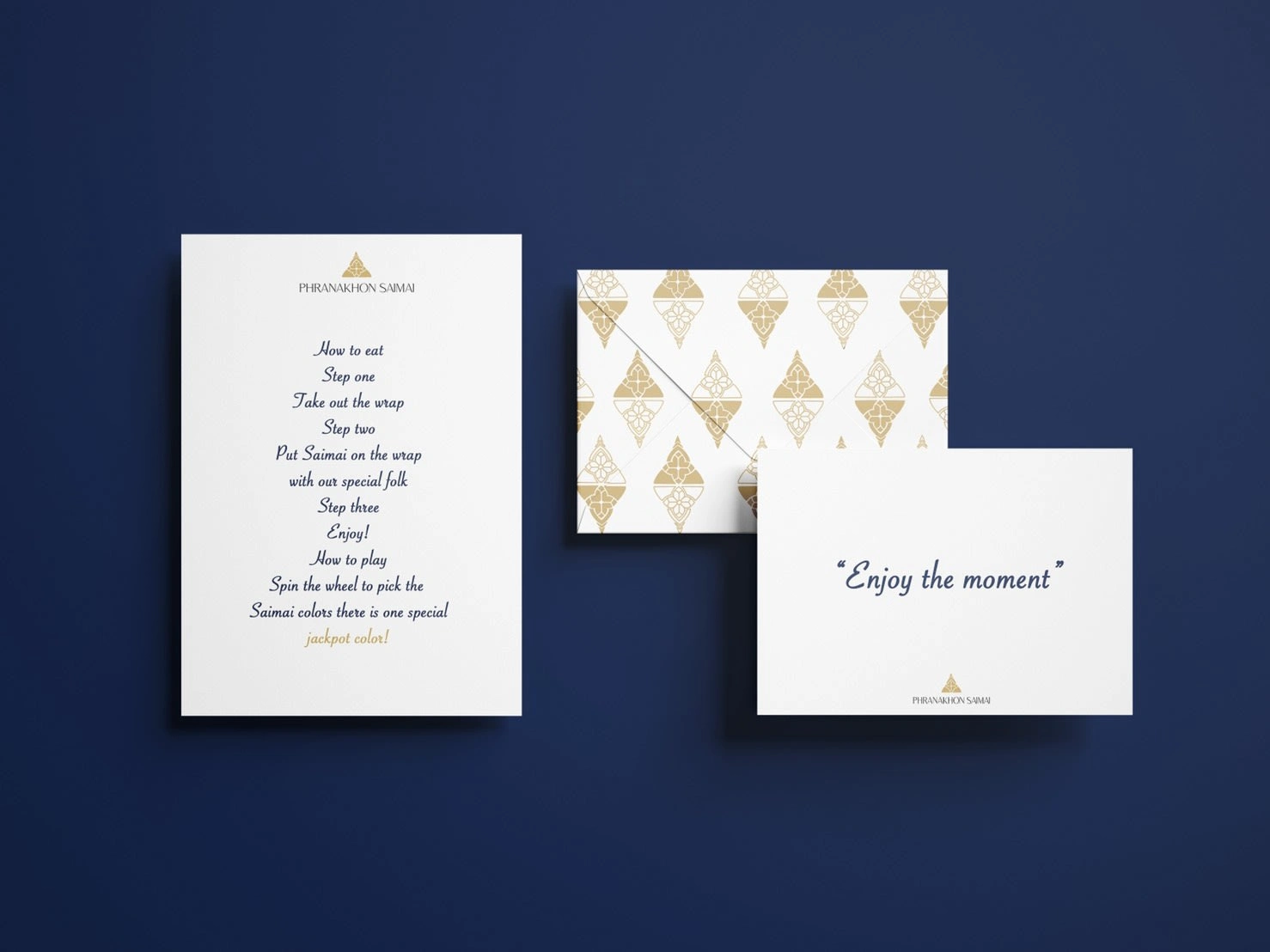
There is a letter in each box with written instructions on how it plays and eat the snack as well as a blessing message to the consumer.
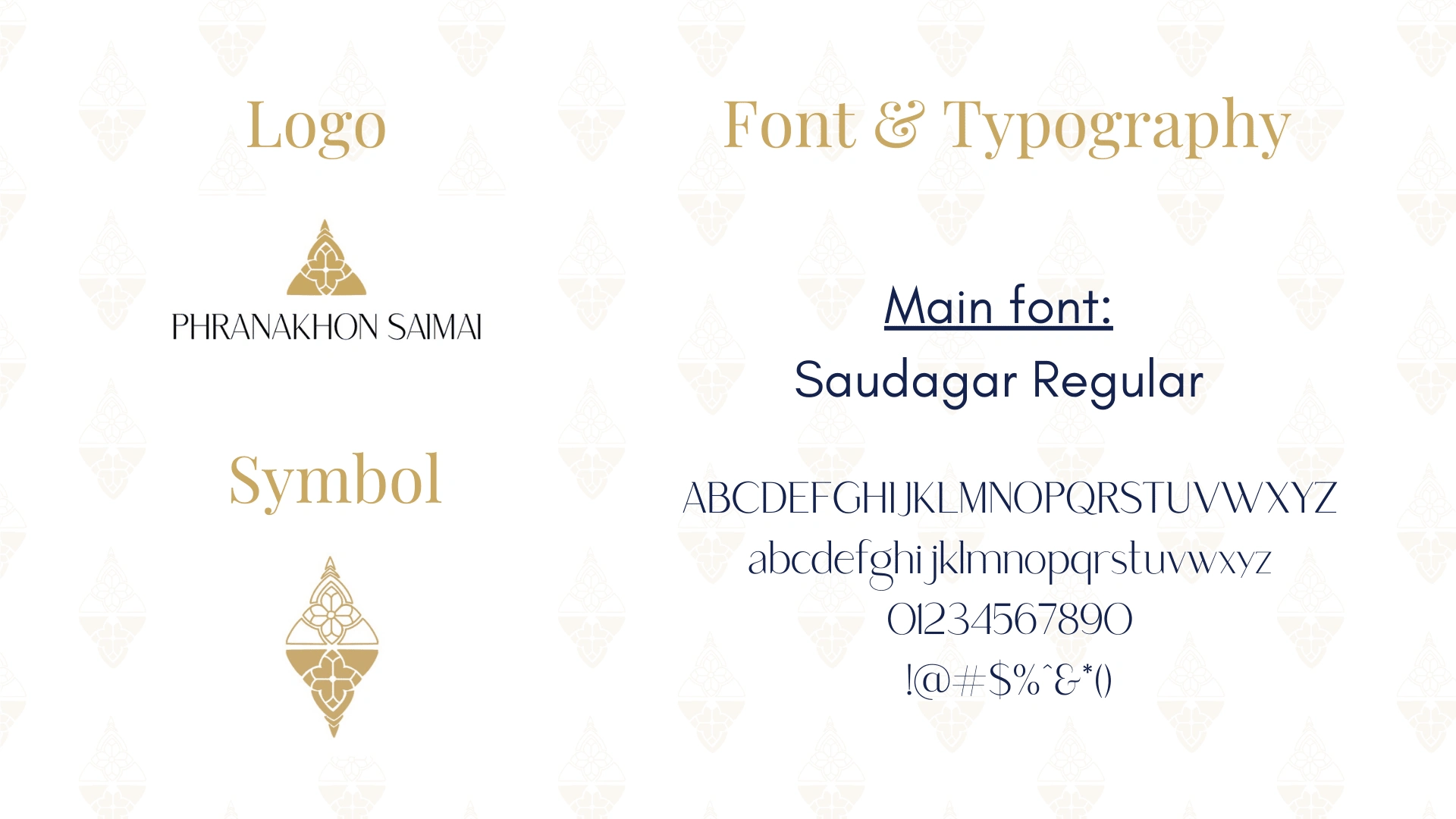
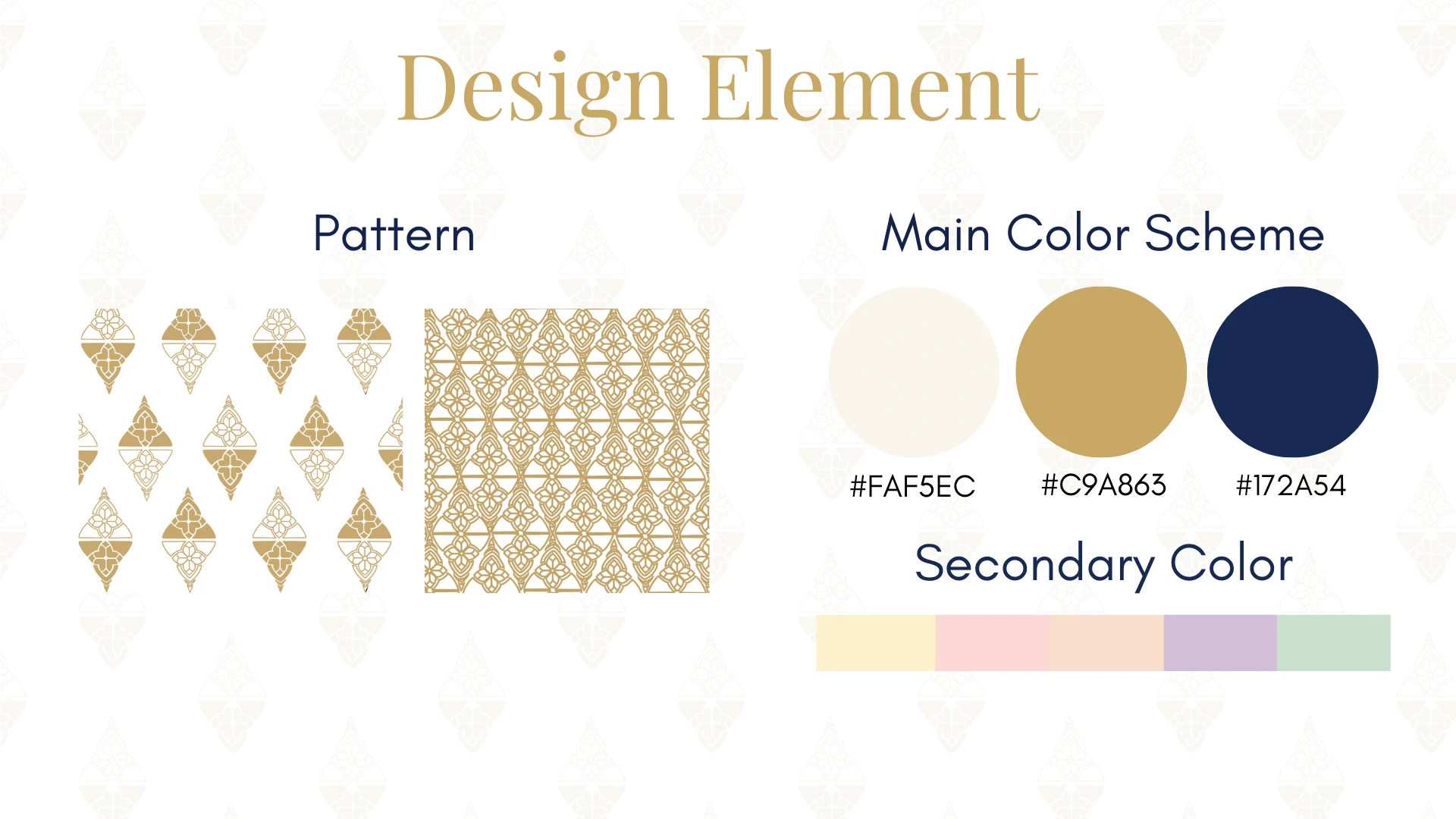
The logo and visual elements in the brand identity are inspired by the traditional patterns in ancient temples all across Ayutthaya.
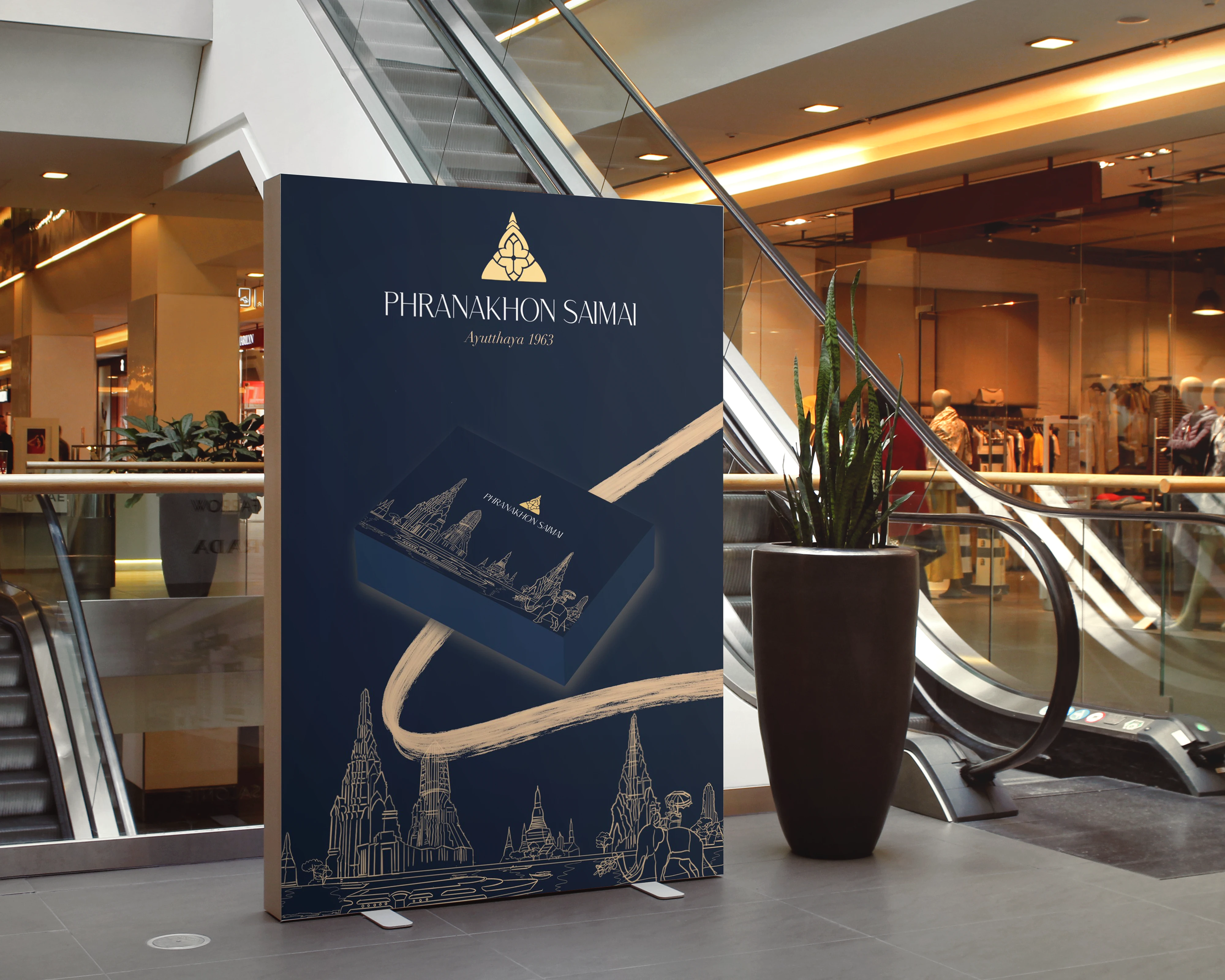
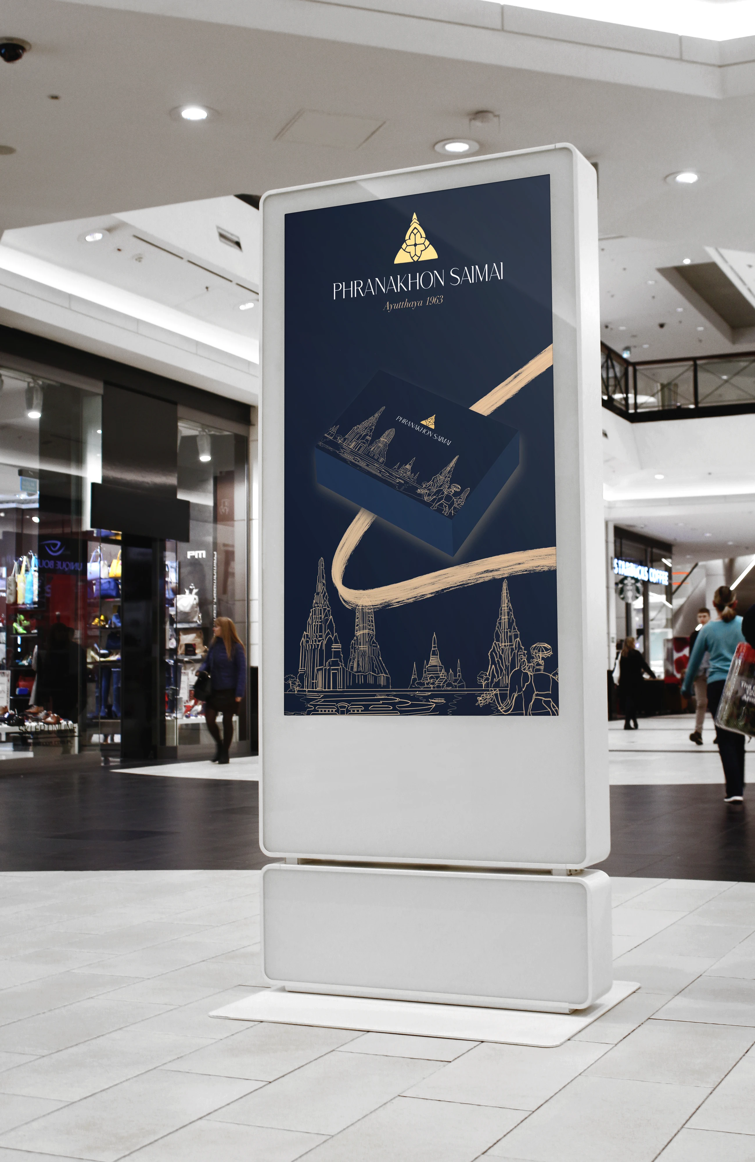
Our design targets international tourists seeking to immerse themselves in Thailand's rich cultural heritage. By placing our product in airports, we hope to showcase the exquisite and distinctive cuisine that is unique to our country. Our aim is to inspire visitors to bring a piece of our culture back home with them as a cherished souvenir, sharing the delightful experience with their loved ones abroad.
Like this project
Posted Apr 17, 2023
A packaging design project that aims to highlight the culture and visual identity of a traditional Thai snack.
Likes
0
Views
67


