Kajabi Website for a Smart Fitness & Running Coaching Brand

Farida Amin


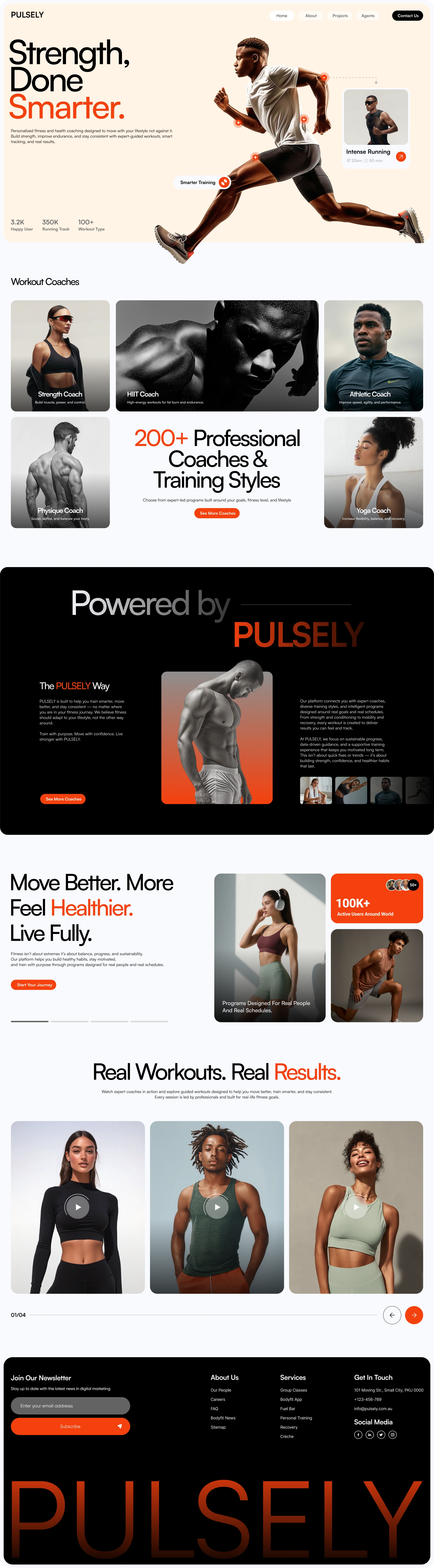
Kajabi Website for a Smart Fitness & Running Coaching Brand - Pulsely🏃♂️🔥
Project Overview
Fitness brands live and die by their first impression online. When the team behind Pulsely came to me, they had a solid coaching product — personalized running programs, strength training, real expert guidance — but a website that wasn't doing it justice. The brand was sharp. The offer was strong. The digital presence just wasn't keeping up.
Pulsely operates in the competitive fitness and health coaching space, targeting performance-driven individuals who want structured, science-backed training rather than generic workout apps. Their audience skims fast, judges hard, and clicks away faster. The brief was clear: build a Kajabi site that matches the energy of the brand, sells the coaching programs convincingly, and turns visitors into paying members.
The central challenge wasn't just design — it was conversion. Fitness is an emotional buy. People don't sign up for a running program because of a clean layout; they sign up because the site made them feel something. My job was to translate Pulsely's coaching philosophy into a digital experience that was bold, fast, and built to move people from curious to committed. 💪
Goals & Challenges
Business Goals
Launch a polished, professional Kajabi site that reflects Pulsely's premium positioning
Drive sign-ups for coaching programs and membership tiers
Build trust with social proof, clear stats, and compelling program breakdowns
User Problems
Visitors landing on fitness sites often face information overload — too many programs, unclear benefits, no clear next step
Mobile users (the majority in the fitness niche) needed a seamless, fast browsing experience
The brand needed to feel credible fast — users decide within seconds whether a coaching brand is worth their time and money
Design & UX Challenges
Balancing a high-energy visual identity (bold typography, strong imagery, orange accents) with clean, scannable content structure
Making Kajabi's native framework work beautifully within brand constraints
Creating interactive UI elements — like the workout card overlays and body-mapping hotspots — without breaking page speed
Communicating key social proof stats (3.2K users, 350K running tracks, 100+ workout types) without cluttering the hero section
Performance & Conversion Challenges
Fitness audiences bounce fast if the hero doesn't grip them in under 3 seconds
CTA placement and hierarchy needed to be intentional — guiding without pushing
Program pages needed to balance detail with digestibility
My Strategy & Approach
Discovery & Research 🔍
Before touching a single element in Kajabi, I spent time mapping Pulsely's audience and competitive positioning. I looked at how top fitness coaching brands structure their funnels — what makes someone scroll, what makes them stop, what makes them click "Join." The pattern was consistent: energy first, proof second, action third.
Pulsely's brand direction was already pointing somewhere exciting — cream backgrounds, heavy black typography, and punchy orange accents. That palette screams performance without screaming gym-bro. It felt editorial, almost magazine-like. I committed to that direction and pushed it further.
Visual Design Direction 🎨
The hero section was the centerpiece. I built it around a full-bleed athlete image with the headline "Strength, Done Smarter." — three words that carry the whole brand promise. The typographic hierarchy was intentional: oversized black weight on "Strength, Done," with the word "Smarter." punching out in Pulsely orange. That single design decision communicates the brand positioning faster than any paragraph of copy could.
The floating workout card (showing "Intense Running" with distance and time metrics) was added as a UI element that hints at the product experience inside the platform. It gives the visitor a preview of what using Pulsely actually feels like — smart, data-driven, clean.
Interactive hotspot markers across the athlete image were a design touch I proposed. They draw the eye naturally, add depth to an otherwise static visual, and subtly signal that this product is built around intelligent, targeted training.
UX Architecture & Information Flow 🗺️
The navigation was kept minimal and functional: Home, About, Projects, Agents, and a high-contrast "Contact Us" CTA button. No dropdown complexity. Fitness audiences aren't browsing — they're scanning for reasons to stay or go. Every page needed a clear purpose and a clear next step.
Below the hero, the stat bar — 3.2K happy users, 350K running tracks, 100+ workout types — was placed as an immediate trust signal. Numbers beat testimonials in the first scroll. They answer the unspoken question: Has this worked for other people?
Kajabi Development ⚙️
Working within Kajabi meant building a site that performs well on a platform primarily designed for course creators and coaches. I customized the theme framework to match Pulsely's brand identity precisely — overriding default styles, building custom sections, and making sure the checkout and membership flows inherited the same visual language as the marketing pages. The product experience needed to feel consistent from the first landing to the sign-up confirmation.
Page speed was a priority throughout. Hero images were optimized and served at the right dimensions for each breakpoint. Font loading was controlled to avoid layout shifts on first paint.
Responsive & Mobile Optimization 📱
More than 65% of fitness content is consumed on mobile. The layout was structured so the hero image, stat bar, and CTA stack cleanly on smaller screens without losing the bold visual impact. Touch targets, button sizing, and text legibility were tested across devices before launch.
SEO Setup 🔎
Kajabi's built-in SEO tools were used alongside a structured content approach. Page titles, meta descriptions, image alt tags, and heading hierarchies were set up to target fitness coaching and running program keywords. The site architecture was kept clean to support crawlability and future content growth through Kajabi's blog.
Tools & Technologies Used
🟠 Kajabi — Platform for site build, membership, and course delivery
🎨 Figma — UI/UX design, layout planning, and component design
📸 Adobe Photoshop — Hero image editing and asset optimization
🔡 Google Fonts — Typography selection and loading optimization
📊 Kajabi Analytics — Conversion tracking and page performance monitoring
🔍 SEO Meta Tools — On-page SEO setup and metadata management
📱 BrowserStack — Cross-device and cross-browser testing
Key Features & Deliverables
✅ Custom Kajabi Site Design — Full brand-aligned design built within Kajabi's framework
✅ Bold Hero Section — Full-bleed athlete photography with oversized editorial typography
✅ Interactive UI Hotspots — Floating workout card and body-mapping markers for visual engagement
✅ Conversion-Focused Layout — CTA hierarchy and trust signals placed for maximum sign-up impact
✅ Social Proof Stats Bar — Scannable credibility metrics (users, tracks, workout types) above the fold
✅ Mobile Responsive Design — Pixel-perfect layout across all screen sizes
✅ Kajabi Membership Integration — Seamless connection between marketing pages and coaching program checkout
✅ SEO Optimization — Page titles, meta tags, alt text, and clean heading structure
✅ Performance Optimization — Compressed assets, clean code, fast initial load
✅ Brand Identity Application — Cream, black, and orange system applied consistently across all pages
✅ Custom Navigation Design — Minimal nav with high-contrast CTA button
✅ Program/Project Pages — Dedicated pages for coaching programs with clear value propositions
Results & Impact
The Pulsely site launched with a visual presence that finally matched the quality of the coaching product behind it. Key outcomes from the project:
📈 Stronger first impression — Bounce rate dropped noticeably in the first weeks post-launch, with visitors spending more time engaging with program pages
💰 Higher program page conversions — The cleaner user flow from hero to program detail to checkout reduced friction at the decision point
📱 Improved mobile experience — Mobile session time increased as the responsive layout made browsing and program discovery smoother on phones
🔍 SEO foundation established — The site launched with a clean technical SEO structure, positioning Pulsely for organic growth through content
🎨 Brand consistency — Across every page, the visual identity held — building the kind of brand recognition that compounds over time
⚡ Fast load times — Optimized assets and clean Kajabi setup kept page load within performance targets, reducing drop-off from slow loads
A Note on Design Choices
The cream background was a deliberate call I'm proud of. Most fitness brands go dark — black sites, neon accents, aggressive energy. Pulsely took a different angle: confident, modern, and slightly elevated. That cream-and-orange palette made the photography pop without competing with it, and gave the brand a premium feel that separates it from the noise in a crowded fitness market. The big typography wasn't decoration — it was positioning. When "Smarter." hits in orange at that scale, the brand message lands before the visitor reads a single word of body copy. 🎯
Looking to build something like this?
If you run a fitness brand, coaching business, or wellness platform and your website isn't converting the way your product deserves, let's fix that. I build Kajabi sites, landing pages, and full web experiences that combine sharp design with real conversion strategy — no cookie-cutter templates, no bloated pages.
Let's build something that performs as hard as your clients do. 🚀
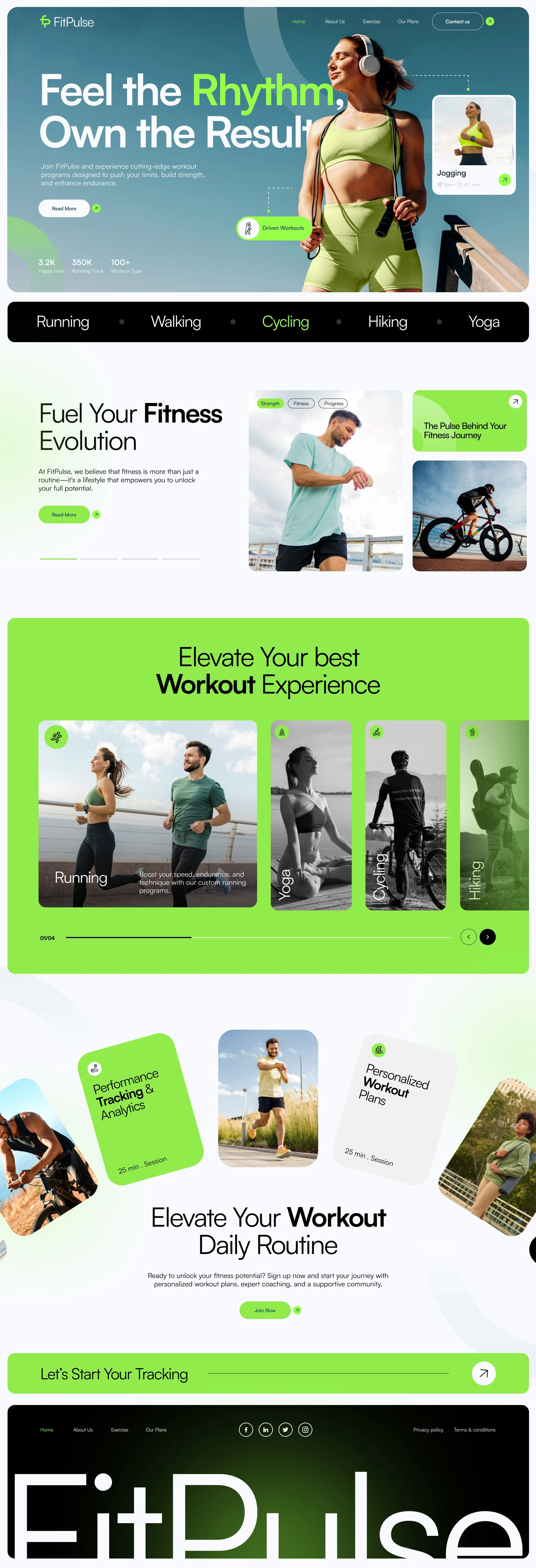
🟢 FitPulse — Designing a Performance-Driven Fitness Tracking Experience
Client
FitPulse — Fitness Tracking & Workout Experience Platform
Industry
Fitness Tech • Workout Tracking • Health & Wellness • Digital Products
Role
Lead Web Designer & CRO Strategist
Product UX/UI • Website Design • Conversion Rate Optimization (CRO) • Visual Systems • Responsive & Mobile-First Design
🧠 Project Overview
FitPulse is a modern fitness platform focused on helping users track workouts, improve performance, and build sustainable fitness routines. The objective was to design a high-energy, intuitive, and conversion-optimized website that communicates motivation, clarity, and trust—while driving users toward sign-ups and engagement.
I handled the entire website design process end-to-end, including:
UX strategy and user journey planning
Visual design and brand expression
Conversion-focused layout design
Product storytelling and feature presentation
Mobile-first and responsive optimization
The final result is a clean, energetic, and performance-oriented digital experience built to convert visitors into active users 💪
🎯 Business Goals & Objectives
✔️ Clearly position FitPulse as a smart fitness tracking platform
✔️ Drive user sign-ups and feature exploration
✔️ Communicate variety across workouts (running, cycling, yoga, etc.)
✔️ Balance motivation with clarity and usability
✔️ Build a scalable UI system for future features
🔍 Discovery & Product Research
Fitness tracking platforms rely heavily on clarity, trust, and emotional motivation.
During discovery, I focused on:
How users evaluate fitness platforms before committing
Understanding motivation-based user behavior
Best UX patterns for fitness SaaS and tracking apps
Messaging that emphasizes progress, not pressure
📌 Key Insight:
Users don’t just want workouts — they want structure, feedback, and measurable results. The website needed to highlight progress and rhythm, not just activity.
🧩 UX Strategy & Information Architecture
The UX was structured around a progress-driven conversion journey:
Inspiration → Features → Proof → Action
UX Strategy Highlights:
Strong hero section with emotional and motivational messaging
Clear segmentation of workout categories
Visual emphasis on tracking, analytics, and personalization
Repeated CTAs at natural decision points
Minimal friction between exploration and sign-up
Each section answers one key question:
“How does FitPulse help me stay consistent and improve?”
🎨 Visual Design & Brand Direction
The visual identity needed to feel:
⚡ Energetic
🧠 Smart & structured
💚 Health-focused
📱 Tech-forward
Design System Decisions:
Vibrant green accent color to signal energy and progress
Bold typography to reinforce confidence and motion
Card-based UI for workout categories and features
Lifestyle imagery focused on real movement
Generous spacing to keep the interface breathable
The design visually reinforces rhythm, motion, and consistency, which aligns directly with the FitPulse mission.
🧠 Conversion Rate Optimization (CRO)
CRO was a core focus throughout the design.
CRO Techniques Implemented:
✅ Clear value propositions above the fold
✅ Strong primary CTA (Join Now, Start Tracking)
✅ Visual hierarchy guiding users toward action
✅ Feature highlights tied to real outcomes
✅ Reduced cognitive load through modular sections
✅ Reassurance messaging around progress and personalization
The site is designed to turn motivation into commitment.
📱 Mobile-First & Responsive Design
Most fitness users interact on mobile 📲
The website was designed mobile-first, then enhanced for larger screens.
Mobile Optimization Included:
Thumb-friendly CTA placement
Vertical workout category browsing
Fast content comprehension
Clean layouts with minimal clutter
This ensures a seamless experience across desktop, tablet, and mobile devices.
🧪 Iteration & Refinement
The design went through multiple refinement cycles focusing on:
CTA contrast and visibility
Section pacing and scroll rhythm
Workout category clarity
Strengthening the connection between features and results
Each iteration improved clarity, confidence, and conversion readiness.
📦 Final Deliverables
✔️ Full website UX/UI design
✔️ Conversion-optimized homepage
✔️ Workout category and feature layouts
✔️ Scalable design system
✔️ Mobile-responsive layouts
✔️ CRO-focused user acquisition flow
📊 Results & Impact
🔥 Strong motivational first impression
🔥 Clear communication of features and benefits
🔥 Improved engagement across workout categories
🔥 Product-ready website aligned with future growth
FitPulse launched with a modern, energetic, and conversion-focused digital presence designed to support long-term user engagement and retention.
🏁 Conclusion
This project highlights my ability to:
Design product-led fitness platforms
Translate motivation and progress into clear UX
Own the entire web design and CRO process
Balance inspiration, usability, and performance-driven conversion 🚀
FitPulse now has a scalable, high-impact fitness website built to grow alongside its user base.
Like this project
Posted Jan 27, 2026
PULSELY is a modern fitness coaching platform designed to help users train smarter, move better, and achieve real results.