Built with Framer
Alex Laurent Minimal Portfolio Website
Bright Ajiboye
Alex Laurent — Minimal Portfolio Website
Role: Design, Development, Art Direction
Type: Personal Portfolio Website
Overview
Alex Laurent is a minimal personal portfolio website built around one core idea:
Remove everything that does not serve clarity.
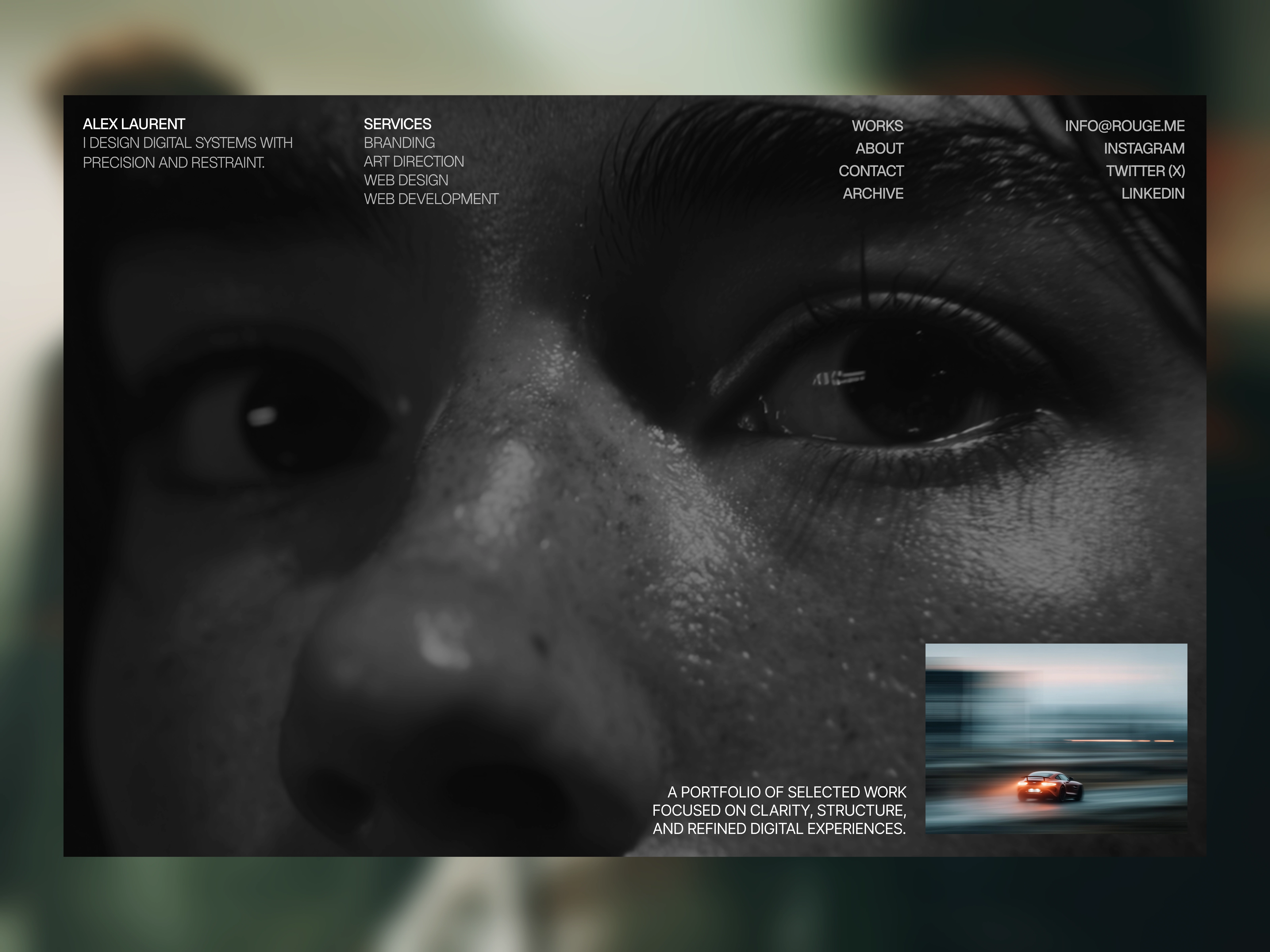
The homepage contains only a hero and a footer — nothing else. No feature sections, no testimonials, no scrolling distractions. Just presence.
The goal was to design a portfolio that feels deliberate, structured, and confident. A space where typography leads, whitespace breathes, and hierarchy guides.
The Challenge
Most portfolio websites try to prove too much.
They stack sections:
Services
Testimonials
Logos
Metrics
“Why me” blocks
The result is often visual noise and diluted identity.
The challenge was:
How minimal can a portfolio be without losing depth?
Can a homepage function purely as a gateway?
Can typography alone carry authority?
Strategy
We stripped the structure back to its essentials.
1. Intentional Entry Point
The homepage acts as a controlled introduction.
It presents identity, not information overload.
This creates:
Strong first impression
Immediate focus
Clear direction to explore further
2. Structured Architecture
Instead of sections on the homepage, the depth lives in dedicated pages:
Work
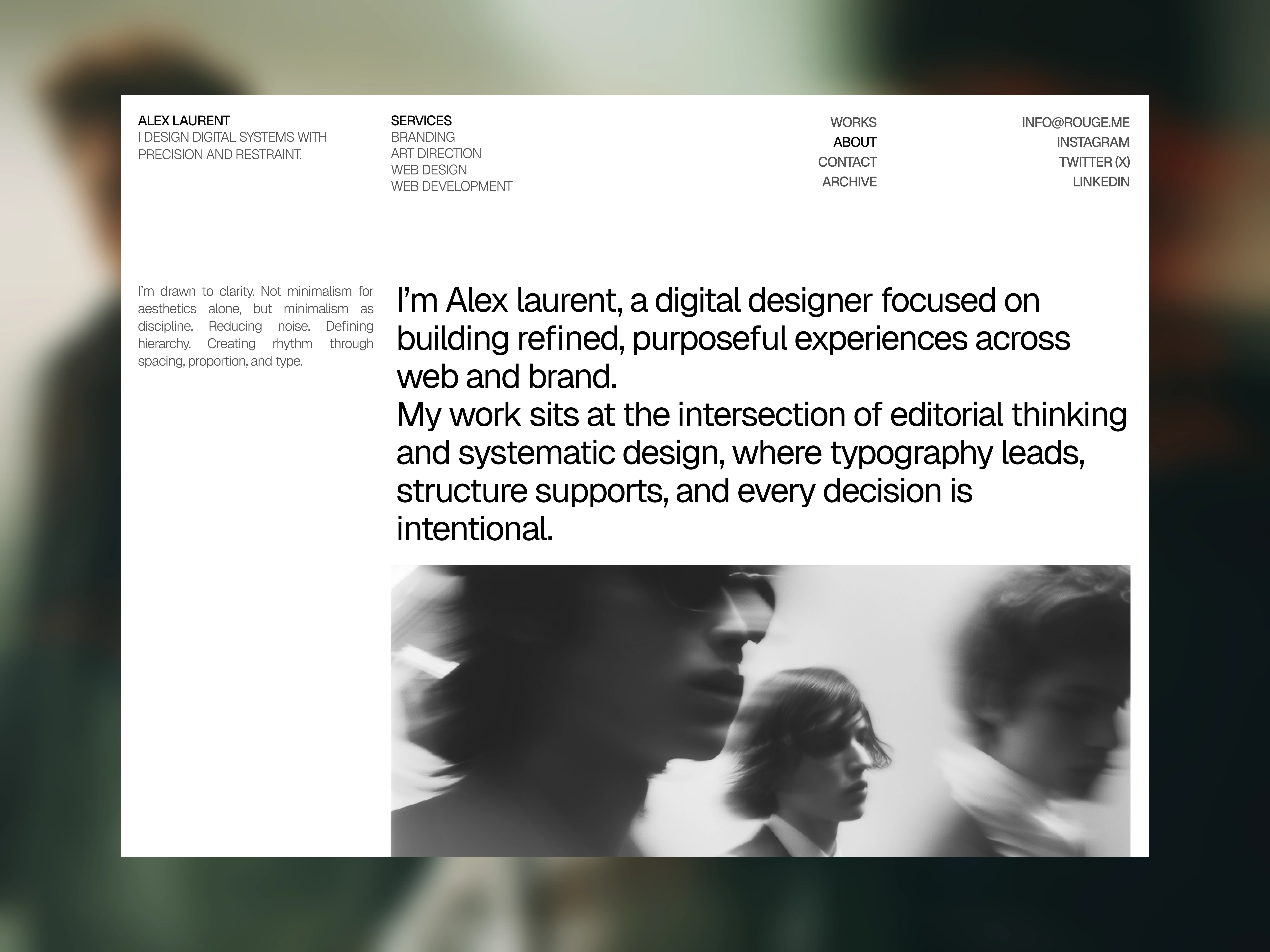
Services
About
Archive
Contact
This separation creates breathing room and hierarchy.
3. Bold Color Philosophy
The visual system is built around:
Deep red background
Black typography
Generous whitespace
Strong typographic contrast
The red isn’t loud — it’s controlled and dark. It adds emotion without sacrificing elegance.
Red introduces:
Energy
Tension
Presence
Black grounds it.
Design Direction
Visual Language
Editorial grid system
Large, confident type
Strict spacing rhythm
Minimal UI elements
No unnecessary decoration
The design feels architectural rather than decorative.
Typography
Typography is the primary design tool.
Large hero headline
Clean sans-serif system font pairing
Controlled weight contrast
Tight line-height discipline
Every margin and alignment was intentional.
Development Approach
The website was built with performance and simplicity in mind.
Clean, lightweight structure
Minimal animations
Fast load time
Smooth transitions between pages
Responsive grid system
Animations are subtle:
Soft fade-ins
Slight hover shifts
No aggressive motion
The goal was to support clarity — not distract from it.
Key Pages
Homepage
Hero + Footer only.
No intermediate sections.
This forces exploration rather than scrolling consumption.
Work Index
A structured list/grid of selected projects.
Each entry is treated with equal weight.
Work Detail Pages
Each project includes:
Context
Challenge
Process
Outcome
Visual system breakdown
The structure emphasizes thinking, not just visuals.
Archive
A quiet collection of experiments, drafts, and explorations.
This page humanizes the work — showing evolution.
Results
Stronger personal brand presence
Clear separation between identity and work
Improved perception of authority and intentionality
A portfolio that feels designed, not templated
What I’d Do Next
Add subtle page transition effects for enhanced flow
Introduce a light/dark toggle variation
Expand archive with process documentation
Final Reflection
Alex Laurent is not just a portfolio website.
It’s a statement about restraint.
It proves that minimalism isn’t about removing elements — it’s about removing noise.
The result is a portfolio that feels calm, confident, and deliberate.
Like this project
Posted Mar 1, 2026
A minimal portfolio built around clarity, structure, and bold typography, stripping away noise to let intentional work speak with confidence and presence.