Bright Ajiboye - Web Designer | ContraWork by Bright AjiboyeBright Ajiboye
Web Designer & Framer Expert
- $10k+
- Earned
- 6x
- Hired
- 4.63
- Rating
- 68
- Followers
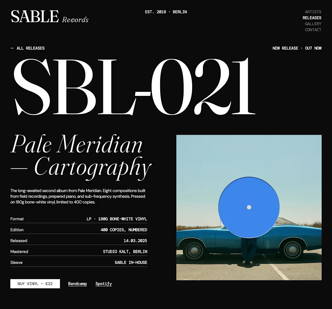
Continuing my exploration of the Sable Records website concept.
This is the Catalogue section, designed to showcase the label's latest releases through a more editorial and immersive approach.
Instead of relying on a standard card grid, I explored a composition built around oversized typography, strong imagery, asymmetry and intentional negative space.
The idea is to make each release feel like more than just an item in a catalogue.
A website can be functional without feeling generic—and for a music label with a strong identity, the browsing experience should be part of the world the label is creating.
Direction: Editorial / Experimental / Minimal
#Framer #WebDesign #CreativeDesign #EditorialDesign SABLE RECORDS — Hero Section Exploration
Exploring a bold, editorial direction for an independent music label.
The goal was simple: make the hero feel like a record sleeve translated into a digital experience.
Oversized typography.
Minimal navigation.
Strong contrast.
Generous whitespace.
A little bit of editorial attitude.
Nothing unnecessary.
Just a strong first impression that immediately establishes the character of the brand.
Currently exploring the full experience → artists, releases, and gallery.
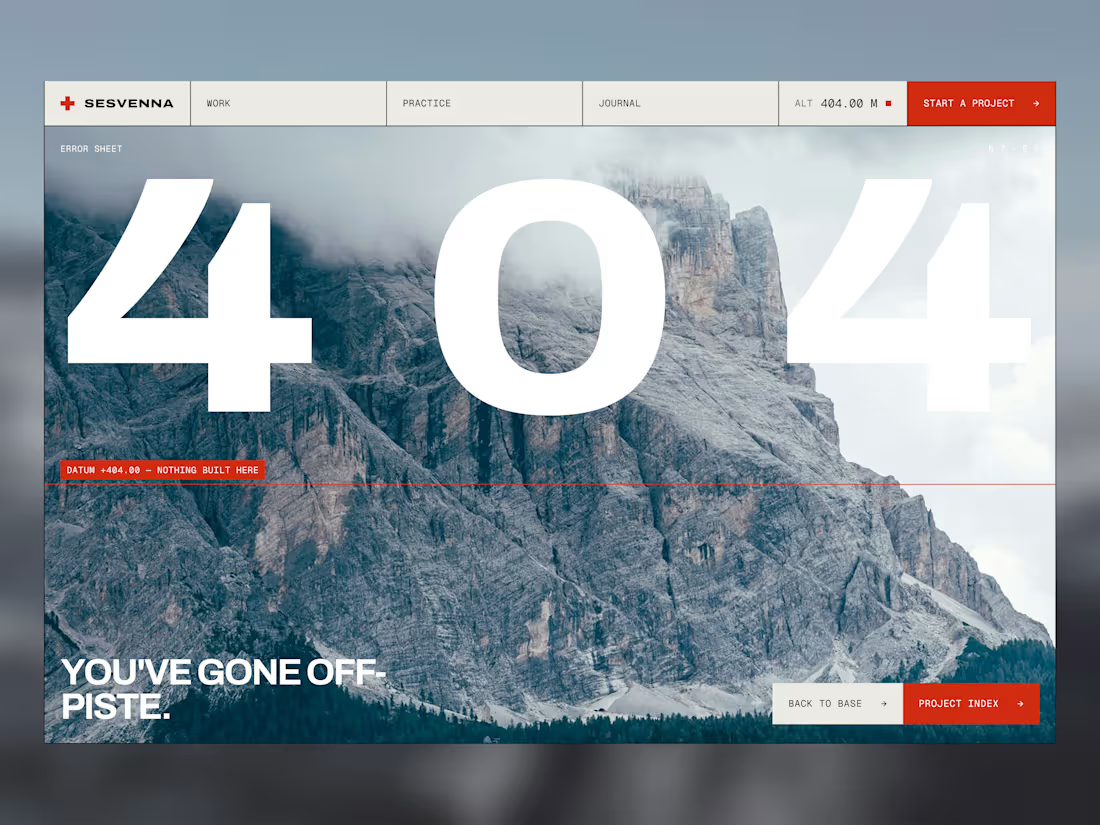
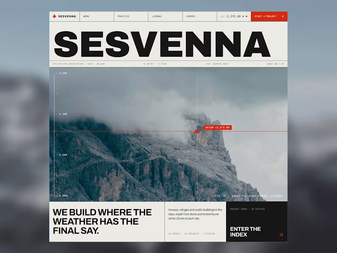
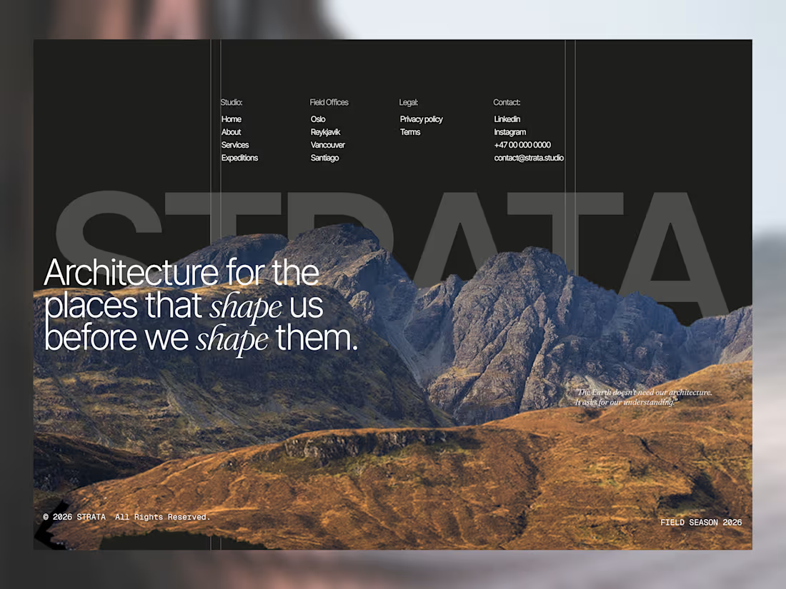
If you’re looking for a designer/developer to bring this kind of visual direction to life, let’s work. A recent landing page exploration for a conceptual architecture studio designing for extreme environments.
The goal was to create an experience that feels editorial, immersive, and timeless—moving beyond the typical real estate aesthetic to highlight the relationship between architecture and nature.
Designed with a focus on typography, composition, and storytelling.
Always exploring ways to turn ideas into experiences. One of the biggest lessons from this project came before the final design.
I initially approached c.black (http://c.black) as a full redesign, only to discover the real goal was to create a seamless extension of the existing website. This shift required rethinking the direction, aligning the new experience with the established brand, and ensuring both platforms felt like one cohesive product rather than two separate websites.
The result was a unified, high-converting experience that stayed true to the brand while improving usability and consistency.
Live Website: https://go.c.black