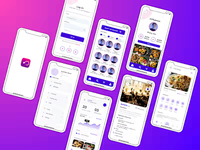
Mental Health Support App
Problem Statement
Many individuals struggle with managing their mental health effectively due to limited access to appropriate resources and support. This lack of accessible resources and connections often leaves them feeling isolated, misunderstood, and without the necessary support system to navigate their struggles effectively.
Solution
Develop a user-friendly Mental Health Support App that provides a comprehensive platform for users to access resources, connect with professionals, and build a supportive community. The Mental Health Support App aims to break down barriers to mental health care, providing a compassionate and accessible platform for users to improve their well-being and find the support they need.
Goals🎯
Accessibility: Ensure the app is easily accessible to users of all ages and backgrounds.
Resource Hub: Provide a diverse range of mental health resources, including articles, exercises, and videos.
Professional Support: Enable users to connect with mental health professionals through in-app messaging or video sessions.
Community Building: Foster a safe and supportive community for users to share experiences and provide peer support.
Progress Tracking: Implement features for users to track their mental health journey and set goals.
Personalisation: Offer personalised content and recommendations based on user preferences and needs.
Project Timeline⏳
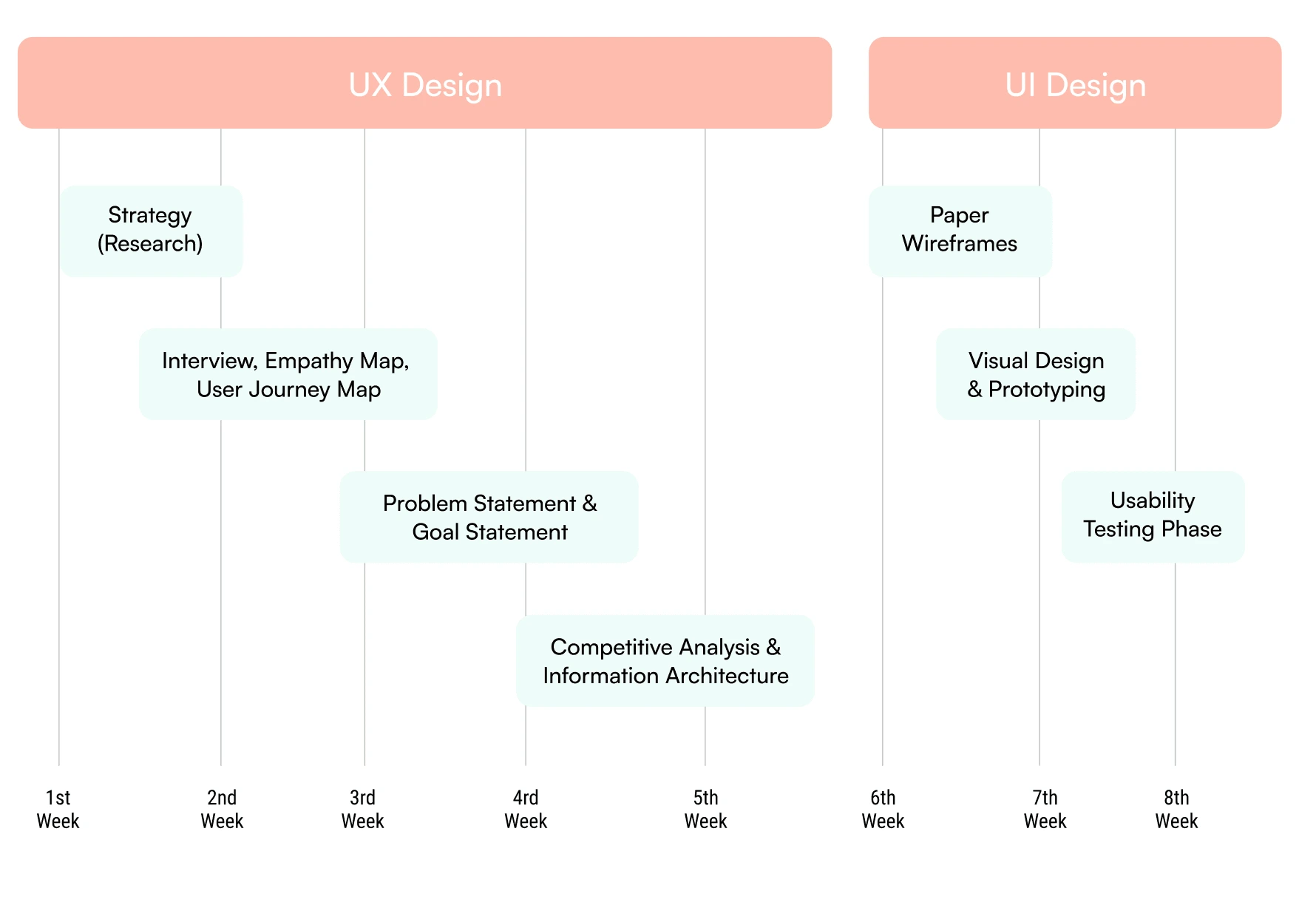
Project timeline to make this app
Design Thinking Process
Our application embodies the principles of the Design Thinking Process to provide a platform for individuals facing mental health and addiction challenges. We prioritize understanding the needs of our users, fostering a supportive community, and facilitating collaboration and personal growth. Through intuitive features and a user-friendly interface, we empower users to share their experiences, connect with others, and access valuable resources.
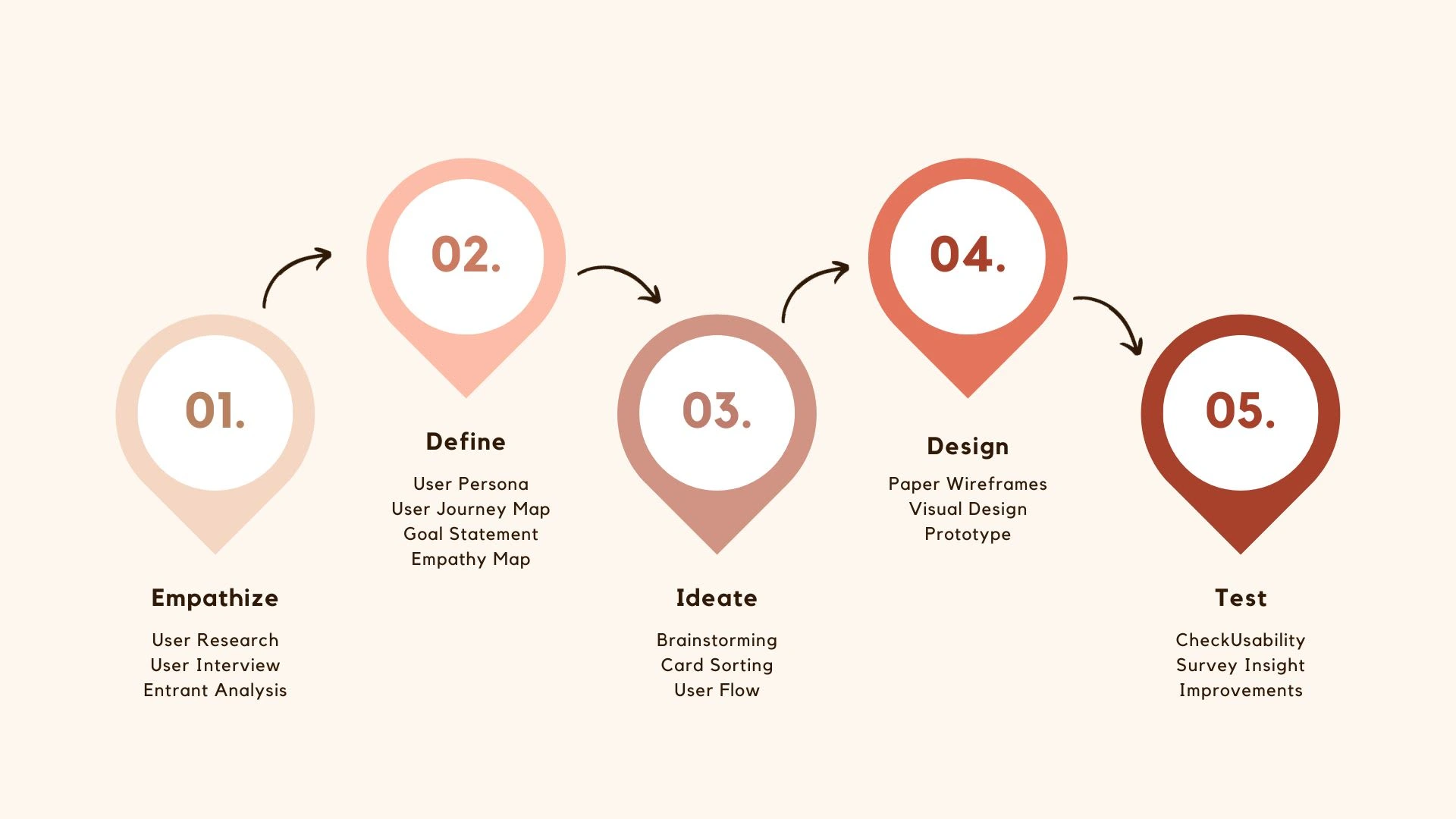
Design Thinking Process in 5 stages
Surveys
After the project kickoff, we defined our research strategy and objectives. Understanding the target audience and their challenges was our priority. First, we built an online survey and shared it in various relevant communities. Based on these, we identified 5 common pain points, which led us to the next step.
User Insights:-
Age Group: The survey respondents were primarily aged between 18 and 35, indicating a younger demographic.
Usage Frequency: Most users reported using the app at least once a week, suggesting regular engagement.
Most Loved Features: Users appreciated the mood tracking and journaling features, which helped them understand their mental health better.
Main Challenges: The survey revealed that users struggled with finding suitable therapists, managing crisis moments, and dealing with information overload.
Common Pain Points:-
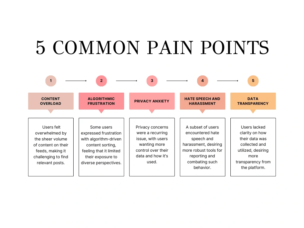
Common pain points of users
Applying Findings:-
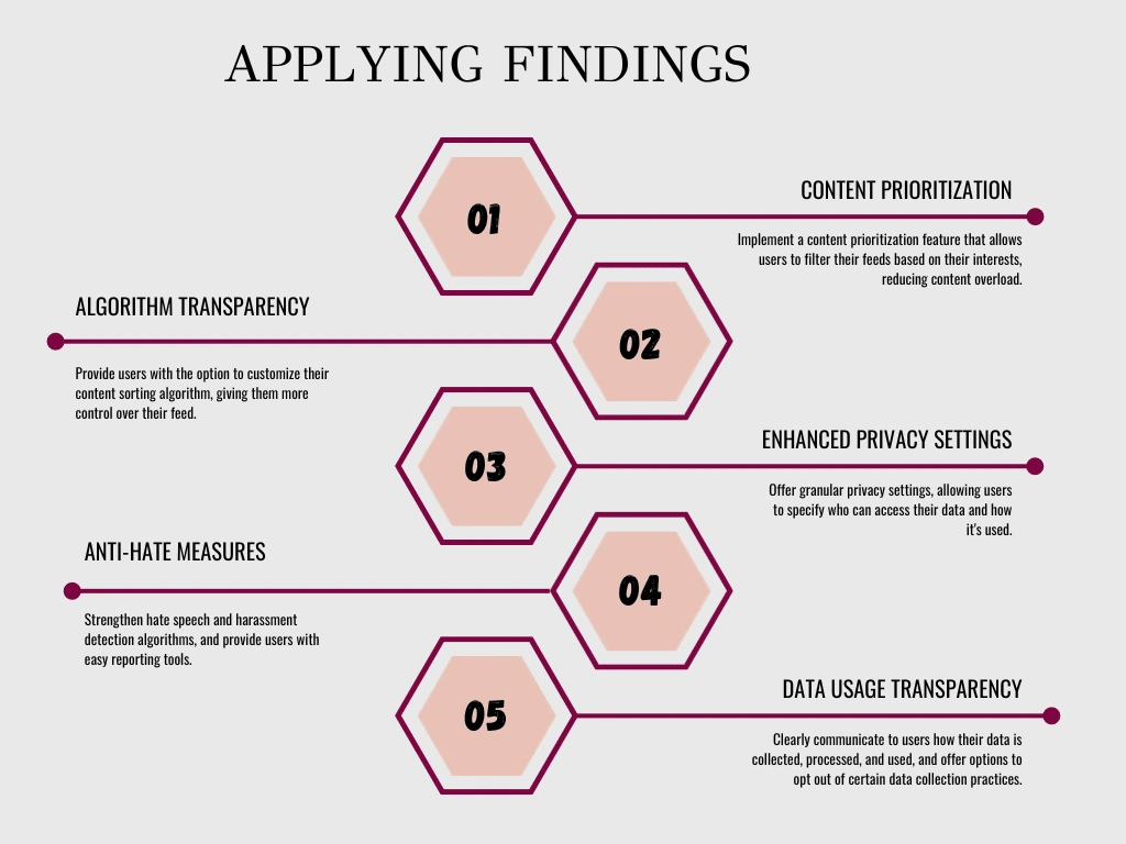
Applying findings to the common pain points of users
By addressing these pain points and applying user insights, the social media platform aims to provide a more user-friendly, personalised, and secure experience while fostering a sense of community and well-being among its users.
Personas
We wanted to better understand our users' goals, needs, experiences, and behaviours. So, we created personas for each of our user segments. They were based on user interviews and surveys, and we kept updating them throughout the project as we gathered more data. We used these personas whenever we wanted to step out of ourselves and reconsider our initial ideas.
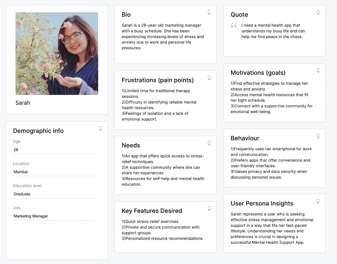
Persona of a user
User Journey
The user journey for the Mental Health Support App encompasses stages from awareness and daily use to crisis moments, therapy-seeking, personal growth, and ongoing support, fostering emotional well-being and community.
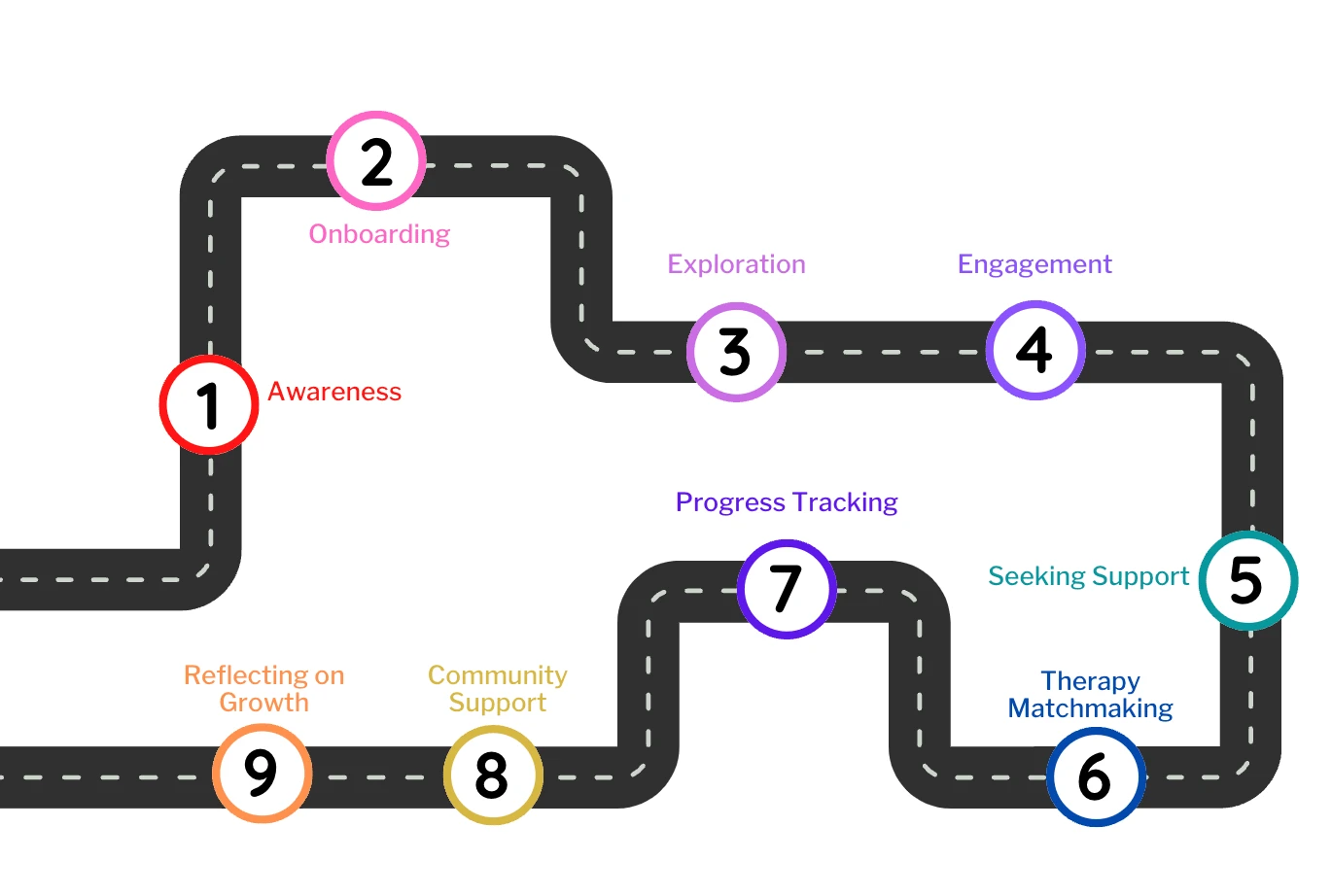
User journey
Customer Journey
We created a customer journey map to build a better understanding of how customers find and interact with the service and discover opportunities for improvement. The map revealed many user problems and opportunities at the consideration and loyalty stages of the customer journey.
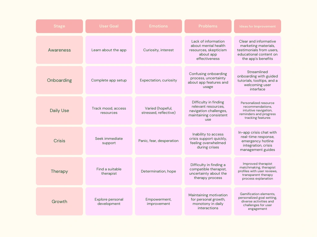
Customer journey
Card Sorting

Card sorting method for the app
Information Architecture
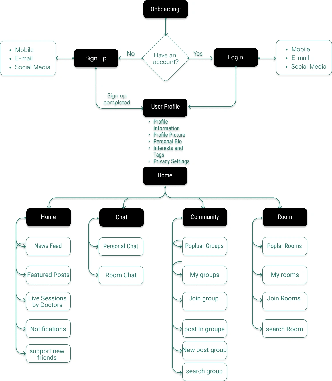
Information Architecture of the app
Sketch
I began the design process with low-fidelity sketches and wireframes to accelerate decision-making through visualization without losing time. My sketches were based on the initial user interviews, the business goal, and the heuristic evaluation. They each pointed to the fact that there were too many distractions in the flow. We came back to the sketches throughout the entire design process to make sure that we didn’t lose sight of our primary goals and ideas.
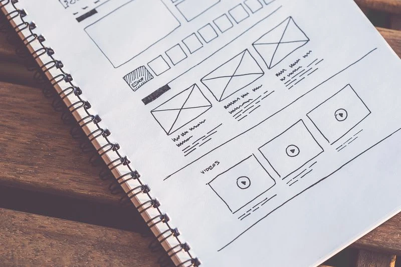
First sketch of the app
The primary purpose of my sketches was to facilitate brainstorming and visualization during the early stages of the design process. They served as a tool for exploring and refining design concepts quickly.
Wireframes
Using Figma, I translated my first sketches into low-fidelity wireframes. Then, I improved them by adding a few relevant stock images and copies provided by the marketing team. At this stage, the wireframes were defined enough for some user testing. Based on 4 tests, I’ve made a few alterations and moved on to creating high-fidelity prototypes.
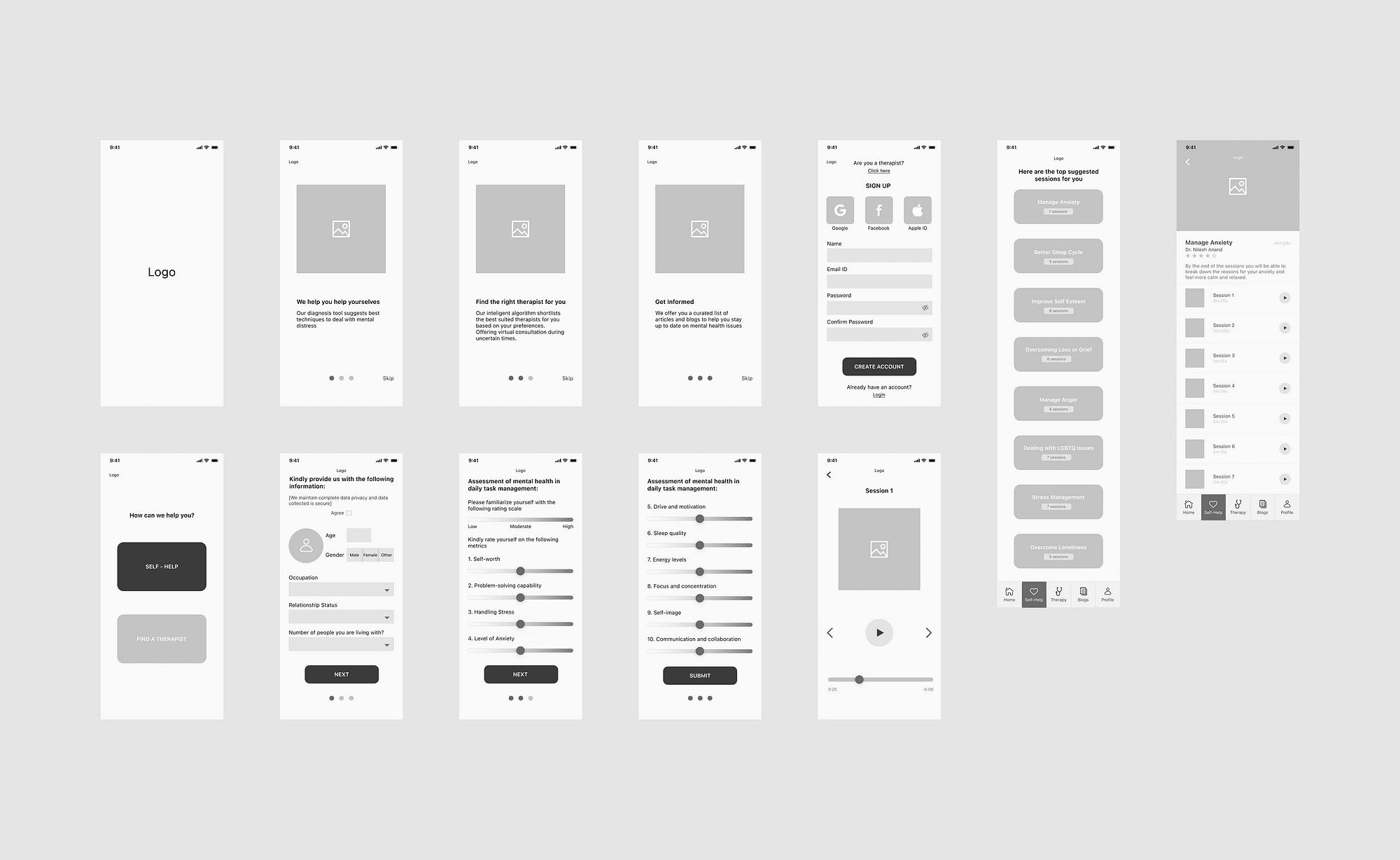
wireframes of the app
Usability Testing
I created a fully functional, high-fidelity prototype of the new flows using Figma. At the same time, we started recruiting subjects for the test who fit our criteria. We did usability tests after iterating on the issues that we’ve identified:-
Issue 01:
Finding: Users struggled to find the "Crisis Support" feature during a crisis moment.
Frequency: Identified in 3 out of 7 usability tests.
User Reactions: Users expressed frustration and anxiety when they couldn't locate immediate help.
Solution 01:
Solution: We added a prominent and easily accessible "Crisis Support" button on the app's home screen.
Rationale: This solution was devised based on user feedback and the urgency of the issue. It was implemented after the first round of testing.
Iterations: We tested this solution with 3 new participants to ensure its effectiveness.
Validation: Users in the subsequent tests found the feature quickly and reported feeling relieved by its presence.
Issue 02:
Finding: Users had difficulty navigating the app's resource section to find relevant articles and self-help materials.
Frequency: Encountered in all 7 usability tests.
User Reactions: Users expressed frustration, with some abandoning the task due to information overload.
Solution 02:
Solution: We introduced a personalized resource recommendation system based on user preferences and mood-tracking data.
Rationale: This solution aimed to streamline content discovery and reduce cognitive load. It was implemented after the second round of testing.
Iterations: We fine-tuned the recommendation algorithm based on user feedback and conducted usability tests with 5 additional participants.
Validation: Users appreciated the tailored resource suggestions and reported improved ease of finding relevant content.
Issue 03:
Finding: Users were unsure about the privacy and security measures in place for their data within the app.
Frequency: Came up in 5 out of 7 usability tests.
User Reactions: Users expressed hesitation and concerns about sharing sensitive information.
Solution 03:
Solution: We implemented clear, concise privacy information and an opt-in data-sharing feature with strict controls.
Rationale: Addressing privacy concerns was crucial for user trust. This solution was integrated after the third round of testing.
Iterations: We refined the privacy settings based on user feedback and conducted usability tests with 4 additional participants.
Validation: Users reported feeling more confident about data privacy and expressed a willingness to share relevant information for personalised support.
UI Design
After addressing the usability issues, I transitioned to the UI design phase, utilizing Figma as the primary design tool. The core objective was to establish a visually compelling and cohesive design that resonated with the brand's core values.
Visual Style: Calming and light to evoke a sense of peace and well-being.
Guidelines: Adhered to Material Design for familiarity and usability.
Platforms: Designed for iOS and Android smartphones and tablets.
Reflecting Learnings: Prioritised simplicity, accessibility, and empathy to support users' mental well-being.
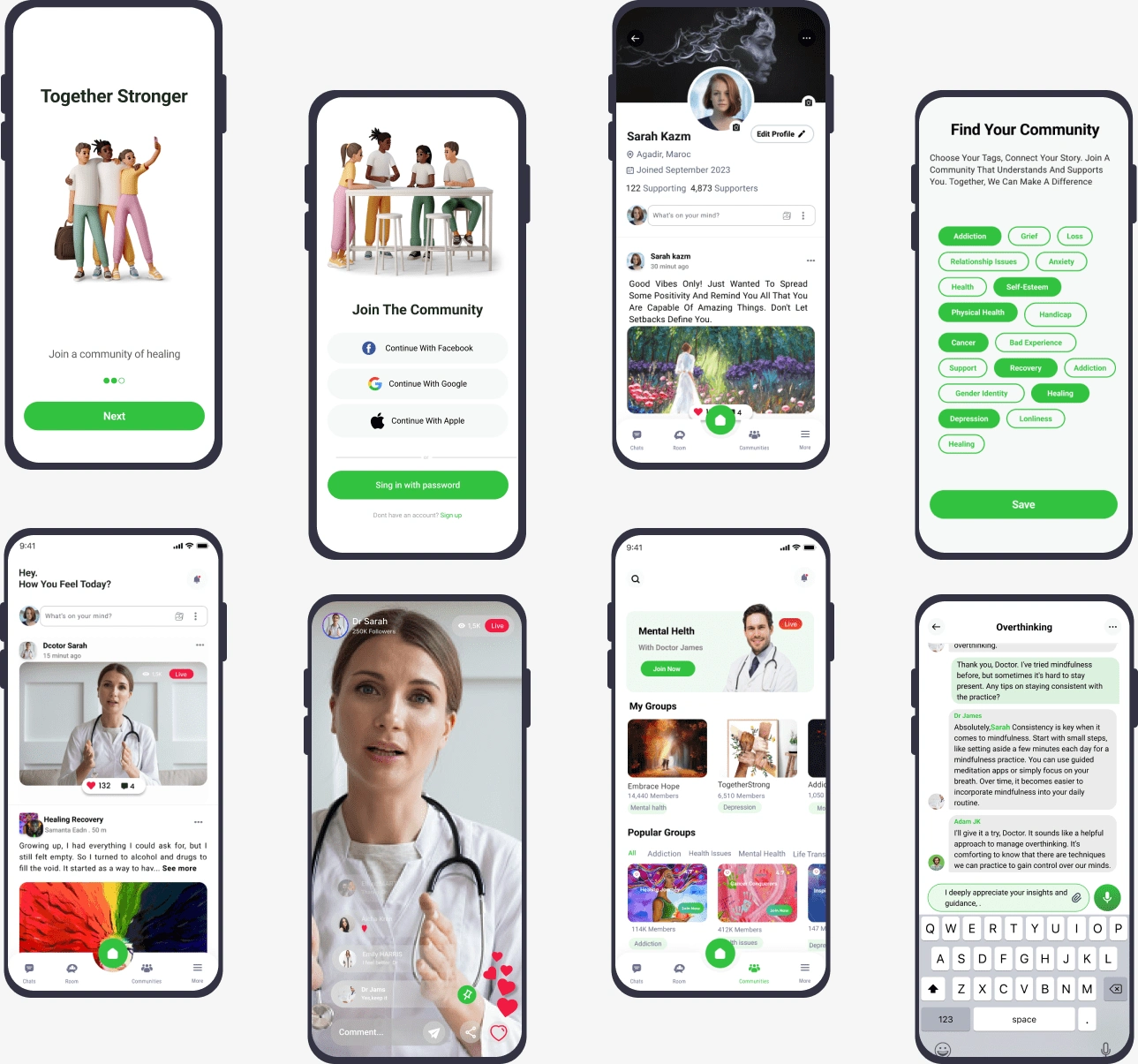
UI design of mental health support app
The final design aims to provide an enjoyable and efficient experience for users, incorporating the lessons learned from their needs and preferences.
Thank you for reading my case study!
Like this project
Posted Mar 8, 2024
I crafted a Mental Health Support App offering resources, connections, and community. Figma, Miro, and Slack are used for efficient design and collaboration.
Likes
0
Views
77


