Golivita: Olive Oil Brand Identity

Mehmet Turan
Golivita is a new premium olive oil from Geyikli, Çanakkale. The name is three words in one: G for Geyikli, Oliva for the olive, Vita for life. The tagline is A life well lived.
The project ran six weeks, from launch roadmap to a 36-page identity system. The brief asked for rooted, pure and alive: warm and premium, modern, muted, never busy.
Finding the signature
Round one tested three ideas of the brand: Naturalist Bold, Pure Elegant and Rooted. Each came with its own logo, a bottle study and three muted palettes.
Round two moved the olive inside the letters. We drew five wordmarks, and Signature Swash became the logo.
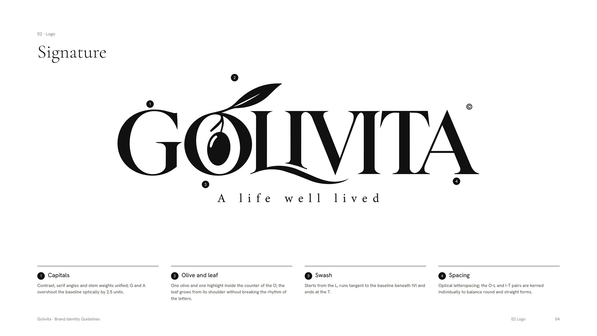
Golivita signature logo
Then the identity turned, from the color of the bottle to the color of the olive: white ground, black logo, and color only from the harvest.
The O of the logo is the symbol. Because the olive and leaf stay inside the letter, it never becomes a generic olive icon.
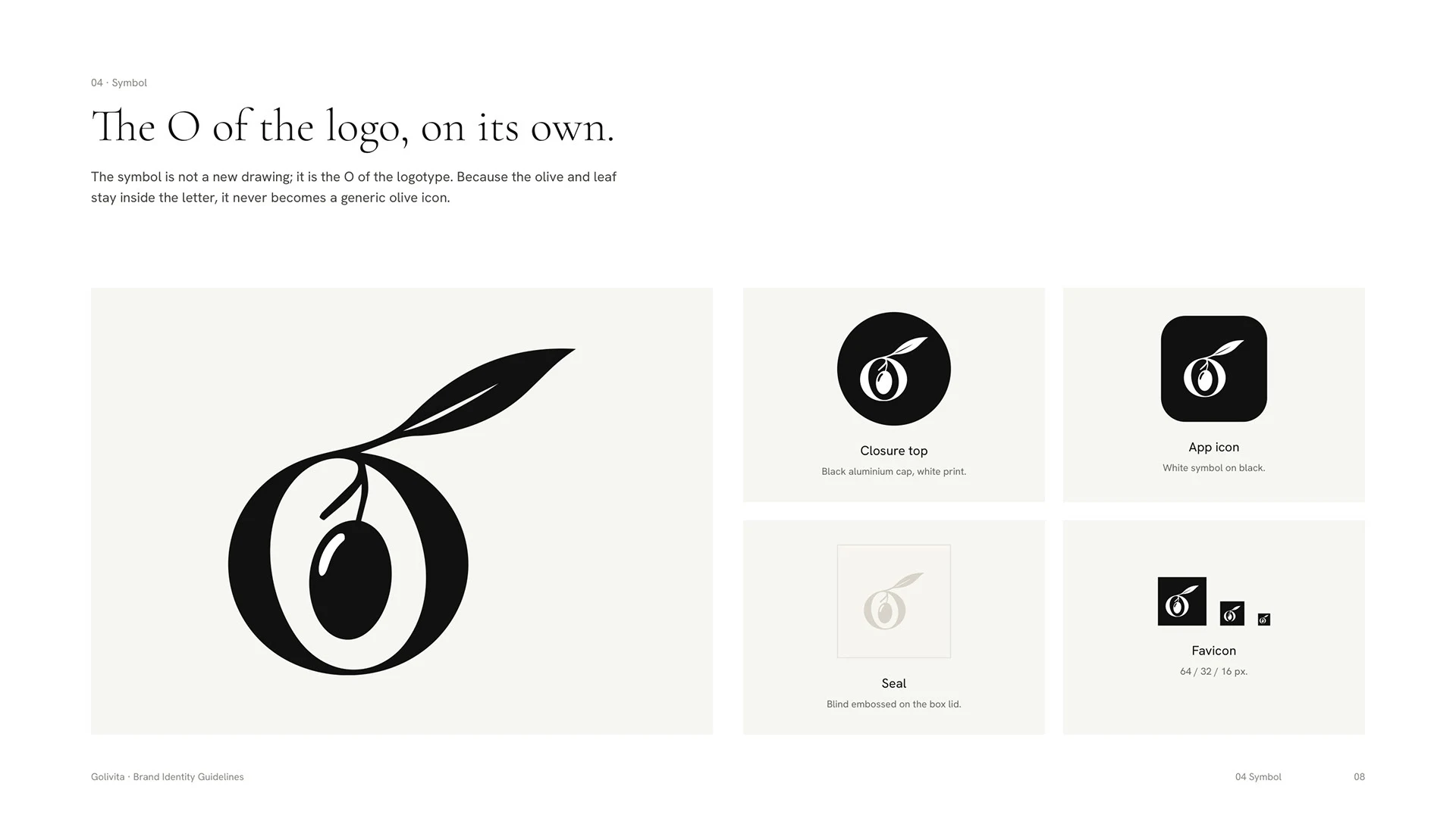
The O of the Golivita logo as a symbol
Many colors, one oil
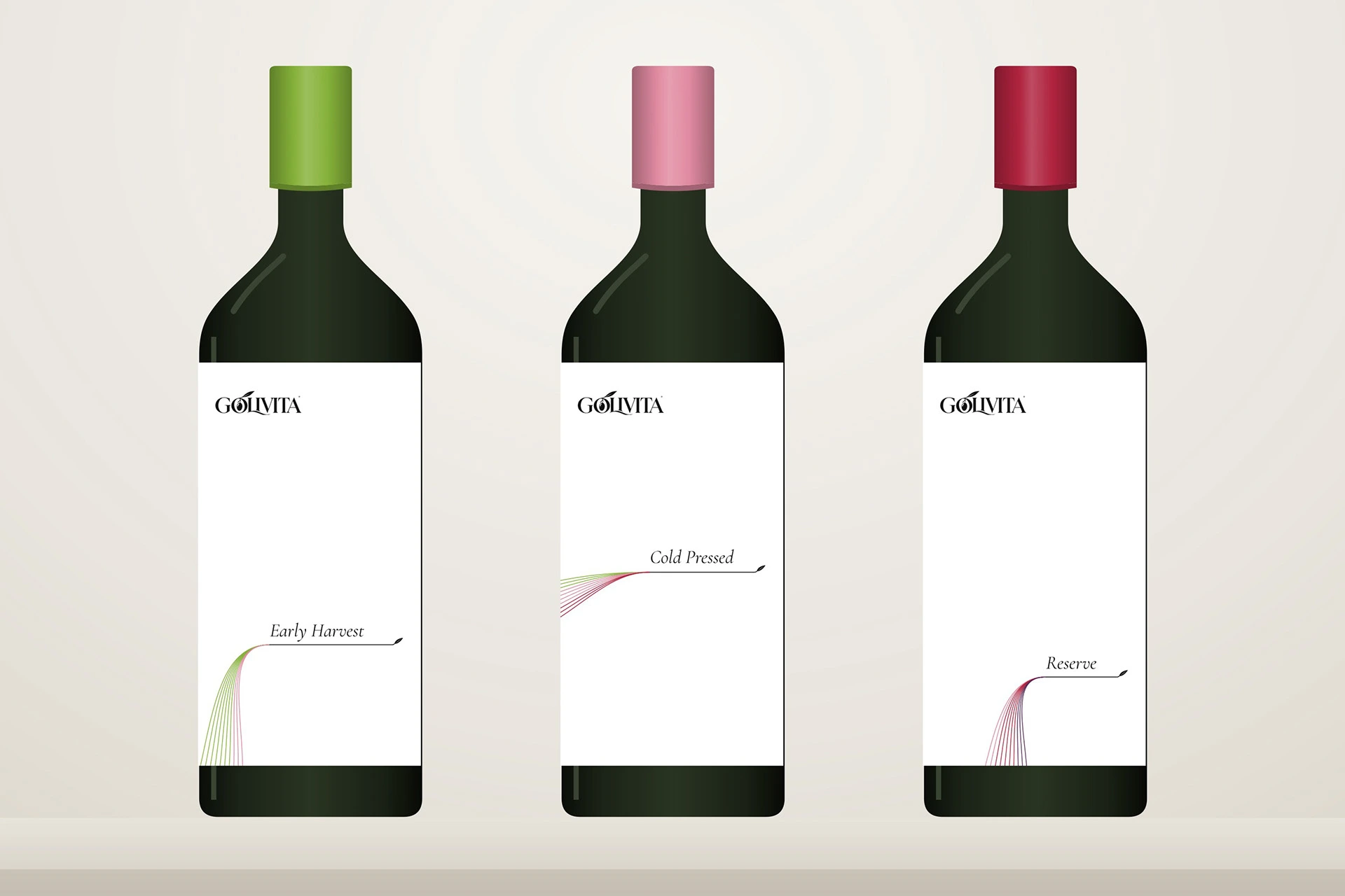
On one tree, olives ripen at different speeds. Each color in a blend enters as a line: ten lines, each one 10 percent of the olives. The lines converge into one black line, and the product name sits on it.
The rule is fixed but the position is free. The convergence point follows the type, so posters, social posts and web pages never repeat each other.
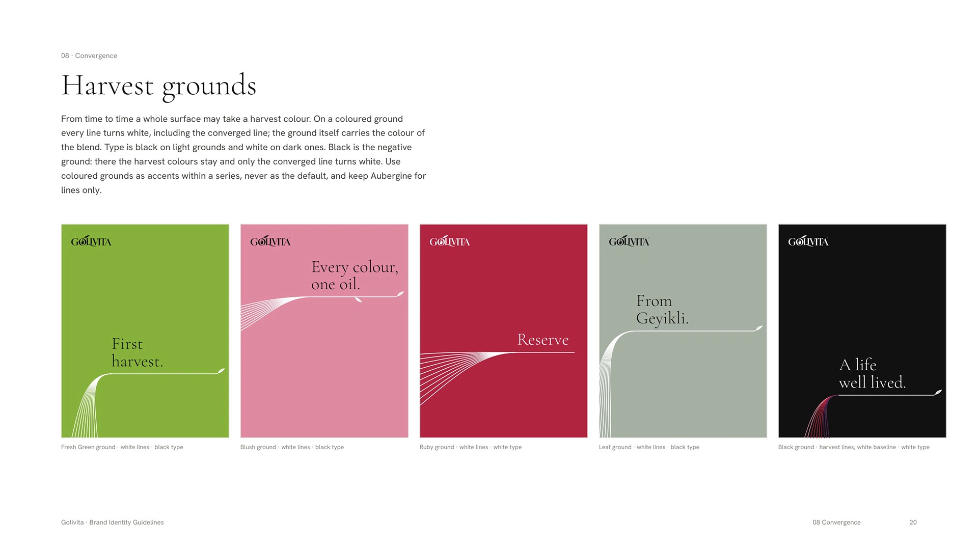
Golivita harvest colors and the converging line
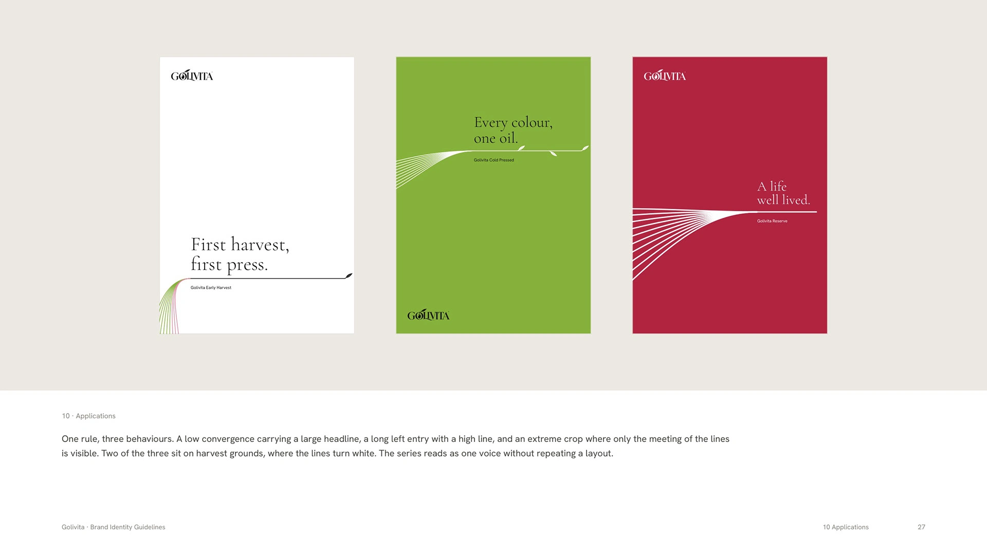
Golivita posters using the line system
What was delivered
A 36-page brand identity system. The bottle, tin and gift box views are previews; label and packaging design follow as the next phase.
Like this project
Posted Nov 4, 2026
A 36-page identity system for a new premium olive oil from Geyikli, Çanakkale, built in six weeks around one idea: many colors, one oil.