Braveheart Sake: Brand Identity and Can Packaging

Mehmet Turan
The founders of Shin Koji came to us with a bold idea: a brand for a sake-based, low-ABV ready-to-drink called Braveheart.
The name held two ideas. Brave meant freedom, rebellion and an unchained spirit. Heart meant Shinpaku, the white heart of the rice grain at the center of sake brewing. The brand had to be geeky yet cool, rebellious yet rooted in tradition, and instantly recognizable on the shelf.
Finding the identity
The brief asked for a hand-drawn logotype with a heart built into the name, references to freedom such as whales, wings and landscapes, and Asian artistic sensibilities with an edgy, modern touch.
We explored three logotype directions:
Shinpaku Negative Space: elegant brush lettering with the rice grain hidden in the "A," and a whale for freedom.
Graffiti Wave Energy: bold, imperfect brush lettering with an indigo stroke and a vermilion Shinpaku seal.
Ink-Grain Signature: expressive brush type with ink texture and a subtle rice grain.
The client chose the first and asked us to combine it with the edgier type from the second. We refined the whale with stronger brush strokes, placed the Shinpaku grain inside its body, and built a secondary Shinpaku icon with colorways in vermilion, gold, emerald and navy.
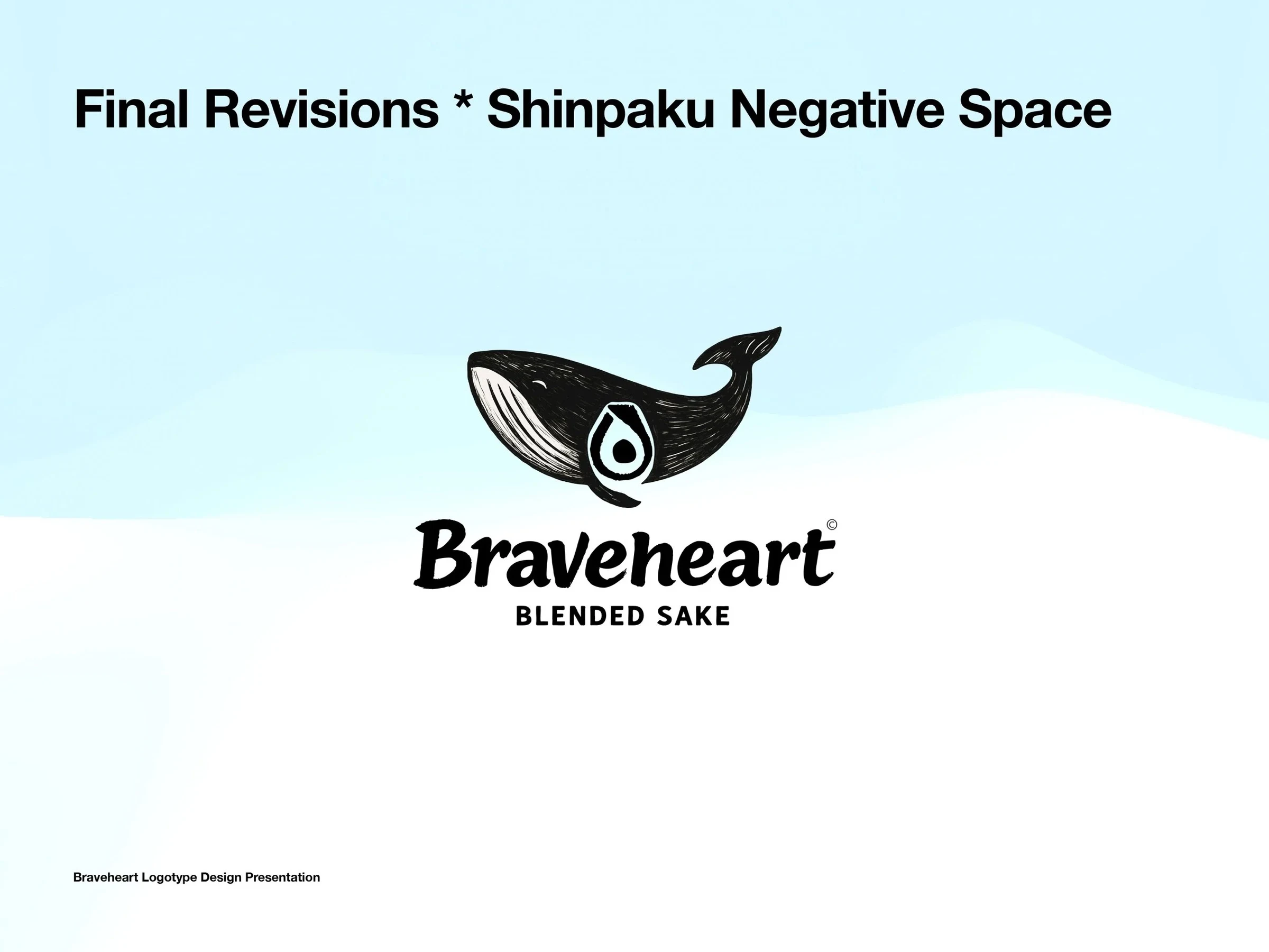
Braveheart final logo with the whale and Shinpaku grain
The pivotal reset
With the identity locked, we moved to a sleek 250ml can and presented five concepts, from collage watercolor to a bold brushstroke heart.
They were beautiful, but the client felt they leaned too elegant and minimal. Instead of pushing forward, we paused so they could sharpen their vision. That reset clarified the direction.
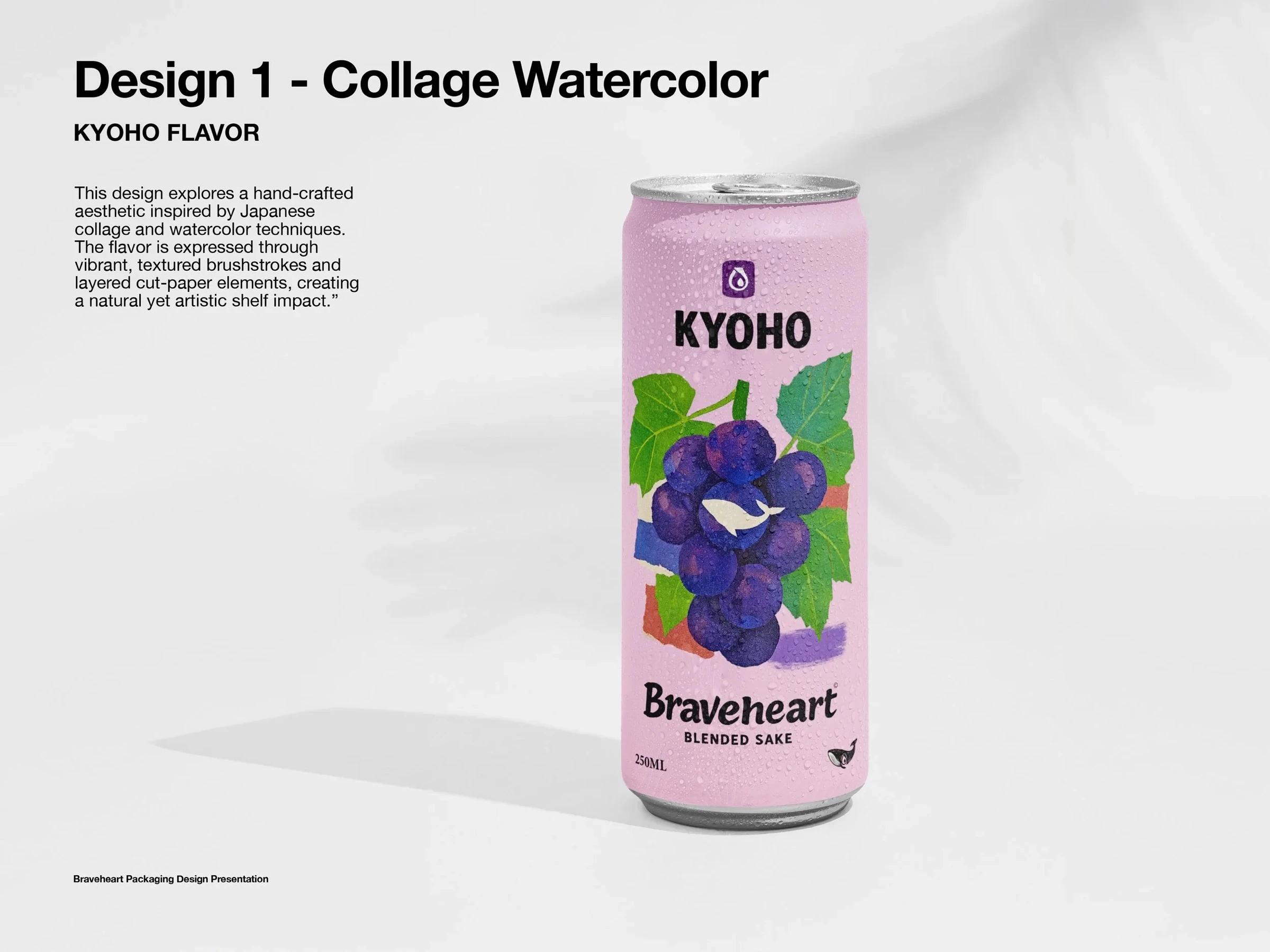
One of the early can concepts
To answer the call for more edge, we made two stronger mockups: a dark Purple Kyoho can with metallic gold motifs, and a playful Blue Coconut can with bright yellow brushstrokes. One leaned premium, the other raw, and that restarted the conversation.
Building the system
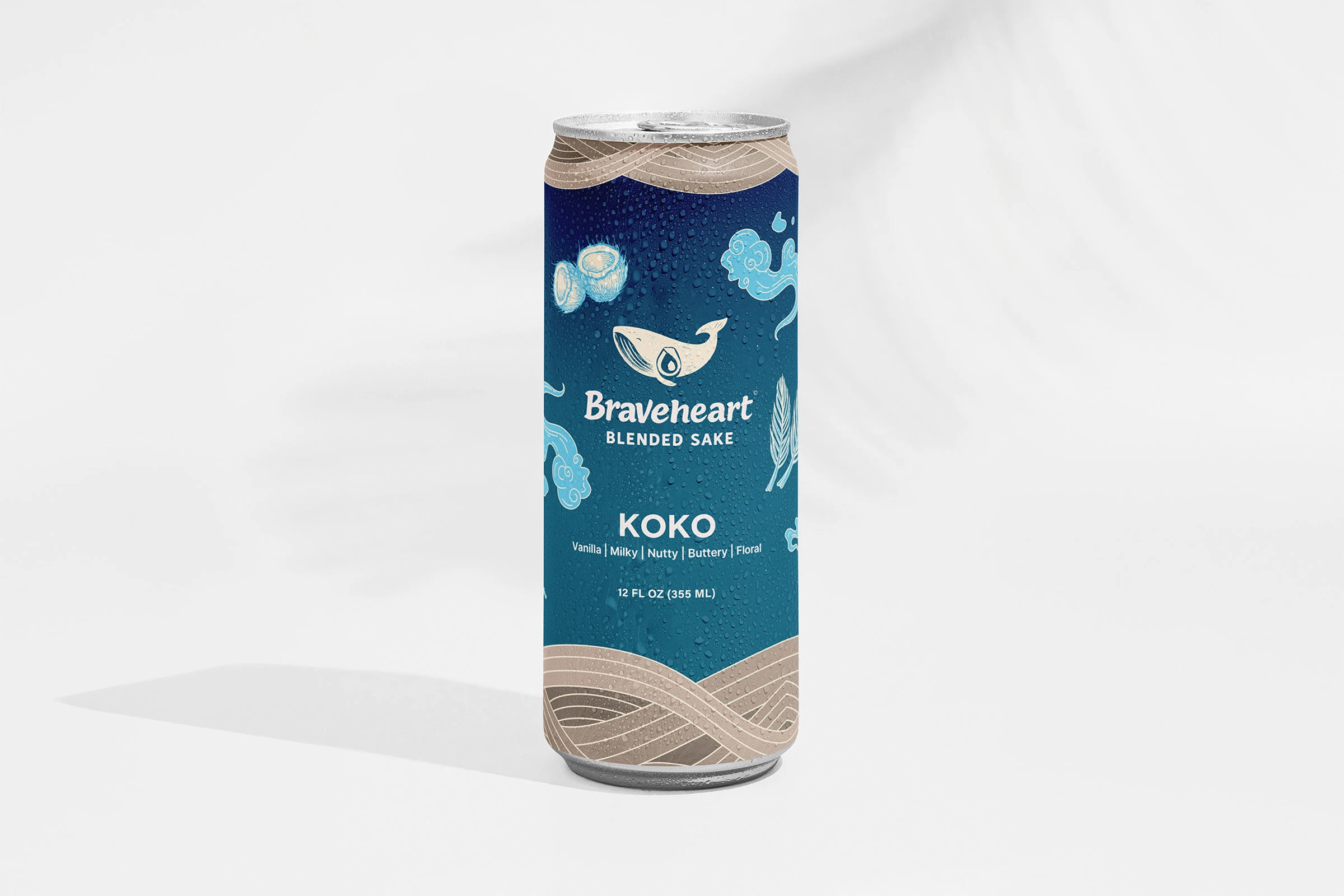
Once the tone was agreed, we built the packaging across three flavors: Sencha, Kyoho and Koko. Each can carries its flavor profile on the front, a one-liner, and duo-tone ingredient illustrations. The seal moved to the back with room for a short brand story, alongside compliance icons and production details.
We presented two complete systems for the final decision: a dark version with one consistent ribbon, and a light version where the ribbon changed by flavor. The brand chose the dark version.
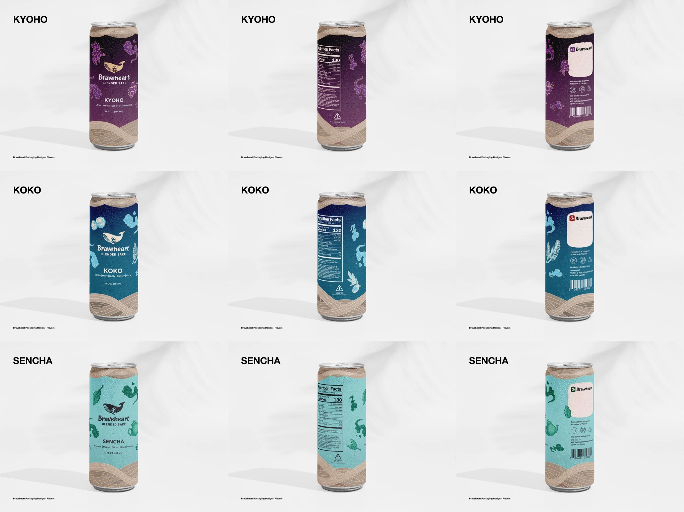
Braveheart final flavor range
What was delivered
A logotype system rooted in Japanese tradition but styled with rebellious energy, a Shinpaku icon, and packaging for three flavors in a design system built to extend to more products.
Like this project
Posted Nov 4, 2026
A brand and can system for a low-ABV, sake-based RTD: from logo directions to three flavors, balancing Japanese tradition with rebellious energy.