CREED: A Nicotine Pouch Packaging System

Mehmet Turan
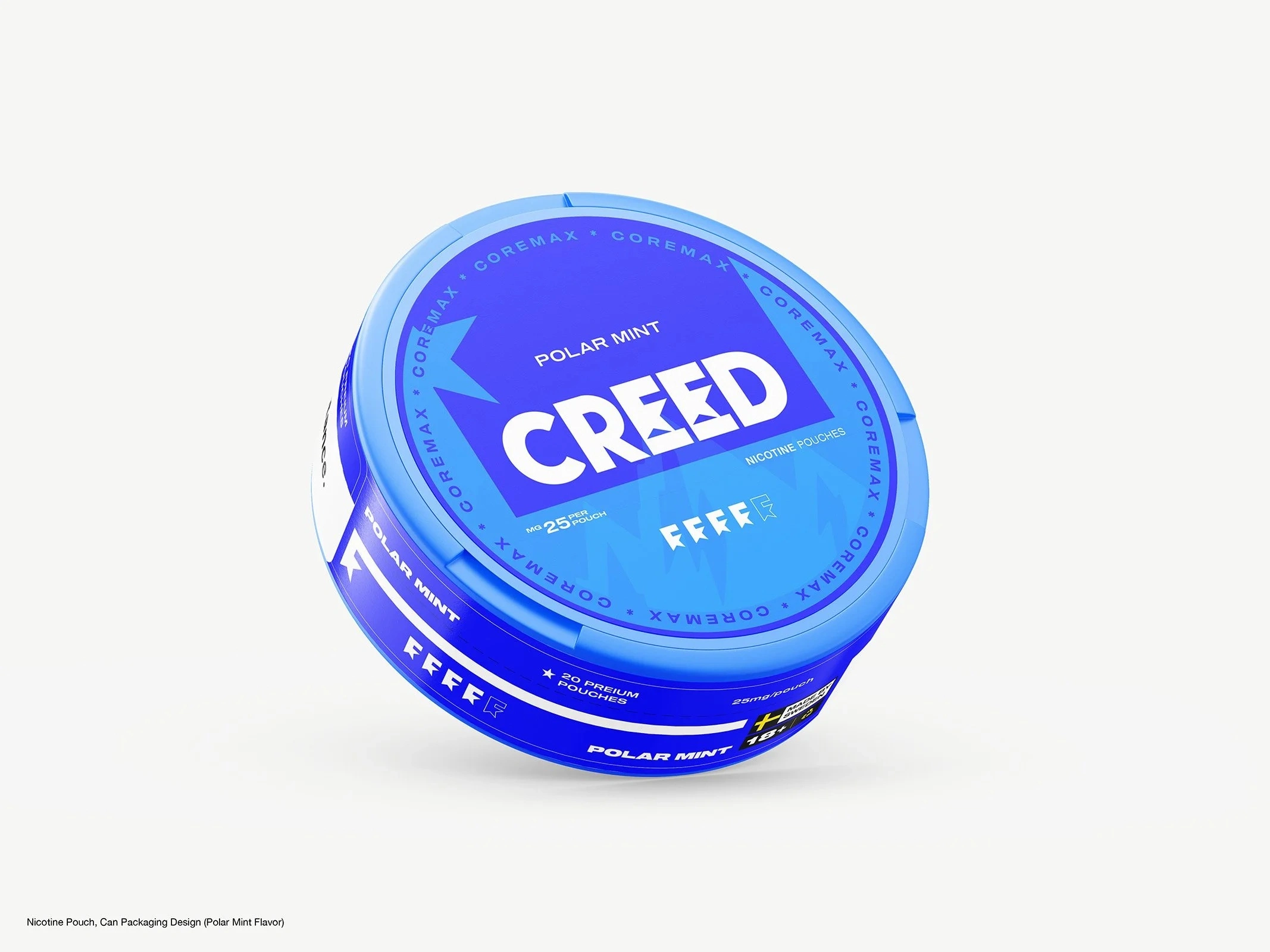
Most nicotine pouch cans look the same: white base, thin logo, a flash of color for flavor. CREED's founder wanted a can people could recognize from two meters away without reading the logo.
He didn't want a label refresh. The job became a visual system.
The brief
The brief was clear about what it wasn't. No neon. No graffiti. No generic Scandinavian minimalism. No copying the pouch brands he'd already ruled out.
The feeling was mature, edgy, engineered but still emotional, bold but controlled. The real work was translating that feeling into a mechanism that could repeat on every can. Because the launch was urgent, we agreed to validate the direction on one flavor before building anything larger.
Four directions, one winning logic
We took four concepts to the first can, Polar Mint, each testing a different way to be recognizable without decoration:
System Ring: a colored outer ring as a flexible flavor indicator around a fixed central layout.
Brand First: a white surface and a strong red logo, with type and contrast carrying the identity.
Impact Blue: a deep navy base for a denser block of color than the category's pale palettes.
Fresh Core: a white and blue combination tuned to read as mint at a glance.
System Ring won because it was the only one built to scale past a single product.
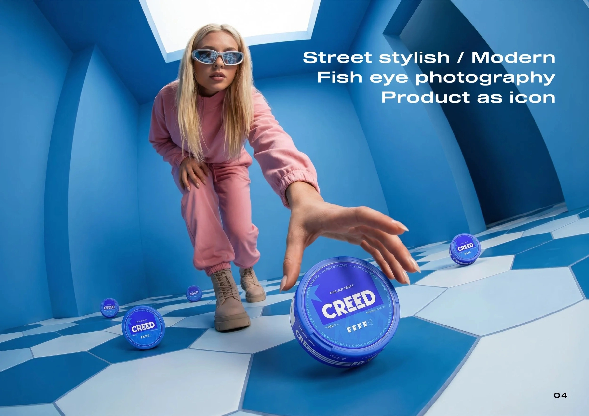
CREED Polar Mint lifestyle image
Building the system
A design only becomes a system when it stops being redrawn for every new flavor.
Structure: a directional arrow on a fixed angle system, anchored to a 61mm circular layout that every can shares.
Color: the upper zone stays fixed for brand consistency, while the lower zone carries the flavor. Color intensity follows nicotine strength, so a light and a hyper strong can look different at a glance.
Type: Shapiro for high-impact brand elements and Inter for small sizes, with a strict type scale.
Finish: spot varnish, embossing on the logo and arrow, and soft-touch zones add a premium layer without changing the logic.
Merchandise: the same arrow carries onto jackets, socks and caps, so a windbreaker and a Polar Mint can read as one brand.
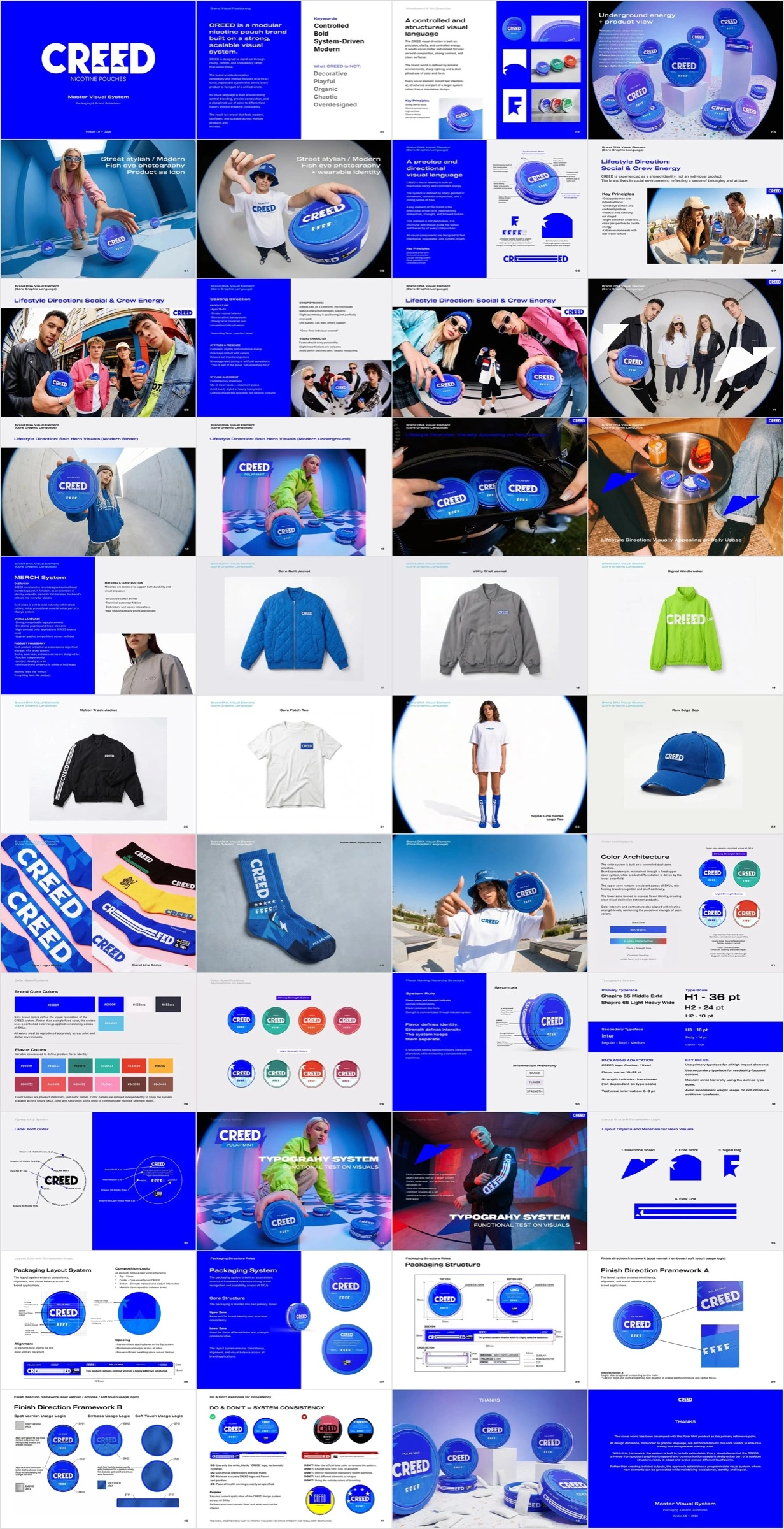
CREED visual system guideline overview
Delivered in phases
Instead of disappearing for two weeks to deliver one big reveal, we split the work into three phases:
Mint Label Sprint: production-ready delivery in 4 to 6 days.
Master Visual System and guideline: 6 to 8 days, once the direction was validated.
Rollout: four more can designs built inside the system.
Locking the system after the first can was approved meant the guideline reflected a direction the client had already seen work, not a theory.
What was delivered
Four concept directions, the Polar Mint can, a documented 15 to 20 page guideline and four more can designs, with merchandise applications built on the same system.
The next flavor won't start from a blank page.
Like this project
Posted Nov 4, 2026
From one urgent can to a documented visual system: four concepts, a fixed brand mechanism, a guideline and a rollout across more flavors.