Retink.io Pricing Page System Redesign
Dani Asomugha
CHALLENGE
While working with the designers on the payments and pricing pages, it became clear that the pricing system was hard to follow.
PROBLEM STATEMENT
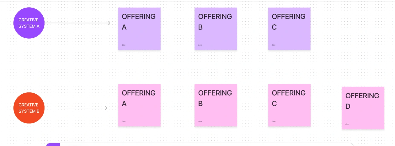
The pricing system was complex. This complexity was partly due to the diverse range of product offerings available to the user. And also due to the multi-creative system that Retink was built on. It was hard to keep track of the pricing plans because there were many of them. Some of the pricing plans had similar product offerings.
HOW I HELPED
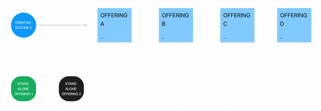
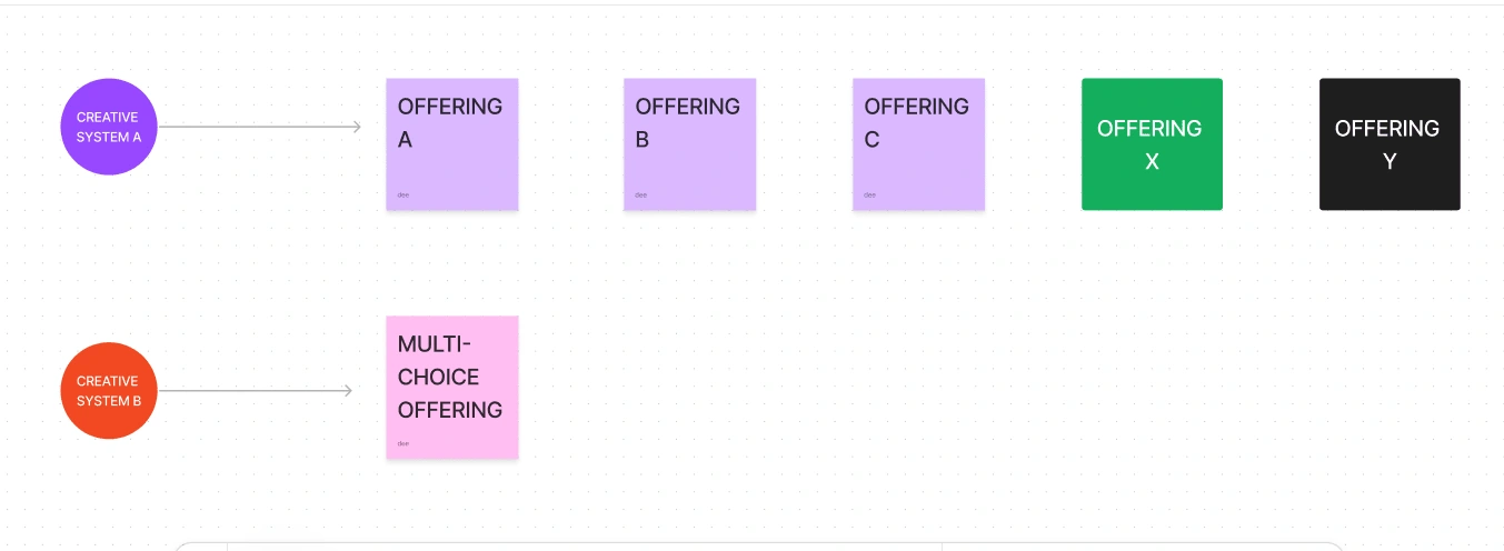
While reviewing the pricing plans, I discovered that most of the offerings of two creative systems could be collapsed and combined into one. I also incorporated stand-alone product offerings into system A. This meant that instead of four multiple option systems, there were now only two. Users would find it easier to understand and select a preferred offering based on their system of choice.
The second system only provided one option that could not be coupled with other plans. The function was built as a multi-choice offering with a drop-down menu so that users interested in the feature could select based on the quantity they wanted.
0 Comments
Like this project
Posted Sep 27, 2023
Redesigning information systems for better user experience