Sinthesis: Sport & Lifestyle Brand Identity

Abdullah Eroğlu


SINTHESIS
A multi-model experiment in brand direction, product visualization and mechanical web design.
Creative Direction · Brand Strategy · AI Art Direction · Web Design · Creative Development · Sound Design
Claude 3.1 / Fable 5 · Gemini Pro 3.1 · ChatGPT / sol5.6 · HTML · CSS · JavaScript · Lenis · Web Audio
Live Website:
https://erogludemo.com/sinthesis/
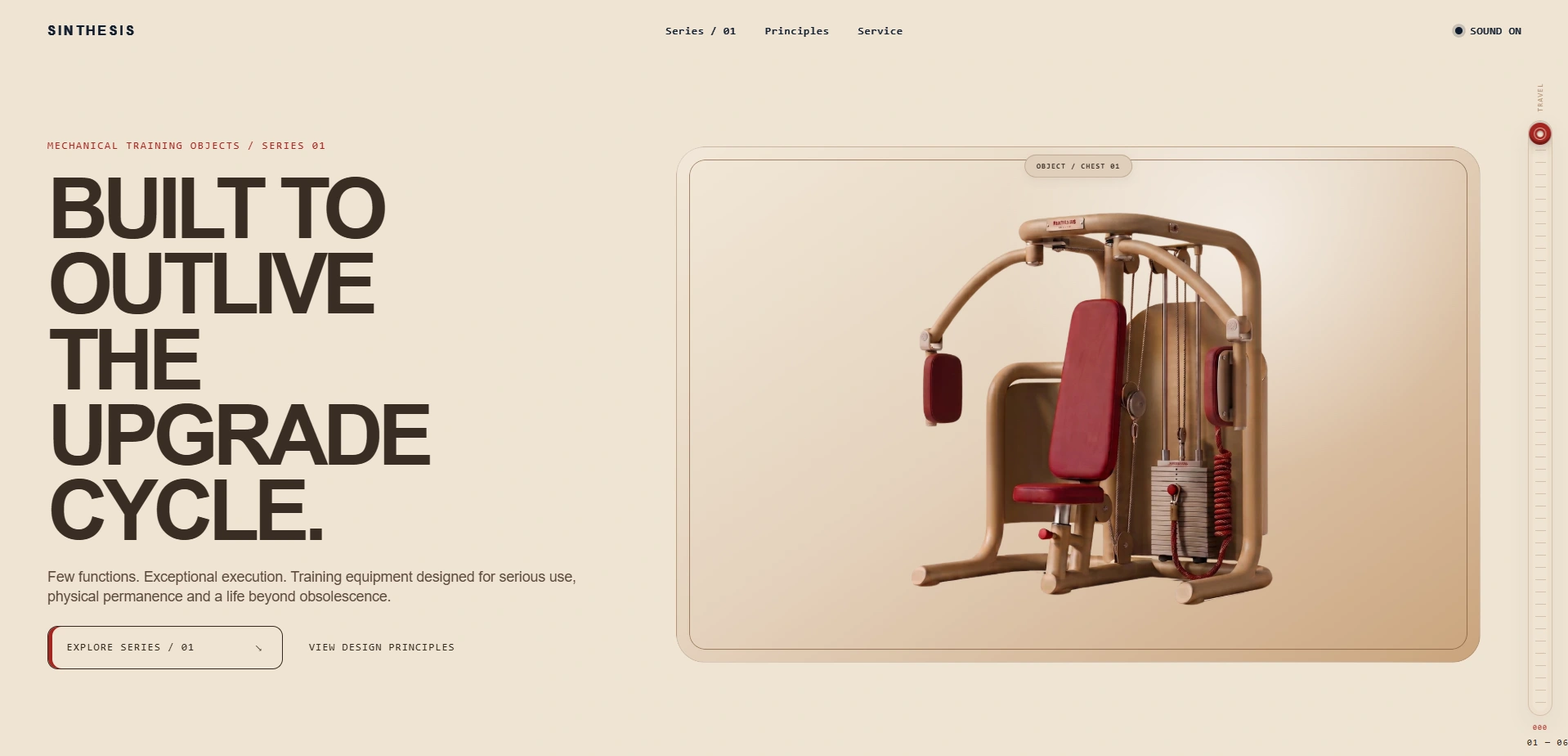
Sinthesis Website Desktop Hero Secti
1 — The experiment
Sinthesis began as a partially formed sport/lifestyle concept.
Instead of simply polishing it, I turned it into an experiment:
How do different AI models contribute to a real creative workflow when each one is given a different job?
The goal was never to make a project with AI for the sake of AI.
It was to use different models for strategy, visual testing and execution, then use my own direction, decisions and development work to turn those fragmented outputs into one coherent brand and one coherent website.
2 — Claude: defining what the brand is and is not
Before generating product visuals, I used Claude 3.1 / Fable 5 to pressure-test the early Sinthesis direction.
The first phase of the project was not about aesthetics. It was about deciding:
what the brand says yes to
what it says no to
what kind of product category it should actually occupy
what would make it feel real rather than like another generic premium concept
That stage clarified several things.
The category was initially too broad.
The audience was too taste-based.
And the strongest tension in the brand became:
technical credibility × emotional ownership.
This pushed Sinthesis away from a vague sport/lifestyle mood and toward a more focused position:
mechanically expressive strength equipment designed to remain desirable and usable for years.
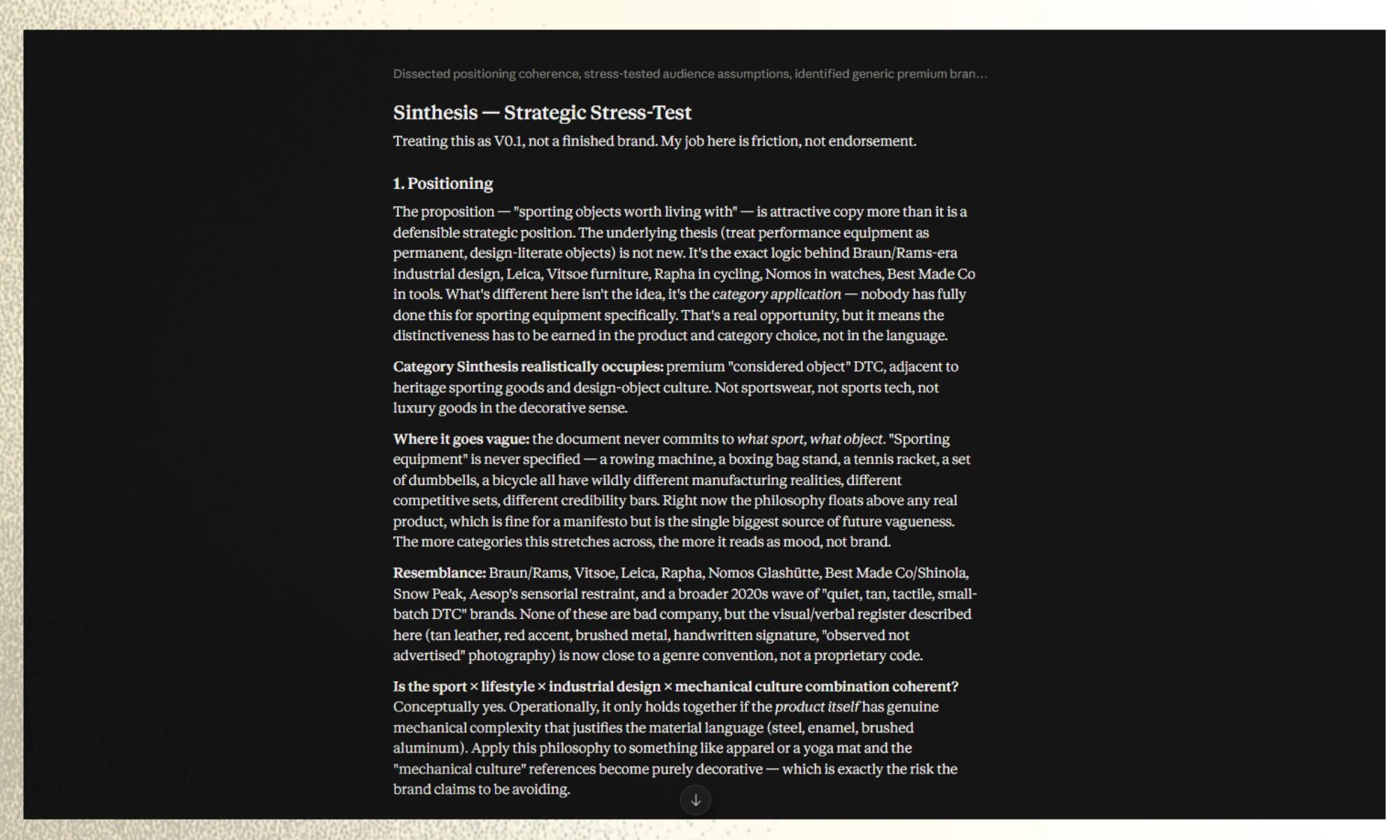
Claude's Stress Test
3 — My role: accept, adapt, reject
I did not treat model feedback as truth.
I used it as friction.
Some parts I accepted, some I adapted and some I rejected.
That process is what actually gave Sinthesis its direction.
From that point on, the brand became much clearer:
few functions
extreme precision
mechanical honesty
longevity without obsolescence
no decorative complexity
no digital gimmicks
no feature without a reason
That is where the project stopped being a mood and started becoming a system.
4 — Building the product language
With ChatGPT / sol5, I translated those strategic decisions into a product constitution.
The most important product rules became:
TAN = STRUCTURE
Warm, low-sheen, micro-textured powder-coated steel.
RED = CONTACT
Human contact surfaces, adjustment touchpoints and physical interaction.
SILVER = PRECISION
Weight stacks, pivots, shafts and necessary mechanical hardware.
The point was not to create a pretty palette.
The point was to make color behave like function.
That logic then expanded into the rest of the industrial language:
smooth round structural tubing
soft but substantial radius families
integrated floor contact
no mechanical theatre
no screen-first product logic
audible, satisfying mechanical feedback where it matters
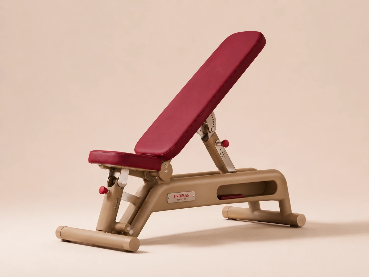
Sinthesis Minimalist Mechanic Bench
5 — Gemini: first visual proof
Once the direction was strong enough, I used Gemini Pro 3.1 to test whether the product could be visualized coherently.
I used several prompt iterations, with support from Claude and ChatGPT in refining the wording, because I wanted to see the idea with my eyes — not just as a written system.
Gemini was the first model that followed the product specification in a consistently convincing way.
It was especially strong at:
understanding the overall idea
preserving the material hierarchy
producing a believable first interpretation of the product language
Its weakness appeared later in refinement.
Small detailed changes were harder to control, no matter how long or precise the prompt became.
That revealed an important workflow difference:
Gemini was strongest when establishing the concept broadly, not when repeatedly micro-correcting solved decisions.
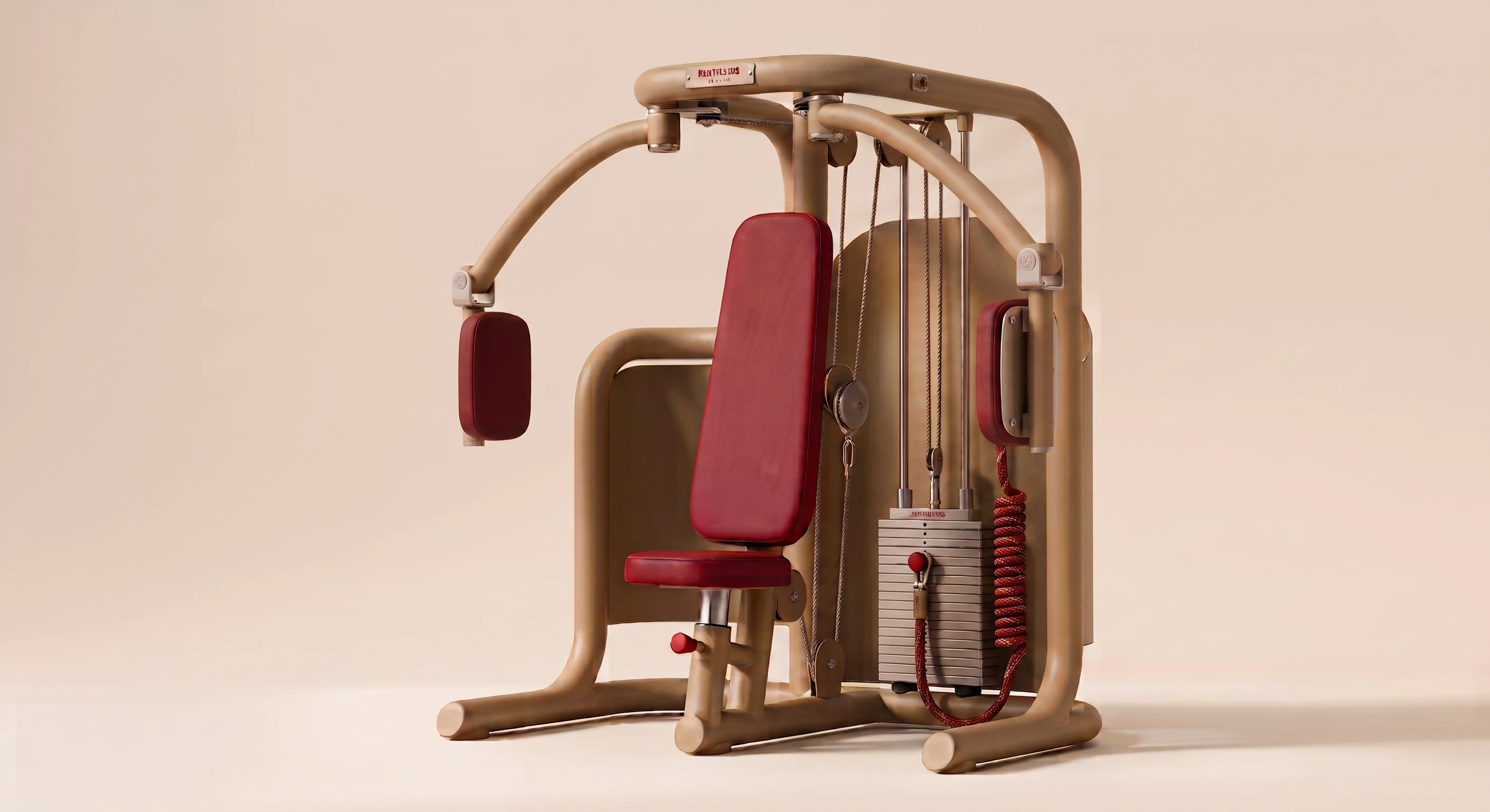
First Succesful Gemini Pro 3.1 Output
6 — From single machine to full system
After that, I moved into a more controlled phase using ChatGPT.
Because ChatGPT already held the memory of the brand direction, product rules and earlier strategic decisions, it became the best place to expand the language into a full family rather than treating each render as an isolated image problem.
This is where Sinthesis became more than one machine.
The founding collection became:
CHEST / 01
ROW / 01
LEG / 01
PULL / 01
ROW / 02
BENCH / 01
Alongside them, I also developed supporting brand objects and field culture assets:
technician / worker imagery
cap
thermos / bottle
tool bag
service-oriented brand atmosphere
At this point the real question was no longer:
Can one render look good?
It became:
Can the system survive across multiple products and still feel like one manufacturer?
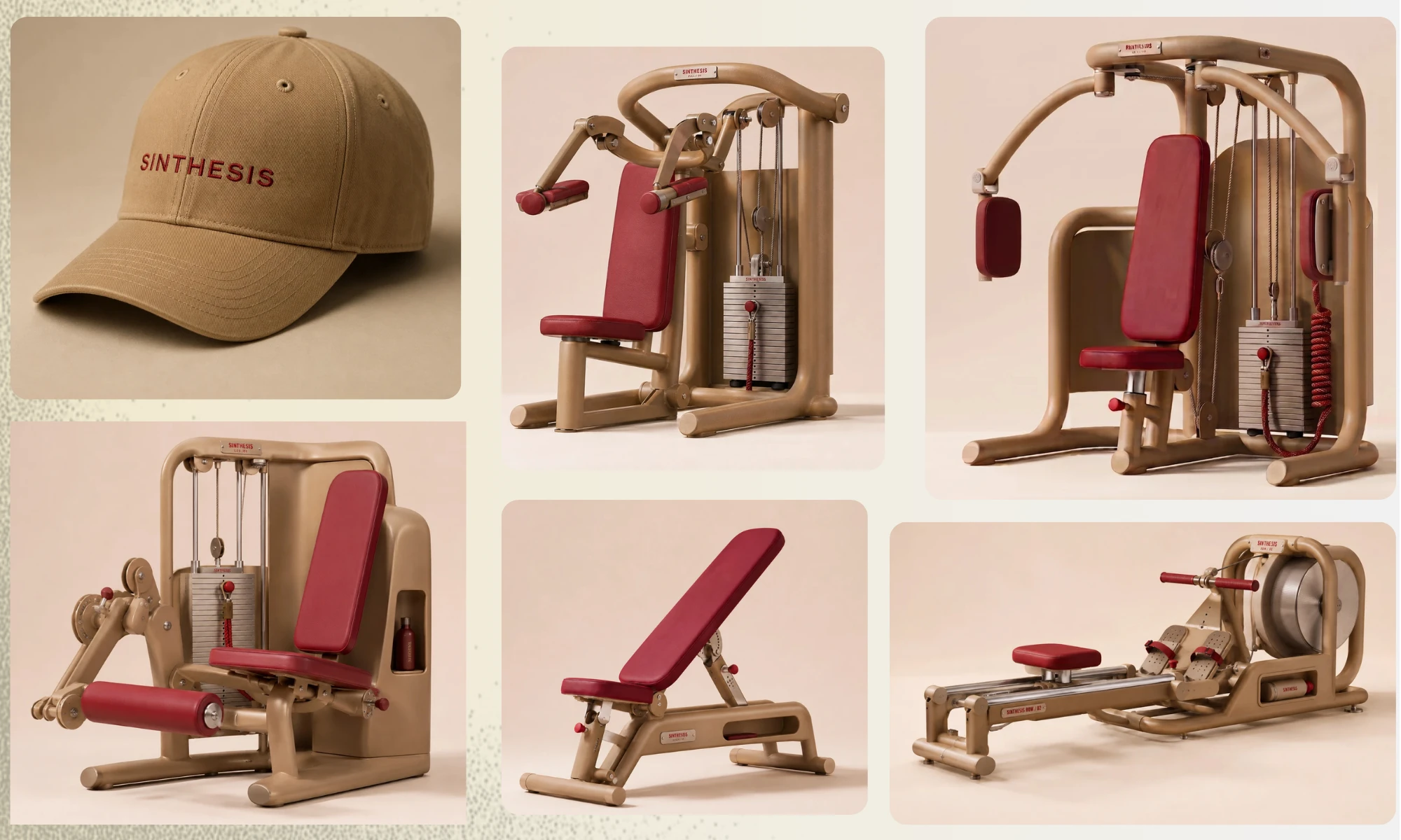
Sinthesis Cap & 5 Machine
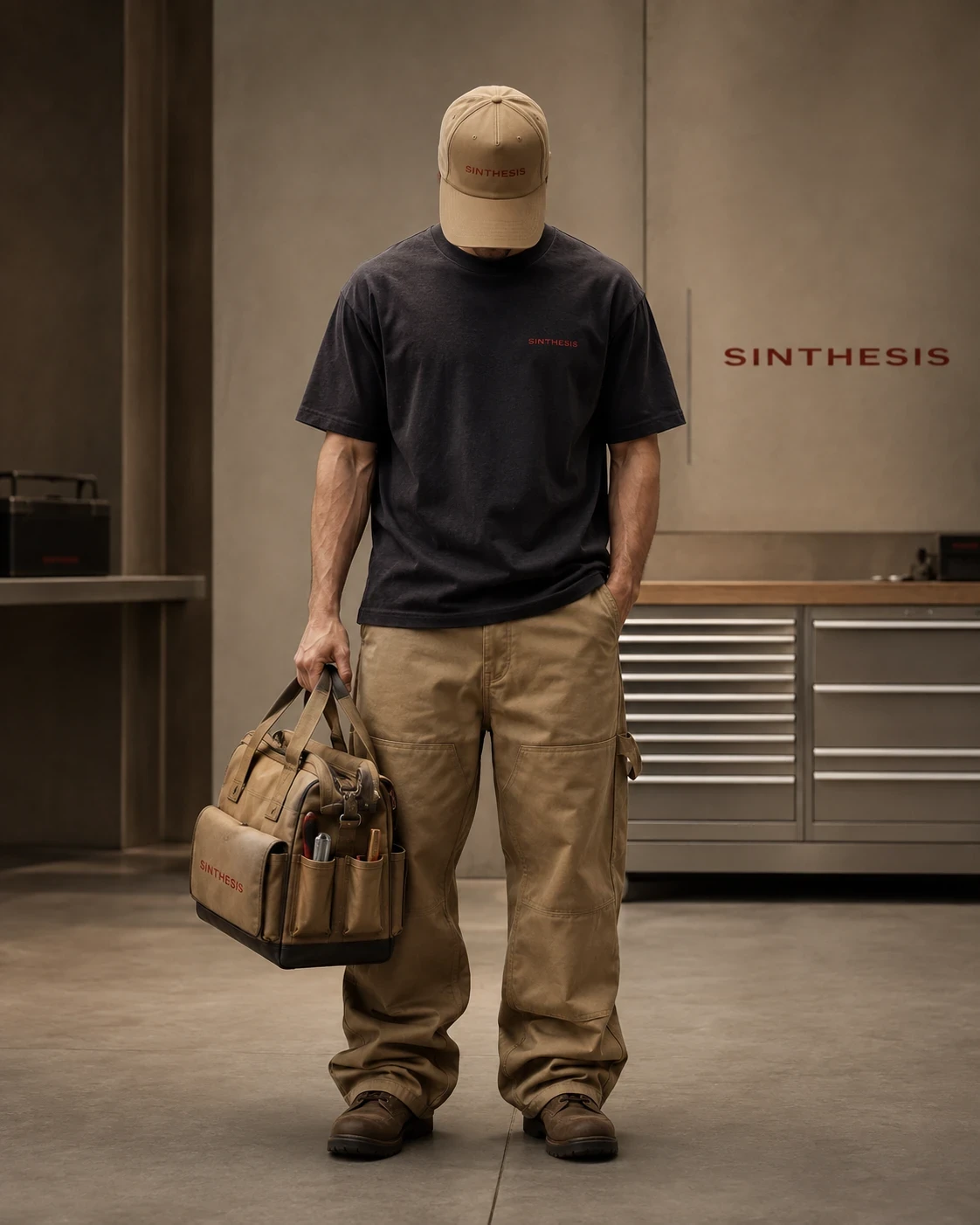
Sinthesis 20 YW Employee
7 — Preparing the images for the web
Before final web implementation, I refined the product assets further.
I used external editing and upscaling to improve image quality, standardize background behavior and make the visuals more usable inside an interactive layout.
I also converted everything to .webp, used lazy loading consistently and kept the media hierarchy clean so the site could stay visually rich without becoming heavy.
This stage mattered because the website was not supposed to look like a moodboard of renders.
It needed a controlled visual system where images, interaction and layout all behaved like the same brand.
8 — Designing the website as a mechanical interface
The website was not designed as a neutral container for the renders.
It was designed as an extension of the products.
That meant the interface itself had to feel:
physical
mechanical
smooth
precise
tactile
slightly resistant
but never clumsy
The desktop experience uses Lenis.
The mobile experience intentionally disables Lenis and stays on native scroll.
That was a deliberate decision. I did not want the desktop behavior awkwardly forced onto touch devices.
Desktop walkthrough (Sound On Recommended.)
Sinthesis Website Mobile walkthrough (Sound On Recommended)
9 — Scroll, sound and interaction as product behavior
One of the strongest later changes was treating the site less like a normal portfolio and more like a mechanical interface.
I added a custom scrollbar that behaves more like a toaster-slide mechanical control than a default browser scrollbar.
It supports the click/detent philosophy of the brand and helps the interface feel less generic.
I also built a sound-reactive scroll system.
The mechanical texture and sound behavior change with scroll speed.
As the user scrolls faster, the cadence and tone shift accordingly.
That made the site feel less like a silent digital page and more like a responsive mechanical system.
On top of that, I built separate hover, click and interaction sounds for desktop and mobile.
But instead of simplifying mobile into a flatter, quieter version, I made a different decision:
mobile interactions became stronger.
To support the mechanical character on touch devices, I introduced hold states and touch-based interaction behaviors so that elements could still feel responsive, tactile and intentionally interactive even without traditional hover.
This meant even some interactions that could normally feel optional became part of the site’s physical character.
Rather than feeling unnecessary, they became part of the soundwork and mechanical identity.
10 — Web development and iteration
The website did not arrive fully formed.
It went through roughly 24 versions developed with ChatGPT.
Some stages were about direction.
Some were about implementation.
Some were about polish.
Some were about fixing behaviors that felt too flat, too generic or not luxurious enough.
As the system matured, I shifted my workflow:
I stopped over-explaining and instead gave clearer, more stable instructions around:
placement
hover behaviors
sound direction
mobile translation
visual hierarchy
performance priorities
and the exact part of the Sinthesis philosophy each section should obey
That made the process much cleaner.
Instead of constantly breaking the system with over-correction, I could let the experience accumulate as one mechanical language.
The final result was polished both in Live Server testing and on the real hosted version until it felt right on both desktop and mobile.
11 — SEO, accessibility and performance
The final site was not only aesthetic.
It was also intentionally structured.
I built it with:
correct SEO hierarchy
optimized image delivery
broad use of lazy loading
.webp assetsnative-scroll mobile behavior
accessible favicon selection
responsive hierarchy that preserves usability as well as style
The goal was to avoid the usual tradeoff where a highly designed interactive site becomes unnecessarily heavy or structurally weak.
12 — What each model actually contributed
Claude 3.1 / Fable 5
Used as an independent critical layer.
Best for defining what the brand should reject, where it was too vague and which strategic tensions mattered most.
Gemini Pro 3.1
Used for early product visualization.
Best at producing the first strong interpretation of the written product direction.
ChatGPT / sol5
Used as the longest-running system partner.
Best for turning criticism into design rules, expanding the product family, shaping the website, refining interactivity, preserving continuity and helping develop the final experience across many versions.
Human direction
Final authority over all of it.
The models contributed.
I decided what belonged.
13 — Result
Sinthesis became more than a fictional brand identity.
It became a record of a workflow:
critique
acceptance / rejection
product logic
visual experimentation
family-building
interactive development
soundwork
responsive design
and final polish
The project is still a brand case study.
But it is also a demonstration of how AI models can be used as different kinds of collaborators inside one creative system, rather than being asked to all do the same job.
The final output is not “AI made this.”
The final output is a branded, interactive system shaped through:
critical feedback, selective adoption, visual testing, design decisions and creative development.
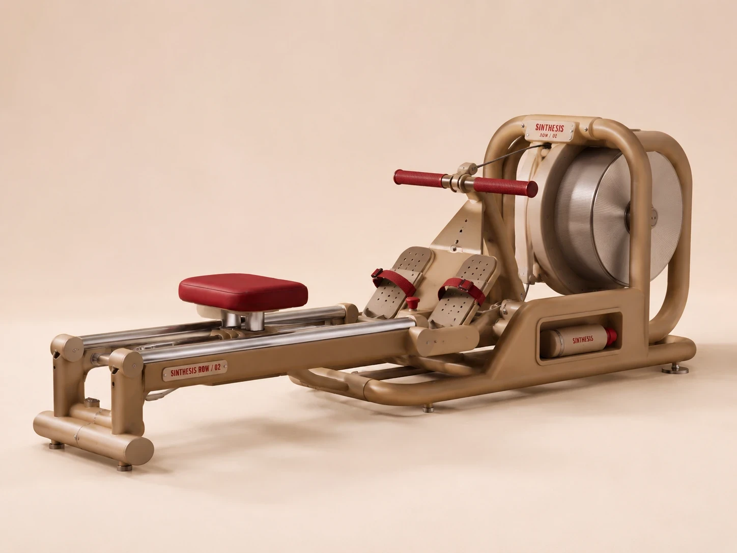
Sinthesis Row Machine
Sinthesis Footer Enterance
SINTHESIS
Few functions.
Extreme precision.
Mechanical honesty.
Longevity without obsolescence.
Live Website:
https://erogludemo.com/sinthesis/
Like this project
Posted Aug 22, 2026
Self-initiated sport and lifestyle brand concept exploring how distinct AI models can support a human-led creative system. I directed brand strategy, product language, visual development, sound, and a mechanical web experience across 24 iterations.