BOLLUNI: Dark Luxury Restaurant Web Experience

Abdullah Eroğlu


The Philosophy
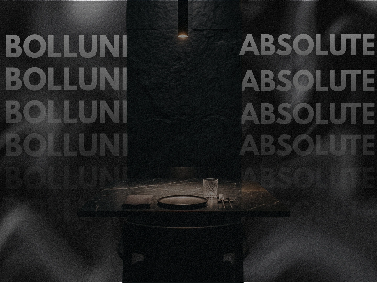
What separates a luxury restaurant from a truly unforgettable one? It's not just the food. It's the moment someone lands on your website and feels something shift. BOLLUNI is a concept built around that exact threshold: the point where digital presence becomes sensory architecture.
BOLLUNI is an avant-garde fine dining concept, a sensory deprivation terminal disguised as a restaurant website. 3 Michelin Stars. Absolute silence. Pure matter. The web experience needed to carry that same weight, that same tension between restraint and overwhelming presence.
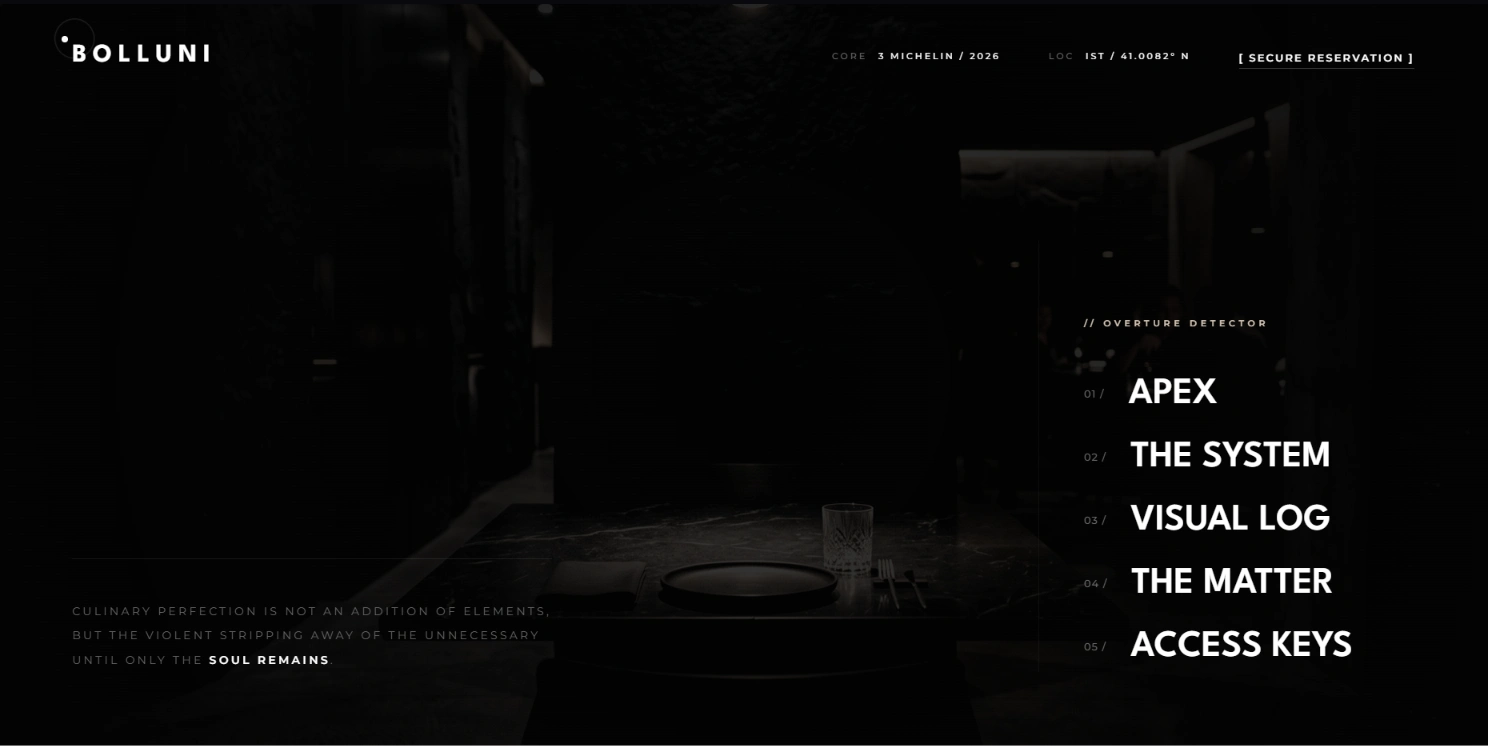
Hero Section
Design Direction
The entire visual language was built on a principle of controlled contradiction: simplicity and complexity coexisting in the same frame, held together by elegance.
The color palette is deliberately muted, almost monastic. Dark luxury tones with carefully placed bait colors that pull the eye without screaming for attention. Nothing is loud. Everything is intentional. The density of content creates a feeling of fullness and depth, but nothing ever tips into excess.
Several images were intentionally aged, textured, and treated with analog-style effects to create a sense of timelessness and mystery. The visual archive section feels like classified documentation rather than a standard gallery. This was deliberate: BOLLUNI doesn't advertise. It reveals.
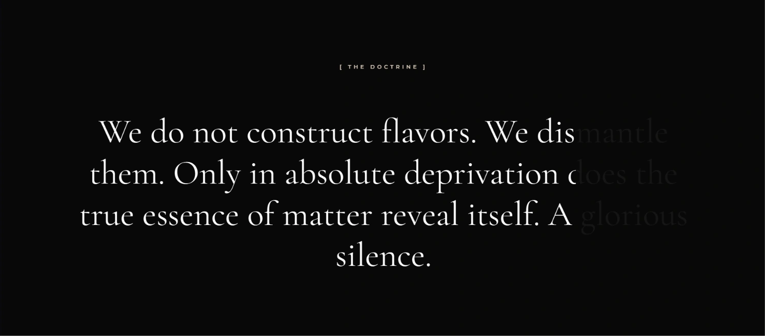
The Doctrine
Typography & Tone
The typographic system walks a razor-thin line between modern and formal. Too formal, and it reads as stiff and forgettable. Too modern, and it looks like every other template-driven restaurant site. The balance point was calibrated to feel authoritative without being rigid, contemporary without being disposable.
The copy itself reinforces this: "We do not construct flavors. We dismantle them." The language is surgical, almost confrontational. It positions BOLLUNI not as a place that serves food, but as an institution that commands respect.
Interaction & Immersion
Scroll tracking and mouse tracking were placed at the forefront of the experience. The user doesn't just browse the site; they move through it. Every scroll triggers a response. Every cursor movement is acknowledged. This keeps the visitor locked inside the experience rather than passively scanning.
Image contrast and color temperatures shift between sections, creating subconscious separation between content zones. The visitor feels the transitions before they consciously register them. This is where the subliminal messaging lives: each section carries its own emotional frequency.
The reservation system is framed as a "Secure Entry Request" with field labels written in data-type notation ([STRING], [INT]). This transforms a simple booking form into an authentication ritual, reinforcing the exclusivity and limited-access atmosphere.
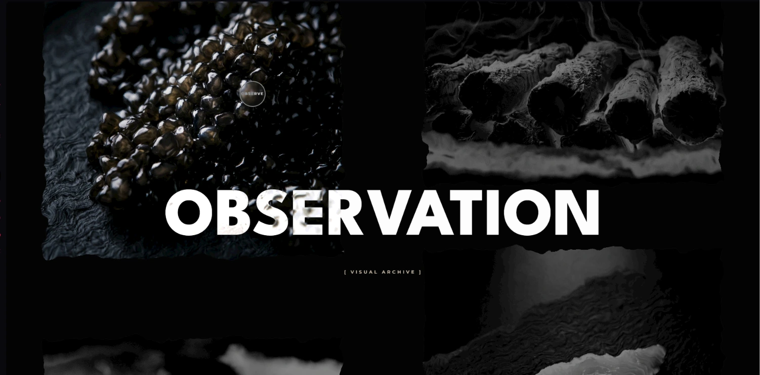
Observation / Visual Archive
Technical Execution
The entire site was hand-coded from scratch. No templates, no page builders, no shortcuts. Pure HTML, CSS, JavaScript, and PHP working in concert.
Performance was treated as non-negotiable. Every asset is optimized, every animation is GPU-accelerated, every interaction runs at native speed. SEO structure and cross-device responsiveness were baked into the architecture from day one, not bolted on as afterthoughts.
What Makes It Different
The gap between a professional restaurant website and a truly premium one isn't just color palettes and performance metrics. It's the combination of presentation, atmosphere, and technical execution blended so seamlessly that the visitor stops thinking about the website and starts feeling the restaurant.
BOLLUNI was designed to be that difference: a digital space where dark luxury, mystery, limited-access energy, and flawless engineering converge into something that doesn't just represent a restaurant, but extends the dining experience into the browser itself.
Like this project
Posted Aug 11, 2026
A dark luxury web experience for an avant-garde fine dining concept. Sensory deprivation aesthetics, scroll-driven immersion, and surgical typography. Hand-coded from scratch with HTML, CSS, JavaScript, and PHP.