Fuat Optical | Istanbul's Top Ranked Optical Store

Abdullah Eroğlu
1 collaborator


The First Brief
Fuat Optik has been open since 1994, running two branches in Istanbul. They came to me wanting a website that matched their reputation: established, trusted, premium. My instinct was to go dark. Black and copper, minimal layout, cinematic scroll. The kind of site I'd build for a luxury brand.
I executed the first version exactly how I envisioned it. Dark, moody, editorial. It looked incredible on my screen.
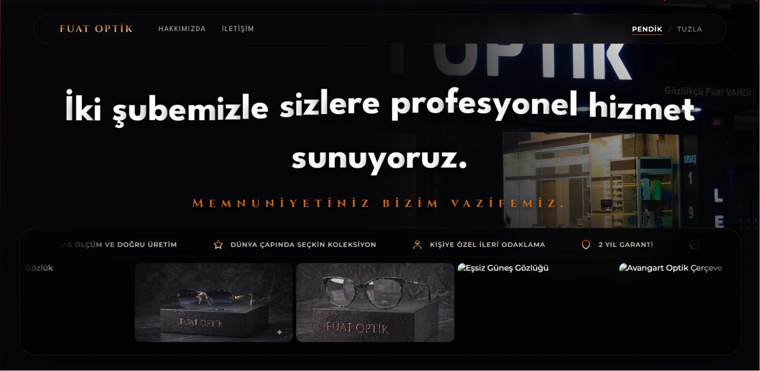
The first version: dark luxury aesthetic that the client found too dark for their audience.
The client didn't agree.
The Pivot
He said it was too dark. Too hard to read. Too "designed" for a neighborhood optical store where grandmothers come in to pick reading glasses and families bring their kids for eye exams. He wanted something everyone could understand at first glance.
I didn't push back. He was right. This wasn't a fashion label or a creative agency. This was a healthcare business serving real people in a real neighborhood. The site needed to work for them, not win design awards.
So we pivoted. Completely.
The New Direction
The client knew his business better than I ever could. He wanted to highlight his campaigns, the popular frame models customers specifically ask for, the expensive diagnostic machines he'd invested in, and his decades of experience in the optical industry. Two branches, since 1994, trusted by the neighborhood.
I listened. But I wasn't just listening as a creative director. I'm a licensed optometrist myself. I understood the clinical weight behind his requests, the difference between a basic autorefractor and a topographer, why certain machines justify the investment, and what actually matters to a patient walking through the door. That dual perspective shaped every decision from this point forward.
As both an optometrist and a creative director, I had to balance his business instincts with sound design decisions. Here's what that looked like:
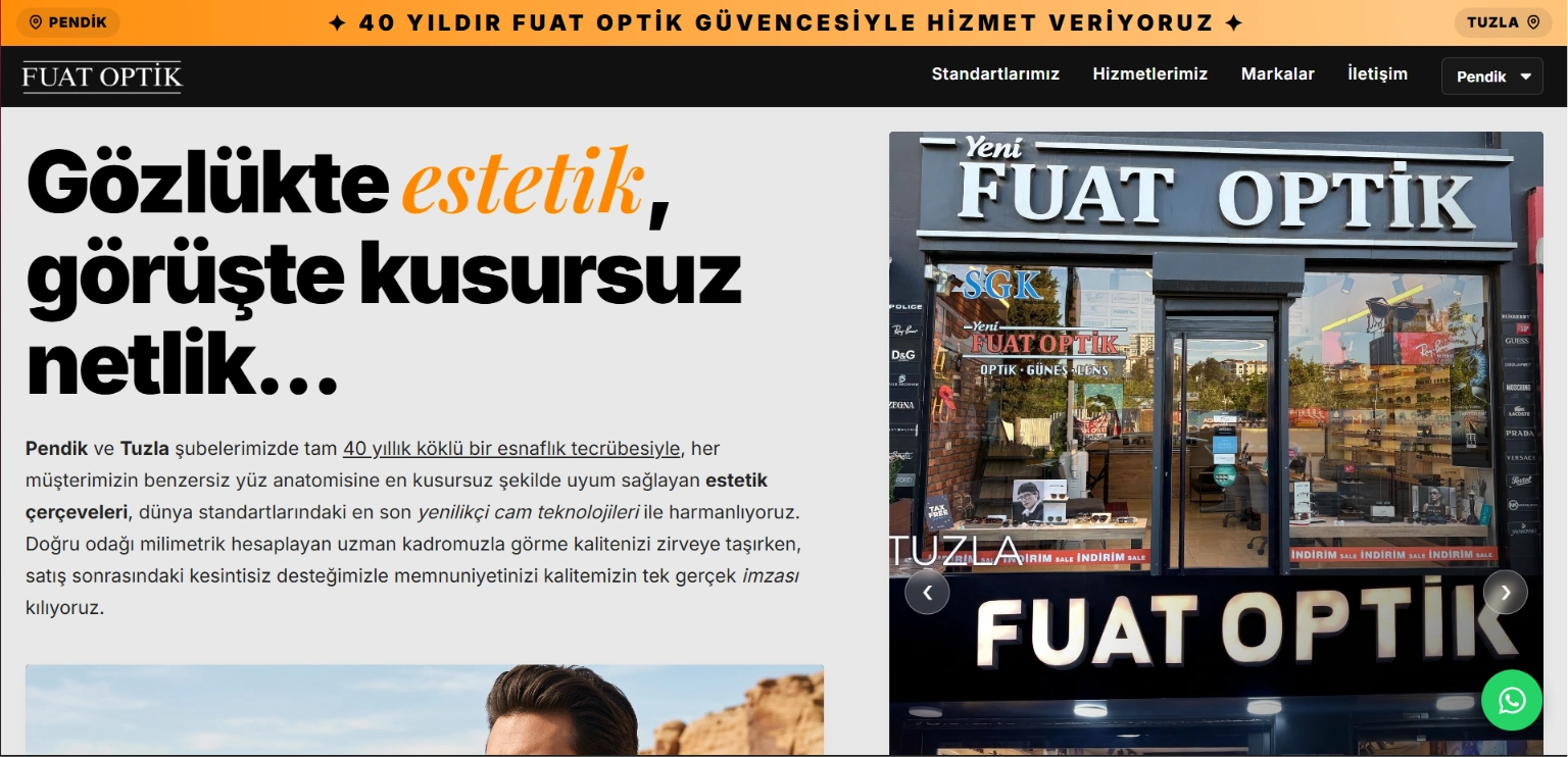
The new direction: light, accessible hero section built around the client's brand colors.
Color & Theme: Kept his beloved orange and black brand colors, but shifted the overall theme to white. Accessibility first. A dark theme in the optical industry, where customers range from elderly patients to young children, would have been a mistake.
Typography & Hierarchy: Stripped away the editorial complexity. Built a clear font hierarchy with generous white space and empty space. Every section breathes. Every heading guides. No one gets lost.
Photography: Some product and store photos weren't available in the quality I needed. So I went to the store myself, shot the machines, the frames, the interior. What I couldn't capture, I generated and refined using ElevenLabs, then color-corrected and composited to match the real photography.
Development: Claude Code accelerated the build process, handling scaffolding and repetitive markup while I maintained full control over every design decision, animation, and interaction.
The Second Revision
The second round of feedback came down to two things: final color palette adjustments and a fundamental shift in how the site communicated value.
Fuat Bey was direct: "In this industry, machines and technology matter. When someone walks in, they shouldn't just read about our equipment as text on a page. They should see it, understand it simply and visually, and recognize that we've invested millions in this technology."
He was right again. And because I understood the clinical side, I knew exactly which machines deserved the spotlight and why. I restructured the equipment section to present each device visually, with clear, jargon-free descriptions that communicated professional capability without drowning visitors in technical specifications. The goal was trust through transparency: show the investment, explain what it means for the patient, keep it digestible.
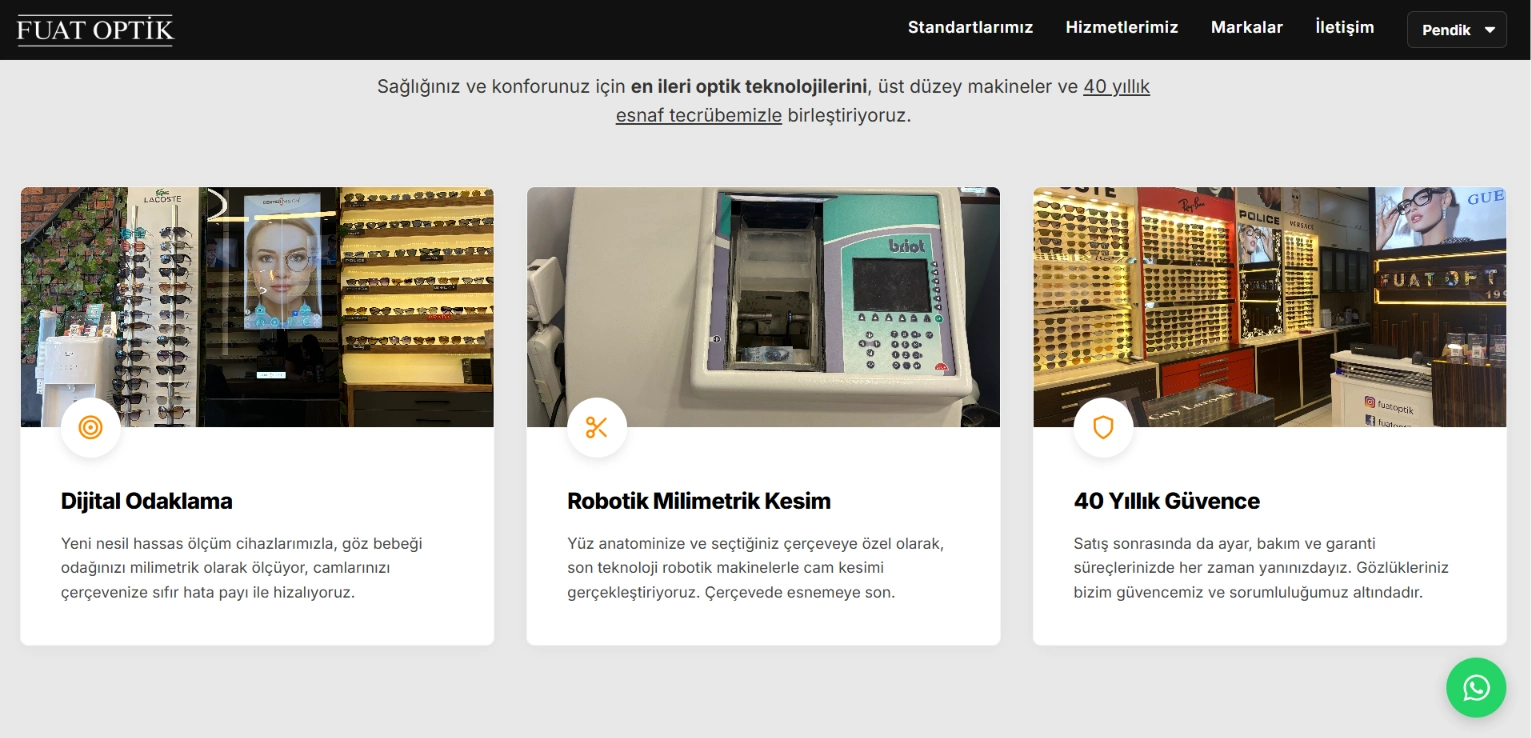
The equipment section: each diagnostic machine presented visually with clear, jargon-free descriptions.
The "Services" section required the same surgical approach. Fuat Bey shared his full service catalog and the brands he works with. There was a lot of information. I used my optometry background as a filter, pulling out the services and brand partnerships that would resonate most with potential customers, the ones that communicate trust, quality, and range without overwhelming a first-time visitor. Every line earned its place. Nothing decorative, nothing filler.
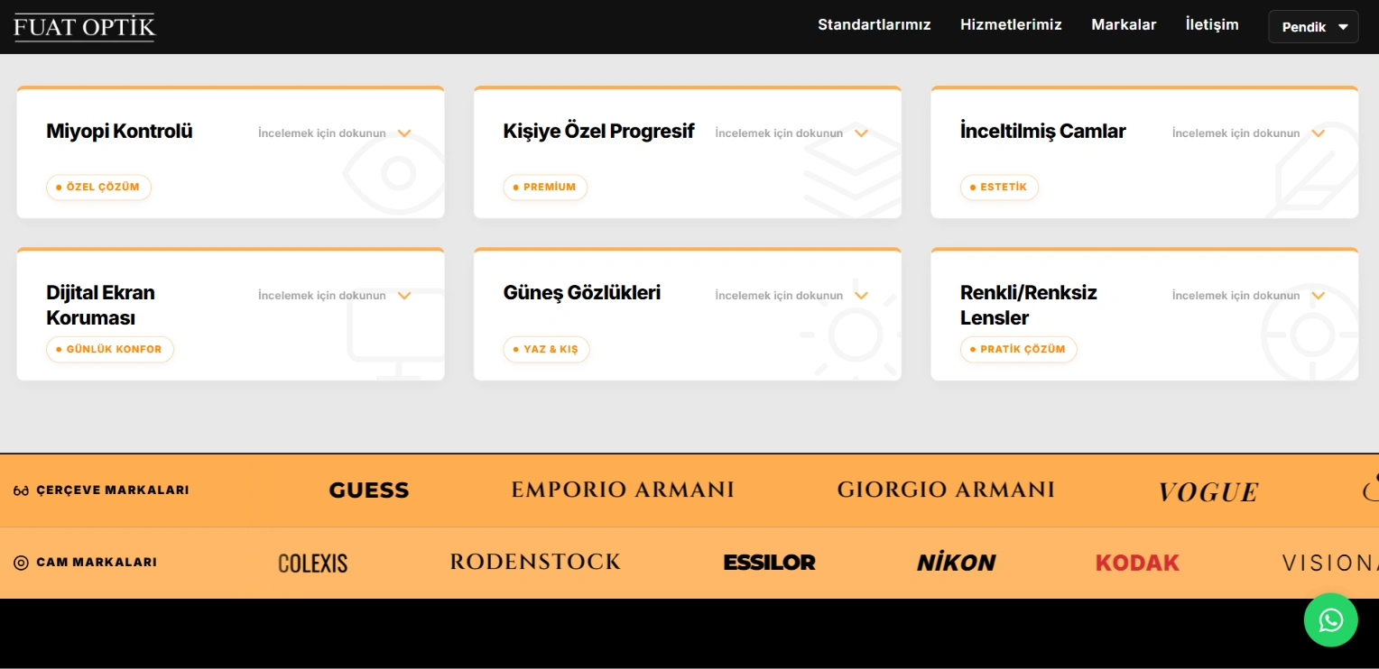
The services section: detailed, corporate, and accessible presentation of everything Fuat Optik offers.
Throughout all of this, I maintained the aesthetic I'd built, the corporate identity, the mobile responsiveness, the performance, and the accessibility. The client's requests didn't compromise the design. They refined it.
The Technical Decisions
Every technical choice served one goal: performance that doesn't compromise aesthetics.
Lenis removal: I deliberately removed Lenis, the smooth scroll library. In a sector like optical retail, where accessibility isn't optional and the audience includes elderly users on older devices, an external scroll library would have caused frame drops and hurt usability. Native scroll, zero overhead.
SEO architecture: Proper H1/H2 hierarchy, meta tags, robots.txt, sitemap. I analyzed local competitors in the district, identified their weak points and gaps, and optimized accordingly. The store needed to rank locally, not just look good.
Performance optimization: SVG icons instead of raster. Minified code. Lazy loading for all images. WebP format for every visual asset. Cloudflare CDN with a server physically located in Turkey for minimal latency.
The result: Near-perfect Lighthouse scores across accessibility, SEO, and performance. A site that looks clean on a 4K display and doesn't stutter on the oldest laptop in the store.
Beyond the Website
The website was just the starting point. Fuat Optik needed a complete digital infrastructure, not just a pretty homepage.
Business Operations: I set up verified Instagram and WhatsApp Business accounts with a dedicated business phone number, linked their tax certificates, and connected everything into a unified corporate structure. This wasn't cosmetic. It simplified their tax reporting and day-to-day operations in one move.
Custom Notification System: I built a PHP-based QuickSender on their website and coded a custom Telegram bot that checks WhatsApp every minute, sends summary notifications every 30 minutes, and fires instant alerts when something happens on the site. No third-party SaaS subscription, just a lightweight system tailored to their actual workflow.
Google Business Optimization: Optimized both branch listings on Google Business for local search visibility, accurate information, and customer trust signals.
Automated Messaging: Set up auto-response systems on both WhatsApp Business and Instagram, so customers get immediate acknowledgment and the team can handle inquiries faster without missing anything.
The whole package was about replacing scattered, generic tools with a connected system built around how they actually operate. Tax compliance, customer communication, real-time monitoring, and local visibility, all wired together from scratch.
What I Learned
The best creative work isn't about defending your vision. It's about understanding when your vision doesn't serve the person paying for it, and having the skill to pivot without losing quality.
Fuat Optik taught me that a white, accessible, performance-first website can carry just as much craft as a dark luxury experience. The constraint made the work better, not worse.
Like this project
Posted Jul 31, 2026
A corporate web experience for Istanbul's longest-running optical store. From dark luxury to accessible performance: a real client pivot story with AI-assisted development.
Likes
1
Views
3
Collaborators