Logo & Visual Identity | Real-estate
Shrutillusion | Branding+Editorial Studio
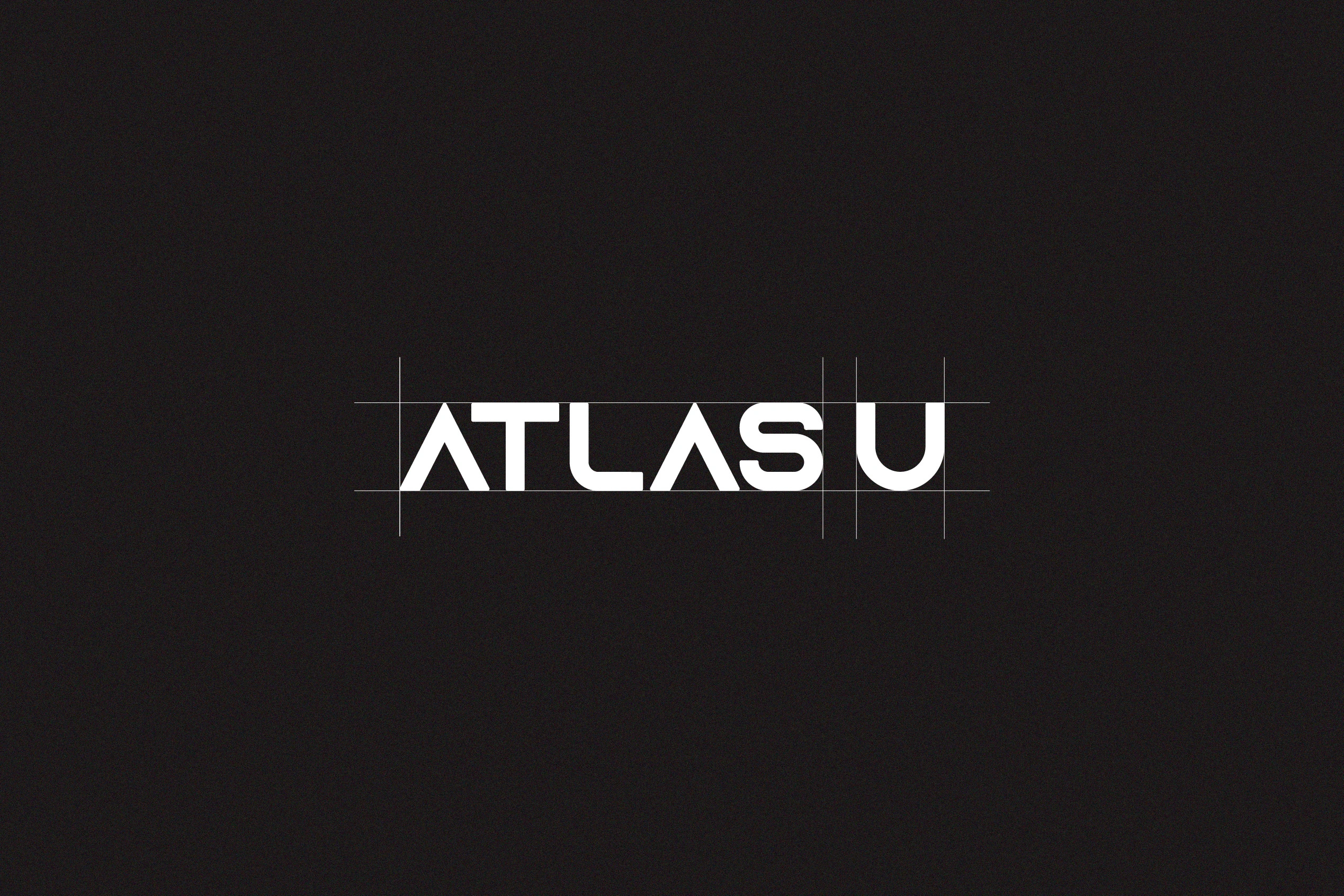
Logo & Visual Identity: Atlas U
Overview
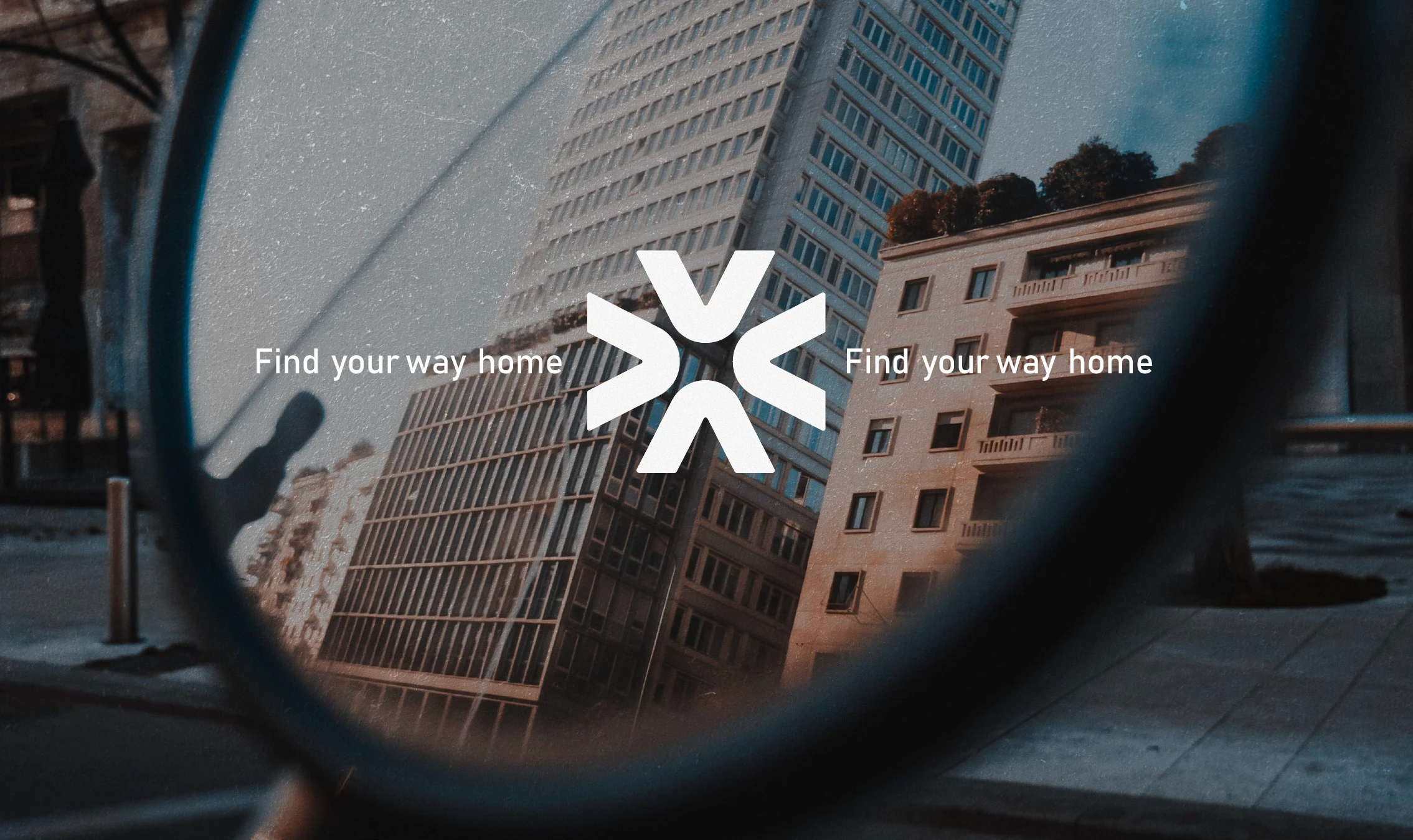
A minimal brand identity for a real estate company built around clarity, calm and direction. Atlas U positions itself as a thoughtful guide in modern living spaces.
Challenges
Creating a visual language that balances professionalism with warmth, without leaning on overused real estate tropes. The brand needed to feel aspirational, yet grounded.
Result
A refined logo system, a soft neutral palette, and a circular motif that reinforces movement and trust. The final identity feels modern, confident, and distinctly human.
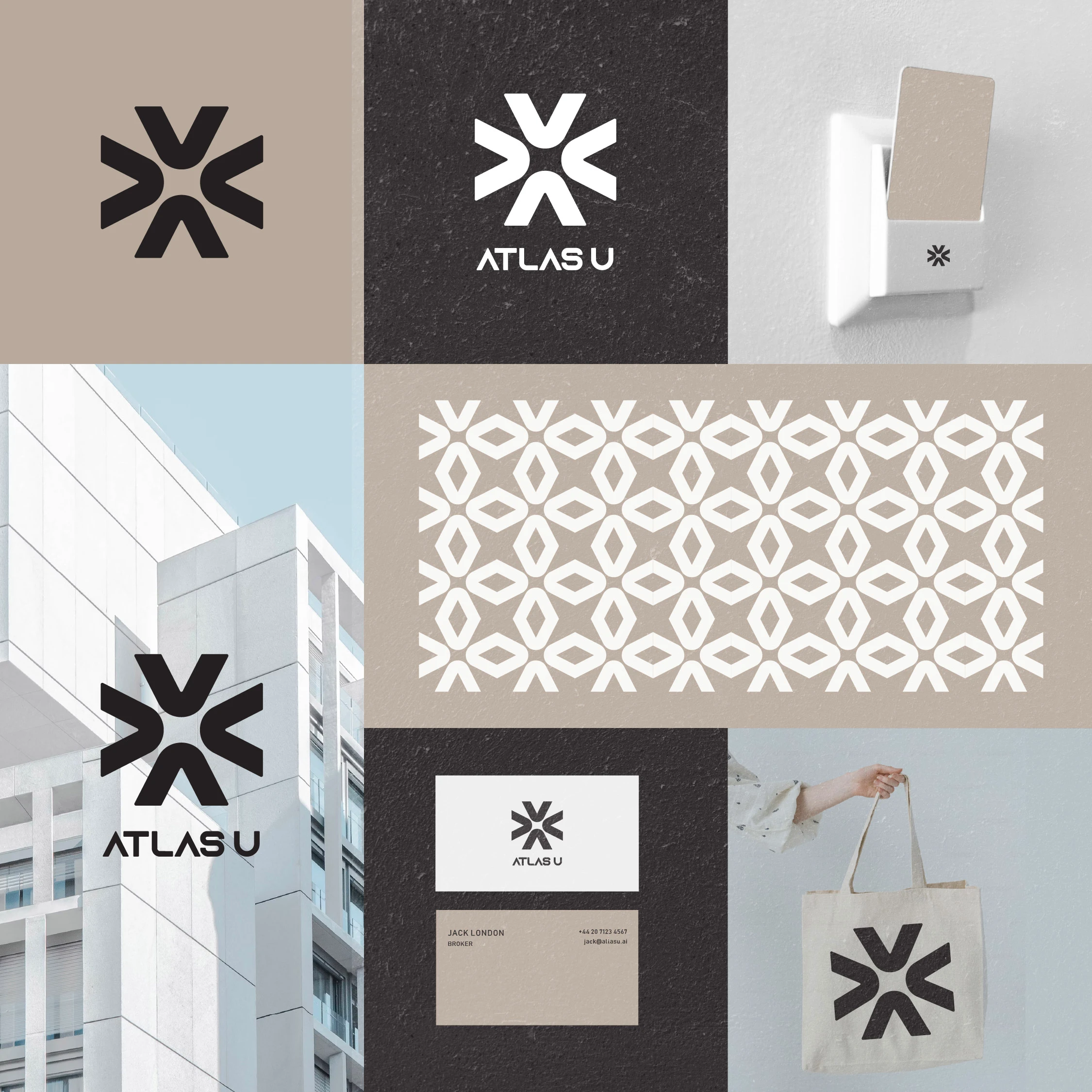
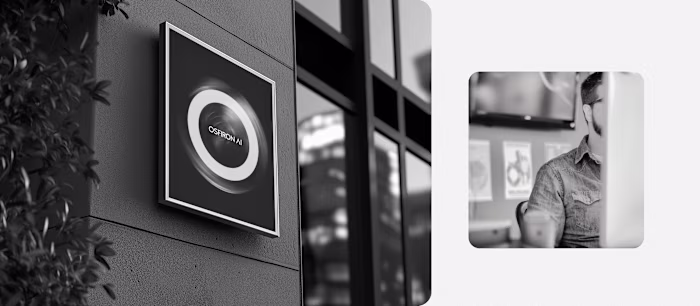
Visual Identity
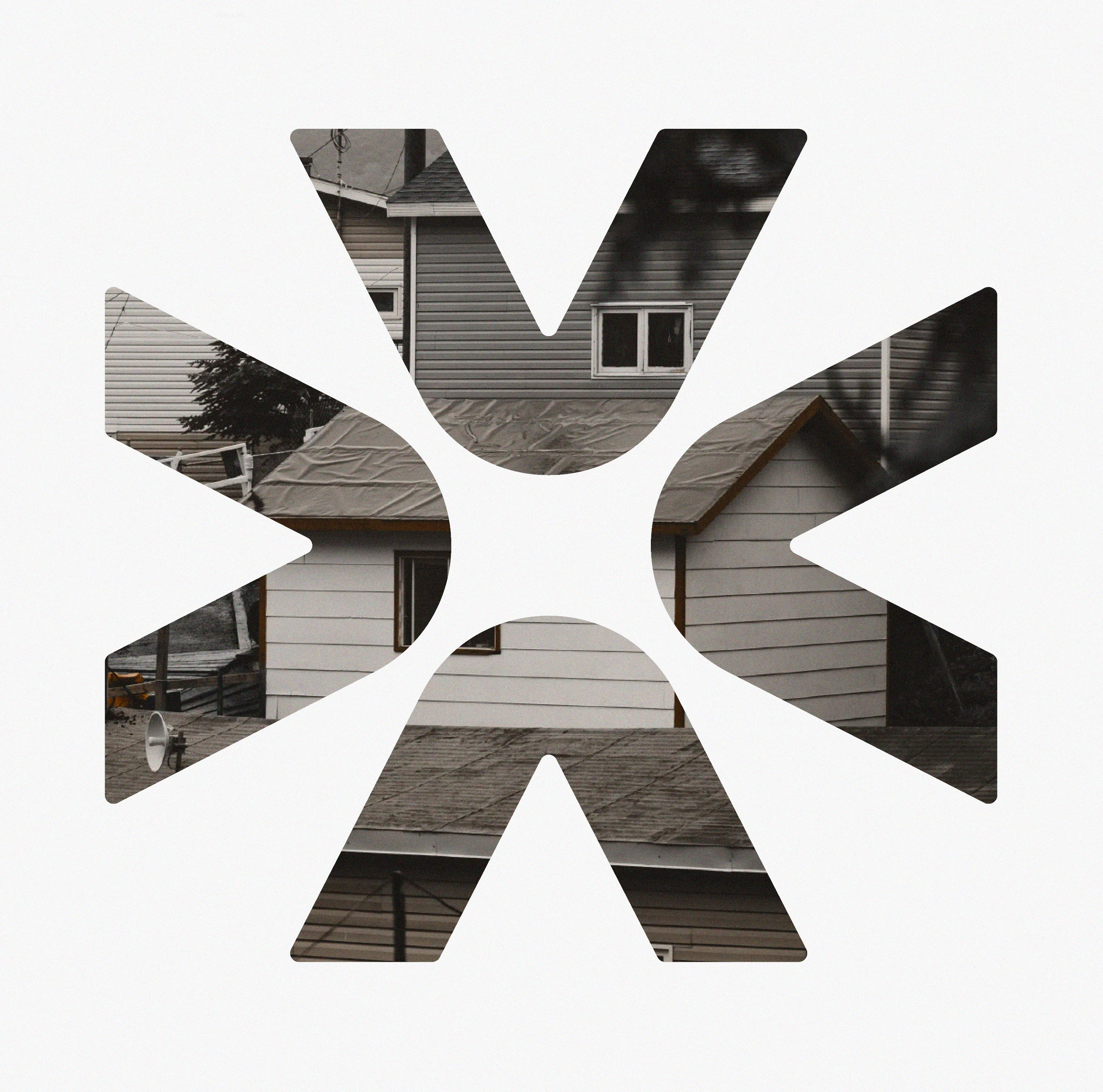
Logo Mark
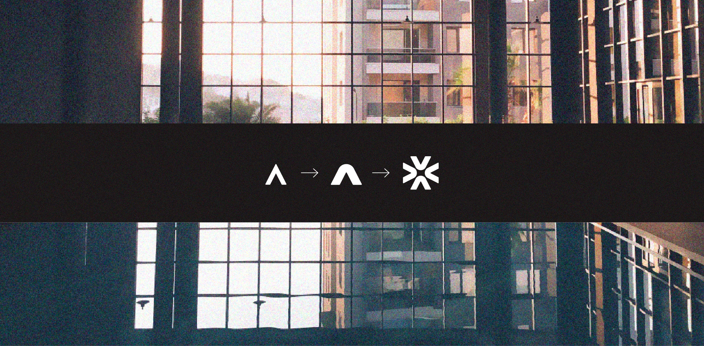
Logo Mark creation process
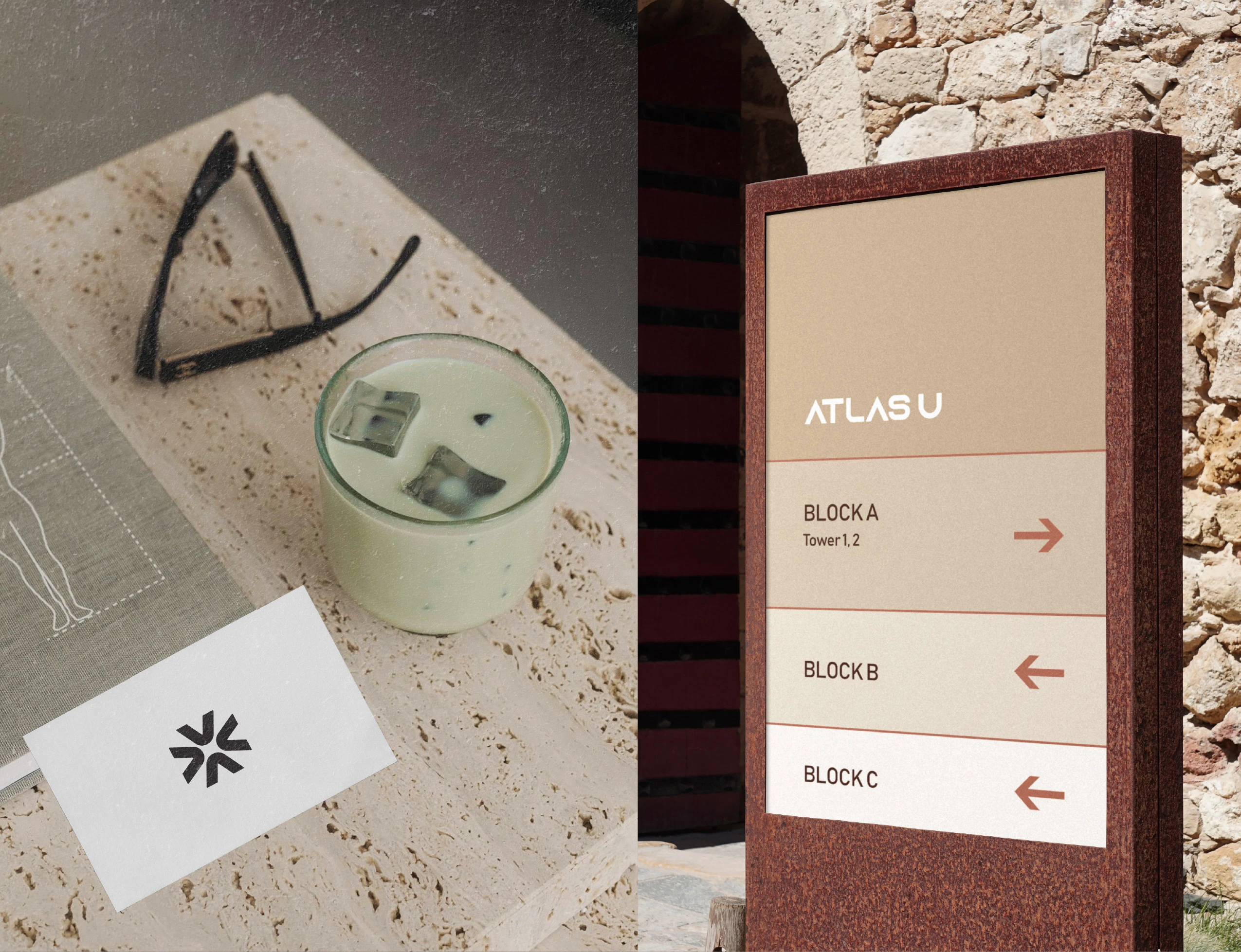
Collaterals
Logomark
Like this project
Posted Apr 7, 2025
Minimal brand identity for a real estate brand built around clarity, calm and direction. Atlas U positions itself as a thoughtful guide in modern living spaces.