Identity System for a Luxury Travel Advisor Platform (Demo)

Vincent L. Anderson
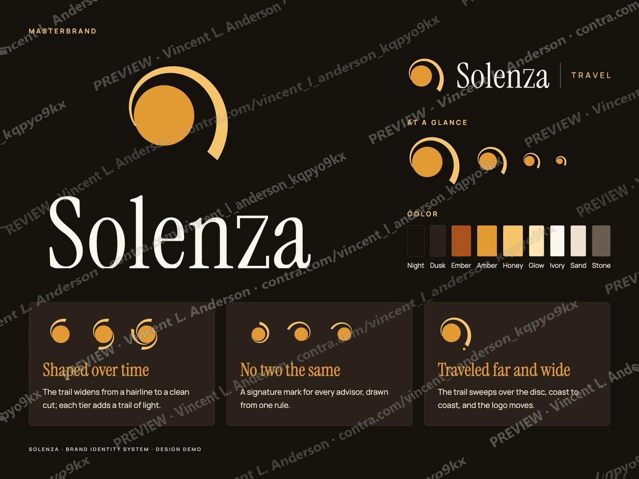
Design demo for a fictional brand; not client work.
I made a logo and identity system for Solenza, a fictional growth platform for independent luxury travel advisors, from a creative brief. The mark is flat: a solid amber disc that leaves a trail, which starts as a hairline at the disc, widens as it travels and ends in a straight cut. The wordmark is drawn from Instrument Serif with a custom z whose diagonal carries the same taper. The system covers the masterbrand and a Travel lockup, four platform marks (OS, Intelligence, Network, Studio) built from four shared parts and one lockup formula with a rule for new extensions, three advisor tiers that add one trail of light per step, a Solenza+ layer for four premium services with a true plus, advisor co-branding with a signature mark per advisor (six shown, all distinct), and a peer co-brand with a fictional consortium. It is applied to an advisor home screen, a proposal cover, an itinerary day, a social post, a partner welcome card and an investor slide, with 9 palette colors, 12 text pairings at 4.5:1 or better, clear space of 2X, minimum sizes, 28 SVG files, PNG exports and a 6-second animated logo.
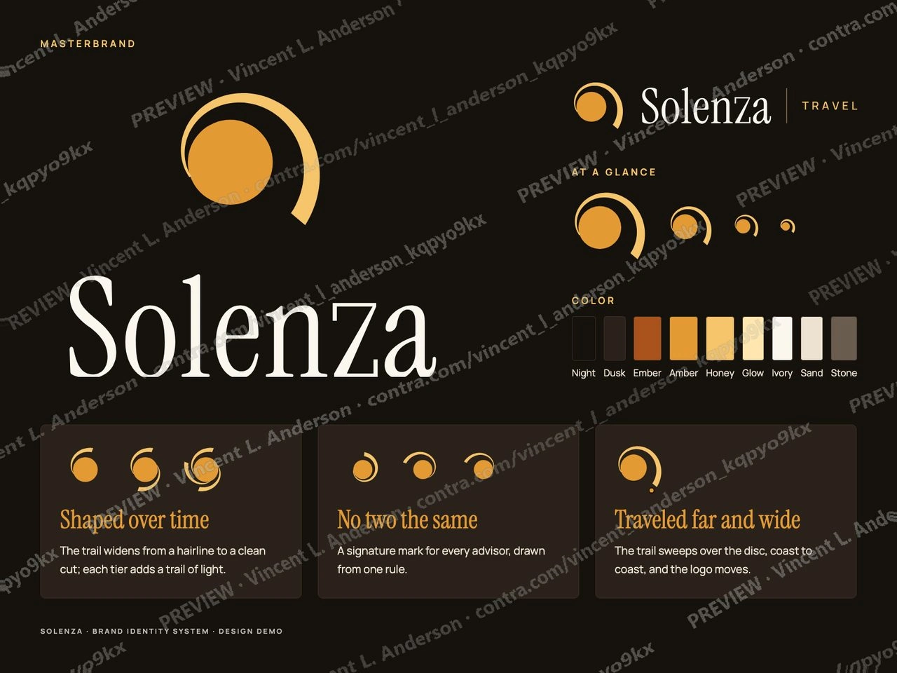
Masterbrand: stacked logo, Travel lockup, sizes, color and the three truths
The logo animates as a journey: the disc arrives, its trail travels out, the name follows, then the tiers gather their trails
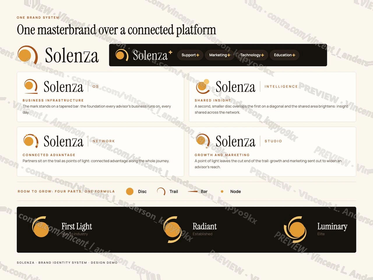
One brand system: masterbrand, Solenza+ services, four platform elements and three advisor tiers
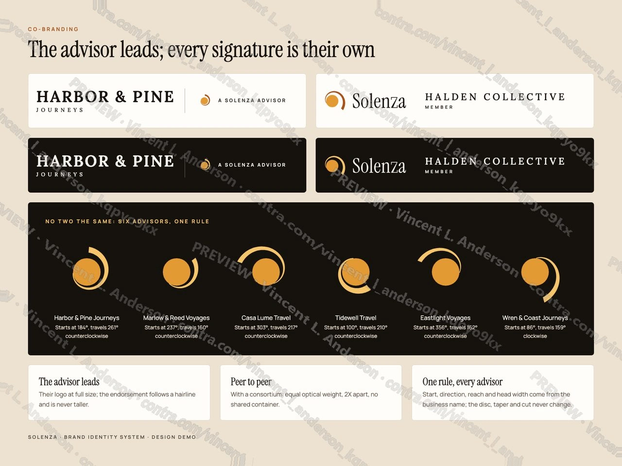
Co-branding: the advisor's business leads, a peer consortium lockup, and six distinct signature marks
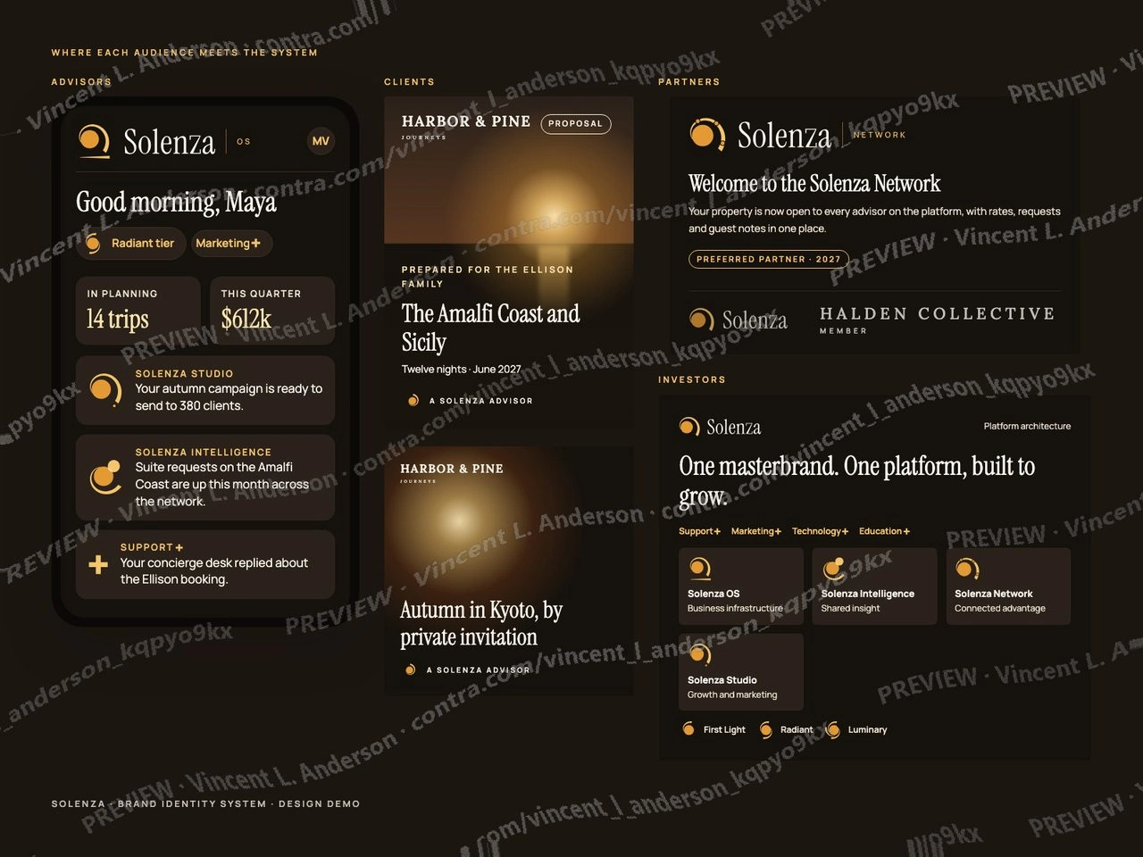
Where each audience meets it: advisor home screen, client proposal, partner card and investor slide
Like this project
Posted Oct 3, 2026
Demo: logo and identity system for Solenza, a fictional growth platform for luxury travel advisors. Masterbrand and Travel lockup, four platform marks, three tiers, a plus services layer, advisor co-branding with signature marks, animated logo.
Likes
0
Views
0